Saturday, September 24, 2016

September Share by Karine

Hi,

I can't believe it's already the end of September! Were did the summer went? Oh my...

September 24th means it's my day here at Blue Fern Studios. So lets start with my first share.
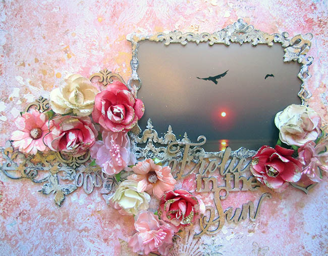
A Walk on the Beach


You have probably seen this layout already, as I presented it September 1st for the moodboard reveal.

I started out with the Contemplation paper from the Serendipity collection.


All around my picture, I used some cards from the Calling Cards, along with some scrap pieces from the Fascination and Anticipation papers, also part of the Serendipity collection.


To add some interest to my background, I used the Brocade Texture and the Arcadia Textures stamps and embossed the patterns with snow Imagine Ink embossing powder. You can see some of the texture created on the picture above, over the flowers.


To embellish, I used some Seaside Lilies, Seaside Roses and Tranquil Roses and Lilies.

Lastly, my chipboard pieces, the Mesh Bits and my title (A Walk on the Beach) are covered with sandy paste and dry brushed with white gesso.
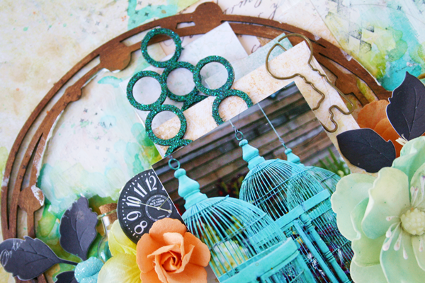


Glee


My second layout uses the Stillness paper from the Tranquility collection.


On my background, i used the Serendipity Medley and Essential Textures stamps.


I decided to cut apart the Dresden Corsage and to emboss the flowers I created with some Garnet Imagine Ink embossing powder. 


To go with the flowers, I also used the Spring Branch that I cut in pieces and embossed with Fern Imagine Ink embossing powder. To add some interest, I used a sponge to add some white gesso while the powder was still hot.


I used some flowers from the Attic Charm Daisies set and some from the Tranquil Blooms set.


Finally, my title piece is part of the Serendipity Words 2 set. I coloured it with ink.
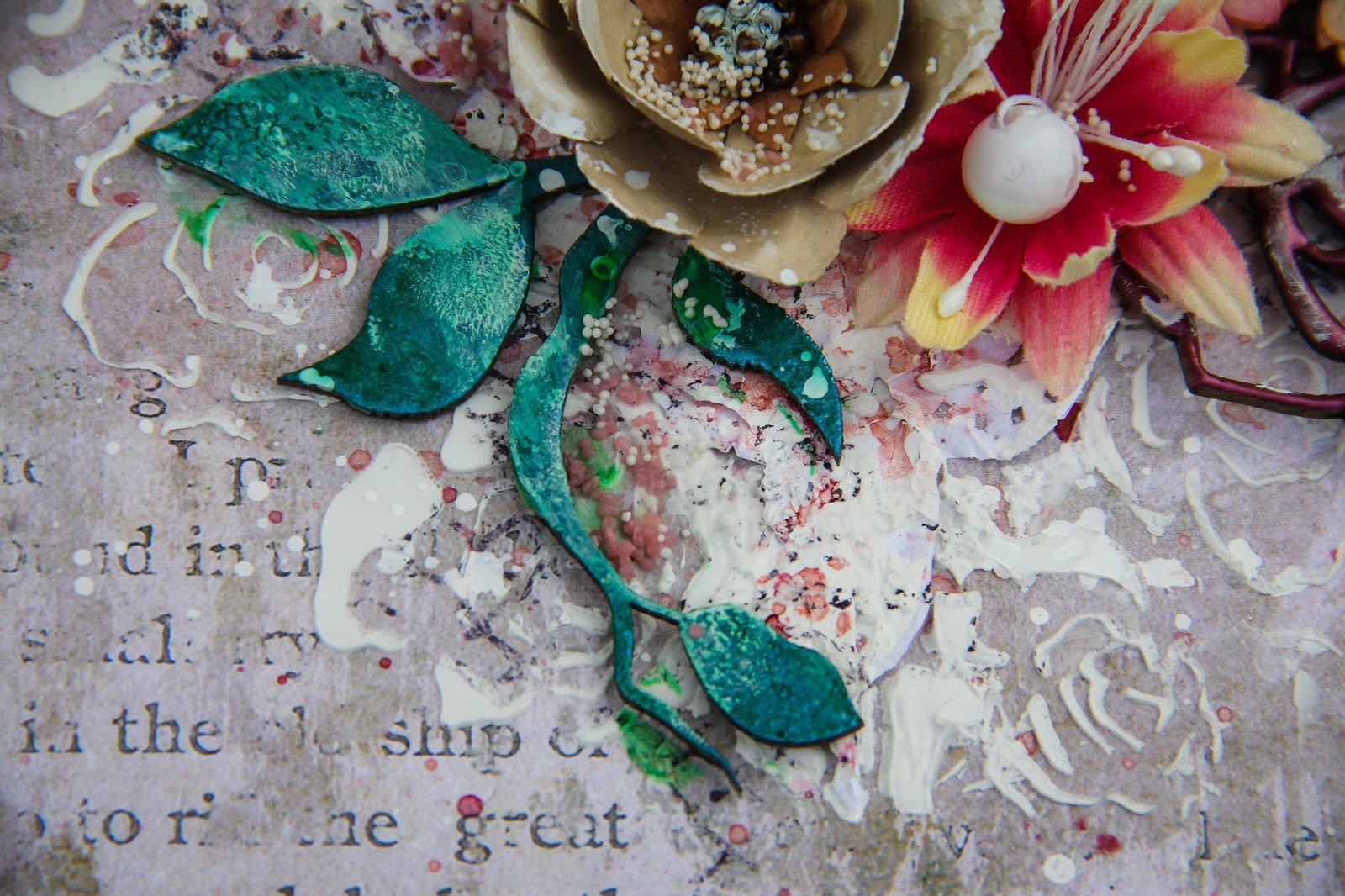


Delightful


Finally, my last layout is called Delightful. I started with one of my all time favorites collection: Ombré Dreams. The background paper here is called Ginger's Dream.


I used the Forever and Serendipity Medley stamps to stamp on my background.


I cut the Turkish panel and embossed the pieces with Imagine Ink snow embossing powder.


Over that, I used the Blooming Flourish that I cut and embossed with Sea Mist Imagine Ink embossing powder. 


My title piece, part of The Optimist Word Set, is embossed with Auburn Imagine Ink embossing powder.

I hope it inspires you.
Have a nice day.


Friday, September 23, 2016

September inspiration by Pascale

Hello Sweeties,

Today I'm up on Blue Fern Studios blog with three new projects. The first one featured the Tranquility collection: it was perfect for this photo of Marilyn Monroe.


I started to cover the Hushed paper with a thin coat of clear gesso; Then I added a design with a stencil and two pastes: black heavy gesso and platinum crackle paste.


When dry, I added more texture with the Arcadia Texture stamp and the Magenta embossing powder.


I just painted the Chelsea Vines with black gesso.


I embossed the Corner Flourishes with Pearl embossing powder.


Then I glued all the embellishments (flowers, chipboard and lace) with a 3D gel. 


Blue Fern Studios products:

Papers - Tranquility (Hushed, Calling Cards) ;
Chipboards - Chelsea Vines, Corner Flourishes ;
Stamp - Arcadia Texture ;
Imagine Ink - Embossing Powders (Pearl, Magenta) ;
Flowers - Courtship Roses, Tranquil Lillies and Roses, Seaside Lillies.

------------------------------------

The second layout feature the Timeless collection which is perfect for this photo I've taken in the park of the castle of Chaumont-sur-Loire (Loire Valley, France). It's a sculpture from Giuseppe Penone: “Trattenere 8 anni di crescita (Continuerà a crescere tranne che in quel punto), 2004-2012”.)


As usual, I primed the Abode paper I chose as background with clear gesso. Then I added a design with a stencil and platinum crackle paste. I sprinkled Foll's Gold and Pyrite glitters while the paste was still wet.


I splattered watered gesso and let dry. Then I continued some splattering with gold and rust mica powders mixed with water and gel medium as well as gold paint.


In the meantime, I painted the Roman Clock with a gold acrylic paint. When dry, I added a coat of clear crackle paste and let dry naturally. I added some rust mica powder to darken the crackle as well as some pale silver mica powder to lighten the clock face.


First I embossed the Stillness title with the mushroom embossing powder. While the powder was still hot I sprinkled some pearl embossing powder as well.


I primed the Arching Leaves with white gesso, then I painted it with a rust mica powder. Then I added a coated of clear crackle paste.


When all the embellishments were glued, I added some micro beads.

Blue Fern Studios products:

Papers: Timeless (Abode, Main Street)
Chipboards - Roman Clock Set - Small ; Arching Leaves ; Peaceful, Stillness, Contentment
Imagine Ink - Embossing Powders (Musrooms, Pearl) ;
Imagine Ink - Glitters (Foll's Gold, Pyrite).

------------------------------------

I chose to work with the Tranquility collection again for my third layout.


I primed the background with clear gesso. Then I added a design with a stencil and clear crackle paste: I covered randomly the stencil with two chalk inks before applying the crackle paste through it.


While the crackle paste was still wet I sprinkled some Pyrite and Blue Ice glitters.


I sprayed all the chipboards with two inks: a brown and a teal and dried them. Then I added the same chalk inks I used previously with the stencil, sprayed some water.


I kept the Floral Garden Bits like this and I covered the Layering Stems with Glossy Accent.


I die-cut some leaves in the Jubilation paper and I colored the flowers lightly with a beige watercolor.


Blue Fern Studios products:

Papers - Tranquility (Blissful, Jubilation) ;
Chipboards - Floral Lattice Bits, Layering Stems ;
Imagine Inks - Glitters (Pyrite, Blue Ice).

Monday, September 19, 2016

September inspiration by Karolina

Hi guys! Karolina here. Welcome on the Blue Fern Studios blog ;) Today it's time for my September inspiration. Can you believe it? Time is running out so quickly!

This time I would like to show you 3 projects - layout and two canvases. 

DREAM BIG

I had so much fun when I was creating this little canvas! I really like the background and turquoise accent in my composition. I used some dark vintage papers to create my composition and the chipboard piece - a little Dream big. I covered the chipboards with ginger embossing powder as well as a leaves.


CAGES

This layout only looks very cheerful. It's full of colors and embellishments, but I created this page to express my feelings. Not exactly good feelings. But I really like when my life, my thought can be an inspiration for my projects. Even though it's clear only for me ;)

Here I also used papers from few different collections. I do love panels chipboard from BFS! You can use it in so many projects and in so many different ways. This time I decided to use two panels.


BEAUTiFUL

And the last but not least my third canvas with funny photos of one of my best friend Weronika. Weronika is 3 years younger then me and she will be always like my little sister, especially I've known her since she was 3! It's a lot of time! 

Here I also used a part of chipboard panel but this time I didn't cover it. 


Ok, so that's all! I hope your monday morning was a little bit more colorful ;) Have a good week and see you in October!


Sunday, September 18, 2016

A layout and Mini-Album with Seaside Cottage by Keren Tamir


Hi Everyone,
Its Keren here on the Blue Fern Studios blog for my September post.
This month I've created a layout and a mini album using the Seaside Cottage collection.

Since I love the beach so much, Seaside cottage is one of my favourite collections and I loved using it again.

Here is my layout:

"Frolic in the Sun"


For the background paper I used the Seaside Cottage Glory paper.
I used a picture of some seagulls flying in the air. It looks like they are Frolicking in the sun and dancing in the sunset. Thats why I used that chipboard title. The title was sprayed in gold ink.


The photo was framed with the Marseille frame which was painted in white gesso, then stamped with the Brocade texture. I used the same technique for the flutter medley and added it to the side of the frame. Then I embellished with matching Blue Fern Studios' flowers and added bits of the Persian ornament chipboard in between the flowers.


<<<<<<<<<<<<<<>>>>>>>>>>>>>


"Vacation"

For my second project this month I created this Sand Castle mini-album.
The mini album already comes like this and its made out of MDF material. However you could easily make and cut these shapes out of cardboard or other material to create your own mini album.

For the background and embellishments I used the following Seaside Cottage papers: Gala, Splendor, Glory and Calling Cards. 


For the cover I used some Blue Fern Studios flowers and some seashells. I also used a few of the following chipboard pieces: Seaside Seashells, Seaside Treasures and By the sea. For the title, I used the Summer Vacation chipboard title and cut out the Summer word out of it. All the chipboard pieces in the album were either embossed with Oatmeal or Breeze embossing powders and then lightly edged with brown distress ink.


For the next pages I used the Destination Label and the Sweetheart frame chipboard pieces which were both embossed with the Oatmeal Embossing powder.


For the following two pages I used the Seaside Lanterns, Memory Frame and Circle Links. All of these chipboard pieces were embossed with the Breeze embossing powder.

For this next page I used the Lane street sign to frame my photo and the and one of the Jubilation corners for the following page. I also use a chipboard shell above the photo which can be seen from the front cover. All of these were embossed with the Breeze embossing powder.
For the last page, which is the back of the album I used the Chipper chipboard frame to frame the photo. The frame was embossed in Breeze embossing powder.
As a final touch I added some snow texture around all the page edges.


Thank you so much for visiting the Blue Fern Studios Blog
Have a wonderful day!!!

Keren

Saturday, September 17, 2016

September Social Media and YOU!!

Happy Saturday, everyone! 
It's Social Media Day here at Blue Fern Studios! 
We love seeing your creations and thank you so much for using our products. That's why we take aside one day a month and let YOU provide inspiration for all of our followers! 
***


First up is Peggy Giovanetti from the USA who has been using her Blue Fern Studios right and left the past few months! Here she has created a beautiful heritage layout using our Tranquility collection. Peggy has added in some gorgeous white lace that really makes her design pop. You can find Peggy on Instagram at  @peggygiovanetti. She blogs Here if you want more inside details about her work. 


***


"Nozomiphoto" has used our Blue Fern Garden collection and lots if yummy BFS chipboard dangles to create this gorgeous layout using photos from her visit to Hyogo Prefectural Park in Japan. The layers and fussy cutting provides so much detail to please the eye!  Really makes you feel as if you were in the Gardens as well. You can find more of her work on Instagram at @nozomiphoto.

***


Don't you just adore this little tote/jewelry holder? This was created by mscrop_mie of Osaka, Japan for a Design Team project using our Attic Charm. This creative gal blogs at www.scrapbook-mscrop.com. She posted her cute little tote on Instagram where you can find her at @mscrop_mie. 

***


Yumiko Mikami brings us her version of the Mermaid paper from Seaside Cottage. We could seriously do a whole blogpost of all the creations we've found of unique ways this paper has been utilized. Yumiko's layers are exquisite and truly give this one a three dimensional look. You can find Yumiko on Instagram at @yun413. She blogs at ameblo.jp/scrap-yun

***


We have one last very special layout for you today! Manuela Zimmerman is one of our paper collection designers. She has brought us Timeless, Tranquility, Sanctuary and more. Her designs can be used so many ways but we love seeing what she creates for herself.  They are always shabby and romantic. She makes her planners look like works of art. This layout (probably digital but we need to ask) just brings a jaw drop! We feel so fortunate to have her as one of our designers! She is always so excited to receive her actual paper version of her digital creations. Her Instagram account is @manu designs. Gorgoeus stuff! 

That's it for today! 
Please continue to tag us on your projects. There is lots of amazing talent out there and we love sharing it! 

See you next month!