Saturday, January 23, 2016

January inspiration by Pascale B.

Hello Sweeties,

Today I'm up on Blue Fern Studios blog for the first time. I have to say that I'm really honored to be part of this amazing Design Team.


For those who don't know me, I'm Pascale B. a working mom of 2 young adults. I live in the Loire Valley (France) well known for its beautiful castles and wines. I love to travel in and out my country and as I take a lot of photos during my trips, you will discover some of my finds in my projects as well as some of my ancestors... I mostly create layouts, but not only...

You can find my work on my personnal blog Scrap Made in Touraine,
some tutorials on Youtube,
and follow me on Facebook

------------------------------------

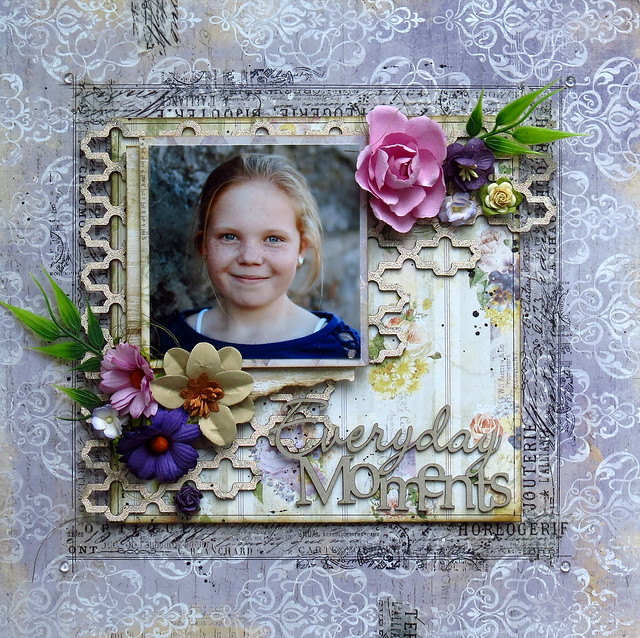
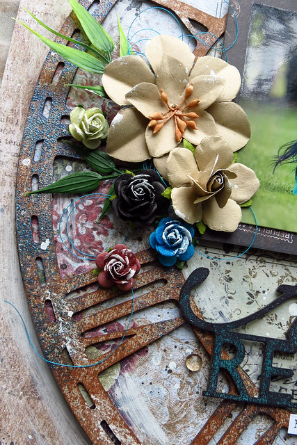
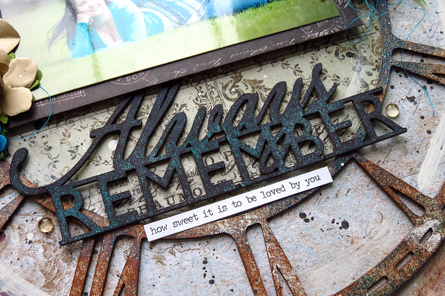
For the first project I choose a photo taken during a walk in the "Fairytales Gardens" of the Castle du Rivau (Léméré, France). It's a sculpture from Bassorade: " The Running Forest ".


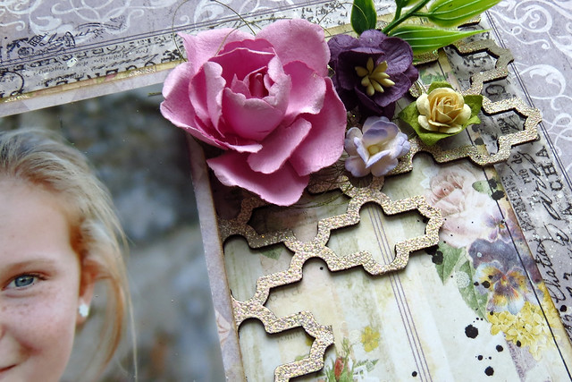
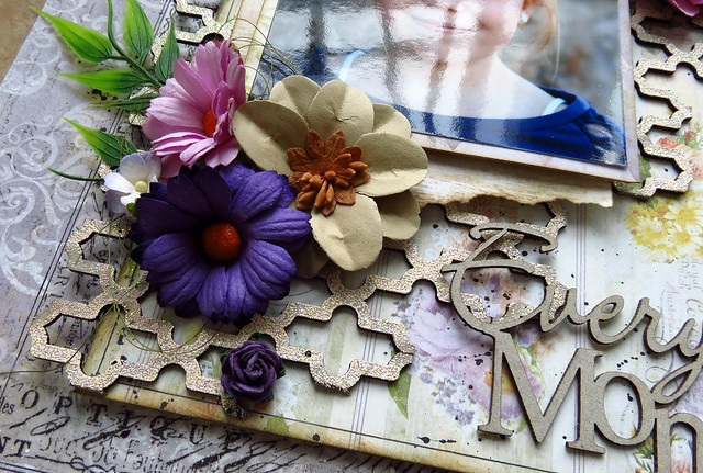
I choose to made a really simple layout : some random stamping with the Brocade texture stamp, a touch of color for the background and some embossed chipboards. I used the Lucky powder on the small flourishes and the Ebony on the Dot Grid panel.


... some flowers colored with Twinkling H2Os and Primary Element.


And to finish I sprinkled Carrabean Glitter and Glass Glitter.


Blue Fern Studios products used:

Vintage Christmas: NoelFrolic: FriendshipPaisley & Vine: Bohemian Dot Grid Panel Mini Flourishes
Vintage Christmas
Noel
Frolic
Friendship
Paisley and Vine
Bohemian
Chipboard
Dot Grid Panel
Chipboard
Mini Flourishes
Stamp - Brocade Texture Imagine Ink - Embossing Powder - Ebony Imagine Ink - Embossing Powder - Lucky Imagine Ink - Glitter - Caribbean
Stamp
Brocade Texture
Embossing Powder
Ebony
Embossing Powder
Lucky
Glitter
Caribbean

-----------------------------------

For this second page I chose a photo I took in September of the Castle of Villandry (Villandry, France), well-known for its beautiful "Jardins à la Française" (formal garden). The new Timeless collection is just perfect for this kind of photo.


I started to protect the paper (Timeless - Artistique) with a layer of clear gesso. When dry, I added some colors coordinated to the photo. I also added a design to the background with the Brocade Texture stamp that I heat embossed with the 14 Karat powder.


I covered the chipboards with clear gesso before coloring them with some Twinkling H2Os. When dry, I used the Brocade Texture stamp to add some texture to the chipboards and I embossed them with the 14 Karat powder too.


I added some texture to the grape vines too: I sprinkled some Sage embossing powder when the paint was still wet and I love the result!


I die cut the the title in a cardstock and embossed it first the 14 Karat powder. I embossed a second time with the Ebony powder but I didn't cover it properly so the gold is still visible.


Blue Fern Products used:

Timeless - Artistique Love Story: The Grand Ball Love Story: True Harmony Quatrefoil Panel Moldings
Timeless
Artistique
Love Story
The Grand Ball
Love Story
True Harmony
Chipboard
Quatrefoil Panel
Chipboard
Moldings
Imagine Ink - Embossing Powder - 14 Karat Imagine Ink - Embossing Powder - Sage Imagine Ink - Embossing Powder - Ebony Stamp - Brocade Texture
Embossing Powder
14 Karat
Embossing Powder
Sage
Embossing Powder
Ebony
Stamp
Brocade Texture

-----------------------------------


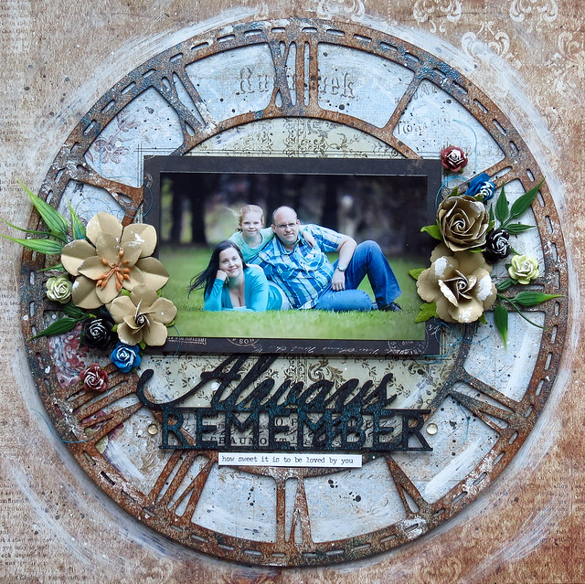
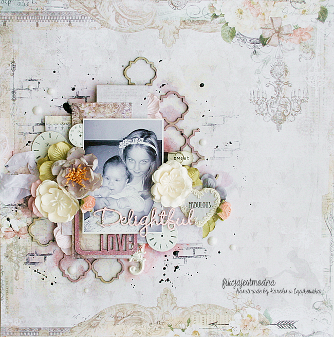
And for the last layout I choose a photo of my great-grandparents's wedding in 1901.


I covered the background (Timeless - Couture) with clear gesso to protect it. When dry, I stamped randomly the background with a background stamp (Postal Texture) and an archival ink. I used a second stamp (Halftone) to add more texture and embossed the print with the pearl embossing powder. Then I added some colors to the background.


First I covered the chipboards (Framington Medley and  Marrakesh Panel) with clear gesso too, and added a thick layer of clear crackle paste. I let dry naturally. Then I colored them with different mica powders and fixed them.


I colored the flower and the leaves and I embossed the last ones with the sage embossing powder to add some texture.


I cut different papers (Autumn Anthology - Cottage and  Sanctuary - Calling Cards) and distressed them before adding them under the photo.


To finish the layout I added some mica flakes and I splattered black gesso mixed with gold mica powder.

Blue Fern products used:

Timeless - CoutureAutumn Anthology: CottageSanctuary: Calling CardsMarrakesh PanelFramington Medley
Timeless
Couture
Autumn Anthology
Cottage
Sanctuary
Calling Cards
Chipboard
Marrakesh Panel
Chipboard
Framington Medley
Stamp: Postal TexturesStamp: HalftoneImagine Ink - Embossing Powder - Pearl Imagine Ink - Embossing Powder - Sage
Stamp
Postal Texture
Stamp
Haftone
Emboosing Powder
Pearl
Embossing Powder
Sage

Thursday, January 21, 2016

Three layouts by Marie-Josee

Hello, Blue Fern Studios fans!

I am really happy to be back on the Blue Fern Studios for the third year. It will be very exciting with all the new products and paper collections!


My name is Marie-Josee, I am 40 years old and I live in Gatineau, Quebec, Canada, with my husband and my daughter. I have been scrapbooking since 2006. I love to create layouts, but I also create cards, mixed media projects and altered art.

You can see my work on my blog, Les créations de mariemily, or on my Facebook page, also called Les créations de mariemily.

I will now show you the three projects I created with three differents paper collections.

"Everyday Moments" layout

For this layout, I used the Déjà Vu paper collection.

I also used a piece of the Turkish Panel chipboard.


I altered it with Blue Fern Studios embossing powder (color Petal). I applied the embossing ink directly on the chipboard, and I sprinkled the powder here and there without covering the chipboard completely.


I did not alter the Everyday Moments chipboard because the color fitted with the rest of the layout.


"Always Remember" layout

For this layout, I used the Sanctuary paper collection.

I also used a piece of the Roman Clock Set - Large, the biggest one, as the focal point of my layout.


Here's how I altered it.

First, I added brown ink to the chipboard with the pad, leaving some bare spots here and there. Then, I added embossing ink randomly, only in some spots, and I used Blue Fern embossing powder (color Fern) to add touches of color here and there on the chipboard.

Then, I added gesso here and there with a dry brush.


I altered the title with a black ink pad, also leaving some bare spots. Then, using teal spray ink, I added more color to the chipboard.


Circles layout

For this layout, I used a paper from the Ombré Dreams collection and the Jumbo Rings panel. I put the panel on my paper and used a pencil to draw the inside of the circles. Then, I set aside the paper.


I primed the chipboard with gesso, and while it was still wet, I sprayed green ink on it.

While it was drying, I stamped the inside of the circles with the Blue Fern Studios round stamps. Then, I glued my chipboard to the paper and added more spray ink.

Here are some details!


Thanks for looking, and have a great week!

Marie-Josee

Wednesday, January 20, 2016

What's New - Part 2

We are back today with more new Blue Fern Studios products that you are sure to fall in love with! 

First up is a sneak peek at our upcoming paper collection, Serendipity. 
  Be sure to check back later  when we will show you the individual pages up-close. 
The detail is stunning!


We have also added these new chipboard pieces:

Garden Celebration


Persian Ornament


Stencil Tag 1


And how about some new titles!


To add some sparkle and bling to your chipboard pieces, we also have some new colors of glitter!


We're excited about our new products, and hope you are, too!
We would love to hear what you think.

Tuesday, January 19, 2016

My first projects for Blue Fern Studios - Karolina Czajkowska

Hi everyone! I am so excited to be here today with my first projects for Blue Fern Studios. 
Such an honor and a pleasure to be able to be a part of this fantastic team!


First, let me introduce myself. It's the most difficult moment, because I'm not really good in talking about myself. My name is Karolina Czajkowska and I live in Poland in one of the biggest city Łódź. I'm 26 and I'm an architect. I finished my study 1,5 year ago. 

I started my scrapbooking adventure 4 years ago and definitely it was a love at the first sight ;)
Scrapbooking is a huge part of my life, and it is more than a hobby by now. I can't imagine my day without scrapping and I am very sad when life and obligations do not allow me to go to my crafty space. One year ago I started to lead classes in Poland and abroad and I do love it! I think I'm mixed media girl. I'm pretty sure that this is the best way for me to find myself and my own style. And what my style is?
I still don't know, but defenitely it's not a clean&simple style ;)

You can find me on:

I created 2 layouts and a winter canvas to share with you today:


Layout "Delightful love"

My first layout is very soft and girly, I think. In the picture you can see two little ladies - my goddaugters. They are so cute, aren't they?


This page based on paper from the Love Story collection. I started my work of covering the entire background under my composition with using clear gesso. Then I made a composition using papers from Déjà Vu collection and of course I added some chipboard pieces.


I chose three chipboards - this one which you can see in the background its's a smaller piece of the Quatrefoil panel. First I used it like a stencil and then I covered it using mists and water paints in pink, lavender and warm beige colors.


I covered two smaller chipboards, a frame with "Love" inscription and "Delightful", using two embossing powders - very soft Cotton Candy and more contrasty Mystic Plum.


In the next step I added some flowers and embellishments of course, to make my projects and a composition richer. Then I added some color mists with paintbrush around my composition. Finally I decided to stamp a background a little bit.

Blue Fern Studios Products Used:

Papers: Love Story collection - The Grand Ball, Déjà Vu collection - Petites Cartes and La Plume

Chipboard: Quatrefoil Panel, The optimist word set, Memory frames

Embossing Powders: Cotton Candy, Mystic Plum

Stamps: Essential Texture 


Layout "Happy Way"

My second layout is defenitely more colorful with a lot of my favourite turquoise. I like to treat layouts a little bit like art journal pages - I mean: telling some story, capturing thoughts and feelings, not only pictures and memories.


I really like to create layouts on the dark background - this makes the colors "explode". This time I chose a beautiful paper in the deep navy blue color from the Sanctuary collection. I love a pattern of this paper. I prepared a photo and then I knew which colors I had to use. I have combined papers from two different collections - Ombre Dreams and Frolic and when I decided where my composition will be, I covered this area with gesso. I also used a modeling paste and stencils. In the next step I reached for a stamp with text and a pearl embossing powder. I wanted to connect it to the pattern from a basic paper.


On my layout you can find two chipboard pieces - the smallest circle from Beaded Strings set and beautiful Ironworks medley. Both of them I covered with a lot of different embossing powders to make a colorful embellishments, matching to my vision of this project. Then I added some light turquoise paint on all gaps.


After adding flowers and color mists around my composition, I stamped again using two stamps sets - this time with a black ink.


Blue Fern Studios Products Used:

Papers: Sanctuary collection: Bountiful, Frolic collection - Petits Moments and Friendship, Ombre Dreams collection - Dream Cards
Chipboard: Beaded strings, Ironworks medley
Embossing Powders: Garnet, Heavenly, Fern, Azure, Mystic Plum, Iris, Honey,
Glitter: Caribbean
Stamps: Essential Texture, Halftone

"Winter time"

My third project, which I would like to share with you today is a winter canvas. I know that Christmas time is gone, but we still have winter and maybe it's not my favourite season, but I really like winter projects!


In the background you can see old book pages. I really like this vintage effect. The next layer is a little piece from the Mini rings panel. I sprayed it with a dark brown mist and arranged it in such a way as to stick out from both sides of my composition. Next I built a very dimensional composition with papers from three different collections Déjà Vu, Autumn Anthology, Paisley & Vine and chipboard frame.


On the close-ups you can see all shades of my frame. First I covered frame with gesso and next I mixed gesso with a blue pigment and with using sponge I started to dabbed on blue accents.
I also added some stamps.


Smaller flakes I covered with white acrylic ink to make a very shiny surface. Then I added some translucent glitter. As a result, my project is more sparkling.


In the background you can also find some stamps and little black dots.


And finally a deer - this handsome gentelman would be a main point of my canvas. First I treated a chipboard with white gesso and then I distressed the edges.

Blue Fern Studios Products Used:

Papers: Déjà Vu collection - La Plume, Autumn Anthology collection - Mercantile, Paisley & Vine collection - Vineland
Chipboard: Winter Deer, Snowflake frame, Shabby flakes, Mini rings panel
Stamps: Essential Texture


I hope I have inspired you today. See you next time :)

Hugs,
Karolina