Showing posts with label Roman Clock Set- Large. Show all posts

Saturday, July 16, 2016

July Layouts by Maja

Hello everyone, welcome to the Blue Fern Studios blog :-)

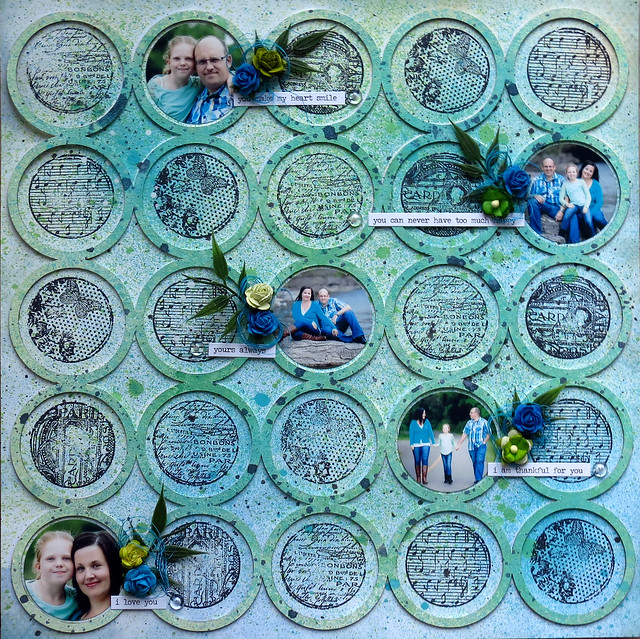
I have three layouts to share today. The first one is made using the Tranquility collection and features a photo of my son on one of our sailing trips:


I love wood-patterned papers! And I used three wood desings for the background of the layout. To mat my photo, I also used the Crackle Bits chippes heat-embossed with 14 Karat ep:


Then I embossed the fascination, serenity and stillness words with the Breeze ep and used them for the title of my page.


Another chipboard piece I used is the beautiful Seaside Charms piece. I used two embossing powders to add colour to it: Copper for the "charms" and Oatimeal for the rest.


Then I completed my design with Tranquility flowers, real seashells, pearl beads, cheesecloth and glitter :-)

Fascination, Serenity, Stillness:
Papers: Tranquility: Contentment, Calm, Jubilation, Calling Cards
Chipboard: Crackle Bits, Serenity, Calm, Hushed; Peaceful, Stillness, Contentment; Serendipity Words 2; Seaside Charms
Flowers: Tranquil Blooms
EP: 14 Karat, Breeze, Oatmeal, Copper
Glitter: Pyrite


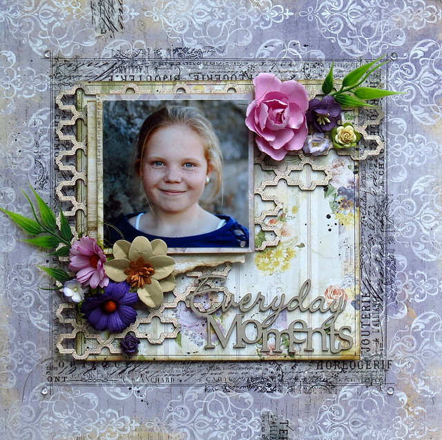
My next two layouts feature the beautiful Attic Charm collection, filled with soft pastel colours and vintage images. It's perfect for sweet gilry projects, like this page :-)


I layered two pink papers and arranged layered calling cards to mat my photo.


I added pieces of lace in between the layers for a more delicate, romantic look:


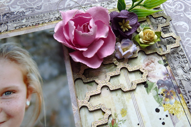
I used the beautiful Circle Flourish Large piece as a frame for my photo. I painted it with golden acrylic paint and added some flowers from various sets to match the chipboard ones:


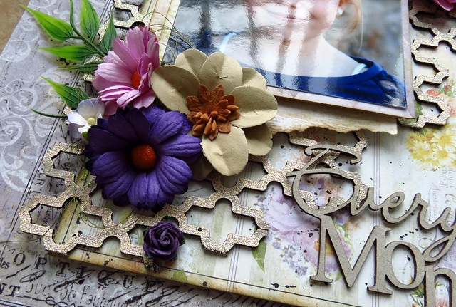
For the title I used the Blooming Beauty piece: I used an embossing pen to trace along separate words and embossed the Beauty with 14 Karat and the Blooming with a mix of Fuchsia and Petal.


I added more flowers down the page and a birdcage from the Veranda set to make a cluster with the printed mannequin image:


Blooming Beauty:
Papers: Attic Charm: Calling Cards, Attire
Chipboard: Blooming Beauty, Circle Flourish Large, Veranda Cage Set
Flowers: Attic Charm Daisies, Attic Charm Glitter Roses
EP: 14 Karat, Fuchsia, Petal


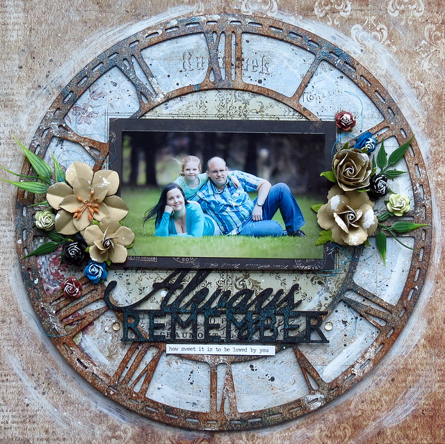
But the Attic Charm collection is not only for girly projects :-) I selected the ecru and soft blue papers for this boy page:


I first layered the Curio and Haberdashery sheets and added some stamping in the background with motives from the Beads&Chamrs, Forever and Deja Vu stamp sets:


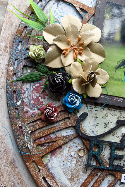
I used the middle clock from the Roman Clock Set Large, coloured it with mists, applied upon the Sachet paper, cut out and used it as the frame for my photo:


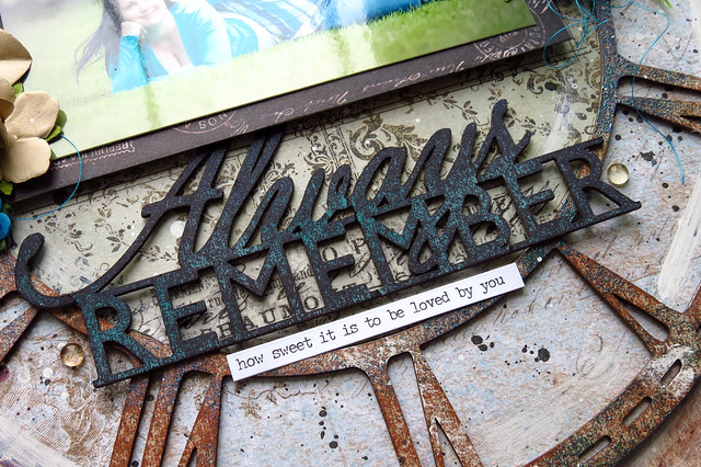
The title for the layout is the Loving You piece coloured with mists and glitter, added some clock hands from the clock set and completed my design with pieces from the Cogs and Gears set and  Tranquility and Courtship flowers:


Loving You:
Papers: Attic Charm: Curio, Haberdashery, Sachet
Chipboard: Loving You, Cogs and Gears, Roman Clock Set Large
Stamps: Beads&Charms, Forever, Deja Vu,
Flowers: Tranquil Roses and Lilies, Courtship Roses
EP: Ginger, 14 Karat, Ebony, Breeze

That is all for today, thank you for visiting and I hope you have been inspired :-)

Saturday, April 16, 2016

April Creations From Maja

Hello everyone, welcome to the Blue Fern Studios blog today!

I have a couple of projects to share, I hope you'd find them inspiring :-)
Let me start with a wedding card I created using the Serendipity collection.


I used some left-overs from my previous projects and created a layered background - I mounted the pieces on 3D dots as I love dimension:


I wrapped one of the pieces in white lace - it looks like a bride's veil ;-) and also adds lightness and elegance:


For the central element I used the gorgeous Frills Panel that I heat-embossed with Oatmeal ep and then added some pastel flowers selected from the Serendipity flower sets. I also added string bows and decorative studs to complete my design:


Wedding Card:
Papers: Serendipity: Anticipation, Contemplation, Inspiration
Chipboard: Frills Panel
EP: Oatmeal
Flowers: Courtship Roses, Courtship Blooms


Another card I made is a more universal card withe the sentiment stamp that says "Best wishes".


For this one I used the lilac papers from the Courtship Lane collection for my background. I layered them and distressed:


The chipboard piece I used for this card is the beautiful Township Collage. I sprayed it white to keep the silhouette look and used it as a guide to place the flowers and butterflies:


As the finishing touch I splashed some golden mist over the background and added some liquid pearls here and there:


Best Wishes:
Papers: Courtship Lane: Main Street, East Plaza; Frolic: Dans Le Jardin
Chipboard: Township Collage
Flowers: Courtship Roses


Time to take to some larger projects :-) Here's the layout I created for our April sketch challenge (have you participated yet? ;-)). I chose a marine theme for my page that features the photo of my boys on one of our sailing trips:


I like to follow sketches quite faithfully, not just use them as general inspiration. And so I tried to recreate the layers and elements included in the sketch, even the quotation tag is the same ;-) I added some stamping in the background:


The swirl in the sketch reminded me of sea waves, and so I used the Circle Groups piece, heat-embossed with Breeze and Oatmeal eps. I also embossed the title word, using Breeze and Ginger eps.


For my flower cluster I used some mulberry flowers as well as real seashells :-)


Anticipation:
Papers: Serendipity: Anticipation, Contemplation, Reminisce, Calling Cards
Chipboard: Circle Groups, Serendipity Words 1
Stamps: Journey, Essential Textures
EP: Breeze, Oatmeal, Ginger


And last but not least, a home decor piece I created based upon one of my favourite BFS panels, the Shabby Brick Panel:


I used my favourite colour combo of golden cream, light turgouise and gold colour palette, selecting some papers from the Blush collection:


Among many layers matting the photo I placed the beautiful Swan Gate chipboard that I embossed using the Ginger and Sea Mist eps.


...and the smallest piece from the Roman Clock Set Large. I embossed the outer frame with Ginger and the clockface with Oatmeal eps.


The title piece is the beautiful Family piece:


This projects could be put in frames, but can also be hung directly on the wall :-)


Family:
Papers: Blush: Charmed, Fondness, Key to My Heart
Chipboard: Shabby Brick Panel,Roman Clock Set Large, Swan Gate, Family
EP: Sea Mist, Ginger, Oatmeal
Stamps: Forever
Flowers: Courtship Blooms


That's all for today, thank you for visiting and see you later! :-)
Maja

Thursday, January 21, 2016

Three layouts by Marie-Josee

Hello, Blue Fern Studios fans!

I am really happy to be back on the Blue Fern Studios for the third year. It will be very exciting with all the new products and paper collections!


My name is Marie-Josee, I am 40 years old and I live in Gatineau, Quebec, Canada, with my husband and my daughter. I have been scrapbooking since 2006. I love to create layouts, but I also create cards, mixed media projects and altered art.

You can see my work on my blog, Les créations de mariemily, or on my Facebook page, also called Les créations de mariemily.

I will now show you the three projects I created with three differents paper collections.

"Everyday Moments" layout

For this layout, I used the Déjà Vu paper collection.

I also used a piece of the Turkish Panel chipboard.


I altered it with Blue Fern Studios embossing powder (color Petal). I applied the embossing ink directly on the chipboard, and I sprinkled the powder here and there without covering the chipboard completely.


I did not alter the Everyday Moments chipboard because the color fitted with the rest of the layout.


"Always Remember" layout

For this layout, I used the Sanctuary paper collection.

I also used a piece of the Roman Clock Set - Large, the biggest one, as the focal point of my layout.


Here's how I altered it.

First, I added brown ink to the chipboard with the pad, leaving some bare spots here and there. Then, I added embossing ink randomly, only in some spots, and I used Blue Fern embossing powder (color Fern) to add touches of color here and there on the chipboard.

Then, I added gesso here and there with a dry brush.


I altered the title with a black ink pad, also leaving some bare spots. Then, using teal spray ink, I added more color to the chipboard.


Circles layout

For this layout, I used a paper from the Ombré Dreams collection and the Jumbo Rings panel. I put the panel on my paper and used a pencil to draw the inside of the circles. Then, I set aside the paper.


I primed the chipboard with gesso, and while it was still wet, I sprayed green ink on it.

While it was drying, I stamped the inside of the circles with the Blue Fern Studios round stamps. Then, I glued my chipboard to the paper and added more spray ink.

Here are some details!


Thanks for looking, and have a great week!

Marie-Josee

Tuesday, January 12, 2016

It's January .. with Sandi Clarkson


Hello, Blue Fern Studios fans!
 My name is Sandi Clarkson and I am thrilled to begin my Second Term with the Blue Fern Design Team.  Having worked with the Blue Fern Studios owner, staff and many of my fellow team members, this tuly feels like home! It also doesn't hurt that I live in the same state where Blue Fern is manufactured to strengthen my sense of belonging! (Texas, USA)  Because of that proximity, I am sometimes the very first designer to get to see the new products! Talk about exciting!! 

I'm married with three grown, married daughters and a growing number of grandkids! By profession, I'm a very recently retired Audiologist (last week) and am excited to have more free time to get "lost" in creating! I enjoy trying new techniques but am usually happiest when the results still fit my "pretty" criteria. My scrap room is my happy place. I kind of love that my desks have paint, gesso and runaway micro beads all over them. I'm mostly a layout girl but love, love, love doing the occasional canvas. 

Please visit my blog at Soft Side of Sandi to see more of my work. 

So, onward with January's projects ...

"XOXO" (based on the January sketch and flipped)

This month I actually did 2 masculine layouts! Or maybe it is safer to say that I've used masculine photos and then did my own thing! For this first one, I've pulled out some older papers from the Sanctuary collection along with some older chipboard pieces. But I've paired them with some of the new embossing powders that I was dying to try .. Oatmeal and Sage. 

The background for this one was created with a stencil, super heavy gesso, tissue tape and a couple of mists, Persimmon and Jingle Bells. The Persimmon helped pull out some of the peachy, red tones from the paper itself. 


Beneath my photo layers is the Paisley and Vine Medley split in half which I've first gessoed and then embossed with the Oatmeal Embossing Powder. The XOXO title was treated the same but double embossed. I've included the Notebook Edges pieces of chipboard which lend themselves nicely to "guy" projects. For them, I've used the new Sage Embossing Powder and then splashed them with white paint. 


My lower cluster includes a Notebook piece as well as more of the Chelsea Vines which were used around the photo as well. Some variegation was created with my gelatos. 


Most of the Blue Fern paper collections come with a Calling Cards sheet which is ideal for photo layers and titles/subtitles. And I generally add some corrugated cardboard for increased dimension. 


I finished my page with flowers and specks of splattered paint, first white, then black. 


Blue Fern Products used:
Paper:
Santaury Birdsong Melody
Sanctuary Garden Plaza
Sanctuary Calling Cards

Chipboard:
Paisley and Vine Medley
Notebook Edges
XOXO
Chelsea Vines

Mist:
Persimmon
Jingle Bells

Embossing Powder:
Sage
Oatmeal

***

"Delightful"

I've been dying to scrap this sweet father/son photo and challenged myself to get it done this month. 
Since they look a little "chilly" I wanted to give the page a frosty feel, so I've pulled out the Autumn Anthology Cottage piece. 

I'm not usually one to mix my "blues" but I just went for it here and am very pleased with the results. I've used the Sky Imagine Ink on the background and paper and on the Floral Lattice Bits. 

For the Roman Clock set, I opted to use the new Heavenly Embossing Powder. Wow, this one really glistens! If you like sparkle, this is the one for you! It's amazing! 


My word title is from the Optimist Set and is simply lightly inked with some brown ink. 


Aren't the Clock Hands intricate and beautiful? 
And the Heavenly Embossing Powder, wow! 


The Floral Lattice anchors the opposite side of the page. You can also see a good view of the Texture 1 stamp being used on my background layer.

Blue Fern Studios Products used:
Paper:
Autumn Anthology Cottage
Autumn Anthology Calling Cards

Chipboard:

Roman Clock Set large
Floral Lattice bits
The Optimist Word Set

Mist:

Sky

Embossing Powder:

Heavenly

Stamp:

Texture 1

***


And now a girly page! 


 "True Love"

Lastly, I'm digging my hands into my new Blush collection stash! These papers are so my colors! I love me some teal with peachy-pink and a touch of yellow. They feel so warm to me. 

Lots of background interest was created on the Enamored paper, side B with Mists and stamps as listed below. And of course, some stenciling. For paper layering, I've torn some of the Enamored, side A as well as the Fondness papers and then the Valentine Cards to tuck here and there. 


I still had a few bits of the Floral Lattice Bits on my desk and decided to just paint them white and let them be a nice contrast to the other colors. I made some circles on my paper, being sure to capture those sweet red hearts near the top! Aren't they cute? 

You can also see part of the Chelsea Medallion that I've used as a photo layer. I misted it with Winter Fern and then heat embossed with Fern Embossing Powder. 


It seems fitting to start working some hearts into my creations, so I've used a couple of pieces from the Valentine Hearts chipboard set. Both were gessoed, then misted with Persimmon and finally heat embossed with the new Garnet color. The top piece with the keyhole is so fun! For that one I mixed in some 14 Karat EP with a double embossing technique. 


Just a closer look at this sweet hearts! And the wings. 


On the right, I've made a Valentine Cards cluster and layered in some flowers and resin. One little fussy cut butterfly is in the mix. He's from the Frolic collection. The Weathered Doilies stamping come into view in this close-up, as well as the Photography stamp. 


A fun dimensional shot! 

Blue Fern Studios Products used:
Paper:
Blush Enamored
Blush Fondness
Blush Valentine Cards

Chipboard:
Chelsea Medallion
Floral Lattice bits
Valentine Hearts

Mist:
Persimmon
Winter Mint

Embossing Powder:
Garnet
14 Karat
Fern

Stamps:
Texture 1
Photography
Weathered Doilies

Thanks for hanging in there with me for this rather long post this month! 
Please be sure to check out the sketch challenge HERE
See you next time! 
Sandi