Showing posts with label fancy signage. Show all posts

Wednesday, November 16, 2016

Maja's November Layouts

A very good morning to you, Blue Fern Studios friends, welcome to the blog today!

The year is coming to an end, and we think of Christmas more and more, getting ready for the holiday, but before I totally get involved into Christmas projects, let me first share some other things ;-)

This first layout is the one you might have already seen if you visited our November challenge post:


I used the Memoirs collection, and chose a burgundy-golden-brown palette for my layout. I added some stamping on the background paper, matted the photo with postcard images cut out from the Photographic Record sheet. Then I added the largest Roman clock piece embossed with Antique Gold and Black Sand eps:


As the November challenge is all about title pieces, I used the longest title I had to make it really stand out :-) I embossed it with Ruby ep and then accented the word "story" with red glitter:


Finally, I added a couple of flowers and embellies and clock hands embossed with Mushroom:


Each Day Is A Story Worth Telling:
Papers: Memoirs: Autumn Biography, Photographic Record
Chipboard: Roman Clock Set Large, Each Day
Flowers: Attic Charm Glitter Roses, Attic Charm Daisies, Courtship Blooms
Stamps: Journey, Postal Textures
EP: Antique Gold, Black Sand, Mushroom, Ruby


My second layout also features the Memoirs collection, but this time I decided to use a light, subtle colours - yes, I think they fits boy pages too :-)


There are a few bolder black accents, like stamping on the background page and a metal tab under the photo:


Otherwise I kept the delicate tones with the title chipboard embossed with Oatmeal ep and pieces of the Marrakesh Panel that I split into several parts and embossed with the Lilac powder:


Million Dollar Smile:
Papers: Memoirs: Photographic Record, Nature's Novel, Tale of Treasures
Chipboard: Million Dollar Smile, Marrakesh Panel
Flowers: Harvest Lilies, Late Winter Lilies, Courtship Bloom
Stamps: Deja Vu, Photography
EP: Lilac, Oatmeal

Those were my Memoirs layouts, but since I just got my DT box filled with the gorgeous Vintage Christmas 2 papers, I couldn't resist making one more page using our latest release :-) And here it is:


I began by cutting the decorative edge of the Twas the Night sheet and layering it upon the Let It Snow paper.


Then I added some stamping and made the title: I cut the word "Christmas" off the Twas the Night chipboard title and placed it on the Fancy Signage piece. I embossed the latter with Oatmeal and Snow powders and for the title word I mixed the Ruby ep with some red glitter for extra sparkle :-)


I also experimented with the Large Flake piece - I mixed Snow, Sea Mist and Icicle powders to create my cutsom mint tinsel :-) I added Spiritually Speaking words, just like the title embossed with Ruby ep and red glitter:


A little flower cluster including Christmas Blooms and Spring Lilies as well an the ornate Candle Stick piece complete my layout:


Christmas:
Papers: Vintage Christmas 2: Let It Snow, Twas the Night, Holiday Treats, Holiday Cards
Chipboard: 'Twas the Night, Large Flake, Candle Stick, Spiritually Speaking, Fancy Signage
Flowers: Christmas Blooms, Spring Lilies
Stamps: Forever, Ornaments
EP: Oatmeal, 14 Karat, Snow, Ruby+ Red Glitter, Icicle+Snow+Sea Mist


And that is all for today, thank you for visiting and see you later! 
Maja Nowak

Friday, February 13, 2015

Two layouts with the Love Story collection by Marie-Josée

Hello all!

I am happy to be back today to share two layouts made with the latest Blue Fern Studios paper collection, Love Story, as well as my sketch layout. Here they are!

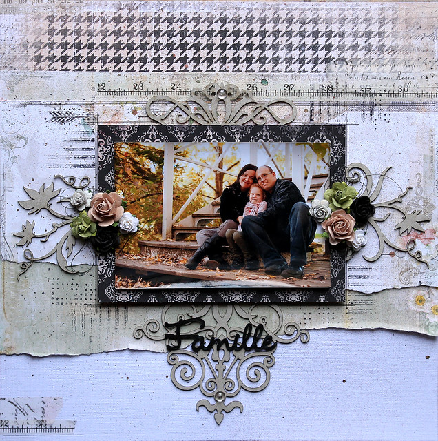
"Famille" layout

For this layout, I used white cardstock as a base. Then, I tore the Grand Ball paper from the Love Story collection in two and used each side on my layout. I also added a piece of the Concerto paper at the top.

Here's a little trick: on this layout, I used two different chipboard that I cut in half.

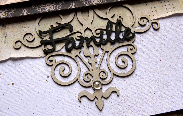
Here's the Britannia Flourish (above and under my picture):


The title, Famille, is from the French Words set: 


And here is the Wild Flourish Bundle (on the left and right sides of my picture):


"Love Story" layout

Here's my second layout with the Love Story collection. I used the Twenty One paper for my background. As you can see, I used the "Love Story" words from the strip of paper we always cut and toss to create my title.


To frame my picture, I used a piece of the Lace Rounds set. Under it is the Symphony border. Both were altered with black spray ink


I cut a small piece of the Symphony border to put on the left side of my layout.


Sketch layout

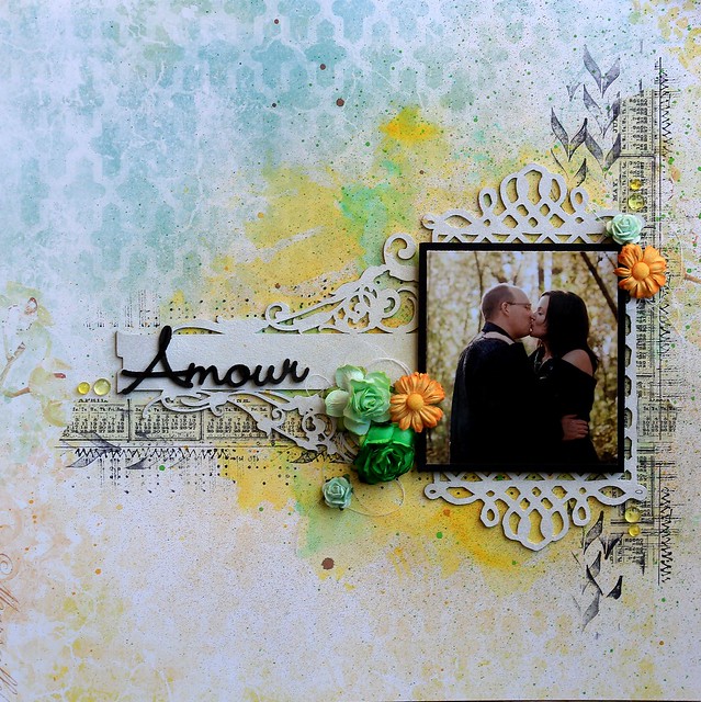
And finally, here's the layout I created for the sketch challenge back at the beginning of February.

I used a paper from the Ombre Dreams collection to create my background, the Ginger's Dream paper.
 

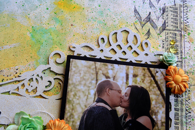
Then, under my picture, I added the Boston Lattice chipboard. I altered it with gesso.


Then, on the left, I used the Fancy Signage chipboard, also altered with gesso, and on top, the word Amour from the French Words set.


Sunday, January 18, 2015

My first 2015 Creations- By Keren Tamir


Hi everyone, Keren here excited to share my Blue Fern Studios creations for a second year and I can't wait to share them with you!!

Here is a little bit more about myself and then two of my creations for this month!!


My name is Keren Tamir and I live in Canada. I am a wife to a wonderful husband who is very supportive of my scrapbooking and a mother of two amazing kids; a 13 year old boy and a 8 year old girl. I’ve been scrapbooking for 11 years and I mainly scrapbook about my family.
I love to create and experiment with many different mediums and techniques. I also love using lots of flowers and vines in my projects. My style is always evolving and that’s one of the things I love about this art.
One of the main reasons I started scrapbooking was to preserve memories and photos for my children. However over the couple of years, I’ve started to enjoy another aspect of scrapbooking. I love the artistic outlet that it gives me. I love to create and I’m passionate about what I do.
I’m delighted to join Blue Fern Studios Design team for a second year. To see more of my art please visit my blog at: http://kerentamir.blogspot.ca
I hope you enjoy my creations!!

<<<<<>>>>>

"You rock my world"


Here is the first one of my layouts for this month. I used one of the Sanctuary collection paper as a background and to frame the photo.


I used the notebook edges to frame the the layout. I simply primed it in gesso and then stamped it randomly.


I used one of the Grunge Talk chipboard pieces as a title as it gave a double standard as both a title and the theme of the photo.


<<<<<<<<<<<>>>>>>>>>>>>>

"Cherish"


This second layout was also designed with the new Sanctuary collection.


The photo was framed in one of the Memory Frames. The frame was painted in brown and then I randomly glued bronzed coloured micro-beads. The same was done to the Fancy signage chipboard piece.


Finally I added the "Cherish" title from the "Adore, Love, Cherish" set.


Thank you so much for visiting the Blue Fern Studios blog.

Have a wonderful day!!

Keren

Wednesday, January 7, 2015

January Projects by Ulrika Blomfelt

Hello!

I´m so happy to share my first work as a Blue Fern Studios designer with you all!


My name is Ulrika Blomfelt aka LillBlomman and I´m a swedish girl who loves all about scrapbooking! I started scrapbooking in April 2006. I live in a cute yellow house next to the woods and still close to our capital Stockholm. Here I live with my very loved hubbie our for a long time longed for son Viggo and a very cute but a bit crazy dog. I became a mother late in life and after that my scrapbooking ment even more for me! You will see lot of Viggo in my work because he´s the one I scrap most about. 

I love to create in all scrapbooking gengres! It´s too fun to just choose one of them. I love to pick out just the right color combination for a project and then continue my work. My style is a romantic mixed-media style but it can change from one project to another. I love to try new techniques and try to develop in my art all the time. I´m so proud to been asked to design for this company and thrilled to work with all amazing supplies. I´m looking forward to design with all the amazing and talented girls and spread the joy of crafting during 2015!
You are also very welcome to my personal blog at: www.lillblommanskapar.blogspot.com

I love making cards so I have two cards and two layouts to show you today.
For my card I used Sanctuary Bountiful and Sanctuary Calling Cards.

I painted the Natural Sprigs first in one shade of green and then I added a thin coat paint with glitter in it.

I used a lovely quote from Sanctuary Calling Cards paper inside of the Roman Clock set.

My next card looks totally different from the first but I actually used the same papers.

To create my sign I used the Damask Panel. First I painted it with Gesso. Then I added a rub-on sentiment. I also gave it a coat with Crackle Paint and light blue fluid chalk.

I painted Mini Flourishes with black acrylic paint and then I added a coat of Glossy accent.

For my layout about my boy and all his Christmas presents I used Sanctuary Botanical Garden and Meadows of Time.


For my Graduated Squares I wanted lots of texture. After Modeling Paste and Acrylic Paint I added some glass glitter.

This is my take on January sketch. I love to add gold to my work and here I mixed the gold with black and lilac.

As background I used Sanctuary Birdsong Melody. First I gave all my Chipboard pieces a coat of Gesso. On my Fancy Signage I used Gold Acrylic Paint and then I sprinkled over with Gold Rush Glass Glitter. On my Happy word Chipboard besides black Acrylic Paint I added Charcoal Art Sugar.

On my beautiful Butterflies I wanted lots of Gold flakes!

Hugs from Ulrika!

Sunday, December 7, 2014

A layout and a card from Camilla

Hi all!

I have worked with the new Sanctuary collection and have made a layout and a card. The layout looks like this:


The chipboards (Smile and Circle Vine) are covered with white crackle texture paste and then I sprinkled some gold glitter onto them.


The card is this one. I have only covered the chipboard piece (Fancy Signage) with white gesso and then used some brown ink.


Thanks for looking!

Camilla