Monday, May 23, 2016

Tranquility inspiration by Pascale

Hello Sweeties

Today, I'm up on Blue Fern Studios blog with some new inspiration. In this first layout, I worked with a photo taken during a recent trip in  Ireland of the Kilmore Abbey (co. Galway, Ireland). 


I started to apply a thin layer of clear gesso to protect the paper, then I added a design with a stencil and 3D Gloss Gel. When dry, I added some colors to the background.


While the background was drying, I covered the Quatrefoil Panel with clear crackle paste and put it aside to dry too. Later I painted it grey..


I painted the Serenity chipboard with two shades of blue Twinkling H2Os, then I covered it with white gesso and finally I embossed it with the Pearl Imagine Ink embossing powder. The blue color show through the white layers.


I painted the Seaweed chipboards in green and added different colors of Imagine Ink embossing powder to add some texture. 


After I've glued all the embellishments, I finished the layout with eggplant glitters.

Blue Fern Studios products:
Papers - Tranquility (Peaceful, Calling Cards)
Chipboards - Quatrefoil Panel, Seaweeds and  Serenity, Calm, Hush
Flowers - Tranquil Roses and Lilies
Imagine Ink - Embosssing Powders (Mushroom, Sage, Ginger, Pearl)
Imagine Ink - Glitter (Eggplant)

----------------------------------------

For this second layout I chose another photo taken in Ireland of a lonely tree.


I'm sure that you certainly noticed that all the Blue Fern STudios's papers have an nice strip at the bottom of each page as can be seen below. Well, I kept all these small strips and I used them to create a texture base. 


I glued all the paper strips soft matte gel and covered them with a thin layer of black gesso. When dry, I splattered some white gesso that I've watered down.


While the background was drying, I covered the Mesh Bits with the Rust Paste.


I colored the leaves with a green Twinkling H2O and added randomly some Chili Powder and Verdant embossing powders. 


I covered the Blooming Flourishes and the title with white crackle paste and let dry naturally. Then I colored them with a Primary Element and amber Izink.


I added more splatter to the background with the Rust Paste and glue all the emellishments.

Blue Fern Studios products:

Papers : Tranquility (Serenity, Calling Cards)
Chipbords (Mesh Bits, Blooming Flourish and Serenity, Calm, Hushed)
Flowers (Tranquil Blooms)
Imagine Ink - Embossing Powders (Chili Powder, Verdant)
----------------------------------------

This third layout is based on May sketch. I took these photo of the town's belfry during a short visit of Avignon (France).


I started to stamp the background with the postmark collage of the "Journey" set, then I covered the paper with a thin layer of clear gesso.


When the background was drying, I die-cut some branches in a kraft paper that I stamped with the writing circle of the "Textures circles" set and embossed with the Ginger powder.


I colored the die-cut leaves and the "Seaweed" chipboard with green Distress inks and I embossed with several colors (Sage, Verdant, Nutmag and Muschroom).


I primed the "Swan Gate" with clear gesso before covering it with a clear crackle paste. When dry I painted it with a gray Primary Element.


When all the embellishments were in place, I added some colors with differents colors of Twinkling H2O. To finish, I added a design with the "Making Plans" stamp that embossed with the "Mushroom" powder.


Blue Fern Studios products:

Papers - Tranquility (Stillness), Serendipity (Calling Cards), Love Story (The Grand Ball)
Chipboards - Seaweeds, Swan Gate
Flowers - Courtship Blooms
Stamps - Textures Circles, Journay, Making Plan
Imagine Ink - Embossing Powders (Ginger, Nutmeg, Verdant, Sage, Mushroom).


Sunday, May 22, 2016

Attic Charm Layout and Video Tutorial by Marilyn Rivera

Hello everyone! Today I would like to show you a page and video tutorial with the new beautiful Attic Charm collection. I also share a second project using the Tranquility collection.
Let's take a look...
  I had so much fun working with the new beautiful  Attic Charm collection. I selected the pretty "Mercantile" paper and the Attic Charm flower to create this page.  I added embossing powder in Pearl color to the Remember Moments chipboard and to the Lattice chipboard, too.
.  


The title is the Remember Moments chipboard.

These butterflies in the background were stamped with The Bourbon Street stamp.

Blue Fern Supplies:
Attic Charm collection-Mercantile, Calling Card papers
chipboard- Remember Moments, Lattice
Embossing Powder- Pearl, Petal
Flower- Attic Charm flower


Enjoy the Video Tutorial!


"SERENITY"
My second project is inspired in the May sketch and I worked with the Tranquility collection.
This beautiful paper is called "Hushed".   I apply distress ink to all 
The Looped Frames chipboard and the Serenity word.  The Tranquil Roses and Lilies flowers give the perfect touch to my page. Let's take a look at a the details...


Blue Fern Products:

Tranquility collection- Hushed, Calling Cards papers
chipboard- Looped Frames, Serenity/Calm/Hushed chipboards
flower- Tranquil Roses and Lilies


Thanks for stopping by...until next time!
Marilyn Rivera


Saturday, May 21, 2016

Two layouts and a mixed media project by Marie-Josée

Hello, Blue Fern Studios fans!

Today, I am featuring two layouts with the latest Blue Fern Studios collection, Tranquility, as well as a mixed media project created with various Blue Fern Studios pieces of chipboard.

First, let's have a look at the Tranquility layouts...

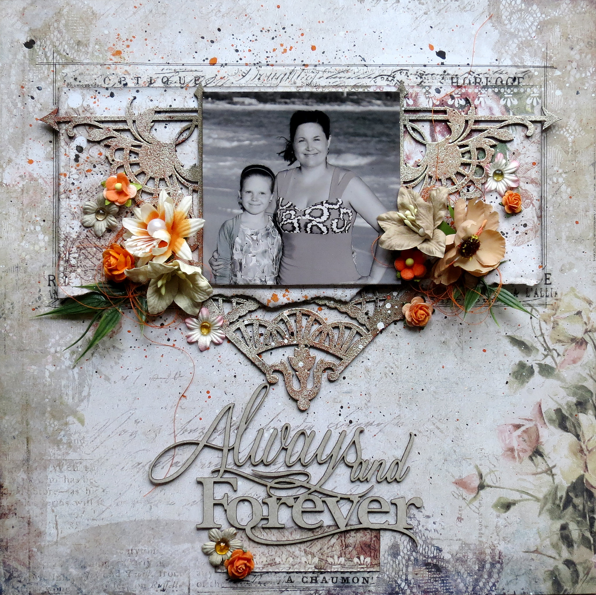
"Always and Forever" layout

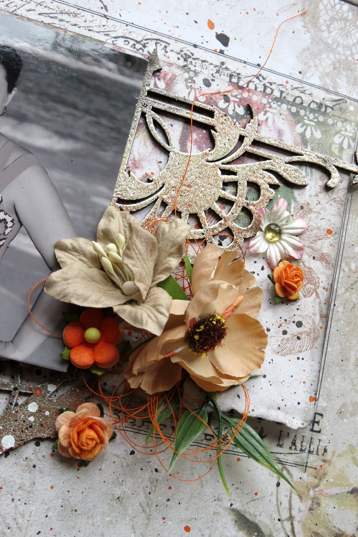
For this layout, I used various chipboards, the Charleston Corners and the Victorian Corner. I altered both with Blue Fern Studios embossing powders. I layered three colors. I started with Mushroom, then I used Chili Powder, and I finished with Oatmeal.

I used the Always and Forever chipboard for the title, which I left bare.

I also used many flowers for the Tranquil Blooms set and the Tranquil Roses and Lilies set. I combined them with smaller flowers that I had in my stash.


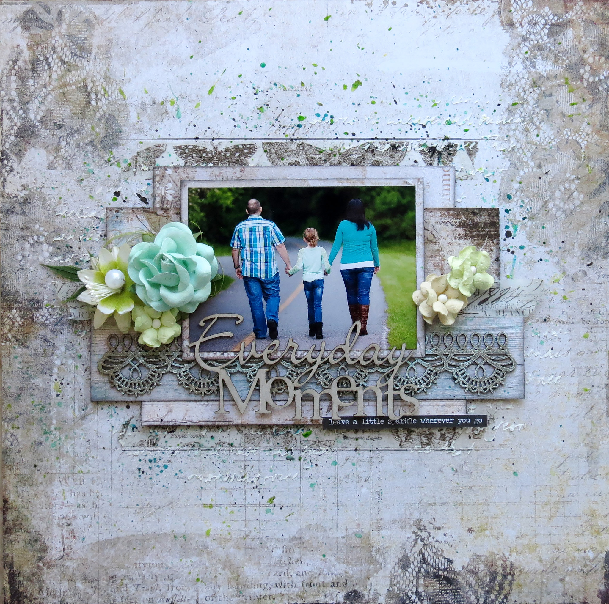
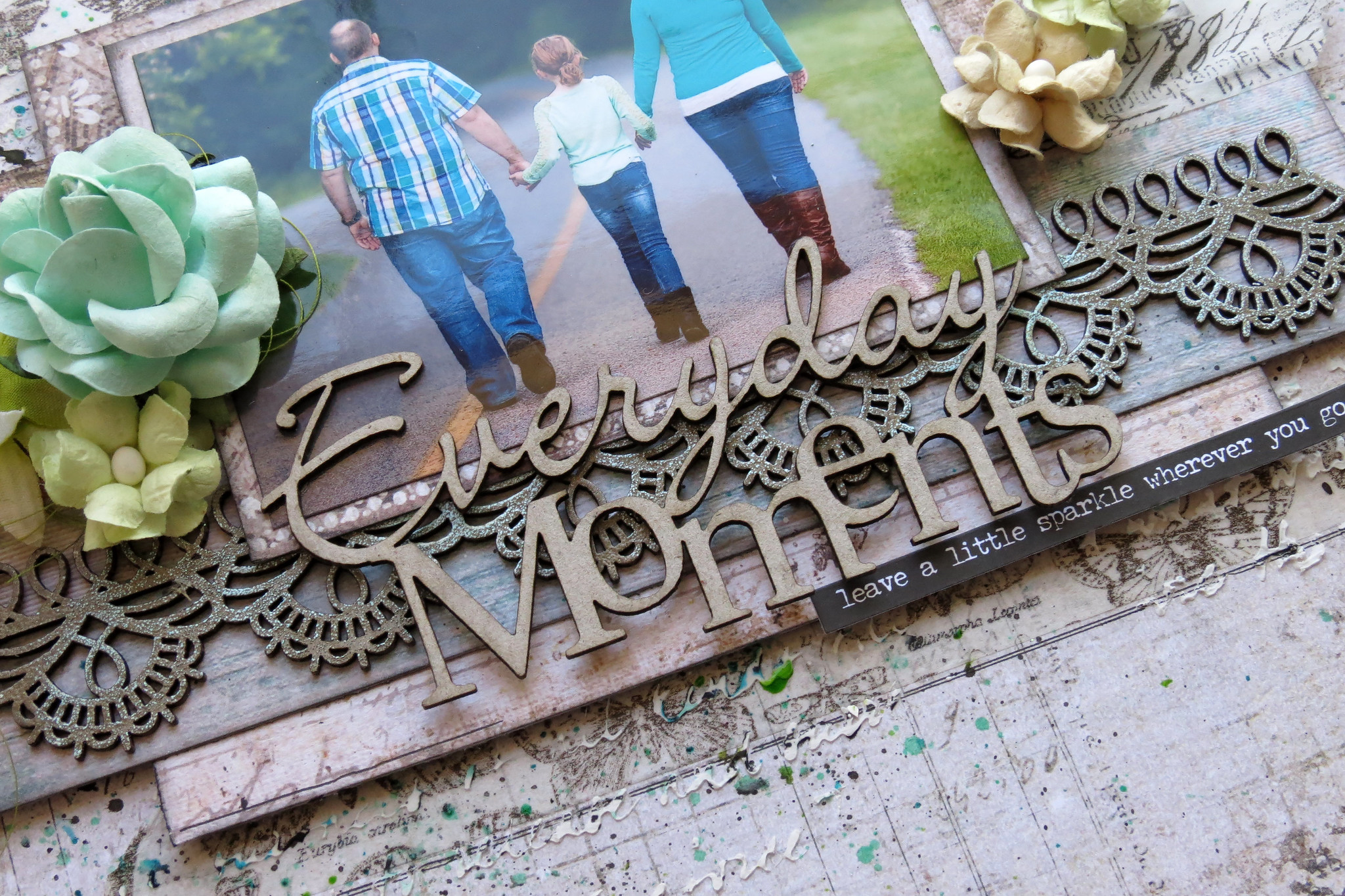
"Everyday Moment" layout

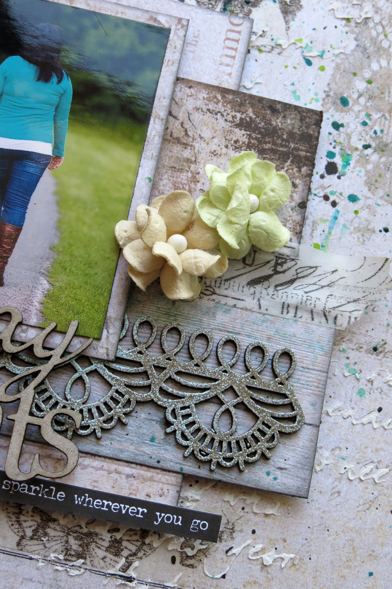
For this layout, I used the Scalloped Border chipboard, which I altered with two different colors of Blue Fern Studios embossing powder, namely Mushroom and Sea Mist.

I used the Everyday Moments chipboard for the title, which I left bare.

I also used flowers for the Tranquil Blooms set, the Tranquil Roses and Lilies set, and the Courtship Blooms set.


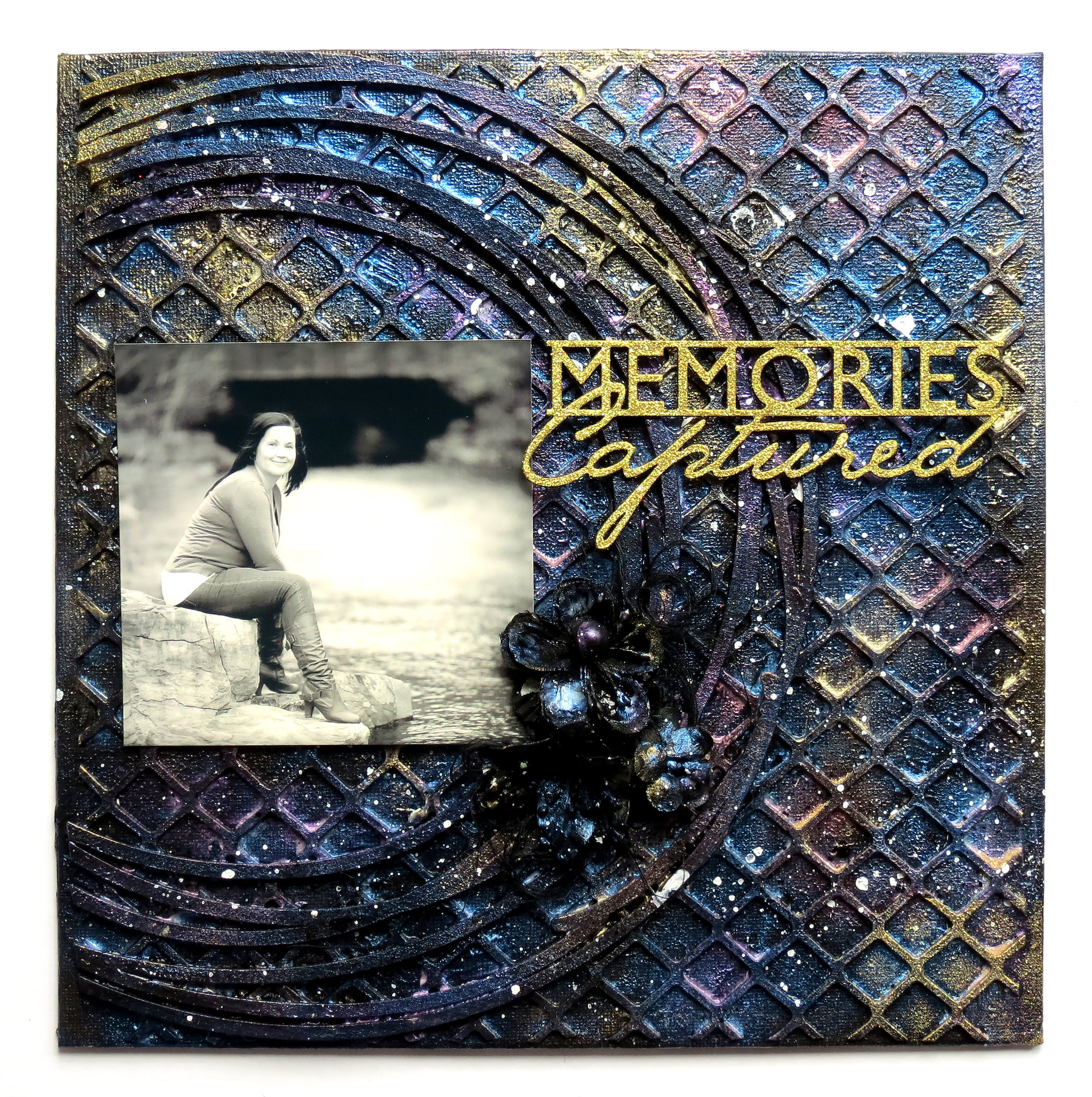
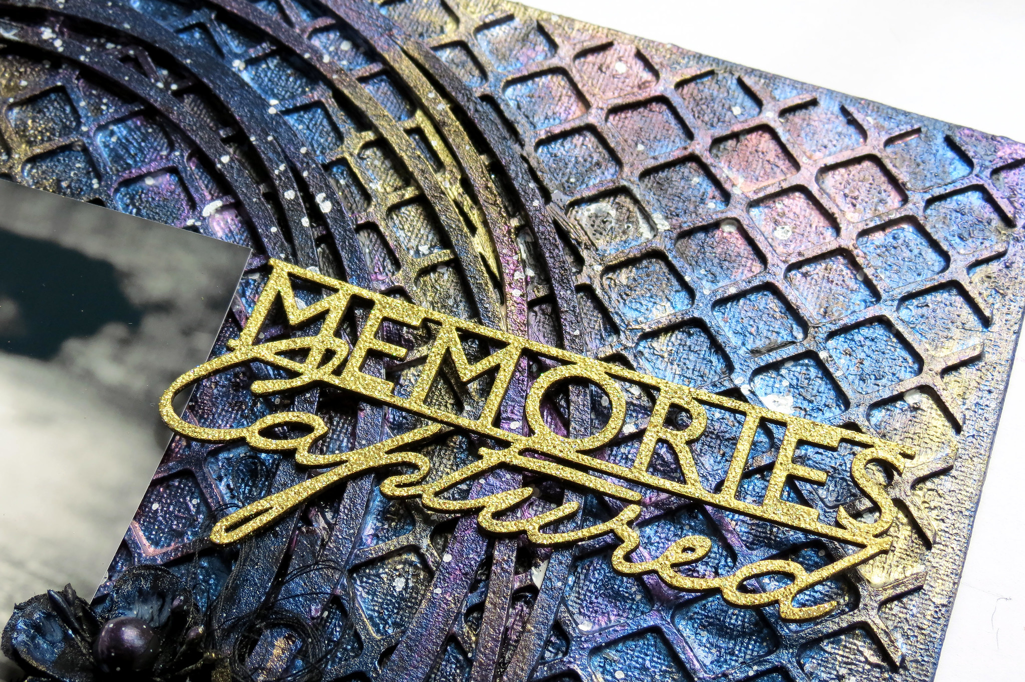
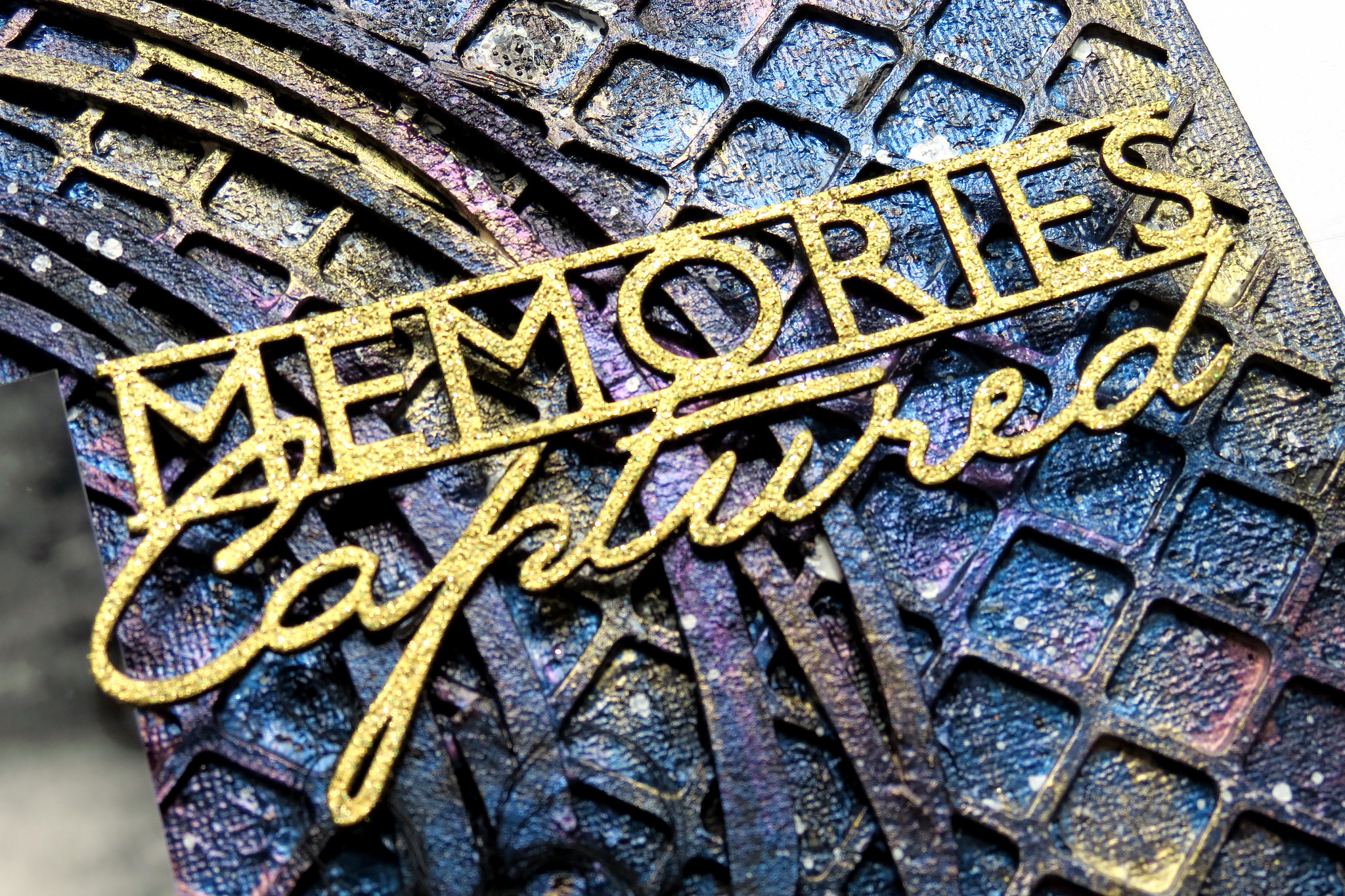
"Memories Captured" mixed media project

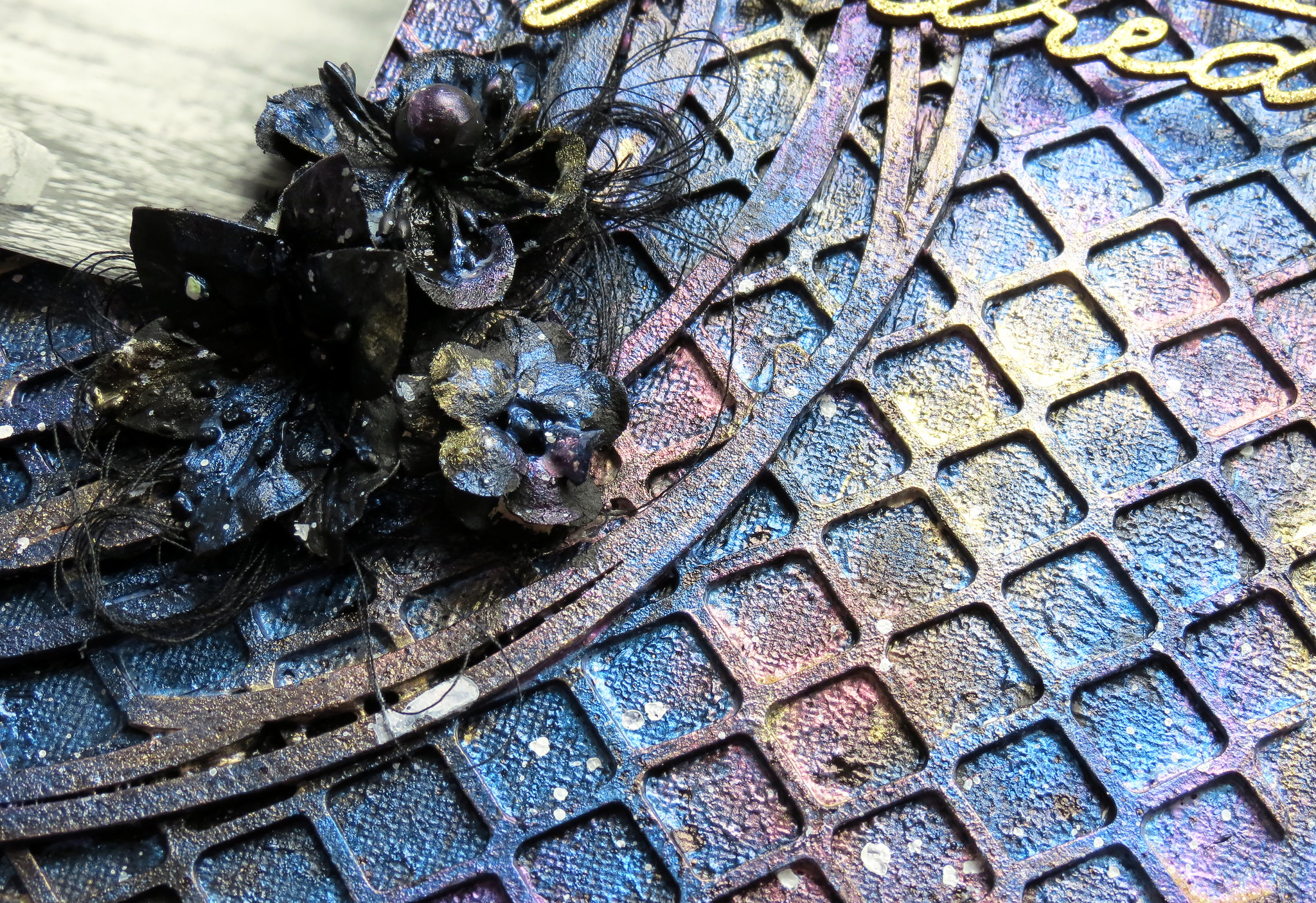
My last project is a mixed media project on a 10" x 10" canvas. I glued a piece of the Chickenwire Panel to my background, and then, I added pieces of two circles from the Graduated Circles set pn top. I primed the whole thing with black gesso.

Then, I mixed some iridescent pigments with a glaze and applied different colors all over my background : blue, violet, red, and gold.

I did the same thing with three Blue Fern Studios flowers and I glued them to the background.

I used the Memories Captured title from the Captured Words set and altered it with Blue Fern Studios embossing powder. The color I used is 14Karat.


Friday, May 20, 2016

The Light & Dark of it

Hi Blue Fern fans!  Today we thought we would share with you some layouts from various members of our Creative Team.  Some of the layouts will be light and some will be dark.  Like most of you, we like to mix it up, and Blue Fern paper will allow you to do that with our diverse paper collections.

First up, let's take a look at some layouts that are soft and mellow.

Marie Eve Bernard used this paper from the Serendipity collection with muted colors that seem to have been made just for this adorable baby photo.  She created just the amount of color she wanted with texture and embellishments.


Sandi Clarkson has chosen to use the somewhat brighter Blush collection for this soft, romantic wedding layout, with stunning pops of color.


This light pink paper from the Serendipity collection is what Cathi O'Neill chose for her layout with this unique photo.  The color palette of the background allows this bold photo to be the star of the show!


But sometimes we are all in the mood for something a little darker - a little more dramatic.  See how the next three members of our Creative Team used darker paper for their layouts.

Speaking of drama, Marie Josee Hamel's layout using paper from the Timeless collection is quite dramatic with the stark white against the beautiful background. 


The photo on Pascale Bernard's layout stands out beautifully, thanks to the various shades of gold she has added to this stunning layout.  This paper is from the Sanctuary collection


Nicole Doiron began with this dark background paper from the Serendipity collection and brought it to life by adding soft colors with  the flowers, chipboard, and other embellishments.  It really adds to the sweetness of this darling photo.


We thought we would finish it up with this art journal page created by Wilma Voermans who chose to use both dark and light, resulting in gorgeous contrast.  The chipboard piece from the "2 Hearts Set", which she has painted black, is the focal point of her page.


That's it for today.  We hope you enjoyed seeing the many ways Blue Fern products can be used, whether you're in a light and airy mood, or a more dark and dramatic mood.

Enjoy your weekend!

Thursday, May 19, 2016

May Inspiration by Karolina

Hi everyone! It's Karolina here and I would like to show you my three projects I made for May's inspiration. Two of them are layouts with our newest collection Tranquility and a third one is a canvas. Ok, let's start!

Dare to Dream

Like I said, I prepared a canvas using a lot of beautiful chipboard. First I covered a canvas with a old book, an then I built my composition. I used three different ways of coloring chipboards - with chalk paints (ornate heart), with ink and glossy accents (Dare to dream) and with ebony embossing powder (Mini Flourishes).


I also added some flowers from Tranquil Roses and Lilies set. They match perfectly!


Blue Fern Studios Products Used:

Chipboard: Ornate Heart, Dare to dream, Mini Flourishes
Embossing Powders: Ebony
Stamps: Forever, Brocade Texture
Flowers: Tranquil Roses and Lilies


Boys will be boys:

My second project is a layout. I used new Blue Fern Studios Tranquility collection. Always when I get new papers I try to use them in a different way than it may seem. That's why I decided to make this messy, boyish layout using a vintage but I think also romantic collection.


Blue Fern Studios Products Used:

Papers: Tranquility collection - Calm, Jubilation, Patience, Peaceful

Chipboard: Boys will be boys, Mini ring panel, Spare Parts, Directions

Embossing Powders: Ebony

Stamps: Makind plans, Widgets, Forever
Spring fever

And the last but not least my third project is also a layout, but this time it is a very colorful and spring proposal. I also used Tranquility collection to show you the versatility of this collection.


Blue Fern Studios Products Used:

Papers: Tranquility collection - Calm, Jubilation, Patience, Peaceful

Chipboard: Spring Iris - Small, Spring Fever, Quilted page panel, Beaded strings

Embossing Powders: Ebony, Cotton Candy

Stamps:  Forever, Arcadia Texture