Thursday, June 16, 2016

A Mini Album And A Layout by Maja

Hello everyone, welcome to the Blue Fern Studios blog!

Today I'd like to share some projects I made using our two latest collections, Tranquility and Attic Charm. I warn you, it's a lengthy post, so grab your favourite beverage and sit comfortably :-)
Let's begin with a mini album I made. It's been based upon the Tranquility collection, though has little to do with tranquility as such ;-) The very title says it all:


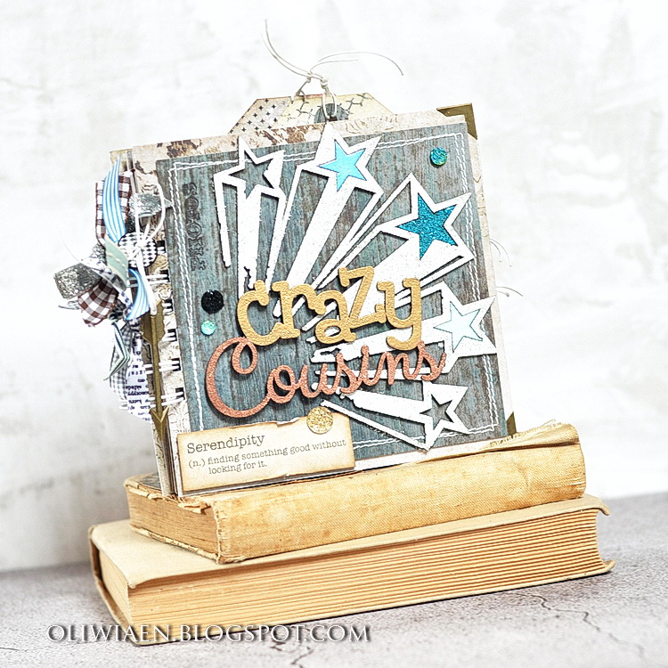
All the pages are made the same way: half of a sheet folded in two for greater sturdiness. For the pages I used the Serenity and Stillness sheets. The covers (made from the Blissful paper) are further strengthened with pieces of the Calm paper machine-sewed around.
I made the title of the mini by combining the Shooting Stars piece with the Crazy Cousins piece. I embossed the former with Icicle, Breeze, Cerulean and Azure eps (I removed two stars and left the three to symbolise the three boys :) ), and the latter with Ginger and Copper eps. I added the stamped word "Photos" and the definition of serendipity from the Serendipity Calling Cards sheet:


Each page features a photo/photos, some stamps and chipboard pieces.
The inner cover is decorated with one of the Captured Words embossed with Oatmeal (as are the bricks), a stamped vintage camera and a Serendipity Calling Cards tag for some jounraling. The first page is stamped with a Forever chain motif and decorated with the word Fun: I embossed the outline with Ebony ep and the inside letters with Breeze first, then re-heated it a little for the powder to become sticky again and sprinkled some Azure glittery bits. That resulted in a nice vintage look:


I stamped the next page with the banner motif from teh Flight & Flair stamp set and added the Arrow Word Friends embossed with Breeze and Mushroom eps and a Cogs&Gears piece embossed with Copper ep - love that glittery shine :-) Then I added an extra page with an Attic Charm tag and a metal key charm:


The other side of the extra page is for journaling: I stamped its edge with a partially inked Making Plans stamp and added an Arrow Word embossed with 14 Karat ep (did I mention I love that glittery shine? ;-)) The next page refers to the quotation from the front side of the extra page - I added the Laugh Loud piece. I embossed the "Laugh" with 14 Karat ep and the "loud" with Oatmeal. The stamps in the background come from the Essential Textures and Photography sets.


The next two pages include stamps from Halftone and Postal Textures sets. On the left page I used the Heads Up! piece from the Optimist Word Set and embossed it with In The Navy, Ginger and Celestial eps for a varied look. I also added a Directions arrow embossed with 14 Karat. The Grunge Word on the next page is embossed with Mushroom ep. If you heat it a little more after it melts, the light particles come up and you get a really nice weathered look.


As the album is small, it needs some space for the journaling. These two pages are also pockets that contain tags I cut out from the Contentment sheet and decorated with quotations from the Serendipity Calling Cards paper:


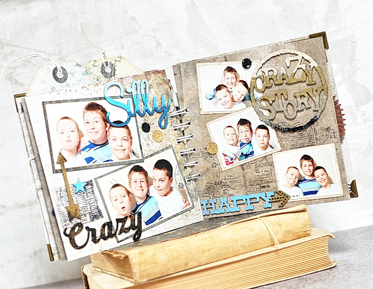
Now the mini's getting really crazy ;-) I stamped the bacgrounds with Journey and Postal Textures stamps and added some chippies. I embossed the Crazy word with Ebony and then sprinkled it with 14 Karat, and the arrow above it - just the opposite :-) The Silly word and Crazy Story from Grunge Talk are embossed to get an ombre effect - that quite easy, I just covered parts of the pieces with washi tape, ink with an embossing ink, embossed with powder and then repeated with darker shades. I used Breeze, Cerulean and In The Navy for Silly and Oatmeal, 14 Karat, Mushroom and Ebony for the circle. I also added the Happy word embossed with Cerulean and 14 Karat:


The last pages feature the Deja Vu, widgets and Journey stamps, Chunky Words embossed with ginger ep and another Grungy Talk piece covered with Copper ep. The tag for journaling is decorated with an Attic Charm Calling Cards quotation.


Crazy Cousins:
Papers: Tranquility: Peaceful, Blissful, Contentment, Stillness, Calm, Patience, Serenity; Serendipity: Calling Cards; Attic Charm: Calling Cards
Chipboard: Grunge Shooting Stars, Grunge Talk, Crazy Cousins, Crazy, Silly, Fun!, Blue Fern Bits/Shabby Brick Panel, Arrow Words, Laugh Loud, Captured Words, Chunky Words, Cogs&Gears, The Optimist Word Set, Directions
EP: Mushroom, In The Navy, Cerulean, Azure, Bonny Blue, 14 Karat, Ebony, Oatmeal, Ginger, Breeze, Copper, Icicle, Celestial
Stamps: Halftone, Journey, Making Plans, Deja Vu, Flight & Flair, Forever, Photography, Postal Textures, Widgets, Essential Textures


Are you still here? :-) Then take a look at the layout you might have seen already if you visited our challenge post! As usually, I followed the June sketch quite faithfully and created this light, cheerful page using the latest Attic Charm collection:


I first stamped a border around the page using Halftone stamps and added a small Dreamy stamp too:


I included the same quotation tag as represented in the sketch and added some glittery roses and daisies from the collection flower sets.


The photo is mounted on a small Splattered Circles frame that I embossed with three eps. I also added some more flowers:


I coloured the Crackle Bits piece with a light teal mist that coordinates with the pastel colours of the papers:


 I hope you join in the fun! :-)

Care:
Papers: Attic Charm: Curio, Calling Cards, Generation
Chipboard: Crackle Bits, Splattered Circles
Stamps: Dreamy, Halftone,
Flowers: Attic Charm Glitter Roses, Attic Charm Daisies
EP: Breeze, 14 Karat, Cerulean

That's all from me for June, thank you for visiting and keep dropping by for some more inspiration from my talented DT friends!

see you, 
Maja

Tuesday, June 14, 2016

Three times mixed media with Attic Charm by Wilma Voermans.

For this layout I used the monthly sketch which you will find here.
Orange is a favorite color for me, to use in vintage aswell as modern layouts.
This picture shows my daughter ready for travelling on the station.
The whole scene gave me a vintage feeling. I love that picture.
My starting point was the KEY paper (B-side).
I use mostly B-sides of papers, no intention, I just like them better ..

The sketch ( I turned it)


For the orange color I  used beads


I colored the white daisies with the orange heart with paint and gesso.
Afterwards I felled sorry for this, because 1 week later my son married.
And what had the bride in her bouquet??? White daisies with a orange heart !
And my beautiful white ones are used....


The lamppost is grunged up with embossing , gesso and paint.
To mimic the brigthness where the lightsource comes from I used golden paint ,
over golden embossing
*******

Second layout is also based on the June sketch.....
It was supposed to be  masculine, since I used a photo from one of my sons.
But there is a difference for me  between very masculine pictures for example in black and white.
This picture is in soft colors , so I did not overdo the masculine theme.


I started with the Sachet paper ( B-side)  out of the Attic charm collection.
My favorit without a doubt..
Colored the background with pastels and water., but left the beautiful pattern to show through.
In the background there are a few soft flowers that I covered up with gesso and my photocluster.
With a black perlpen, I draw random figures.
Than with a mask some greyish/blue inking.


The chipboard is a frame piece ,  one of the clipboard set.
I cut it up, used one as my love you title and the rest here and there over the layout.
I made a mix from nutmeg and oatmeal powder.
The color gets less intensive because of the oatmeal. 
Tip for summerlayouts: Oatmeal is super for beachthemes!

The titel is just inked up with black drawing ink

*******


My last layout for today is also in green/orange  Like the first one.
It just came out this way :) 
Although the orange is not that obvious like the first layout.


The start of the layout was on the beautiful Generation paper (Yes, again the B-side).
Starting off with two colors orange ink.  (offcourse first clear gesso )
Random heavy gesso, and than different shades of green embossing sprinkled over the background.
I have many many colors Blue Fern Studios embossing powder.
It is  such a luxury to pick the colors out of the whole range.
Here I used verdant and Lime..
Heatset it.
Than with a foliage stencil again heavy gesso.


The chipboard pieces I used are all embossed with pearl embossing powder.
Flourish, winter page dangle and title.


Thanks for visiting the blog, 
I hope you liked my post.
x Wilma x


Monday, June 13, 2016

Attic Charm Project by Bec

Hi Blue Fern Fans, today I have three projects made with the new Attic Charm Collection.
This collection is filled with the most gorgeous papers and pastel colours.

Stillness

First up I have a layout

I started by tearing the Curio paper and layering it onto the Sachet paper.
I then added some stamping with brown ink and the Serendipity Medley & Forever stamps before I added some texture paste through a stencil.


I treated the brick pieces out of the Shabby Brick bits with white crackle paste before I coloured them with a brown mist.


To colour the Roman Clock and Stillness title I used a mix of the Ginger, Oatmeal & Mushroom embossing powders.


I finished off the layout with some Tranquil Blooms & Tranquil Roses and Lilies mixed with a few extra flowers.


Blue Fern Studios Products Used:
Attic Charm Collection Papers: Sachet & Curio
Chipboard: Roman Clock Set Large, Shabby Brick Bits, Stillness from the Peaceful, Stillness, Contenment Set.
Stamps: Serendipity Medley & Forever
Embossing Powder: Ginger, Oatmeal & Mushroom 
Flowers: Tranquil Blooms & Tranquil Roses and Lilies

Tag Album


I made this tag min album by covering some tags with the Attic Charm papers.


For the cover I used the Swan Gate chipboard piece which I coloured with the embossing powders in Sea Mist, Breeze, Petal, Cotton Candy & Ginger


On the inside I used several of the Calling cards as well as lots of images I fussy cut.


Attic Charm Paper Collection
Chipboard: Crackle Bits & Swan Gate
Embossing Powder: Sea Mist, Breeze, Petal, Cotton Candy & Ginger

Memories


Finally I  have a layout made with the June Sketch.
I flipped the sketch so my photo is on the other side of the page.


To colour the Lace Rounds and Scalloped Border I used distress inks.
I covered the Berry Stems with Oatmeal embossing powder.


On my background I used the Serendipity Medley stamp with the Honey embossing powder and the Forever stamp with brown ink.


I finished my layout off with Attic Charm Daises, Courtship Roses, Tranquil Blooms & Tranquil Roses and Lilies


Blue Fern Studios Products used:
Attic Charm Collection Papers: Mercantile & Calling Cards
Chipboard: Lace Rounds, Scalloped Border & Berry Stems
Embossing Powder: Oatmeal & Honey
Stamps: Serendipity Medley & Forever
Flowers: Attic Charm Daises, Courtship Roses, Tranquil Blooms & Tranquil Roses and Lilies


Thanks for visiting

Bec.

Sunday, June 12, 2016

Sandi's June Inspiration and Process Video

Hello, Blue Fern Studios fans! 
Sandi here with you today sharing my June creations which feature the new Attic Charm collection as well as lots of other great Blue Fern Studios products! 


I am totally in love with the entire Attic Charm collection! There are so many ways that it can be utilized but I went soft and demure on both my projects. 

First up is this sweet layout with a photo of my niece and grandniece. Of course, little Lexi is one of our newest family "princesses," so the chipboard title seemed perfect. 

I did a little background work with super heavy gesso and a stencil and then pulled out my Imagine Ink Leaf mist to add some depth. I've also used the BFS Wallflower stamp for dimension. 


My photo was framed with the Rose Shield chipboard which was gessoed and then embossed with Snow Embossing Powder. I did some random embossing with Lilac, Lime and Icicle Embossing Powder. For glimmer, I added some Peridot Glitter. To the left are some of our new Attic Charm Daisies. 


Under and beneath my photo layers I've included the Collage Border which was treated similarly to the Rose Shield for a cohesive look. Just a bit more subdued. I love that this shot includes a close-up of our new Attic Charm Glitter Roses as well as the Daises. Seriously in love with these flowers! 


My title was heat embossed with Snow Embossing Powder and then inked a bit to help make it pop off the page. The Icicle Embossing Powder was added to the crown for a little more sparkle . I balanced it with a few of our new flowers and layered it with a Calling Card. 


Blue Fern Studios Products used:
Paper: Attic Charm Attic Key, Spring Posy and Calling Cards
Chipboard: Little Princess, Rose Shield, Collage Border
Embossing Powder: Snow, Lilac, Lime, Icicle
Glitter: Peridot
Mist: Leaf
Stamps: Wallflower
Flowers: Attic Charm Glitter Roses, Daisies

***


My second project is called Life is Full of Surprises .. in this case twins. I've done a video tutorial for you this month and the link is near the end of my post. These are my adorable grandsons. 


Some of our gorgeous new Attic Charm Glitter Roses and Daisies. 


The "Working Part" chipboard which was so fun to alter! 


Love how the title chipboard turned out! 


I'm obsessed with all of our new flowers including the Tranquility Blooms I've tucked in. 


Just  a little dimensional shot for you! 

Now on to the process video:


Blue Fern Studios Products used:
Paper: Attic Charm Curio, Mercantile, Attic Key, Calling Cards
Chipboard: Working Parts, Life is Full of Surprises
Embossing Powder: Seven Seas, Peacock, Auburn, Ginger, Ruby
Mist: Winter Fern
Stamps: Halftone, Forver
Flowers: Attic Charm Glitter Roses, Daisies, Tranquility Blooms

That's it for this time!
Can't wait to see what YOU are creating!