Showing posts with label 14Karat embossing Powder. Show all posts

Tuesday, January 26, 2016

Blush,timeless collection layout! with Yuko.


Hi! Friends! Yuko is here!
I am honored to be able to come here the third time!
Blue Fern Studios is no longer present a must-have for me.

 I love all products!!!


My name is  Yuko Tanaka and I live in Japan.
                   I live with my husband and a beautiful daughter.
                  After I got married in 2006,I started sorted our wedding photos and organizing
                  so that I could start “scrapbooking” in 2007.
                  I gave birth to the daughter of the wish to 2012. 

                 Now   I  eager in leaving the growth of the dearest daughter !


・Blog  http://wihtcolors.blogspot.jp/
・Fecebook  https://www.facebook.com/yuko.tanaka.102
・Instagram  https://www.instagram.com/sbyuko/
・Pinterest  https://jp.pinterest.com/yukotanaka102/


I made the layout using the First Blush collection!

【sweet on you】
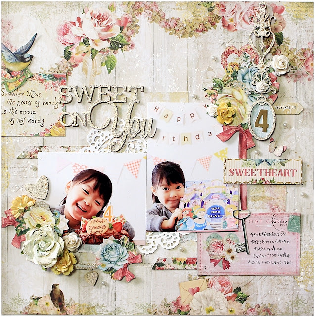
It is a photograph of the birthday of my daughter.
Gift is a favorite Disney Princess picture book!


This title is a favorite
It was embossed with an embossing powder Oatmeal. This color love over! ! !

You get gold is strong when the light hits, but ease likely to match anything in the beige-ish color!


It dangles also I was embossed with Oatmeal.
Some Dangles paste a 4 of 4-year-old.


It has stamped in gold ink on mount of paper.


Stamp: Weathered Doilies - Click Image to Close 
I used the doily on the bottom right.

*****BFS products*****
<paper>   Blush  calling cards/celebration /key to my heart
<chipboard>  sweet on you /Déjà Vu Dangles Chippies
<embossing powder> oatmeal
<stamp>Weathered Doilies


【WHAT A wonderful DAY】
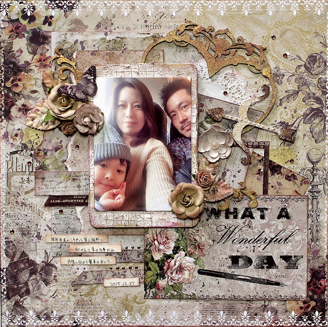
Here chic TIMELESS collection.
It is a beautiful collection with elegant very classical.


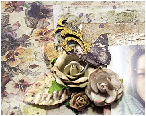
Chip board of heart  I used 14karat of embossing powder.


I buried mesh after painting a cardboard with modeling paste, and attaching structure, and add ink it with purplish red and brown ink.


*****BFS products******
<paper>   Timeless  calling cards/Main Street/Abode/song
<chipboard> Royal Heart Frame/Valentine Hearts
<embossing powder> oatmeal/14karat


The last is the layout using the January of the sketch.


【HUGS】


 Chip board of this heart, the arrow of the part and the heart is another chip board.
I was stuck by decomposition.

Valentine Hearts - Click Image to Close
I cut off the heart of the arrow of the right middle and acquired the heart (cut a feather) with the upper feather.


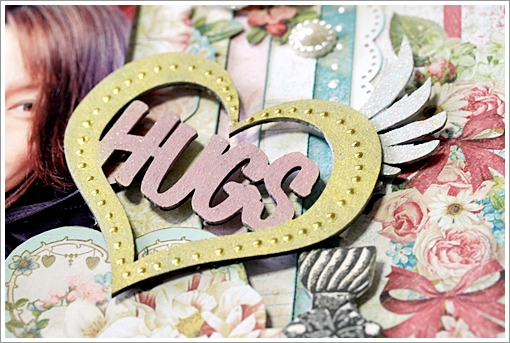
And I used the feather which I cut for here.


Perfume bottles use by cutting cut what was stamped.


Stamp - Bottled Sentiments - Click Image to Close
Beautiful bottles!!!


*****BFS products******
<paper>   Blush  calling cards/sweet heart/ Reminisce
<chipboard>  Valentine Hearts/Heart Hugs
<stamp> Bottled Sentiments


Thank you for looking!!!

Saturday, January 16, 2016

January Inspiration by Maja Nowak

Hello there, Blue Fern Studios Fans :) I'm so excited to be sharing my first post as a DT member!


My name is Maja Nowak (Oliwiaen in the Internet), I live in Poland with my university-sweetheart husband and our two sons. I started scrapbooking in 2008 and, although I have always been crafting (drawing, painting, cross-stiching and decoupage), scrapbooking seems to have taken my whole heart (and time!). 
My style is mostly romantic and shabby chic. But being a mom of two growing up boys who are almost always present in my layouts, I sometimes create something more modern too :-) You can see my work on my blog (where you will find links to my Scrapbook.com and Pinterest galleries too).
I love Blue Fern Studios products: thick papers with beautiful designs, varied chipboard pieces and most gorgeous vintage stamp images! I'm really happy to be working with such quality products. So let me show you what I used them for in my first projects :)


I have created three layouts for January. You might have noticed the first one, as it was presented among fantastic samples by my DT friends with our January sketch challenge reveal :) I went for my favourite teal tones combined with golden and white accents to scrapbook a photo of my darling elder son:


I like to follow a sketch as closely as possible, and so I did for our challenge too. For the background I layered papers from the Paisley&Vine collection and added some elements I cut out from the Frolic collection:


Among other embellishments I used this cute chipboard arrow that I covered with 14 Karat embossing powder - I'm simply in love with this one, the best golden metallic/glittery golden ep I've ever used! Forgive me if I use it in every project of mine ;)


In my title piece I first covered the chipboard with Oatmeal ep and then sprinkled some 14 Karat here and there to get this effect:


I hope you'd join in the fun and share your interpretations of the sketch too :)

Dream Big:
Papers: Paisley & Vine: Nature, Deja Vu: Atelier, Frolic: Dans Le Jardin, Calling Cards
Chipboard: The Optimist Word Set, Directions
Embossing powder: Karat, Oatmeal


My second project is a layout that was inspired by... the piece of chipboard I used for my title: We're All Mad Here ;) I reminded me of the Alice in Wonderland style and I immediately thought the Blush collection and of those crazy photos of my sons and their cousins :) Together they resulted in a funny whimsical page that I had a true fun making!


For the background I used the Charmed paper, then I cut out the flowery frame from the Fondness sheet and layered it on top.


 I also cut the key image from the Key To My Heart paper and added it below my photos:


And then I used scraps of those papers to mat my photos and to stamp some images onto :) I stamped two balloon images, decorated them with liquid pearls, glitter and flowers and mounted on 3D dots:


As for the title piece, I decorated it with embossing powders and did that in stages: I first covered each word separately with embossing ink reinker (of course, you can use an embossing pen that I don't have ;)) and heat-embossed it with a different colour ep before going on to the next word:


We're All Mad Here:
Papers: Blush: Fondness, Charmed, Key to My Heart, Reminisce
Chipboard: We're All Made Here, Directions
Embossing powder: Buttercup, Karat, Petal, Fern
Stamps: Flight & Flair, Journey, Photography, Deja Vu


And finally the third layout I made using the beautiful Timeless collection: you should have seen me choosing the papers! I couldn't decide for ages, they're all so beautiful :) In the end I decided on gray tones and here's the result, with my shiny boys in the photo ;)


I distressed the edges of the Artistique and Papillons papers and layered them together. Then I added some stamping in the background:


I cut out some tags from the Keepsakes sheet and matted my photo.


I covered the title chipboard piece with the 14 Karat ep (told you, I love it!)...


...while for the "industrial" pieces from the Cogs&Gears and Working Parts sets I used a custom mixture of the Poinsettia, Cerulean, Icicle and Ebony powders. I took a pinch of each (a really tiny amount, together they gave me enough to emboss all the parts and still more than a half was left for future use. If you wish to mix several powders, I'd recommend taking small amounts and as you add more colours, emboss on some spare scrap of paper to check the result.) I mixed the powders well on a scrap of paper and after embossing my pieces I got this really natural rusty-patined but still metallic shiny look of old metal pieces.


I also added a real vintage watchface and a key charm to my page. Then I tucked in a couple of mini roses here and there - I think they go well with all those "masculine" elements ;)


You Shine:
Papers: Timeless: Artistique, Papillons, Keepsakes
Chipboard: Working Parts, The Optimist Word Set, Cogs & Gears
Embossing powder: 14 Karat, Poinsettia, Cerulean, Icicle, Ebony.
Stamps: Deja Vu, Essential Textures.

Thank you so much for visiting the Blue Fern Studios blog today - see you later!

Maja

Tuesday, January 12, 2016

It's January .. with Sandi Clarkson


Hello, Blue Fern Studios fans!
 My name is Sandi Clarkson and I am thrilled to begin my Second Term with the Blue Fern Design Team.  Having worked with the Blue Fern Studios owner, staff and many of my fellow team members, this tuly feels like home! It also doesn't hurt that I live in the same state where Blue Fern is manufactured to strengthen my sense of belonging! (Texas, USA)  Because of that proximity, I am sometimes the very first designer to get to see the new products! Talk about exciting!! 

I'm married with three grown, married daughters and a growing number of grandkids! By profession, I'm a very recently retired Audiologist (last week) and am excited to have more free time to get "lost" in creating! I enjoy trying new techniques but am usually happiest when the results still fit my "pretty" criteria. My scrap room is my happy place. I kind of love that my desks have paint, gesso and runaway micro beads all over them. I'm mostly a layout girl but love, love, love doing the occasional canvas. 

Please visit my blog at Soft Side of Sandi to see more of my work. 

So, onward with January's projects ...

"XOXO" (based on the January sketch and flipped)

This month I actually did 2 masculine layouts! Or maybe it is safer to say that I've used masculine photos and then did my own thing! For this first one, I've pulled out some older papers from the Sanctuary collection along with some older chipboard pieces. But I've paired them with some of the new embossing powders that I was dying to try .. Oatmeal and Sage. 

The background for this one was created with a stencil, super heavy gesso, tissue tape and a couple of mists, Persimmon and Jingle Bells. The Persimmon helped pull out some of the peachy, red tones from the paper itself. 


Beneath my photo layers is the Paisley and Vine Medley split in half which I've first gessoed and then embossed with the Oatmeal Embossing Powder. The XOXO title was treated the same but double embossed. I've included the Notebook Edges pieces of chipboard which lend themselves nicely to "guy" projects. For them, I've used the new Sage Embossing Powder and then splashed them with white paint. 


My lower cluster includes a Notebook piece as well as more of the Chelsea Vines which were used around the photo as well. Some variegation was created with my gelatos. 


Most of the Blue Fern paper collections come with a Calling Cards sheet which is ideal for photo layers and titles/subtitles. And I generally add some corrugated cardboard for increased dimension. 


I finished my page with flowers and specks of splattered paint, first white, then black. 


Blue Fern Products used:
Paper:
Santaury Birdsong Melody
Sanctuary Garden Plaza
Sanctuary Calling Cards

Chipboard:
Paisley and Vine Medley
Notebook Edges
XOXO
Chelsea Vines

Mist:
Persimmon
Jingle Bells

Embossing Powder:
Sage
Oatmeal

***

"Delightful"

I've been dying to scrap this sweet father/son photo and challenged myself to get it done this month. 
Since they look a little "chilly" I wanted to give the page a frosty feel, so I've pulled out the Autumn Anthology Cottage piece. 

I'm not usually one to mix my "blues" but I just went for it here and am very pleased with the results. I've used the Sky Imagine Ink on the background and paper and on the Floral Lattice Bits. 

For the Roman Clock set, I opted to use the new Heavenly Embossing Powder. Wow, this one really glistens! If you like sparkle, this is the one for you! It's amazing! 


My word title is from the Optimist Set and is simply lightly inked with some brown ink. 


Aren't the Clock Hands intricate and beautiful? 
And the Heavenly Embossing Powder, wow! 


The Floral Lattice anchors the opposite side of the page. You can also see a good view of the Texture 1 stamp being used on my background layer.

Blue Fern Studios Products used:
Paper:
Autumn Anthology Cottage
Autumn Anthology Calling Cards

Chipboard:

Roman Clock Set large
Floral Lattice bits
The Optimist Word Set

Mist:

Sky

Embossing Powder:

Heavenly

Stamp:

Texture 1

***


And now a girly page! 


 "True Love"

Lastly, I'm digging my hands into my new Blush collection stash! These papers are so my colors! I love me some teal with peachy-pink and a touch of yellow. They feel so warm to me. 

Lots of background interest was created on the Enamored paper, side B with Mists and stamps as listed below. And of course, some stenciling. For paper layering, I've torn some of the Enamored, side A as well as the Fondness papers and then the Valentine Cards to tuck here and there. 


I still had a few bits of the Floral Lattice Bits on my desk and decided to just paint them white and let them be a nice contrast to the other colors. I made some circles on my paper, being sure to capture those sweet red hearts near the top! Aren't they cute? 

You can also see part of the Chelsea Medallion that I've used as a photo layer. I misted it with Winter Fern and then heat embossed with Fern Embossing Powder. 


It seems fitting to start working some hearts into my creations, so I've used a couple of pieces from the Valentine Hearts chipboard set. Both were gessoed, then misted with Persimmon and finally heat embossed with the new Garnet color. The top piece with the keyhole is so fun! For that one I mixed in some 14 Karat EP with a double embossing technique. 


Just a closer look at this sweet hearts! And the wings. 


On the right, I've made a Valentine Cards cluster and layered in some flowers and resin. One little fussy cut butterfly is in the mix. He's from the Frolic collection. The Weathered Doilies stamping come into view in this close-up, as well as the Photography stamp. 


A fun dimensional shot! 

Blue Fern Studios Products used:
Paper:
Blush Enamored
Blush Fondness
Blush Valentine Cards

Chipboard:
Chelsea Medallion
Floral Lattice bits
Valentine Hearts

Mist:
Persimmon
Winter Mint

Embossing Powder:
Garnet
14 Karat
Fern

Stamps:
Texture 1
Photography
Weathered Doilies

Thanks for hanging in there with me for this rather long post this month! 
Please be sure to check out the sketch challenge HERE
See you next time! 
Sandi