Sunday, February 21, 2016

Three layouts, three collections by Marie-Josee

Hello, Blue Fern Studios fans!

Today, I will show you three layouts I created with the latest Blue Fern Studios collections!

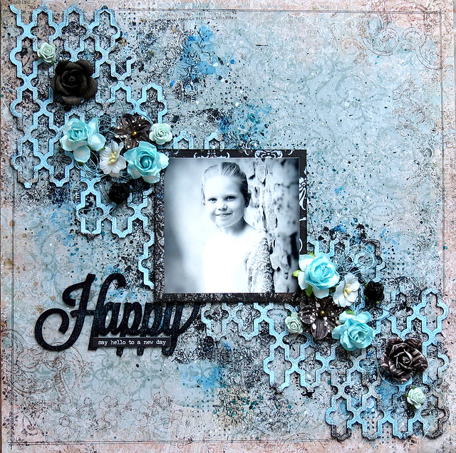
"Happy" layout with the Serendipity collection

Here's the layout I created with the latest collection, Serendipity. I used the Imagination paper as my background, with I altered with black ink and the Arcadia Textures stamps.


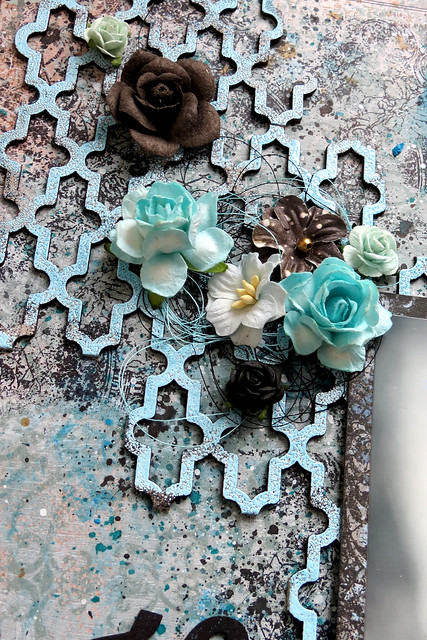
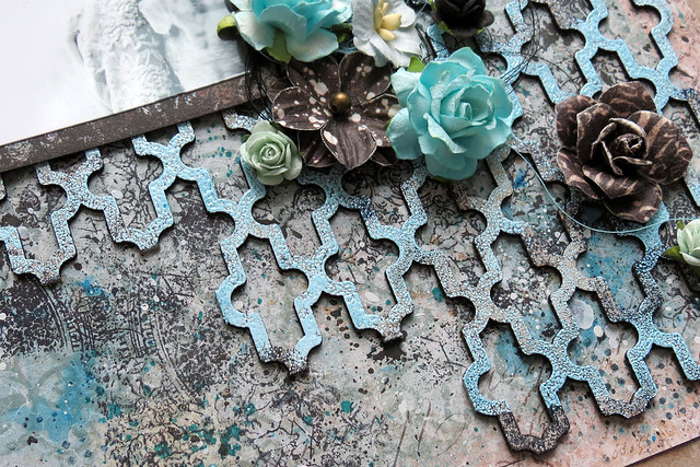
The chipboard I used in the background is the Turkish Panel. I used only a part of it.


I altered it first with a black ink pad. Then, I used the Sea Mist embossing powder on top. I did not cover it completely. I wanted to see some black.


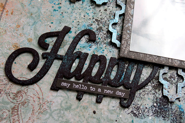
For the title, I used a chipboard from the Happy, Heart, Love chipboard set. I altered with a black ink pad, and I also added teal spray ink.


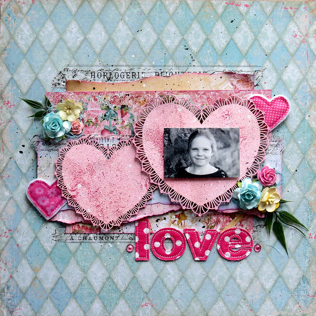
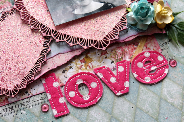
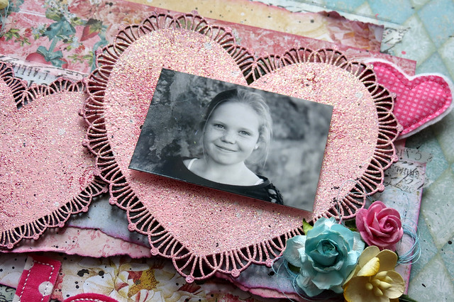
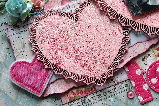
"Love" layout with the Blush collection:

For the background of this layout, I used the Charmed paper from the Blush collection.

I used the Frilly Hearts chipboard set as the focal point of my layout. First, I altered them with light pink paint. Then, I embossed them with the Cotton Candy embossing powder. Using the Brocade Texture stamp, I added patterns here and there with embossing ink and color using the Fuchsia embossing powder.


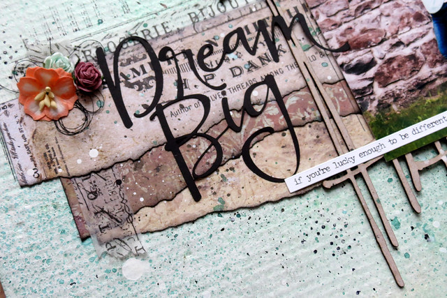
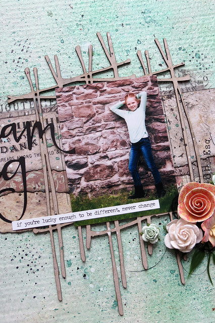
"Dream Big" layout with the Timeless collection

The background of this layout is made of recycled cardboard, which I altered with various mediums.

I used scraps of paper of the Timeless collection that were left after I created other layouts. I love how their colors fit with the background of the picture I used.


I also used the Crossing the Lines chipboard behind my photo.


That's it for today. I hope you enjoyed seeing my projects!

Friday, February 19, 2016

Karolina's February Projects

Hi everyone!
It's Karolina here. Today I would like to show you my three February projects. I created two layouts and a frame using the newest collection from Blue Fern Studios - Serendipity. These collection is absolutely stunning and I'm totally in love ;) Using my projects I tried to show you how this collection is incredibly versatile and universal.

"Believe in your selfie"

My first project is a frame with a positive message. I used papers from Serendipity collection and one of the newest chipboard pieces - selfie square. I added also some background chipboards, because I really like when such elements stick out from my composition. It makes my composition reacher and the effect is realy nice, don't you think? 


I covered chipboards pieces using three different embossing powders in maching colors.


A selfie square chipboard I covered using acrylic ink in the white color - while the ink was still wet I added a lot of transparent glitter to make my frame more shiny. 


You can also find a gliiter in several colors on a frame. It's great idea to add some glitter accents on our background.

Blue Fern Studios products used:

Papers: Serdendipity collection - Fascination, Inspiration, Contemplation
Chipboards: Selvie Squares, Bits of Honey, Checker Bits
Stamps: Forever, Essential Textures
Embossing powders: Lilac, Sea Mist, Cotton Candy
Glitters: Blue Ice, Cranberry, Merlot, Caribbean

"Memories Captured"

My second project is a layout in shabby chic style. If you are wondering who is this little girl in the picture, it's me. I think I was 2.

I used papers from Serendipity collection of course and beautiful sentence "Memories Captured" chipboard. In the background you can see texture pieces.


I covered chipboards using white embossing powder and then I add some ink and colors.


I added a glitter in several spots to make my project more sparkle.


In the background you can also find some stamps.

Blue Fern Studios products used:

Papers: Serdendipity collection - Fascination, Anticipation, Calling cards, Contemplation, Inspiration
Chipboards: Floral Latice Bits, Captured Words
Stamps: Forever, Halftone
Embossing powders: White
Glitters: Pyrite, Blue Ice

"Blooming Beauty"

My last project is also a layout, this time in retro style. In the picture you can see one of my best friend. Retro style matching perfect to this photo I think.


As I said, papers from Serendipity collection are not only absolutly stunning, but very universal too. You can make a spring project like my frame, very delicate and shabby projects like my first layout and also some projects in retro style.


This time I covered a chipboard Blooming Beauty using black embossing powder, to add some strong contrast to my project.


I used a cooper embossing powder to create a vintage look of frame and then I put it under my photo as a part of my composition.


Blue Fern Studios products used:
Papers: Serdendipity collection - Fascination, Anticipation, Calling cards, Contemplation, Inspiration, Reminisce
Chipboards: Folkart frame, Blooming Beauty
Stamps: Forever, Halftone, Brocade Texture
Embossing powders: Ebony, Cooper
Glitters: Pyrite, Blue Ice, Burnt Cooper

Thank you for visiting Blue Fern Studios blog today. See you next time in March!

Karolina


Thursday, February 18, 2016

February Layouts-- By Keren Tamir


Hi Everyone,
Its Keren here with my design team projects for February.
I created two different themed layouts using the latest two new collections from Blue Fern Studios.

"Blush" and "Serendipity"

Both these collections are stunning and perfect for the month of love.

Here is the first layout designed with the Blush collection.

"Love"


I used the Blush "Key to my heart" paper for the background. The Blush's pastel colours were perfect for this beautiful wedding photo of my cousin. I just love what the photographer did with their hands and I had to use a frame to highlight the heart.


The frame I used is the Folkart frame. I added a Romantic chipboard dangle of a locket above and below the frame. I wanted to make it seem as if the frame is dangling from the top of the page.
I embossed both frame and dangle with Imagine Ink cotton candy embossing powder


The chipboard word "Love" and the heart were simply inked in chalk ink.


<<<<<<<<<>>>>>>>>>


"Uniquely You"

My second layout is different from the the one above in term of both theme and colours.


I used the Serendipity "Contemplation" paper for the background and the "Calling cards" paper for layering behind the photo.


To create a natural texture in the background I used a modelling paste over a woodgrain stencil. Then while the paste was still wet, I spread 3 different colours of Blue Fern Studios Imagine Ink embossing powder. I used sage, nutmeg and ginger.


I also used the new whimsy chipboard flourishes as accents. They were simply inked in brown chalk ink.


Thank you so much for visiting the Blue Fern Studios blog today
Have a fantastic day!!

Keren

Tuesday, February 16, 2016

Maja's February Projects

Hello, Blue Fern Studios Fans and welcome to the blog today :-)

For my today's post I created various projects, so I hope everyone would find something for themselves to get inspired. All of them feature our latest release, the Serendipity collection.
Let's start with the layout:


I first layered two papers in contrasting colours for the background and added some stamping. For the title, I traced the words of the "Always Remember" chipboard with embossing marker and heat-embossed them separately with Heavenly and Ginger embossing powders:


Then I cut out some journaling cards to mat my photo. I tucked some flowers in between then layers,  I also included some loose brick pieces I found with my Shabby Brick Panel (you can also find them in the Extra Bits sets :-)) that I covered with subtle crackle paint.


I created a custom button by attaching an epoxy sticker to the bird image and cutting it out. As for the extra pieces you might get with your chipboard, I decided to keep them and use for some interesting decor element :-) I first removed the pieces from the chipboard, covered them with various eps and but them back together, creating kind of a mosaic/stained glass element (to be able to mount it on 3D dots, I matted the shapes with some paper on the back side):


For the word part, I first embossed the background pieces with Breeze ep and then re-heat it a bit so that particles of Oatmeal ep would stick to it and embossed again to get a shabby chic look:


Always Remember:

Papers: Serendipity: Anticipation, Fascination, Imagination, Chronicle
EP: Ginger, Heavenly, Azure, Seven Seas, Breeze, Oatmeal
Chipboard: Always Remember, Charmed Page Dangles, Shabby Brick Panel/Extra Bits
Stamps: Photography, Forever, Vintage Edges

I used this mosaic/stained glass technique for my next project too, an OTP home decor piece with the beautiful Couture chipboard as the main image:


Just as with the Charmed dangle, I removed the pieces, covered them with Lilac and Mystic Plum eps and but them back into the main piece that I covered with 14 Karat ep.


For the background, I layered some papers, put some lace in between the layers and stamped a dangle from the Deja Vu stamp set, then added some dimensional elements to it:


I also included a flower cluster with a button and metal wing charm in it. Beneath my composition I put the Inspiration chipboard on the passe-partout I splashed with black ink:


Inspiration:

Papers: Serendipity: Inspiration, Merriment, Reminisce
EP: Lilac, Mystic Plum, 14 Karat
Chipboard: Couture, Serendipity Words 1
Stamps: Deja Vu

I also made two cards for this post - here's a wedding card that features the Boston Lattice chipboard piece:


I think it makes a beautiful bakcground for the flower cluster, and it also reminds me of a wedding pergola :) For the background, I layered two sides of the Glee sheet:


 I covered the chipboard with white chalk mist and used the extra pieces as propping places to hide 3D dots:


Wedding card:
Papers: Serendipity: Glee
Chipboard: Boston Lattice


It wouldn't make a February post without a Valentine's card ;) Here's one I gave to my own personal hubby:


I used the True Heart stamped image for the main motif: I stamped it on watercolour paper, coloured it with Distress inks, cut out and mounted on layered papers that I also stamped with Journey stamps:


For the sentiment, I used the "love" word from the Chunky Words set, covered it with glue and dipped in the Fool's Gold glitter. Just to make sure it would fall off, I secured it with glossy accents. 


Love card:
Papers: Serendipity: Contemplation, Inspiration
Chipboard: Chunky Words
Glitter: Fool's Gold
Stamps: Journey, True Heart

I wish you a lot of creating time - and see you next time!
Maja Nowak

Monday, February 15, 2016

Inspiration from our Creative Team

Welcome to the middle of February.  We hope you had a sweet Valentine's Day.

We have loved seeing how our Creative Team has used all the new Blue Fern Studios products this year.  Today we would like to share some additional projects from our great team.  In honor of Valentine's Day, our theme this week is pink and/or anything love related.   You are sure to find some sweet inspiration! 

First up is this frosty, wintery layout created by Keren Tamir using several Blue Fern snowflake chipboard pieces that she has painted white.  The title is from our "Cool, Calm, Chill" word titles set.  
What a gorgeous layout Keren has created!


Like Keren, Wilma Voermans's layout shows how a piece of basic white cardstock can be transformed into a work of magic.  The finishing touch is the "Blushing Beauty" chipboard title.


Marie-Josee Hamel created this beautiful layout using our Blush Collection.  
The photo is perfectly framed with a couple of our chipboard borders.


A collection of love-inspired layouts just wouldn't be complete without a baby.   
Sandi Clarkson also chose to use the Blush collection for this super-sweet layout. 


If you miss seeing two-page layouts, then this one is for you.  Nicole Doiron has created two very romantic wedding layouts using the Blush paper collection, along with our Best Day Ever chipboard title, and the Romantic Page Dangles. 


Although Bec Genet's layout isn't pink, it certainly is elegant with tones of gold and black, and fits in nicely with our love theme.  The paper is from our Autumn Anthology and Love Story collections.  The "Love This" title is part of the "Arrow Words" chipboard set which also contains 7 other titles.


Our final project today is for those of you who love Artist's Trading Cards (ATC).   Renea Harrison has one for you that she created using the Timeless collection.  The shabby hearts are accented with Blue Fern's Mystic Plum embossing powder.  Who wouldn't love to receive this beauty?


We hope you have found some inspiration to use the next time you create!


Sunday, February 14, 2016

Two mixed media layouts with video tutorial by Wilma Voermans

Today I present you the two layouts I made with the new Serendipity collection.
Newly I do not only scrap for keepsakes.
I love scrapbooking , but most of my familypictures are in project life albums. 
More pictures and more journaling, and it is my big fun to make my own cards.

But.....I still love scrapbooking on 9x12 and 12x12.
And I will still do familyphotos 
But when I see a beautiful picture somewhere online I just scrap it .
No more bad feelings that it is not a keepsake.
I keep them for myself  , after all it is a hobby..

Enough  talking , here is my first layout


I can tell you how and what I did, but if you want to know.....
Here is the start to finish video. Which will show you the whole process.
Chipboard used: Serendipity title and grid pieces .

I hope you have time and fun to watch .


***********************

The second layout is also made with the Serendipity collection.
The background paper is called merriment.
Normaly I work many hours on a layout.
Well...working is a big word :) 
But I think  add something, drink coffee, add something, etc etc.
This layout ;  I cant believe I did it.....was made in one hour!!
It was difficult, to just add without thinking and not go through my stash for hours.
But I saw the sun going away , and I really wanted to make a bright picture for this post.
I am not comfortable to rush, but today it just worked out.

For both layouts I used the Serendipity words as a title.
All the color you see is done with bright Japanese watercolor.
On the title aswell .

I used it because watercolor dryes quick .
The flourish is the organic vine.
I had fun with this new collection.
Thanks for visiting the blog.

x Wilma x