Hello Blue Fern fans - Kelly here.
Today I have three layouts to share...so I will just get right to it!
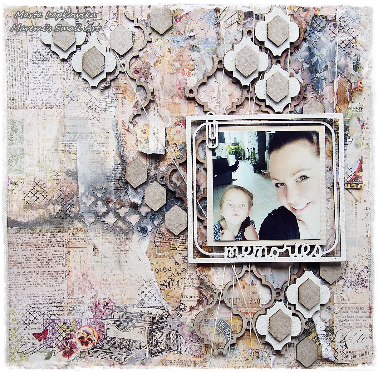
"You Are So Fun"
For this layout, I have followed the sketch for this month's challenge...I hope you will play along, too! (Find the link in the right sidebar.)
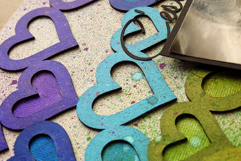
Below you can see a section of the Renaissance Border, and the word "You" from the Valentine's Word Set. These both were dabbed lightly with gesso, then painted with various colors of water color paint. Once they were dry, I dabbed around the edges randomly with a green chalk ink.
Below is a section of the Twiggy Branch, which was left mostly bare, with just a touch of green chalk ink.
Below are the other bits of the Renaissance Border and Twiggy Branch, and bottom left I have used one of the Nifty Tags and Tickets to ground my title. I placed one of the adorable little Vintage Keys below that.
Chipboard used:
Renaissance Border
Nifty Tags and Tickets
Vintage Keys
Twiggy Branch
Valentine's Word Set
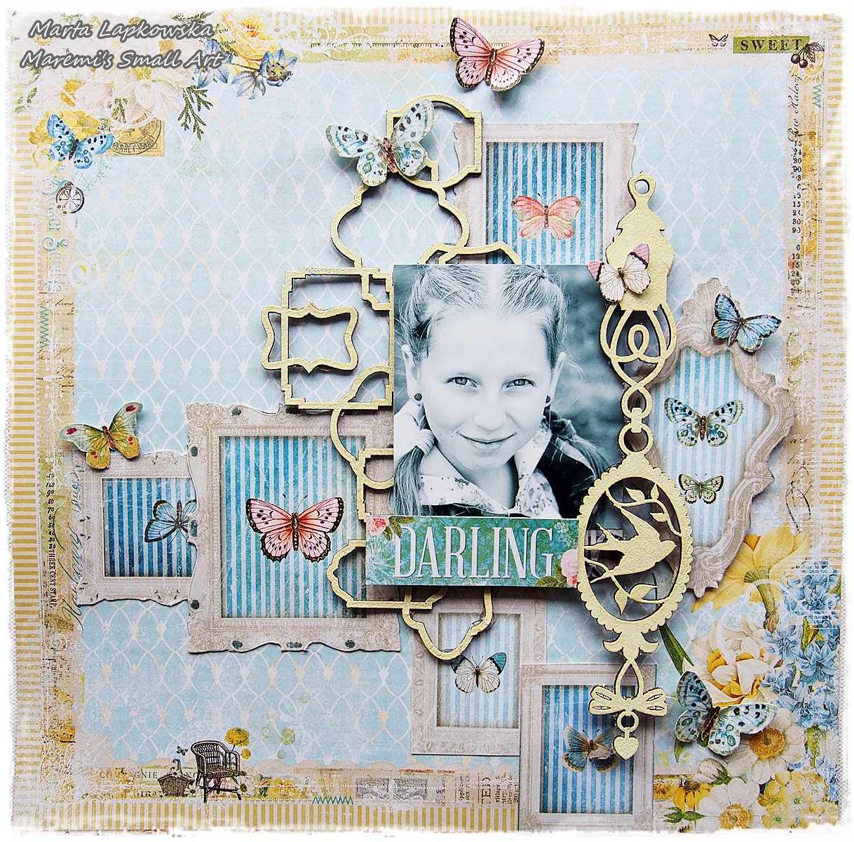
"Good Vibes"
I used a wide variety of chippies on this one, too...I just really had fun with this page, for the photo that I love so much. First up, the title...this was simply embossed with a white detail embossing powder..I just adore the font for the Good Vibes set, so fun!
Below..one of the Circle Motifs..painted with a shimmery pearl acrylic paint, a few dots of gold paint for the flower centers, then the leaves were colored with a green watercolor pencil. A touch of stamping with a script stamp was done on top of that.
Up next...Garden Daisies (Large), I applied the same technique as I did the flowers on the Circle Motif, but to top them off I painted on just a bit of a textured medium. The stem was misted with a shimmery green mist.
Good Vibes Word Set
Garden Daisies - Large
Circle Motifs
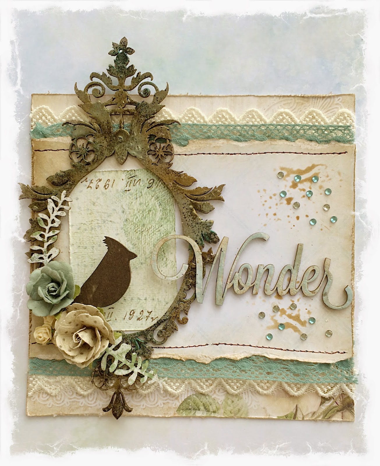
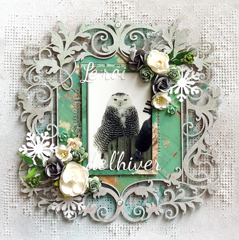
"Smile"
Another "summer" page. This one is loaded up with bits and pieces of chipboard..see if you can spot them all! Below you will find one of the Nifty Tags and Tickets, which was stamped lightly with green and teal ink. Also, you can see the end of the Calligraphic Border, which was painted with a gold acrylic glaze, then dabbed with a bit of teal acrylic glaze. I also tucked in pieces of the Natural Sprigs, which were distressed, then embossed with green and gold embossing powder.
For my title, I used the cute "Smile!" polaroid frame from the Picture Perfect set. This was left mostly natural, with a few dabs of ink here and there, and a dark brown chalk in around the edges for definition.
Last but not least, I have added a section of the Blue Fern Frame..I cut this apart and have slowly been using pieces of it. I stamped with a script stamp and then embossed with gold. I then added touches of all of the paints and inks that I used on all of the other pieces in my project to make it blend nicely.
Calligraphic Border
Blue Fern Frame
Nifty Tags and Tickets
Natural Sprigs Set
Picture Perfect
Thank you so much for stopping in today, I hope you have enjoyed my projects. See you soon!