Wednesday, May 18, 2016

Tranquility Layouts and video tutorial by Keren Tamir


Hi everyone,

Its Keren here on the Blue Fern Studios blog with two projects using the new Tranquility collection.

"By the Sea"


I used the Jubilation paper as the background because I love the woodgrain effect for my beach layout.
I have a video tutorial below on how I created this project.


Blue Fern Studios Products:

Tranquility Jubilation paper
By the sea chipboard
Crackle bits- from new Attic Charm collection (coming soon)
Blue Fern Studios blooms
Fern embossing powder
Oatmeal embossing powder
Sea mist embossing powder
Pearl embossing powder
Snow embossing powder

<<<<<<<<>>>>>>>>>

"Happy"

This is another layout I created with the Tranquility collection this month.
It has different tones which shows the versatility of this collection.


I used the bourbon stamp to create the textured background. I stamped and embossed using the Auburn embossing powder.


The Shrine chipboard frame was first embossed in Mushroom embossing powder and then stamped and embossed with the Auburn embossing powder.


The romantic dangle was embossed in the Chilli Powder embossing powder. I also used it to stamp and emboss the butterflies in the background.
All the flowers are also from Blue Fern Studios as they've now started selling matching flowers to their collections.


Blue Fern Studios Products:
Tranquility- peaceful
Tranquil blooms
Romantic page dangle chipboard
Shrine frame chipboard
Optimist word set chipboard
Bourbon street stamp
Embossing Powder auburn
Embossing powder mushroom
Embossing powder chilli powder


Thank you so much for visiting the Blue Fern Studios blog

Have a wonderful day!!

Keren

Tuesday, May 17, 2016

May Social Media Features and YOU!

Hello, Blue Fern Studios fans! 

It's already time for another Social Media feature! 
We've been out and about on Pinterest, Instagram, Twitter, Facebook and a few online galleries just to see what you are creating with your Blue Fern Studios products! 

We really want to encourage you to use Instagram if you are not already! It's a great resource for inspiration. And an easy way to scroll through pretty photos without other distractions. 
Plus, you can post to other social media sites easily with just one upload.
We are nearing 800 followers! How soon can we reach 1000?! 
Thanks for helping us grow our Social Media presence. 

Now for some great features:


One of our lovely Facebook followers, Bev Code, posted this layout to our  Facebook page and linked it to her online gallery. She's used the Timeless collection and several pieces of BFS chipboard. Thanks, Bev, for always sharing your work with us! 


We found this beauty by @eiko_ehira on Instagram! What a gorgeous way to use the romantic Blush collection! We love when people use our products in new creative ways. Wouldn't you love to reach out and touch this one?! Thank you, @eiko_ehira. This is so inspiring. 


This dramatic layout created by Sandra Bernard was found on Pinterest as well as Instagram at @sandradeebernard. Her use of the Timeless collection, raw Blue Fern Studios chipboard and mixed media with co-ordinating florals is breathtaking! 


Our Courtship Lane collection has been so well received and Instagram user @bliss_scrap.31 created a gorgeous layout and placed it in a frame. This way you can really go super 3 dimensional and add plenty of chunky embellishments. 


Frolic is an older but favorite paper collection! @megu_ig shared this on Instagram. What a great choice for wedding photos and some altered chipboard! Thanks for tagging us @megu_ig! We love it! Such an adorable couple. 


Okay, one more!
 We couldn't pass  up this beautiful layout by @akemihonma using our Serendipity paper collection. She tagged us on Instagram as well and we pinned it to our Blue Fern Studios Pinterest projects board where we try to pin as many of your creations as we can. It's a win-win! 

As always there are new Blue Fern Studios products in the works! 
We'll have a new collection to share in about a week or so. 

Don't forget to tag us on your projects or your haul videos.
We truly want to feature YOU! 

See you next time! 
Sandi

Monday, May 16, 2016

May creations by Maja

Welcome, dear Visitors, to the Blue Fern Studios blog today :-)

It's Maja here to share some projects I made for today's post.

Let's begin with the layout you already could see  - my sample for the BFS May sketch challenge.


As usually, I followed the sketch quite closely, trying to incorporate all the elements. I used the Timeless collection. For the background, I layered the Freedom and Maconnerie sheets and then repreated the brick pattern from Maconnerie using bricks (mine were leftovers from the Brick Panel, but you may also get them in the Blue Fern Bits set) I coloured white:


Under the photo you may see the tags I cut out from the Calling Cards sheet. Then I embossed the Merriment word first with Garnet ep, and then with Mystic Plum - as it is semi-transparent, it resulted in a new, shimmering colour :-)


I decorated the Love This word from the Arrow Words set, and placed it on an ornament I cut out from one of the Calling Cards tags. I completed my page with a piece of lace and mini roses:


Merriment:
Papers: Timeless: Maconnerie, Freedom, Keepsakes, Calling Cards
Chipboard: Arrow Words, Serendipity Words 2, Shabby Brick Panel/Blue Fern Bits
EP: Garnet, Mystic Plum

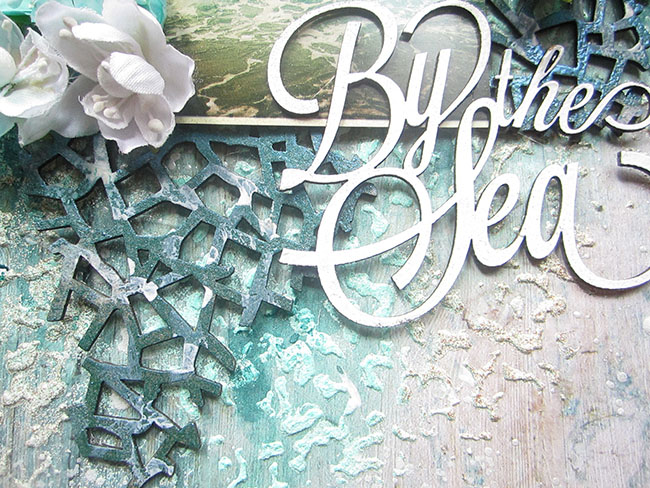
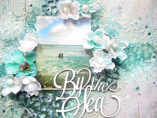
 For my second layout I used our latest release, the Tranquility collection - I just fell in love with the wood patterns included!


I couldn't resist using one of those beautiful woods for the background ;-) Then I matted the photo with the darker wood pattern and placed it onto the largest of the Splattered Circles chipboard set and added flowers from the two sets that match the collection. Then I surrounded the photo with pieces from the Seeing Stars set.


I coloured my chippies with four different embossing powders, re-heating and adding pinch of various colours here and there to get a varied, distressed look:


For the title I used a piece from the Spiritually Speaking set and embossed it with In the Navy ep - I just love this deep dark blue it gives! And then, as a cherry on top, I added yet another star in the form of a metal charm from my stash :-)


Angel Eyes:
Papers: Tranquility: Serenity, Jubilation, Calm, Patience
Chipboard: Seeing Stars, Splattered Circles, Spiritually Speaking
EP: Mushroom, Icicle, Oatmeal, 14 Karat, In the Navy
Flowers: Tranquil Blooms, Tranguil Roses and Lilies


Mother's Day is celebrated on different days around the world, but many countries celebrate it in May. And so, last but not least, come two cards I made for this occasion:


I also used papers and flowers from the tranquility collection - as you can see, it's perfect for boy themes and romantic creations too :-) I went for the pink palette with one of the cards and combined some chipboard pieces from various sets, painting them or embossing with embossing powders:


The other card features one of the chipboard sets that go with the collection, Jubilation Corners, and the aqua-green flowers from the collection blooms.


I first coloured the chipboard with various mists for a delicate shiny look and then accentuated the butterflies with white crackle paint. I just love the shabby chic effect!


Mother's Day Cards:
Papers: Tranquility: Hushed, Peaceful
Chipboard: Veranda Cage Set, All Natural Set, Jubilation Corners, Mini Flourishes
EP: Oatmeal, Cotton Candy
Flowers: Tranquil Blooms, Tranguil Roses and Lilies, Courtship Roses


And that's all for today, thank you for visiting and do visit us later for more inspiration :-)

hugs, Maja

Saturday, May 14, 2016

Three layouts ideas with the new tranquility collection made by Wilma Voermans..

Today I would love to show you three different mixed media layouts .
All three made with the tranquility collection.
I love the line , it has many possibilitys.


My first layout is one with a grunge beach look.
On the beach you always find things like old wood, bitses and pieces.
On most of my beach layouts I like to use that feeling by adding things I find around me.
I started with the Contentment paper.
The B-side is perfect for a beach look.

I wanted a sandy feeling to the whole layout.
I added many layers, starting with joint compound in my background .
It has already a sandy feeling.
Two colors glimmerspray ,  turqoise and sandcolor.
Next some paper from a old notebook , very light swimmpearls
 (the ones you use in flowerarrangements).


Around my picture pieces of a old shirt .
A little story about the titel ....
I came home and found my best shoes half eaten by my dog.....
I was very angry and dissapointed, but it is a dog that was found on the streets of Spain
She still has to learn some domestic things :)
So I thought, take the pieces and use the brandname as a titel.
On the layout you see more pieces I collected on the ground from my beloved shoes.


I used two chipboard pieces, seaside charms and Frolic mesh.
 Stippled light gesso and than used three different embossingpowders .
I sprinkled them all three in the wet gesso and just heatet it here and there.. 

I did the same in the background, but did not heat at all.
The three colors: oatmeal, ginger and mushroom.
They gave me the perfect sandy look I wanted.

*******


My next layout was based on the Stillness title that comes with the Tranquility collection.
The background paper is the b-side of the Serenity paper.
I used the May sketch for the design:


I totally love the tranquil foliage chipboard piece .
With the title and mood of the picture I did not want too much on the page.
Sometimes enough can be enough for me.
The circle is a negative piece of chipboard that I never throw away.

ITo all the chipboard I stippled gesso .
When it was not completly dry I sprenkled orange Peel glitter .
After that a little sage embossingpowder.
I heatet with the heatgun, but not too much.
It gave me a rough surface.
On the title also the gesso, orange Peel glitter and some orange paint.
When it was still wet I went over the under part with gesso .
Just lightly to get the ombre effect. 

*******


For the last layout I wanted a soft babyfeeling without getting sweetness all over the place.
I think the picture has enough sweet in it :) 
I used the Stillness paper as my background aswell as behind the picture.
Behind and between I used a chipboard piece that comes to the Attic Charm collection.
This collection will be released soon !
I embossed it with Pearl embossing powder .
After that it got some gesso with pinkish ecoline here and there.
The heart was embossed with Garned Embossing and dulled down with gesso.
The title was very easy, just some black ink that gets into the chipboard very easy.
*****

Thank you so much for visiting the blog and looking at my monthly post.
x Wilma x


Friday, May 13, 2016

May inspiration by Bec

Hi there, today I have my May projects for you.

Beach Wedding Canvas


First up I have a canvas I made as a belated wedding gift for a friend


I began by covering the canvas with the new Tranquillity Collection papers: Serenity and Jubilation. I then used what was left over from these papers to make a photo mat.  


I distressed the edges of all the papers and I added modeling paste with a stencil to the background of the canvas.


I used the Persian Ornament Chipboard piece to go under the photo, I coloured this with the Mushroom Embossing Powder.
For the title Love Always I used two different embossing powders in Snow and Seven Seas.


To finish off I embellished this canvas with some of the gorgeous new Blue Fern flowers. I used Courtship Blooms, Courtship Roses and Tranquil Roses and Lilies.


Blue Fern Studios Products used: 
Papers: Tranquillity Collection -  Serenity and Jubilation
Chipboard:  Persian Ornament  Love Always
Embossing Powder: Mushroom, Snow and Seven Seas
Flowers: Courtship Blooms, Courtship Roses and Tranquil Roses and Lilies.

Mini Beach Shadow Box


My next Project is a mini shadow box made with the Tranquillity Collection


I used the Tranquillity paper Jubilation to line the squares inside the box as well as the outside edges and bottom of the box.


Then I used the Seven Seas Embossing powder to colour the top surfaces of the box.
I filled the mini bottles with the Gulf Coast and Blue Ice Glitters


I coated all the Seaside Seashells chipboard pieces with white sand texture paste, and when this was dry I rubbed a little distress ink over the surfaces.


I finished with off with a few real sea shells and Courtship Blooms, Courtship Roses and Tranquil Roses and Lilies.


Blue Fern Studios Products used: 
Papers: Tranquillity Collection -  Jubilation
Chipboard:  Seaside Seashells
Embossing Powder: Seven Seas
Glitter: Gulf Coast & Blue Ice
Flowers: Courtship Blooms, Courtship Roses and Tranquil Roses and Lilies.

The Future Belongs to Those who Believe on the Beauty of Their Dreams


And finally today I have a layout to share which I made with the Serendipity collection


I used the Serendipity Fascination paper as my background for this layout, I added some mists and texture pastes for colour and interest. Then I used the Serendipity papers Glee and Calling cards to make a photo mat.


I used the whole Natural Sprigs Set pack and covered all the pieces with white crackle paste. When the paste was dry I coloured them with a green mist and brown distress ink.


To colour the Folkart Frame I used Liquid Pearls in Bisque
For my title I cut one to the calling cards up and spread the words over my page


Blue Fern Studios Products used: 
Papers: Serendipity Collection - Fascination, Glee & Calling Cards
Chipboard:  Natural Sprigs Set & Folkart Frame


Thanks for Looking

Bec