Friday, February 26, 2016

Blush ,Timeless,Serendipity collection layout Yuko


Hello!  Yuko here!
I made 3 works newly this month!
I use different collection for each.
Those collection is characteristic, and anything is very beautiful!


【Sweet】
I use Blush collection!  I love This collection!!! 
  Particularly this paper is a favorite in that!


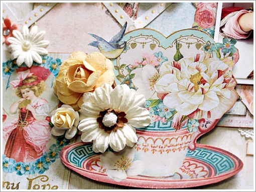
I used favorite emboss powder oatmeal for a title.


<Blue Fern Studios Products>
Paper   Blush collection   Calling Cards/Celebration/Cupid's Folly/ Reminisce
Chipboard  Cute, Sweet, Sassy/ Flourish Hearts
Embossing powder   oatmeal


【cute】
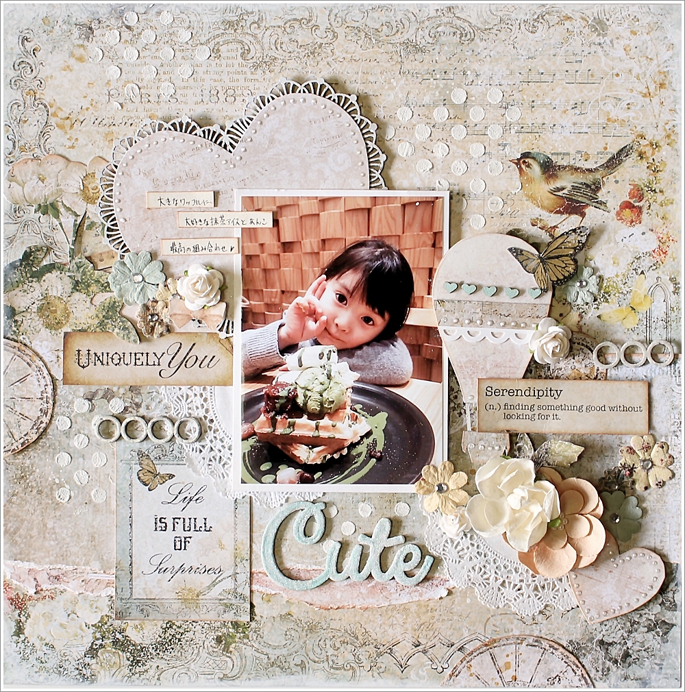
I used serendepity collection for this work.
This series is very chic, and it is beautiful!


The chip board of the big heart has to paste the paper.

Balloon of chip board was also to paste the paper.
Small heart took advantage of the part that does not need a another chip board.
That was a good accent!


Chip board of the title will use the Sea Mist of embossing powder
It was sprinkled artsuger of Prima after applying a heater.


<Blue Fern Studios Products>
Paper Serendipity collection   Calling Cards/ Glee/Imagination/ Merriment
Chipboard  Cute, Sweet, Sassy/2 Hearts Set/Frilly Hearts/Mini Ring Things
Embossing powder   Sea Mist
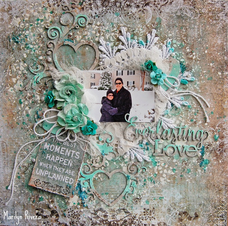


【Adorable】
The third of the work was to use the TIMELESS collection. 


It's really is cool I TIMELESS collection!
Cool finished in chic, can either girls elegant.
And have a first glance seems difficult, I thought it was very easy-to-use collection.


I used VERDANT of the emboss powder for the cardboard of the leaf.
It is different from sage which I introduced last time in this color again, and a gold color strongly appears when I expose a heater and dissolve it.


 I repeat black from emboss of the gold.


The title is CELESTIAL of the emboss powder.
It was the finish which the lam of various colors entered the black, and thought whether it was flamboyance more, but was unexpectedly blackish.


<Blue Fern Studios Products>
Paper TIMELESS collection   Calling Cards/Maconnerie/ Abode/Artistique
Chipboard  Classic Ornaments/Perfect, Adorable, Special
Embossing powder   CELESTIAL/GINGER/EBONY/VERDANT


Thank you for looking!


Thursday, February 25, 2016

Blue Fern Studios and Swirlydoos Kit Club Blog Hop


Blue Fern Studios is excited to join Swirlydoos Kit Club for their February Scrapbook Kit Reveal!

Thank you for joining our blog hop this month! If you came here from Rae's blog, then you are on the right track. If not, go back to Swirlydoos' blog and start from there.  Make sure you leave a comment on all the blogs for a chance to win a prize! And, make sure you have LIKED & FOLLOWED Swirlydoos on Facebook!!!


 Swirlydoos is proud to bring you their beautiful February collection featuring the Timeless paper collection from Blue Fern Studios:


BALLAD


And check out these coordinating add ons that perfectly compliment the February scrapbook kit! 


Are you a subscriber? If so, your kit is on its way, if you don't already have it! If not, check out the Swirlydoos store to see if there are any February kits or add ons in the store!

Has it sold out? - become a subscriber and not only will you never miss a kit again, but you'll also pay less for your monthly scrapbook kits!
*Mention this blog hop and save 10% on your first kit*


 Never miss one of our kits again!

You have until midnight, eastern time, February 28th to complete the hop. Winners will be announced on the Swirlydoos Blog on 03/01.  In order to qualify to win here is what you need to do:

1:   Visit all of the blogs and leave a comment on each. This way we know you were there. Take your time. There are REALLY beautiful things to see along the way.

2:  Before you leave each blog, look for the “special” words and write it down. 
Once you have visited all the blogs and collected all the special words, they will create a sentence. 

3:  Finally, go back to the Swirlydoos blog and leave a comment letting us know how much fun you had, and tell us the sentence that was created with all of the special words you collected. Can't wait to hear from you.

Our special word is : whenever

The party continues over at Jan's blog. Have fun!

Blog Hop Order: 

Wednesday, February 24, 2016

Three Serendipity layouts with Karine

Hi there Blue Fern Studios fan,

Karine's here today to share with you three layouts I created with our amazing Serendipity collection. My first one is called Moment.


I used the Fascination paper as my background. My composition is entered around the Ornate Frame, which I embossed with brown embossing powder . While the powder was still hot, I sprinkled some glass glitter.


My title piece is part of the French Words set. I painted it with white gesso first, and added some mist after. To make it pop a little bit, I added a few touches of white gesso.


I used exactly the same products to alter my Floral Lattice Bits.


To add texture to my background, I used the Forever stamps set.

My second layout is called Reminisce. Here it is.


I used the Merriment paper as my background.


To mat my picture, I used some cards from the Calling Cards paper.


I used the Quatrefoil panel behind my picture. I simply covered it with white gesso.


In my embellishments cluster, I used the Leafy Page Accents. To alter the chipboards, I used the Imagine Ink Garnet Embossing Powder and while it was still hot, I sprinkled some Pearl Embossing Powder.


My title piece, the Serendipity Words 2, was treated with the same steps.


I also used the Essential Textures stamps to alter my background paper.

My last layout is called Everlasting Love.


I used the Inspiration paper.


I centered my composition around the Gazebo chipboard. I started out by painting it with white gesso. I covered everything with two mist colors to get the right shade of blue. I wanted more texture, so I used the Garden Frolic stamp set and ink to add more interest. Finally, I added some grained grit over the roof of the Gazebo.


My title piece, the Everlasting Love chipboard, was primed with white gesso and then, I painted half of it with some mist.

 
You can see in the pictures that I used the Garden Frolic stamps sets to alter my background as well. I just love the stamps from this set: they are so versatile: lattice pattern (black ink), handwritten script (blue ink), some flowers (black ink).


I hope you'll give the Serendipity collection a try! It is just gorgeous.

Have a great day.


Tuesday, February 23, 2016

Serendipity Inspiration by Pascale

Hello Sweeties,

Today I'm up on Blue Fern Studios blog with three new projects. The first one showcase a photo of a work of art from the 2015 exhibit in the Castle of Riveau (France).


I started to protect the background as well as the chipboards with a layer of clear Gesso. I covered the Roman clocks with black gesso. Then I stamped them with the Arcadia Textures stamp and embossed them with the Ginger embossing powder. Finally I added some teal color.


I embossed the Organic Vine and the Spring Branch with different colors of embossing powder to give them some texture. I added some Garnet embossing powder on the "flowers" of the Organic Vine and when the powder was still hot I covered it with Merlot glitter.


Having glued all the embellishments, I added more colors and Merlot and Caribbean glitters.


Blue Fern Studios products used:

Serendipity papers - Imagination, Reminescence
Chipboards - Organic Vine, Spring Branch, Roman Clocks Set - Small
Imagine Ink - Embossing Powders - Verdant, Sage, Seven Seas, Ginger, Garnet
Imagine Ink - Glitters - Merlot, Caribbean
Stamp - Arcadia Textures


The second layout showcase another photo of work of art I've taken in Pussigny (Indre-et-Loire, France) during the Pussifolies 2015. The Pussifolies is an annual event (in June) where painters have one day to achieve a paint (4 x 2 m). The canvas are hung in the streets, on the wall of the house and everyone can see how they work. 


Again I started with a layer of clear gesso on the background and the chipboards. When the background was dry, I added more blue and gray colors; Then I added a design with the Arcadia Textures stamp and Pearl embossing powder; the result is really subtle.  


I painted the title with white gesso and different shades of blue. Then I used the Arcadia Stamp to add a design and I embossed it with the Pearl embossing powder. The blue color showed through the embossing. I colored it again with a darker color to add some contrast.


I covered the Chelsea Vine with a brown primary element. Then I embossed the leaves with the Verdant embossing powder. I added more primary element on top on the leaves and heat them again to melt the primary element with the embossing powder. I covered the branch with Crackle Accent.


I painted the Quatrefoil Panel with the same brown primary element and covered it with a Graphite paste. Then I covered it randomly with a Graphite paste as I want to see the brown color underneath.

Blue Fern Studios products used:

Serendipity papers - Glee, Fascination, Reminisce, Calling Cards
Chipboards - Serenpidity Word 1, Chelsea Vines, Quatrefoil Panel
Imagine Ink - Embossing Powder - Pearl, Verdant
Stamp - Arcadia Textures


The third layout showcase the "Big Clock Gate" of La Rochelle (France). 


Like previously, I covered the background with clear gesso. Then I added some random stamping with the Brocade Texture stamp.


I covered the brick wall panel  as well as the brick part of the Flourish Medley with white gesso, I used a sponge as I want to obtain some texture. When dry, I colored it with Burnt Umber.


I colored the leaves of the Flourish Medley with different shades of green. When the colors were still wet I added Verdant and Sage embossing powders and heat set them. I followed the same process on the die-cut leaves using the Verdant embossing powder on the rose leaves and the Sage on the sprig leaves.


Blue Fern Studios products used:

Serendipity papers - Inspiration, Fascination
Chipboards - Flourish Medley, Shabby Brick Panel
Imagine Ink - Embossing Powder - Verdant, Sage
Stamp - Brocade Texture

Monday, February 22, 2016

Marilyn's February Layouts and Video Tutorial

Hi everyone! Marilyn here to share with you two projects and a video tutorial with the new beautiful Serendipity collection.

I choose the Contemplation and Calling Cards papers from the Serendipity collection. I used the Flourish Hearts, Everlasting Love and the Whimsy Flourishes chipboards in this page.

I apply embossing powder pearl and sea mist colors to all the chippies.

I cut out a card from the Calling cards paper to embellish my page.

I added pearls and micro beads with gel medium.

Blue Fern products:
Serendipity- Contemplation and Calling Cards paper

Chipboard: Flourish Hearts, Everlasting Love, Whimsy Flourishes
Embossing powder: Pearl, Sea Mist
Stamp: Brocade Texture
Mist:Winter Mint


Here's the video tutorial I hope you inspire.


 "Blow Out the Candles"
In this page "Merriment"is my base paper that I enhanced the color with the cotton candy mist. 

I apply cotton candy and 14  karat embossing powders to the Persian Ornament chipboard .

The Blow out the Candles chipboard goes perfect with my daughter's photo. I stamped with the Texture 1-stamp.


Supplies:
Serendipity:
 Merriment paper
Mist: Cotton Candy
Chipboard: Blow Out The Candles, Persian Ornament
Embossing Powder: 14 karat, cotton candy
stamp: Texture 1

Thanks for stopping by...until next time!
Marilyn Rivera