Hello Blue Fern Studio Friends
This post is very meaningful to me as its all about Gratitude and Thanks.
There are so many things I'm thankful for that If I list them here I won't have enough space to display my creations this month.
All three of my projects this month were created as a gift for three different people whom I love very much and are very special to me.
I'm Thankful and Grateful that I have them in my life!!!
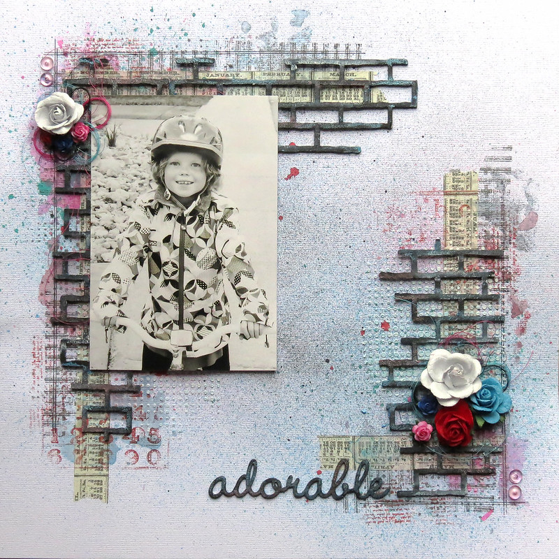
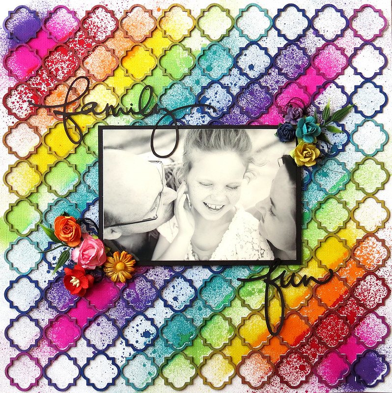
The first project is a layout created for the parents of this precious baby who has been such a miracle of life.
"Sweet Dreams"

When I asked the parents to give me the color scheme of this baby's nursery they described these colours above which are exactly the colours of some of the papers from the Blue Fern Garden collection. I was then so happy to fussy cut, frames, bows and other images from those papers.

I framed the photo in one of the Ever After frames. I simply primed it with Gesso and then painted it using Shimmerz sky blue paint.

I treated the Frilly Heart behind the photo with the same gesso and paint to match the Blue Fern Garden Papers.

Finally the title was inked in blue fluid chalk ink.

<<<<<<<<<<<<<<<>>>>>>>>>>>>>>
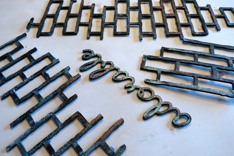
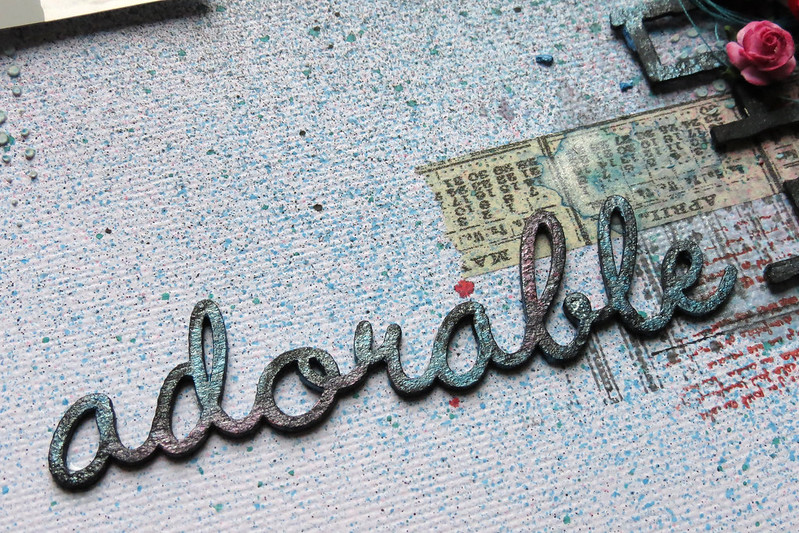
The next two projects are very near and dear to my heart. I created them for two very special people in my life. Both these people asked me to create Gratitude Journals for them and I thought it would be great to include some Blue Fern Studio Chipboard on the front cover.
"The Book of Gratitude"

I bought 2 hard cover journals at the dollar store. Then, using some of the Blue Fern Garden papers I covered both front and back. To blend the paper seam to the cover's background I used light moulding paste and a brick stencil.

I used the tree from the Descanso Garden Set, a little bird and one of the Veranda cages. I have a tutorial below describing how I created the tree. The bird was painted in silks glaze paint and the bird cage in brown fluid chalk ink.


Here is the tutorial on how I created the texture on this tree:


<<<<<<<<<<<<<<>>>>>>>>>>>>
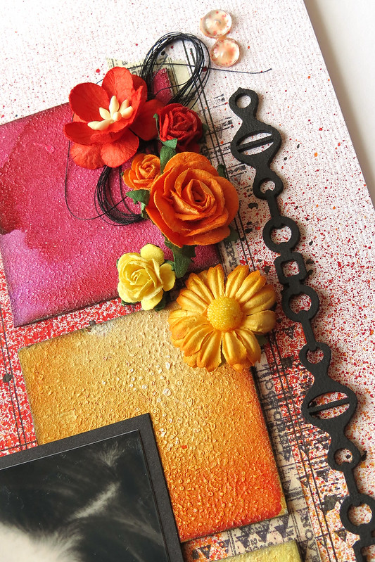
"The Book of Gratitude"

This is the second book of gratitude I created. Its a little different than the other one but still unique on its own.

I used a different set of Blue Fern Garden papers to cover this journal. Then, I also covered the seams with some stencilled moulding paste. This time I used a different stencil to mimic the pattern on the Blue Fern Garden paper.

I used two different shades of Silks glaze paint to cover all the different flowers on the cover as well as the mini butterfly.
The Lattice fence was roughly covered with gesso leaving parts unpainted.

I try to find things to be thankful and grateful each and every day.
I hope you sit back today and find something to be thankful for.
Thanks so much for visiting the Blue Fern Studios Blog
Have a wonderful day!!!
Keren