Tuesday, July 21, 2015

Bente's July inspiration.

Hi, I hope all of you in the northern hemisphere are enjoying a lovely Summer, 
and that the Winter is not too bad on the rest of you :-) 

Today I have some layouts to share with you that are absolutely 'fresh from the press' so to speak.
I was in the UK last week celebrating my eldest daughters graduation from university and 
when I got back I had to finish my projects rapidly!! 
-But with such awesome products to play with it's not a problem:-)


My first page is based upon a pink paper from the Montage collection. 
On top is a paper from the Deja Vu collection. As yo can see the collections mix very well.
-Especially when you add a litttle mixed media here and there. :-)
I 'framed' the whole page with the largest sized Graduated Squares, painted white then inked around.


 The gorgeous piece of chipboardbelow the picture is one of the recent shapes and called
  Rock Wall Bits. I painted it beige , stapmed on it and addedsome pink glitter. The part of the Grunge Frames chipboard piece above the photo was given the same treatment. I just love to add glitter to my pages at the moment :-)


The cute small dots scattered all over my page are the insides of then alpha stickers that I used.


I used the Montage collection for my second project. I love all the lovely yellow papers in that collection:-)


And here are some close ups of the details.

I used one of the Memory Frames as my title and hid it partially behind my photo.


The arrows are from the Directions set and simply painted black.


Making banner-pieces or mats behind the photos are such great ways to use up those left over pieces from your favourite patterned papers.


And finally here is my page for the current sketch challenge that you can find HERE.


The chipboards I used are:
Laughter, Happy, Smile and Floral Clock.

And a closer peek at some of the details:


That's all from me for today!! 
Have a good week! 


Monday, July 20, 2015

A Little Bit of Chipboard

Sometimes it takes just a little bit of chipboard to bring your project together.  Today we thought we would share some projects by members of our Creative Team showcasing the inspiring ways they have used chipboard for things other than layouts. 

Chipboard is awesome to use on a canvas, as you will see from the examples below.  It is easily attached with glue, and adds just the right amount of dimension and interest.


On this close-up of Yuko's canvas, you can see how she has so beautifully used chipboard that adds dimension, but blends in so well with her background.


This is an example of how Marie-Josee has used our Wonderland Tree as the focal point for her canvas.


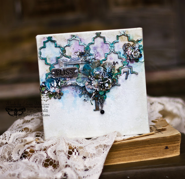
The chipboard piece Elena has added to her background was the perfect starting point for her artsy canvas.  From there, she built her layers on top of it..


Jelissa's canvas comes together with a chipboard title (and don't you love that frosty chipboard border she has under the title?). 


Keren has used a chipboard clock to represent time on this art journaling page.


Sometimes a little dimension is all you need.  Kim has tucked in some painted chipboard pieces on her altered clock.


Thanks for stopping by today.  We hope you have enjoyed this look at how many ways Blue Fern chipboard can be used on ALL your projects!

Saturday, July 18, 2015

One Paper Two Different layouts with Deja Vu- By Keren Tamir


Hello Blue Fern Studios Fans. Its Keren here and I have a fun twist for you this month. 
I created two different layouts using the exact same paper for the background.
I used the Friperies paper from the Deja Vu Collection and you wouldn't even know its the same paper as both layouts look completely different.
By changing colours, texture and products you can create two totally different projects with the exact same paper as a background.

Here is the first one:

"Puppy Kiss"


This is a picture of my daughter kissing our new puppy.
I stamped the background using the Deja Vu stamps. Then I splattered with different colours. Finally I used the tattered diamonds bits to give the background some more texture. They were inked with orange distress ink and then embossed in a creamy color.


I framed the foto in one of the heart hugs. I cut the word kiss out of the heart and used it for the title. Then I was left with the heart which I used for framing. The heart was also inked and embossed like the tattered diamond bits were.


<<<<<<<<<>>>>>>>>

"Thankful for you"

This is the second layout I created with the Friperies paper from Deja Vu but this time I used green and teal hues.


I also created lots of texture in the background using texture paste and splatters.


I used "Valerie's Window" behind the photo as I wanted it to mimic the flower arches in the picture.


I used the Chelsea Vines to add some magical feel of the garden I created around the photo. I wanted to transport people into the photo of this beautiful garden.


Finally I used the word "Thankful" as a title. All chipboard pieces here were coloured with green distress ink and then splattered with both black and white water-colour paint.


Thank you so much for visiting the Blue Fern Studios blog
have a wonderful day!!

Keren

Thursday, July 16, 2015

Layouts Featuring Paisely & Vine By Debbie

Hi everyone, Debbie here with you today to share some layouts I created using the Paisley & Vine Collection which was introduced a few weeks ago.  I love the warm tones of the papers.

On  my first layout I used Bohemian, Nature, Vineland and Playing Card papers and added some masking, misting, paints and microbeads.

The Circle Flourish Chipboard surrounds my photo.  I first applied some gesso to the chipboard and then added some misting, water colors, gelatos and microbreads.

I painted a piece of the Quartre Foil chipboard with some yellow and blue paints and added more microbeads and tucked the chipboard behind the flowers.

Here I've used a piece from the Layering Stems chipboard, which I painted with watercolors and gelatos and added more of the blue microbeads.

My next layout was based on the July sketch.
I used the Nature, Pathway, Splendor, Passion and Playing Card papers along with some masking and inking.

 I incorporated 2 chipboard pieces as a base for my picture, Frills Panel and Vintage Labels.  Both pieces were embossed using a number of products to achieve the aged look.

Tuked beneath the flowers is a Leafy Page Accent and Mini Rings chipboard.  Both of which I embossed and inked.

More pieces of the Mini Ring Things chipboard with some gold microbeads.

My final layout you saw earlier in the month on the blog, again using papers from the Paisley and Vine Collection.
I used the Whimsy paper as my background, which I lightly
applied light pink ink around the outside of the paper.  I also used Playing Card and Passion papers from the collection.


I inked the chipboard Perfect with some dark red ink and placed pieces of the Framington Medley chipboard, which I embossed with white powder and added some blue ink around my picture.

A gorgeous Royal Monarch chipboard butterfly embossed white and placed within a flower cluster is the perfect touch!

I hope you enjoy my layouts!

Thanks for stopping by!
. . . Debbie

Tuesday, July 14, 2015

My first blogpost for Blue Fern Studios. Mixed media layout and a pocketletter .


                Hello, my name is Wilma Voermans and I am a new team member at Blue fern Studios.
                                I live in the beautiful Bernese Oberland , Switzerland.
                     Talking English is not that difficult, but in my writing can be mistakes.
                                            I hope you will forgive me this.

                                  My first love is abstract mixed media on big canvas.
                     It is a side of my creativity I never show, because it is something for myself.

                        A few years ago I discovered scrapbooking and I was addicted right away.
                    Scrapbooking is so versatil , so many styles , techniques and materials can be used .
                                       Getting the mood of the picture,  be creative ,
                                       and make a keepsake for the next generation.
                                                         What more can we ask for?

                        Next to this I do Project life and my new addiction: pocketletters!

           Lets start with my first project for this post.......a vintage mixed media scrapbook page.
                                    Vintage and flowers is not my first to go to style,
                                     but I have a daughter that loves to dress vintage...
                                           Those pictures have to be scrapped too :)


                               My inspiration to start was the Love Story collection paper Concerto:

I used the black and white side to start.
But than I sort of lost myself with paints and medium.
But that doesn't matter, I had the feeling of the paper in mind.
For my layers behind the picture I also took leftovers from the Cottilion paper.


I knew I was going to use the tattered diamonds bits, so I took a stencil with the same shape.
The pink diamonds you see in the background is a mix of ink and translucent embossing paste.


For the chipboard I first painted it with black writersink.
It is deep black and you dont need to cover the chipboard first.
After it dryed I painted roughly over it with distress paint in Tarnished brass.


Lets go to my Blue Fern inspired pocketletter.
If you start with them, look out......it is highly addictive.
Not only is it great to receive real mail, it is fun to make somebody, somewhere something nice.

Pocketletters can have themes and  any kind of style.
Vintage, modern , colorfull, funny , cute etc etc
It are 9 cards and you add them in those baseball sleeves.
The card size is ATC , 2,5 x 3,5.

There should be a short (or long ) letter in one of the sleeves.
And you add some treats in the sleeves.
Little embellishments, a teabag, little tags, emphemera, well....anything goes.
There are groups on facebook for pocketletters swaps and it is a real hype at the moment.

For me it is not about the things that come with my letters.
 I love it when I see my swappartner made something with love and fun. 
Untill now I (almost) always got lovely letters and I like to save them as they are.
 I leave everything in it. 

The most fun letters for me are the ones with the themes: 
about yourself , your surrounding, country  , what do you like and so on. 

But I keep writing about them......lets have a look.
I decided to keep this letter calm, offcourse to see the beautiful background paper.

I used only one sheet of paper:

Cut it up to 7,5 by 10,5 

On the backside I mark the paper in 9 pieces..

At this point you can make your background or first cut them up.
I just did something with a stencil and distress ink before cutting

I have leftovers pieces from the 12x12 sheet.   I fussycut flowers and borderpieces from it.
I also used my Blue Fern stamps in the background and made embellishments with them.


Here the finished frontside:

On the backside I did not do to much, I love the print from the paper, and it is filled with little treatments anyway.
As you see, I added vintage poststamps, lace, flowers, a (real) dryed edelweiss, little shoes, a bookmark , mini incense, some BFS chipboard and offcourse the letter.
There is one pocket empty, I want to add a minipicture from her granddaughter in it.
I took it from her profile , so I dont show it here.... for her privacy.

I hope you like my first blogpost, have a great day!