Sunday, March 20, 2016

New Chipboard Designs from Blue Fern Studios

It's spring and what better time to introduce some new chipboard!  We have a great assortment from two designers, Michele Singh and Mina Arutynova.


First up are a couple of beautiful frames designed by Michele Singh, along with a title that is perfect for all those photos of cousins!

 Rose Shield


"Cousins are Friends for Life" title


Looped Frames


Our next set of designs are from Mina Arutynova.  She has created a set of smaller frames, titles for each season of the year, and two elegant borders.


Mini Frames


 Seasons


Diamonds and Loops


Dangle Border


Thanks so much for taking time to stop by and see our new chipboard pieces.

Saturday, March 19, 2016

Karolina's March Projects

Hi everyone!It's Karolina here. Today I would like to show you my three March projects. I created a layout and two cards using the newest collection from Blue Fern Studios - Courtship Lane and a Blush collection. First collection is very shabby with a lots of soft colors perfect for all your spring projects. While the second one is very vintage.
Take a look for my projects :)

Cards
I prepared two simple cards using Courtship Lane Collection. Like I said - it's very soft, romantic and shabby,


 I covered chipboards using chalk ink. It's really simple and quick solution to paint our chipboard pieces. I also added some stamps in the background to make more contrasty accents.


Papers: Courtship Lane collection - Calling Cards, East Plaza, Lover's Lane, Parkway
Chipboards: Petite Boutique Frames, Leafy Page Accents
Stamps: Forever


Enjoy the journey


My second projects is a layout. In the photo you can see me, my best friend Mariusz and our swedish mom Annki. We made this picture when we was in Sweden in the autumn.


Although Timeless collection is very vintage, your projects do not have to be! Look at my layout and then you will see :)


I mixed these beautiful browns, beige and black papers with magenta, pink and yellow amber accents, that's why I obtained very interesting not-vintage effect.


I decided to use a beautiful chipboards piece "Enjoy the Journey". I covered it using a gesso and a yellow amber mist and two different collors of glitter.


The same colors I used in the background and I added some shiny glitter stains too.


Papers: Timeless collection - Freedom, Calling Cards,Couture, Song, Main Street
Chipboards: Enjoy the Journey
Glitters: Autumn, Burnt Cooper

Thank you for visiting Blue Fern Studios blog today. See you next time in April!

Karolina


Friday, March 18, 2016

Keren's Projects with Courtship Lane Collection


Hello Everyone!!
Its Keren here with two projects for Blue Fern Studios!
I usually create two layouts but this time I wanted to create something different with the Courtship Lane collection.

"Home Sweet Home Memories"


I really love the vintage house images on the Courtship Lane papers so I fussy cut them to fit into my three part shadow box frame.
I cut three different houses to fit each of the boxes as they measured 3,4 and 5 inches squared respectively. The houses were cut out of the West Plaza, East Plaza and Calling cards papers.


The middle box was framed with one of the graduated squares. The right box was framed with the Memory frame. Finally I placed the Iron Signage chipboard on the top corner of the left shadow box.
All three chipboard pieces were embossed in both Oatmeal and Sage embossing powders.
Then I added a "Home Sweet Home" phrase out of the Calling Cards paper to add to the sign.

I added some matching  Courtship flowers and other vines to embellish around the frames as well as the Evening Lamp Post  chipboard which was simply painted with acrylic paint.


<<<<<<>>>>>

"Sail Away"

For my second project, I used the Town Gossip paper from the Courtship Lane  for the background.


I framed the photo in one of the Beaded Strings chipboard which was embossed with Tangerine embossing powder. I also added the swirly doodle under the photo. I cut it in half so it would show under both ends of the photo. Both the light house chipboard piece from the "By the Sea" set, were embossed in Ginger embossing powder


The sail away title was sprayed in brown to match the Courtship Lane flowers.
I also used the Journey stamp to create some texture in the background with brown ink.


Thank you so much for visiting the Blue Fern Studios Blog

Have a wonderful day!!

Keren


Thursday, March 17, 2016

Social Media Update and Some Featured Layouts!!!

We love it when you share "your" Blue Fern Studios projects on our Social Media sites! 
Don't know where we are? 
We've just made it a little easier by placing our Social Media icons at the top of our right hand sidebar. 
See, right over there to your right.

Our Creative Team works hard to give you great inspiration right here on our Blog. So, we hope you're following us on Bloglovin' or by email.

We also strive to do daily updates on Facebook, Pinterest, Instagram and Twitter. You Tube gets updated at least 3 times monthly, usually on the 3rd and the 22nd plus one additional rotating day. 

While we are "out there" posting in Social Media, we look around to see who has tagged Blue Fern.
 Why?
Because we want to see YOUR work, leave you some love and because we want to Feature you right here on our Blog!!!

So, create something fun, tag us when you upload to your social media and then start visiting the Blue Fern Studios Blog on the 17th of every month to see if you got featured!!!

This month we are focusing on our Instagram account. 
That's the little camera icon … or here is the link if you want to grab it:
While we've been perusing our Instagram tags, we've found some terrific projects.
Here are just a few:

@tyemel

Ginny Hickmott of Wales using Timeless
@ginny_hickmott006


Laura Gilhuly 0f Canada using Timeless
@angelbearscraps


Chobi of Tokyo, Japan using Frolic
@Atelierand


Tomoringo of Osaka, Japan using Frolic
@tomoringo1031


***
It's also interesting to see which of our Creative Team projects are YOUR most "liked." 
This month on Instagram, these were your top 3 favorites:
(although this changes moment by moment!)


That's it for today. 
Be sure to follow us, tag us and check in on the 17th to see if you were featured! 
Have fun creating! 

Wednesday, March 16, 2016

March Layouts by Maja

Good morning, BFS Fans, welcome to the blog today :) It's Maja here to share three layouts I made using our latest collection, Courtship Lane. 
Ladies first, so let's start with a girly page :)


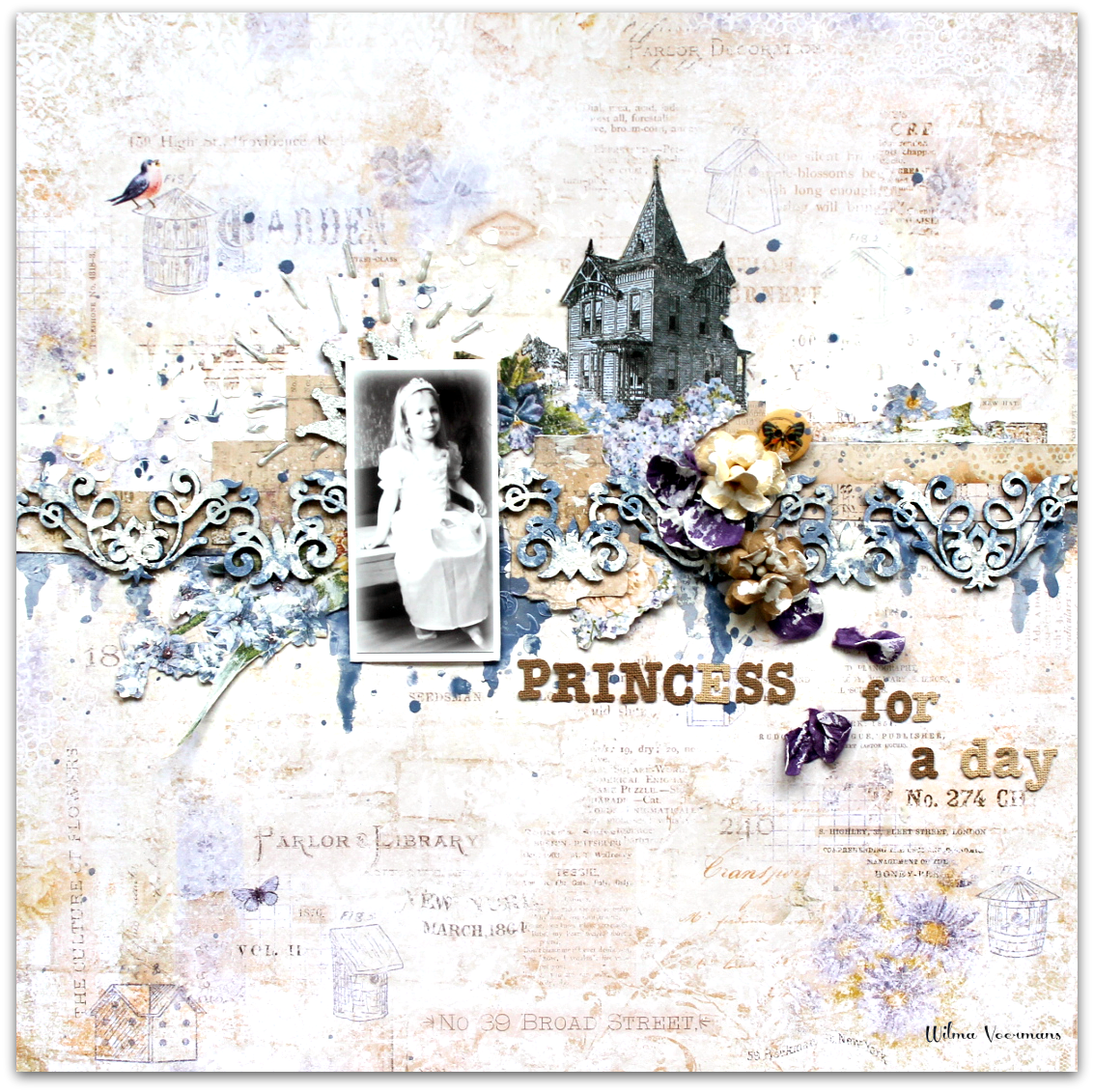
I like to layer papers for the background and add stamps - and so I did here. For the top layer I chose the Concert Hall paper as the young lady in the photo plays the violin. I also matted the photo with various papers and formed a semi-frame using Whimsy Flourishes, "closed" on the other side of the photo with the Village Sign Post piece embossed with Copper ep. Then I added some flowers and embellies:


The title word "Happy" is embossed with three eps in the purple palette for an ombre effect:


Papers: Calling Cards, Concert Hall, West Plaza, Royal Street
Stamps: Deja Vu, Forever, Vintage Edges
Chipboard: Whimsy Flourishes; Happy, Heart, Love;Village Sign Post
EP: Iris, Lilac, Mystic Plum, Verdant, Copper

For my second layout I opted for a cheerful spring palette of colours. This time the background features only one paper, Parkway, and no stamps.


I used several designs to mat the photo and they fill the beautiful frame Clip Frames set. I added colour to it with two shades of green embossing powders: Sage and Lime. I made the words stand out by embossing them with Oatmeal ep. Together with the large "Handsome" piece (embossed with Honey) they form my title:


Then I added some chipboard accents from the Arrow Words and Directions sets - to highlight them against the green frame I used Copper ep to emboss. I also added pieces of the Chickenwire Panel that I left saute.


I use flowers also on my boys' layouts, as they still don't mind ;) Here I used beautiful Courtship Blooms and Courtship Roses:


Papers: Parkway, Royal Street, Calling Cards
Chipboard: Handsome, Arrow Words, Directions, Clip Frames, Chickenwire Panel
EP: Sage, Lime, Copper, Oatmeal, Honey

And finally my last layout for March for which I chose orange tones of papers and embellishments:


I composed my background by tearing the house image off the West Plaza paper and layering the rest upon the Lover's Lane sheet. Then I added some stamping and a backet pattern using white modeling paste and stencil and then splashed some tangerine, golden and white mists:


Using two pieces from the Circle Groups I arranged a triangle-shaped design under the photo. I embossed them with Ginger ep and added some pieces from the Cogs & Gears set. I embossed them with Nutmeg ep for more contrast and placed upon or inside the circles:


One of the Arrow Words makes my title - I embossed it with Copper ep because it's very glittery and really makes this small piece pop out:


To finish off my page, I added some Courtship Blooms and metal charms:


Papers: Bourbon Avenue, West Plaza, Royal Street
Chipboard: Arrow Words, Circle Groups, Splattered Circles, Cogs & Gears
Stamps: Widgets
EP: Honey, Ginger, Copper, Nutmeg

I like how by selecting papers I could concentrate on main colours of the collection - green, purple and orange - separately to create varied backgrounds and climates for my pages.

That's all for today, thank you for visiting and see you later!

Maja

Tuesday, March 15, 2016

A Look Back at Timeless

Today we thought we would take a look at our popular Timeless Collection.  I noticed a theme in each of these layouts created by members of our Creative Team.  The theme seems to be family.  Timeless is defined as: not affected by the passage of time.  We all have different reasons why we love to create layouts, and one of those reasons is to preserve memories.  Those memories that are most dear to us are truly timeless.  The love we have for our family is timeless.  This collection, with its gorgeous vintage images, is perfect for recording your memories.

Marie-Josee Hamel


Karine Gagnon


Bec Genet


We hope you enjoyed this look back at the Timeless Collection by Blue Fern Studios.

Monday, March 14, 2016

3x Layout inspiration by Wilma

When I got the Courtship lane collection I saw so many possibilities.
It is just hard to decide which paper to use first ;) 
My first layout is made after the March sketch.
The picture is not the best quality... but I love it so much.
She was walking and acting like a princess that day, but also princesses get tired and soar feet.


The sketch:

For my background I used the beautiful Royal street paper.
And I fussy cut a  few parts out of the West Plaza paper.


The beautiful chipboard  Symphony  was first gessod, than sprayed with colormist in the wet gesso.
Than I took a white piece of cardstock and depped it here and there.
The white shows through and you are left with a great background for a card and colored chipboard..

A few Blue fern flowers and finishing touches ....

*******


This next  layout was super fun to do.
Playing with color just makes me happy.


My background is made with ecoline watercolor and some Blue Fern Studios embossing powders.
The stamp I used in the background  comes from the Texture1 set .

I cut up the Mod Square panel, and embossed it not to neat with pearl embossing powder.

*******

The last layout for today is also made with the Courtship lane collection :


The chipboard flowerframe and the titel  are colored with Gansai Tambi watercolor.


Thanks for visiting the blog, I hope you liked my post.
x Wilma x