Tuesday, April 22, 2014

1960 by Lisa Griffith

Hello there! 
It's my turn to share my projects that I made this month. For both my layout and my card
I used the same techniques on my chipboard pieces , and I really love how they turned out.

The first project is a layout featuring a photograph of my Grandma....

'1960'


Here I have used a gorgeous Blue Fern Studios chipboard called 'Blooming Flourish.' I will try to show a close up below so you can see how a few simple techniques can alter your chipboard to make them look so beautiful. First I covered the chipboard with Viva Croco Crackling paint in white and set it with a heat gun to get an amazing weathered and cracked look. Then I covered the chipboard with a deep purple ink and let that dry. Last step is I applied embossing gel around the edges of the chipboard and then embossed them using silver embossing powder.  Really love the final result, it made the pieces look really aged and added so much character to my projects. 
I hope you'll try it!

Here are a few close ups...


I also made a card using an absolutely stunning Blue Fern Studios piece called 
'Damask Motif' that I treated the same way as I mentioned above, 
and really let this piece be the star. 


I started with the Blue Fern Studios paper called 'Parlour' as my base and then applied 
gesso, purple mist and some stamping underneath the altered chipboard.

Here is a close up..


I hope I have inspired you a little to alter your chipboard, 
and have fun playing with some textures! 

Until next time,
Lisa 


Monday, April 21, 2014

Kelly's April Projects

Hello there, Blue Fern fans :)
Kelly here today. I have a long post...three layouts today, so I'll get right to it!!

"So Sweet"

For this one, I went back to one of my all time favorite pieces of BFS chipboard...the Floral Clock
I covered this piece with embossing ink, then sprinkled three different embossing enamels..gold, ivory, and copper for a variety of color and texture. For the clock center I added another clock embellishment and clock hands.


Tucked into the bottom of this cluster is another "older" favorite, the Ornate Medallions. This one was also given a coating of copper embossing enamel.


"Perfect Moment"

I chose to use the gorgeous Blue Fern Garden papers for this one, as the colors worked perfectly with my photos - I love when that happens!

I started with the "Boudoir" paper, and layered strips from other Garden papers.  Over the paper strips, I added  two of the Jeweled Page Dangles, which were embossed with a light pink embossing enamel. I also have used one of the Flourish Hearts, which I cut apart and tucked the heart half, and the flourish half on either side of my photos.


"I Love You So"

For this one, I fussy cut the beautiful rose and bird cage motifs from the Blue Fern Garden papers, and placed them strategically on my page.  Below I have used one of the Memory Frames, simply painted white.


I added one of the Grande Cages, which was first painted white, then given a brushing of chalk ink.


The small flower border piece below is the "cut out" from one of the Floral Hearts. Once again, I just painted it white to make it really stand out!


Blue Fern Products:
Floral Clock
Ornate Medallions
Blue Fern Garden: Boudoir
Blue Fern Garden: Calling Cards
Blue Fern Garden: Signature
Floral Hearts
Flourish Hearts
Grande Cages
Memory Frames
Jeweled Page Dangles.

I hope you've enjoyed my projects today :)
Have a wonderful week!
s
Kelly

Sunday, April 20, 2014

April Projects with Rae

Happy Sunday! It's Rae with you to share some projects I've made this month. 


Dream Layout

First up, I have my sketch layout. You may have seen it if you have checked out our April sketch challenge. Here is the lovely sketch:


And, here is my take on it using the Blue Fern Garden paper collection:


Here's a closeup of the "Beaded Strings" circle piece. I primed it with gesso, then used a blending tool with Frayed Burlap Distress Ink by Ranger. I finished the treatment by adding some random stamping with a text stamp in archival ink, and placed some bling on each of the "beads."

This piece from the "Ironworks Accents" set fit perfectly at the top of the layout. I primed it with gesso, then added some Ranger "cement" embossing powder, then lightly added some grey chalk ink for added distressing.

The "Blue Fern Flourish" is tucked under the flowers. I used gesso to prime (of course!), then added some green Distress Stain and some olive chalk ink after the stain was dry. 

If you haven't already, play along with us this month with the April sketch: April Sketch Challenge!


Butterfly Tag


For this tag I used three keys from the "Vintage Keys" set. I colored them with silver Izink without priming them first to create a "dull" look to the keys.


I painted this "Bohemian Butterfly" with glossy black paint with a sponge. When it was dry, I glued it to some pink paper, then cut around it. I topped it off with some crystals to accent the body. 


Dream Big Layout

And, the last project I am sharing today is this layout:


I tucked the "Seasonal Wildflowers" under the picture after coloring it with blue chalk ink and sponging on some walnut stain Distress Ink. I layered the different inks several times in random spots, and added some small blooms.

This title is from "The Optimist Word Set." I primed it with gesso, then added some Ranger embossing ink in turquoise. It was a little brighter than I wanted it to be, so I used some brown chalk ink to randomly tone down that blue. 

For the "Doily Bunting" I grazed it with black archival ink, then added some wired raffia along the "string," and then placed tiny blooms on each doily.


Thank you for letting me share my projects with you today! Enjoy the rest of your weekend!

Rae

Friday, April 18, 2014

So Much Gratitude and Thanks- by Keren Tamir


Hello Blue Fern Studio Friends
This post is very meaningful to me as its all about Gratitude and Thanks.
There are so many things I'm thankful for that If I list them here I won't have enough space to display my creations this month.

All three of my projects this month were created as a gift for three different people whom I love very much and are very special to me.
I'm Thankful and Grateful that I have them in my life!!!

The first project is a layout created for the parents of this precious baby who has been such a miracle of life.

"Sweet Dreams"


When I asked the parents to give me the color scheme of this baby's nursery they described these colours above which are exactly the colours of some of the papers from the Blue Fern Garden collection. I was then so happy to fussy cut, frames, bows and other images from those papers.


I framed the photo in one of the Ever After frames. I simply primed it with Gesso and then painted it using Shimmerz sky blue paint.


I  treated the Frilly Heart behind the photo with the same gesso and paint to match the Blue Fern Garden Papers.


Finally the title was inked in blue fluid chalk ink.


<<<<<<<<<<<<<<<>>>>>>>>>>>>>>

The next two projects are very near and dear to my heart. I created them for two very special people in my life. Both these people asked me to create Gratitude Journals for them and I thought it would be great to include some Blue Fern Studio Chipboard on the front cover.


"The Book of Gratitude"


I bought 2 hard cover journals at the dollar store. Then, using some of the Blue Fern Garden papers I covered both front and back. To blend the paper seam to the cover's background I used light moulding paste and a brick stencil.


I used the tree from the Descanso Garden Set, a little bird and one of the Veranda cages. I have a tutorial below describing how I created the tree. The bird was painted in silks glaze paint and the bird cage in brown fluid chalk ink.


Here is the tutorial on how I created the texture on this tree:


<<<<<<<<<<<<<<>>>>>>>>>>>>

"The Book of Gratitude"


This is the second book of gratitude I created. Its a little different than the other one but still unique on its own. 


I used a different set of Blue Fern Garden papers to cover this journal. Then, I also covered the seams with some stencilled moulding paste. This time I used a different stencil to mimic the pattern on the Blue Fern Garden paper.


I used two different shades of Silks glaze paint to cover all the different flowers on the cover as well as the mini butterfly.
The Lattice fence was roughly covered with gesso leaving parts unpainted.


I try to find things to be thankful and grateful each and every day.
I hope you sit back today and find something to be thankful for.

Thanks so much for visiting the Blue Fern Studios Blog

Have a wonderful day!!!

Keren

Thursday, April 17, 2014

Inspiration from Colors in the Blue Fern Garden Paper Collection by Joyce


The colors of pinks, roses and greens from the Blue Fern Garden (“BFG”) paper collection inspired me to create this collection of a layout, a 6 x 6 card, and an artist trading card collection.  A lot of fussy cutting took place to capture all those glorious colors, prints and patterns and assemble them onto the collection.

Layout:

 
I used the pretty rose pattern from the BFG Signature paper to create the basis of the composition of the layout.  No, your monitor is not blurry, that photo of the kids is blurry, a defect from the camera or the photographer in those days.  Sadly, the shoes are more in focus, and unfortunately, a lot of these old pics I inherited are blurry.   But on to the best part… those chipboard dangles! This one is the Flutter Page Dangle.  I cut off the butterfly portion of the dangle and placed it on the other side of the layout on top of the rose pattern paper.  It looks more like a “flutter fly” than a “butterfly” because I applied mists of water to separate the cardboard to make the wings look like they are in motion. I love the dangle chipboard pieces because they are so versatile and you can cut them up too.

Treatment of the Dangle: The dangle was created by first applying white dauber, light green mist, and a darker mist.  To add depth, you sporadically cover the chipboard with the two mists (allow to dry between applications) and carefully allow some overlapping but not too much or you’ll only create one color. After the applications of mists dry, add some detail with a black marker, or water color pencil around various areas.  Try to create larger sweeps of the application of the marker, or watercolor pencil, in some areas and go over them with a white gel pen to add little dots to create further detail.  A simple treatment with lovely results.


Artist Trading Card Collection:

It was time for another artist trading card collection,  and I quickly set about creating this collection with my left over scraps of the “Signature” page to BFG paper collection.  I thought the rose pattern on the paper would add a lovely base layer on the cards.  More,  BFG papers were used to create the torn textured layers on top of the base paper.  I strategically placed the torn textured papers so they would not cover up the rose pattern on the base layer.  The BFG papers are really sturdy and can stand mixed media applications very well.  The little flowers are the result of using a flower punch over the rose pattern areas on the BFG Signature paper, and the centers were filled with beads, and a specially formulated glitter mixture from my forensic scrapping buddy which consists of red glitter and various sized micro beads. The glitter mixture looks like candy and is so pretty on chipboard too.


On the cards, you’ll find the window frames from the “petite window” chipboard collection. 
Treatment of the Petite Windows:  Each petite window was treated with a coat of white dauber, one light sporadic application of a light green colored chalk ink, one light sporadic application of a medium green colored chalk ink, and a light spray of a darker green glimmer mist in which I let the liquid of the mist run in various places making sure not to let it cover the entire frame. Applying the inks and mist sporadically over the frames creates interest and depth.     Some gold pen, black and white markers were used to highlight certain areas on the frame too.
 
6x6 Card:


This is the second of my “Women of Substance” card series. I used the BFS April sketch for the basis of the card. The card series is dedicated to the women before me from my maternal line of the family. I’m introducing these women to my 20 year old niece and future generations. Each of the 6 x 6 cards will have a picture of the woman, and inside the card, I will write a biography for the women I knew. And, for those few photos I  have of women from the 1800’s, I’ll incorporate some historical facts to enlighten my niece of what life must have been like living during that period so that she will know what it was like living before the Smartphone and her Twitter account. J  Each card will be mailed to my niece in intervals, and I hope she thinks of them as gifts when she receives them in her mailbox. Hmm…I foresee in he near future, a decorate box using BFS chipboard to store these cards.
Here’s Ginger from the 1950’s, I’m certain her hairstyle gave that a way.  All the papers on this card are from the Blue Fern Garden paper collection, including the fussy cutting papers.  Some of the papers were stamped, gesso’d, torn, and stamped some more to add texture and interest
to the front of the card.  I have used the “Ever After” frame, and Turkish bits chipboard pieces from “BFS”. The size of the chipboard frame is just perfect for the 6 x 6 card.  The frame was treated very similarly to the Petite Windows except a stencil and molding pasted was used to create the raised circles.  The card was pasted on another piece of Blue Fern Studio’s paper.  I don’t normally leave a piece of chipboard undressed, but the Turkish bits added some balance in the composition lighted painted with a white dauber, and a pretty bead.
Thank you for stopping by, and I hope I have inspired you to do something similar for those women who came before you and to share some of your family history with your future family.  And, of course, add some beauty by using some BFS chipboard to your creations.  


Wednesday, April 16, 2014

Chipboard alteration tutorial by Marie-Josée

Hello all!

Today, I have a quick and easy chipboard alteration tutorial for you.

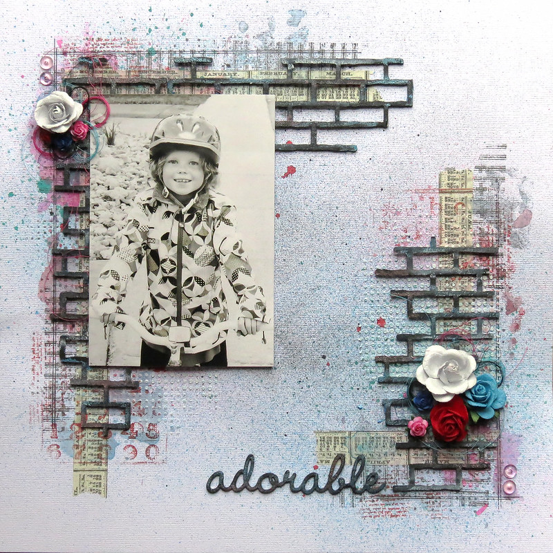
Here's the layout I created with the altered chipboards. I used chipboards from the Shabby Brick Bits set and the Good Vibes set.

We usually prime our chipboards with white gesso, but for this layout, I used black gesso instead to create another effect.


To alter your chipboard, you will need:

- Black gesso
- A sponge
- Various colors of Faber-Castell Gelatos (choose them according to the colors of your project: here, I used white, metallic blue and metallic pink)
- Paintbrush
- Water

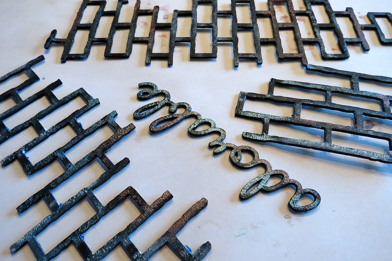
1) Alter your chipboard with black gesso. Apply it with the sponge, it's easier and less messy. Let dry or dry with a heat gun.


2) Apply various colors of Gelatos randomly on your chipboard.


3) Dip your paintbrush in the water and blend the colors. Don't use too much water. Let dry or dry with a heat gun. Once dry, if needed, add more color.


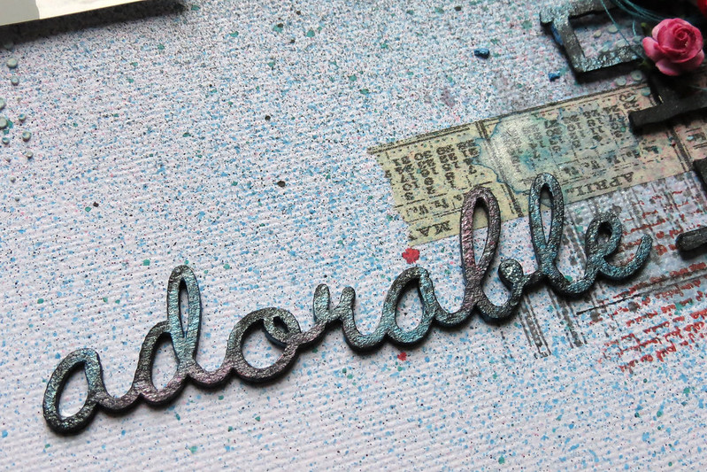
Here are some close-up views of the altered chipboard on my layout.