Showing posts with label Frolic. Show all posts

Tuesday, April 26, 2016

3 different collections with Yuko


Hello!Blue Fern Studios funs!
It's Yuko here!


【WHAT  A  wonderful DAY】
My family went to the memorial trip last month married 10 anniversary.
We took the photo at the same location as 10 years ago!

It was a wonderful experience!

Precious memories!

Because I wanted to express the clean and gorgeous feeling of Chapel

I chose this TIMELESS collection!


 Used tulle and white bird with the image of a wedding.

Clipboard (dangle) was embossed in parl.
It is clean out a little luster.

Such as the pattern of the letters and these bottles of paper
I feel good looks very little vintage.

Also processing the embossed of parl to the heart of the chip board,
 put a gold liquid Pearl from the top that.


<Blue Fern Studios>
Paper :  TIMELESS Artistique/ Calling Cards/Couture
Chipboard  : Romantic Page Dangles/Lace Heart Border
Embossing Powder/Pearl


【Journey】
These photos were taken by a Taketomi Island visited on the trip.

Because it was the color to red point
I chose the photo that is reflected in the bright red hibiscus and bougainvillea.


After the chipboard colored with ink
I was tracing with a pen of lame.


Chip board of the film was embossed with oatmeal.
Really this color is an excellent color can also be used to elegant to casual!


<Blue Fern Studios>
Paisley & Vine : Bohemian/Pathway/Playing Cards/Splendor/Whimsy
Chipboard : Journey, Explore, Discover/Film Strips/Directions
Enbossing Powder/Oatmeal


The other work is using the April sketch.


Paper used was a little nostalgic Frolic Collection.

The title was used for embossing powder 14karat.
This color also uses well with your favorite !


And Circle punch the card stock in the background, using the created template
I put a glitter paint a bond there.

This color and is beautiful!
The name is CARIBBEAN.


Finely skip the white paint
To have toned down as multiplied by the veil softly.


Blue Fern Studios
Frolic Collection -  Adorn/Friendship/Petits Moments
Chipboard-Brilliant, Amazing, Dazzling
Embossing Powder -14Karat
Gilitter-CARIBBEAN


Thank you!


Thursday, March 17, 2016

Social Media Update and Some Featured Layouts!!!

We love it when you share "your" Blue Fern Studios projects on our Social Media sites! 
Don't know where we are? 
We've just made it a little easier by placing our Social Media icons at the top of our right hand sidebar. 
See, right over there to your right.

Our Creative Team works hard to give you great inspiration right here on our Blog. So, we hope you're following us on Bloglovin' or by email.

We also strive to do daily updates on Facebook, Pinterest, Instagram and Twitter. You Tube gets updated at least 3 times monthly, usually on the 3rd and the 22nd plus one additional rotating day. 

While we are "out there" posting in Social Media, we look around to see who has tagged Blue Fern.
 Why?
Because we want to see YOUR work, leave you some love and because we want to Feature you right here on our Blog!!!

So, create something fun, tag us when you upload to your social media and then start visiting the Blue Fern Studios Blog on the 17th of every month to see if you got featured!!!

This month we are focusing on our Instagram account. 
That's the little camera icon … or here is the link if you want to grab it:
While we've been perusing our Instagram tags, we've found some terrific projects.
Here are just a few:

@tyemel

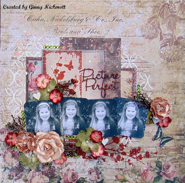
Ginny Hickmott of Wales using Timeless
@ginny_hickmott006


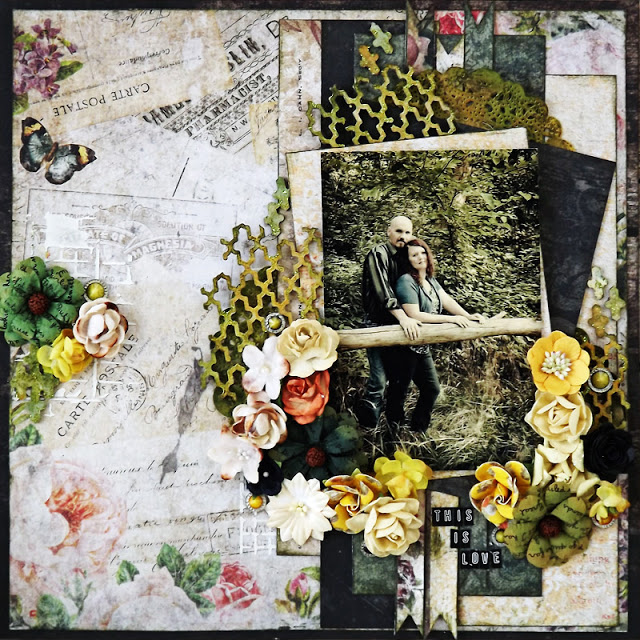
Laura Gilhuly 0f Canada using Timeless
@angelbearscraps


Chobi of Tokyo, Japan using Frolic
@Atelierand


Tomoringo of Osaka, Japan using Frolic
@tomoringo1031


***
It's also interesting to see which of our Creative Team projects are YOUR most "liked." 
This month on Instagram, these were your top 3 favorites:
(although this changes moment by moment!)


That's it for today. 
Be sure to follow us, tag us and check in on the 17th to see if you were featured! 
Have fun creating! 

Friday, March 11, 2016

March Creations by Nicole Doiron


How happy I am to be here with you again to share some more 
creations using Blue Fern Studios products.

Two of my layouts feature the beautiful new Courtship Lane collection,
starting with this romantic page inspired by the March sketch challenge.


This is the beautiful March sketch.  I'm hoping to see your take on it!


Like all Blue Fern Studios papers, Courtship Lane has elegant floral designs
and is centered on a Home Sweet Home theme.  And when I think of home, I think of love!
I used the Everlasting Love title which I covered in Imagine Ink Copper 
embossing powder and then dabbed in white paint.


Below you see the fancy Floral Vine which I embossed in Imagine Ink Copper, Sage
and Iris embossing powders.  I love the way the mix of colors turned out.


I did some stenciling on my background and mixed in different purple shades of stains.
I added a small piece of the Ironwork Accents set adorned with a purple gem.


All and all, a very soft color palette with a touch of copper to match the beautiful, 
albeit dead, rusted tree in front of which Yves and I posed in this picture.


Blue Fern Studios Supplies
Paper: Courtship Lane (Royal Street, Parkway, Calling Cards)
Chipboard: Everlasting Love, Floral Vine, Ironwork Accents
Imagine Ink Embossing Powder: Copper, Iris, Sage


My 2nd Courtship Lane inspired layout brings the 'home' theme home, so to speak.
I decided to scrap this old but precious family photo.  I have very few pictures of me alone as a baby
 or with my family, and the ones I do have are of very bad 1970's quality. This one, however, is certainly
a favorite of mine and I found that it was perfect for Courtship Lane.


Slipped behind my photo is the Princess Window which I've treated with 2 shades of Imagine Ink  powders,
Ginger and Nutmeg. I then lightly dabbed on some copper and white acrylic paint.


I did the same to this piece from the Leafy Page Accents set...


and this fancy hinge from the Ironwork Accents.


Other chipboard pieces used are the Reminisce word from Serendipity Words 2 and the Shabby Brick Bits
which I simply covered with Snow embossing powder.


Blue Fern Studios Supplies
Paper: Courtship Lane (West Plaza, Parkway)
Chipboard: Princess Window, Ironwork Accents, Leafy Page Accents, 
Serendipity Words 2, Shabby Brick Bits
Imagine Ink Embossing Powder: Ginger, Nutmeg, Snow


As you may know, I'm from Canada and, in my part of the country especially, we have the longest Winters!  
They always seem to drag on and on and on... So to warm myself up a little, 
I thought of using this adorable picture of my friends' daughters on a beautiful 
Summer day matched with the bright happy papers from the Frolic collection.


The beautiful blue background paper, Petits Moments, covered in different shades of blue mist reminds
me of a bright blue sky.  I decided to combine it cut out circles of the pretty butterflies
from Dans le jardin paper.  I love the combination of blue and yellow.


 I chose Sunshine Kisses as my title, using the Sunshine piece from the Optimist Word Set
that I colored in  Buttercup yellow Imagine Ink embossing powder.


Surrounding the picture is the Floral Medley Frame on which I used a mixture of Seven Seas,
Breeze and Azure embossing powders with added white paint.  You can also see below
the Mixed Media Poppies that I cut into 3 pieces to display across diagonally on my page behind the butterflies.


Lastly, I chose to add this sweet little heart and arrow from the Directions set... perfect to accentuate 
the adorable sisterly love between these two little girls!


Blue Fern Studios Supplies
Paper: Frolic (Dans le jardin, Petits moments, Calling Cards)
Chipboard: Floral Medley Frame, Mixed Media Poppies, Directions, Optimist Word Set
Imagine Ink Embossing Powder: Sevens Seas, Breeze, Azure, Buttercup


Whether or not it's Winter where you are, I hope I've added a little sunshine in your day with my projects!  
I can't wait already until next month's post!
- Nicole

Saturday, January 23, 2016

January inspiration by Pascale B.

Hello Sweeties,

Today I'm up on Blue Fern Studios blog for the first time. I have to say that I'm really honored to be part of this amazing Design Team.


For those who don't know me, I'm Pascale B. a working mom of 2 young adults. I live in the Loire Valley (France) well known for its beautiful castles and wines. I love to travel in and out my country and as I take a lot of photos during my trips, you will discover some of my finds in my projects as well as some of my ancestors... I mostly create layouts, but not only...

You can find my work on my personnal blog Scrap Made in Touraine,
some tutorials on Youtube,
and follow me on Facebook

------------------------------------

For the first project I choose a photo taken during a walk in the "Fairytales Gardens" of the Castle du Rivau (Léméré, France). It's a sculpture from Bassorade: " The Running Forest ".


I choose to made a really simple layout : some random stamping with the Brocade texture stamp, a touch of color for the background and some embossed chipboards. I used the Lucky powder on the small flourishes and the Ebony on the Dot Grid panel.


... some flowers colored with Twinkling H2Os and Primary Element.


And to finish I sprinkled Carrabean Glitter and Glass Glitter.


Blue Fern Studios products used:

Vintage Christmas: NoelFrolic: FriendshipPaisley & Vine: Bohemian Dot Grid Panel Mini Flourishes
Vintage Christmas
Noel
Frolic
Friendship
Paisley and Vine
Bohemian
Chipboard
Dot Grid Panel
Chipboard
Mini Flourishes
Stamp - Brocade Texture Imagine Ink - Embossing Powder - Ebony Imagine Ink - Embossing Powder - Lucky Imagine Ink - Glitter - Caribbean
Stamp
Brocade Texture
Embossing Powder
Ebony
Embossing Powder
Lucky
Glitter
Caribbean

-----------------------------------

For this second page I chose a photo I took in September of the Castle of Villandry (Villandry, France), well-known for its beautiful "Jardins à la Française" (formal garden). The new Timeless collection is just perfect for this kind of photo.


I started to protect the paper (Timeless - Artistique) with a layer of clear gesso. When dry, I added some colors coordinated to the photo. I also added a design to the background with the Brocade Texture stamp that I heat embossed with the 14 Karat powder.


I covered the chipboards with clear gesso before coloring them with some Twinkling H2Os. When dry, I used the Brocade Texture stamp to add some texture to the chipboards and I embossed them with the 14 Karat powder too.


I added some texture to the grape vines too: I sprinkled some Sage embossing powder when the paint was still wet and I love the result!


I die cut the the title in a cardstock and embossed it first the 14 Karat powder. I embossed a second time with the Ebony powder but I didn't cover it properly so the gold is still visible.


Blue Fern Products used:

Timeless - Artistique Love Story: The Grand Ball Love Story: True Harmony Quatrefoil Panel Moldings
Timeless
Artistique
Love Story
The Grand Ball
Love Story
True Harmony
Chipboard
Quatrefoil Panel
Chipboard
Moldings
Imagine Ink - Embossing Powder - 14 Karat Imagine Ink - Embossing Powder - Sage Imagine Ink - Embossing Powder - Ebony Stamp - Brocade Texture
Embossing Powder
14 Karat
Embossing Powder
Sage
Embossing Powder
Ebony
Stamp
Brocade Texture

-----------------------------------


And for the last layout I choose a photo of my great-grandparents's wedding in 1901.


I covered the background (Timeless - Couture) with clear gesso to protect it. When dry, I stamped randomly the background with a background stamp (Postal Texture) and an archival ink. I used a second stamp (Halftone) to add more texture and embossed the print with the pearl embossing powder. Then I added some colors to the background.


First I covered the chipboards (Framington Medley and  Marrakesh Panel) with clear gesso too, and added a thick layer of clear crackle paste. I let dry naturally. Then I colored them with different mica powders and fixed them.


I colored the flower and the leaves and I embossed the last ones with the sage embossing powder to add some texture.


I cut different papers (Autumn Anthology - Cottage and  Sanctuary - Calling Cards) and distressed them before adding them under the photo.


To finish the layout I added some mica flakes and I splattered black gesso mixed with gold mica powder.

Blue Fern products used:

Timeless - CoutureAutumn Anthology: CottageSanctuary: Calling CardsMarrakesh PanelFramington Medley
Timeless
Couture
Autumn Anthology
Cottage
Sanctuary
Calling Cards
Chipboard
Marrakesh Panel
Chipboard
Framington Medley
Stamp: Postal TexturesStamp: HalftoneImagine Ink - Embossing Powder - Pearl Imagine Ink - Embossing Powder - Sage
Stamp
Postal Texture
Stamp
Haftone
Emboosing Powder
Pearl
Embossing Powder
Sage