Hi friends!
Today I'm up on the Blue Fern Studios blog with a video tutorial for you. And I'm so excited about this one because it features the amazing new paper collection Sanctuary by our new designer Manuela Zimmerman. If you're a fan of shabby romantic papers like me, you must hoard this collection NOW.
So I found this beautiful winter scenery photo while searching for inspiration on Pinterest (it's December after all) and it is just perfect for the dark pensive tones of the Sanctuary papers. This collection may seem nature-themed, but I found it to be perfect for my winter layout as well. That's how versatile it is!
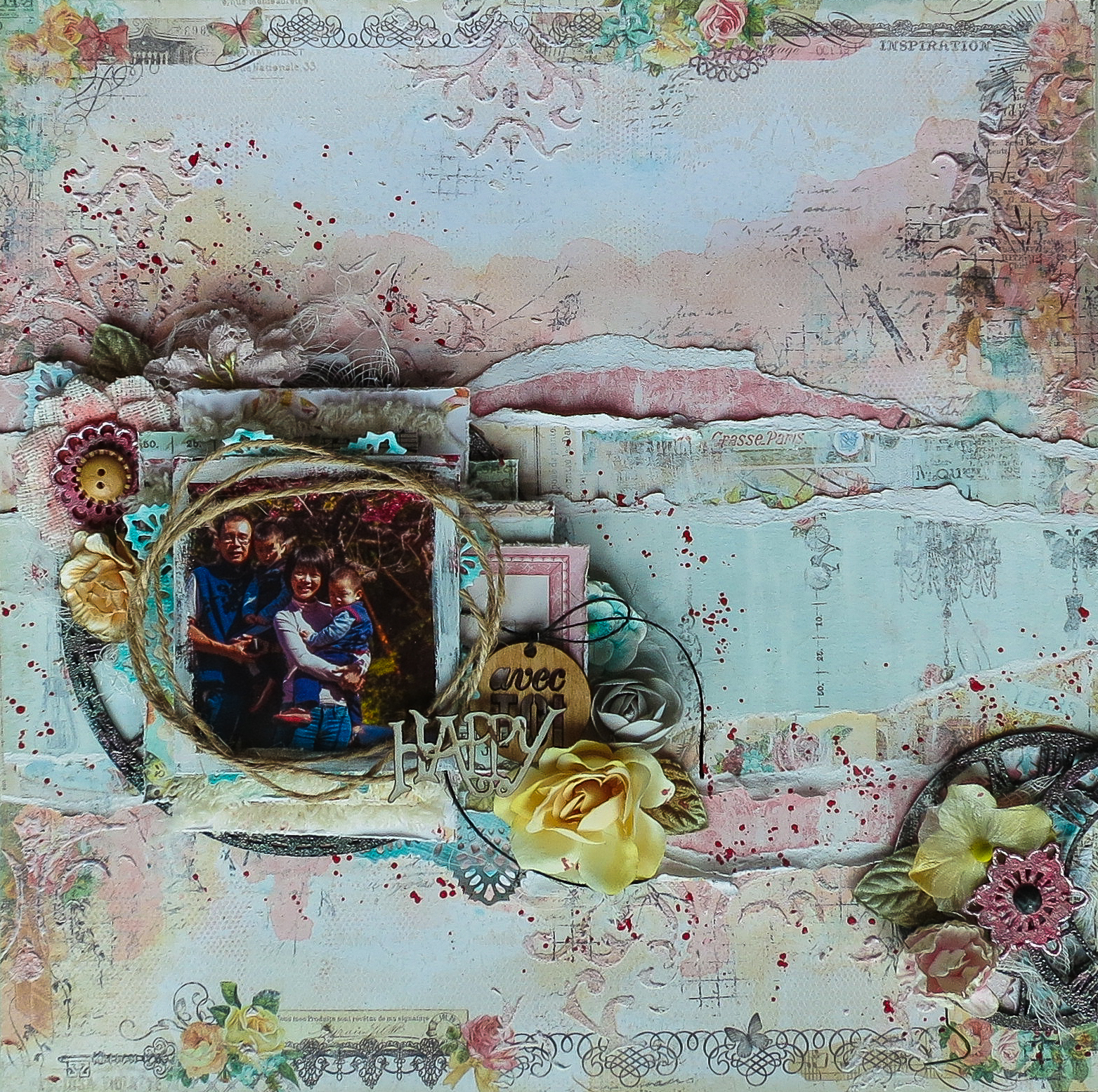
Here's the project:
Here's the project:

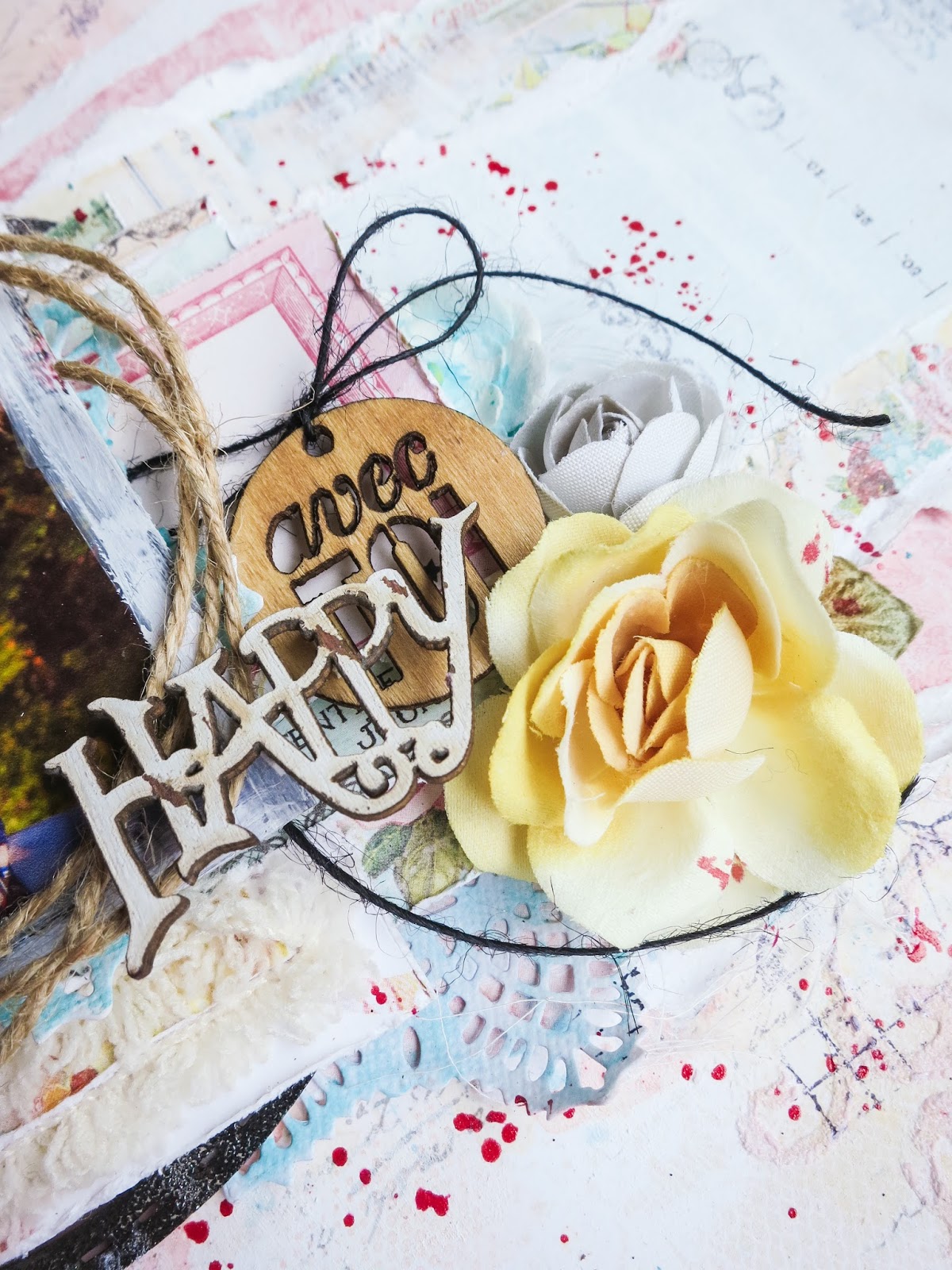
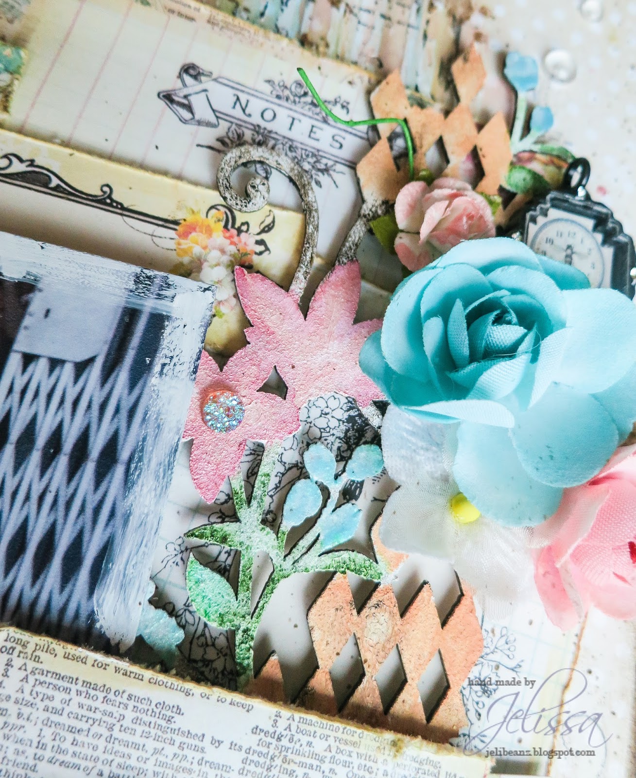
And some close-ups:
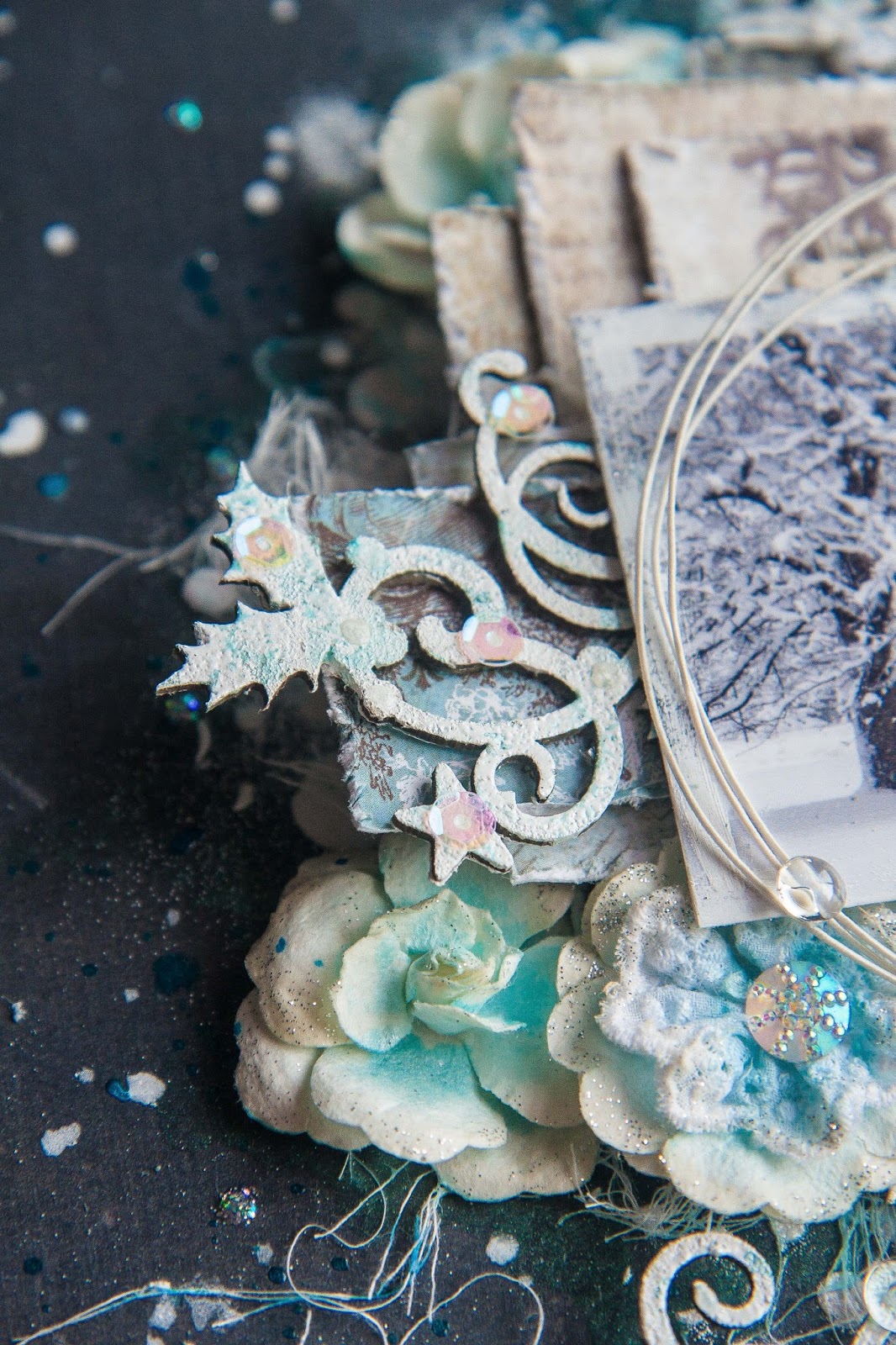


Love those chipboards! I've used Holiday Vine (snipped into 3 pieces and tucked everywhere), Shabby Flakes and Winter Trees.

Making my own snow here - it's so much fun :D
And here's the video of how I created this layout:
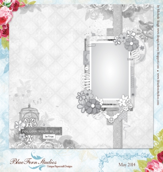
Don't forget, every month Blue Fern Studios has a sketch challenge going on. Here is this month's sketch by Michelle Singh:

So gorgeous isn't it? I'm so inspired I'll be using it for some of my other DT projects as well.
That's all I have for you now. Meanwhile, happy crafting!
love,
.png)


.png)


.png)