Showing posts with label By the sea. Show all posts

Saturday, July 26, 2014

2Projects from Yuko


Hello! it's Yuko.
Today I will  share 2 projects "LOVE"&"this Moment"


【LOVE】

 photo jji_zps51006706.jpgliked cardboard of the heart of this big (12 inches of size) very much!
This gives a very good impact and tightens a work.


I paint cardboard with modeling paste and attach structure.
I colored it use gelatos.

I painted the snow tex to chipboard heart.
Mixed shimmerz paint the snowtex.


<Blue Fern Studios Products>
 papers:       Ombre Dream(Ginger's Deream)
 chipboards: Memory Frames/Chunky Heart Panel


【This Moment】
  photo hh_zpsd556ea40.jpg
 It's summer layout!
However, it is a picture of last year.
And looking forward to going to the beach this year!


This time, all paint of this LO used Shimmerz INKLINGZ. 
It has colored very finely.!


I will use the cardboard 
of the series of this sea well from now on!


<Blue Fern Studios Products>
 papers:       Ombre Dream(Susan's Deream)
 chipboards: By the sea /Sarside Treasuresl/This moment


Thank you for looking♥
 

Yuko

Monday, July 7, 2014

July projects from Camilla

Hi! Camilla here with a layout and a card. For both projects I have used papers from the Ombré Dreams collection.

When I made the layout I created the background by using Color Blooms, masks, stamps and texture paste. Then I added some paper layers underneath the photos and then some flowers and chipboards. The chipboards are painted with white gesso, then I used a script stamp before I inked with fluid ink chalk in blue.


Here is a close-up of the Blue Fern Flourish:


And the By the Sea chipboard:


And finally the Checker Bits:


This is the card. The chipboards are painted in white gesso with a hint of orange in it. Then I stamped with a script stamp.


The chipboards I have used are Lace Rounds and Wild Flourish Bundle.


Thanks for looking!

Friday, February 28, 2014

3 Layouts by Leila Cardoso

Hello Ladies

Here I am again to show you some projects using Blue Fern Studios projects. I hope you like it!

Let's see...

"Happiness"


I used the Signature paper from Blue Fern Garden Collection, also the Shabby Brick Panel and the word "Happiness" from Good Vibes set.

In detail the panel that I colored with vintage photo Distress Ink...

The word Happiness I colored with acrilic paint and put some blue gelatos...


"The Best Day Ever"


In this one I used the wave from By the Sea Set and title The Best day Ever, both I colored with 2 colors of gelatos and put some gesso too.


And the last one...
"Pretty as a Picture"


All chipboards I colored with pink acrilic paint and add gelatos in gold color...

I used In Bloom paper - Garden Collection,  Circle Groups, butterfly by All Natural Set, one flower by Bohemian Flowers, the title Pretty as Picture and Romantic Page Dangles.


Thanks for stopping by and look my projects for today!!!

xoxo

Leila

Friday, January 17, 2014

Inspiration from the Colors of Sea Glass


Greetings from Joyce in Southern California!   I came on the scrapbooking scene three years ago when I came into possession of some old family vintage photos.   I decided to preserve them and tell my family’s stories through those photographs. My intention was to only scrap these photos and put them away for future generation’s enjoyment.  However, I came down with the hoarding ailment so many of us have caught, and I started stalking art stores for supplies, joined an online monthly scrapbooking kit club where it exposed me to the terminology, trends, and manufacturers.  I immediately became smitten with this art form because it allowed me to incorporate all my previous skills of drawing, watercolor painting, bead work, home and apparel arts, and a legitimate excuse to buy more art supplies.   I’m excited to be back designing for Blue Fern Studio’s (“BFS”), because I enjoy taking something raw like chipboard and transforming it into a pretty embellishment.  But most of all, I enjoy sharing ideas and techniques for the BFS Follower.  My style?  Well, I will leave that up to those of you that view my work.  You can find me here at BFS on the 17th of each month, and every day on my blog at  http://scrapsofelegance.blogspot.com.
Today, I am sharing a project inspired by the colors of sea glass, and using a fiber tissue technique to create structure, texture and dimension on some of the chipboard pieces.   


Technique:   Apply gesso, or white paint, to the chipboard and allow to dry.  Then apply glue to the chipboard and tear off small pieces of the fiber issue paper and work it in and around the defined areas of the chipboard and set to dry thoroughly.  I normally add several layers, and fold and scrunch the paper as I mold the paper to the chipboard.  Once the fiber tissue paper is dried, apply clear gesso (do not use the regular opaque gesso) and let the application dry.  Apply mist in the same color family with a small paint brush in three stages starting from the lightest to the darkest color, and allow each stage to dry before continuing to the next stage.  Save the darkest color application for valleys created by the fiber tissue paper (don’t over work the valleys too much with the dark color, it should be done sparingly).  After the final application is dried, apply a light application of metallic paste on the peaks of the fiber tissue paper. To further enhance the design of the chipboard piece, use a water color pencil around the shape of the chipboard, and into very small crevices.

The small 4 x 4 canvas below is transformed by adding the pretty delicate leafy page accent chipboard using the same fiber tissue paper technique on top of a hand-cut corrugated heart. You can see the water color pencil work better on this chipboard piece.  


Check back with me here in the future, because I’ll be providing a pictorial tutorial on the fiber tissue paper technique I created on one of my future design team projects for you. 


Tip for the Day:  Use clear gesso instead of opaque gesso on your chipboard when you’re creating with light colored water based mists.  The opaque gesso acts as a resist and repels light colored water based mists, and you’ll waste your mist product. The clear gesso will absorb the color beautifully and allow you to work with lighter color mists.
Thank you!


Friday, January 10, 2014

A layout and an art journal with Jackie Clark


Good morning! I'm Jackie Clark, and I'm very excited to be a new Design Team member at Blue Fern Studios for 2014.

A little about me... I am a very soon to be 35 year old mother of three little boys. I have been married to my highschool sweetheart for 10 years, and we have a rowdy black Lab who rounds out our family. I live in beautiful Vancouver, BC, Canada, and we enjoy all the West Coast has to offer - skiing in the winter and boating, biking and swimming in the summer.

I have been scrapbooking since 2000, but took a couple years off after the birth of my oldest son; when I came back to it my style evolved from flat, multi-picture, two page layouts to what I love today - texture, color and dimension. You can see more of my work on my blog at www.scrapsofbrilliance.blogspot.com.

Now on to the projects I've prepared using Blue Fern Studios chipboard for January.


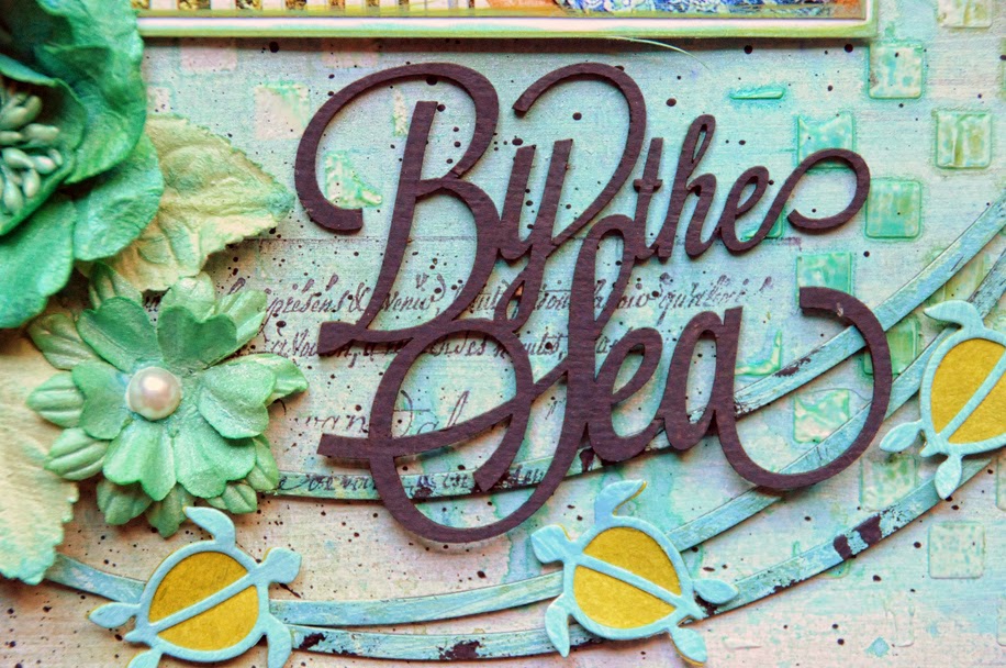
I generally scrap photos with people in them, however this lighthouse on the easternmost tip of Mexico that was attached to the hotel we stayed in last year was too beautiful not to scrap, and coordinated perfectly with the By The Sea set. I also added in the word "Sunshine" from The Optimist Word Set and some clouds from the Cloudy Skies set.


Though the color scheme for both sets of words differs, they were treated in the same way - I primed them with gesso, then built up colors with Gelatos and finished them off with some shimmery paint which added some dimension and toned down the brightness of the Gelatos. I quite often add additional layers of media to my chipboard until I get an effect I am happy with.


The lighthouse was painted with shiny dimensional paint to match the lighthouse in the photo.


The clouds were also treated with two colors of shiny paint which I applied with my finger to give them texture.


Blue Fern Studios Chipboard Pieces Used:

By The Sea
The Optimist Word Set
Cloudy Skies


My next project was a Christmas gift for my niece, who loves art journaling and card-making. I made the covers out of cardboard and built the journal up from there with her tastes in mind.


The Circle Groups chippies provided fantastic anchor points for my cluster. I started by painting them with a metallic paint, then ran them through my embossing machine and added touches of metallic purple paint to accentuate the raised areas.


Lo and behold, one of my metal clock accents fit perfectly inside one of the circles.


The film strip from the Picture Perfect set was simply pressed into a black ink pad, leaving some areas untreated. The word "Captured" was painted with gesso and then I added some of the metallic purple paint I'd used on the circles.


Blue Fern Studios Chipboard Pieces Used:

Circle Groups
Picture Perfect

Thank you for stopping in to have a look! I hope you will check back often; the rest of the Design Team will be introducing themselves and sharing some marvellous inspiration over the course of the month. And a special thank you to Leslie and Valerie for including me in this wonderful team!
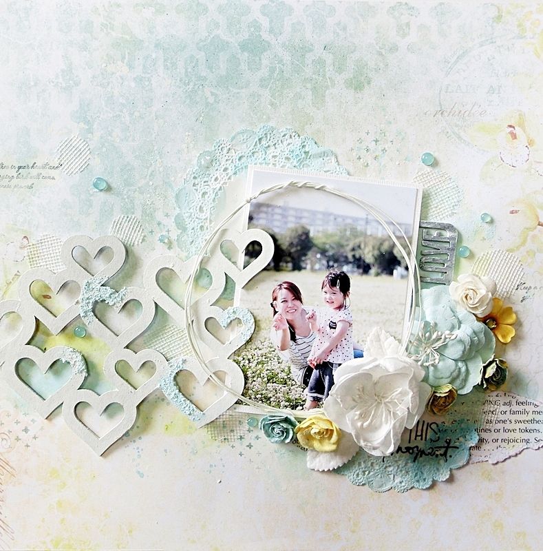
Tuesday, December 3, 2013

It started with 2 pieces of Kraft paper...

 It's me, Lisa!! December is here!! I hope that everyone is getting into the holiday spirit!!! Well, with the hustle and bustle of the season, It may be a little difficult to find time to create. But Create I must, so I pulled out 2 pieces of 12x12 Kraft paper..After all, it is the color of chipboard. I covered them with gesso...Then the magic began...

 I created this layout as a gift for a dear friend who lost her husband this year.
I primed the Graduated Circles with gesso. Then painted them with acrylic glaze and dabbed some black paint over it when it was dry.

 I painted the By the Sea words with flat black acrylic paint.


  I always save the innards from my panels chipboard. The diamonds came from the Harlequin Page Panel. I glued them to the background and painted them with gesso to blend in, before I sprayed the whole page with mists.


  This next layout was totally inspired by Australian artist Di Garling. I just pulled some chipboard from my collection and got busy.


To adorn the Spring Branch, I covered it with some texture paste and let it dry. Then I painted it with acrylic glaze.


I painted the Doodle Flowers with acrylic glaze as well. I added a rhinestone to the middle of this one.

 
I painted and tucked some of the Doodle Flowers among the flower cluster.


Thank you for joining me today on the Blue Fern Studios Blog. Make sure you check back often to see the inspiration created by Design Team. You can join me on my blog for details, and the story behind the By The Sea layout.