Showing posts with label Blooming Foliage. Show all posts

Wednesday, July 22, 2015

My First DT Projects and Video Tutorial by Marilyn

Hi everyone! Marilyn here excited to share with you my first design team creations and video tutorial for Blue Fern Studios
A little about me:
My name is Marilyn Rivera and I'm from Puerto Rico but I'm living in North Carolina with my lovely family now.  I have two wonderful teenagers and a very supportive husband.  I'm a Fashion Designer although the last 18 months I'm a SAHM.  I've been scrapbooking for 8 years and nowadays is become more than a hobby, I've been giving the opportunity to travel and give workshops. I love to share my knowledge and techniques in my classes and in my video tutorials.
In my work you will see some techniques that I use for my dressmaking  combined with paints, mediums, lace, pearls and lot of textures!
I'm so happy to be part of the Blue Fern Studios Creative Team and I hope my work and video tutorial inspired you.

You can see my work in my blog HERE and my videos tutorial in my YouTube channel HERE.

"MEMORIES" 
My first project is a layout with this special 25 years old picture when hubby and I were newlyweds.
I worked with the gorgeous new collection Frolic and I chose the Petits Moments and Amoroso papers.
I create the background design using the Ring panel and you will see all the creative process in my video tutorial.
I placed the 'Butterflies Friends' chipboard around my photo and cut out these butterflies from the Dans Le Jardin paper from the Frolic collection.

My title is the  'Memories' word chipboard that I painted in different tones, don't miss  the video tutorial.


I added glass beads and pearl in the rings of the chipboard to create dimension.

Supplies:
 Frolic Collection:  Dans Le Jardin, Mercantile, Amoroso
Blue Fern Chipboards: Ring panel, Butterflies Friends, Memories word


Here is the video tutorial, I hope it inspired you...Enjoy it!


"A Special Day"

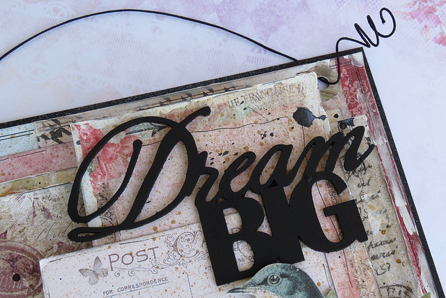
My second page is about my daughter's birthday seven years ago.  I worked with the "Mercantile" paper from the Frolic collection.  I embossed the clock from the "Roman Clock Set"-small  and my title the word "Special".
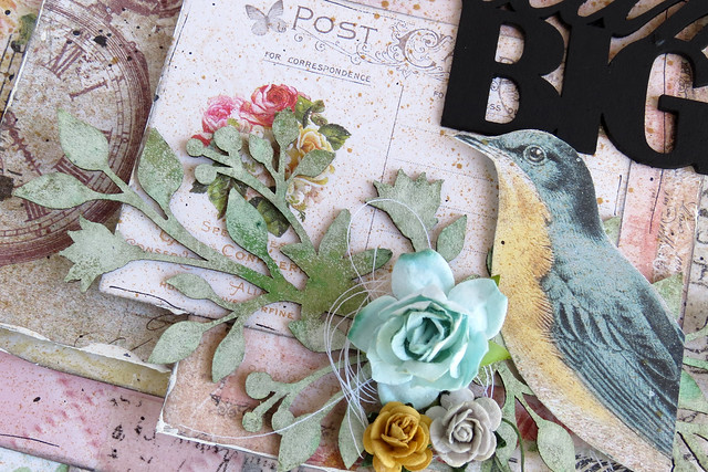
I placed the beautiful clocks around my photo and between my flower cluster.


I painted with gelatos the "Blooming Foliage",  then I covered the leaves with gel medium and green micro beads.

Supplies:
Frolic Collection: Mercantile paper
Blue Fern chipboard: Blooming Foliage, Roman Clock Set, "Special" word

I hope you find inspiration in my first blog post.
Have a great day!

Marilyn Rivera


Monday, April 13, 2015

Three off-the-page projects by Marie-Josée

Hello all,

Today, I will show you three off-the-page projects created with the beautiful Blue Fern Studios products!

Pop-up box with the Sanctuary collection

This is supposed to be a card, but to me, it looks more like an off-the-page project, since there is no place to write text. However, it can make a great wedding or anniversary souvenir, combined with a card. Thus the "Your Hearts Together" sentiment on the front panel.

For those of you who are interested to know how to create this project, here's a great tutorial I found on YouTube.

I used various papers from the Sanctuary collection to create this card: Birdsong Melody, Meadows of Time and Garden Plaza.


I cut the birds and flowers out of two different papers: The brown birds were cut out of the Birdsong Melody paper, whereas the blue bird and the flowers were cut out of the Meadows of Time paper.

On the front panel, I used a piece of the Bowed Trinkets to frame my sentiment.

I used the Mini Flourishes on the back panel to add texture and interest behind the paper flowers.


I also cut two pieces of the Lattice Fence to use on the side of my pop-up box.


Here's another view of the whole card.


Canvas with the Montage collection

Here's a small canvas (6" x 8") that I created with the Montage collection.


First, I altered my canvas with gesso, various mists and stamps.

Then, I also altered the small Circle Flourish frame with gesso and mists. I also added pearls on the circles of the frame.

Then I cut a piece of the Calling Cards paper from the Montage collection to use as a background.


I also used one of the calling card in the center of my frame.


Wall decor with various Blue Fern Studios collection

To create this piece, I used paper scraps from various Blue Fern Studios collections: Ombre Dreams, Montage, Sanctuary, and Love Story.


First, I used foam dots to assemble all the pieces of paper, to give dimension to my project. Then, using my finger, I applied gesso to the edges of the papers. Then, I sprayed various colors on the whole project: brown, white, and black.

I used the Blooming Foliage chipboard, combined with flowers. I altered it with gesso and green mists.


Then, I used the Dream Big chipboard, which I altered with black gesso.


Saturday, March 22, 2014

"(love these) Memories" by Lisa Griffith

Hello everyone! I hope this post find you all well. It's my turn to share my projects today. The first layout I created was an experiment just to get some interesting looks using the new line of paper from Blue Fern Studios.

"(love these) Memories"


Here I started with the Blue Fern Studios paper called "Signature", and created some texture using heavy gesso and a stencil, and then sprayed with Ranger Vintage Photo ink and water. These papers really are amazing how well they hold up to whatever mediums you want to use. (There was a little bit of warping, but a small price to pay.) I love how the paper, inks and gesso mixed to create a watercolor effect. The chip board pieces I used is one of Captured Words piece that I cut in half and pieces of the Chainlink Panel. For the chipboards I coated them with gesso and then painted them with brown ink and then a coat of clear crackle paint. I was trying to get them to look like wood to match my photo. I also used a small strip cut off from the bottom of the paper, and a piece of the blue packaging that comes with the chipboard that I punched with a lacy punch and layered under my photo. I also cut out some butterflies Blue Fern Studios paper "In Bloom".


Next up I have a layout that I created using a vintage photo of my mum.......

"Pauline"


Here I used three different pieces of chip board called Circle Motifs, Petite Windows and Iron Work Accents. For all of the pieces I painted with Silks paint in Emperor's Gold (my new all-time favorite) and then stamped over the pieces with black ink. I added some bits of a vintage magazine, some Prima flowers and pink paint.


And my last project is a mixed media card I made for St. Patrick's Day.


I created my card using a piece of the paper "Signature" as my base, lots of stamping, misting, and the gorgeous Blue Fern Studios chip board called Blooming Foliage. I covered the chipboard with a light coat of gesso, and then painted it with green mist and gold paint and then a coat of Glossy Accents.


I hope you have enjoyed my projects and feel a little inspired?
Thanks for looking,
Hugs, Lisa xo


Monday, March 17, 2014

Lace Organization Project, and a Shabby Chic Tag

Hello everyone, Joyce here to share an organization idea for your lacy bits.  I had several boxes of acquired lacy bits, and after some time, the boxes became overfilled, disorganized, and I quit reaching for them to use on projects.  They were just too pretty not to be used. I organized them so that I could see all the different patterns, and hopefully make them easier to reach for any put away too.  I made a template out of a 4 x 6 index card in the shape of an “H”, just like those organizational embroidery cards for DMC floss, and cut the “H” shape out of various old scrapbooking papers.  Then you simply wind all the lacy bits over each card.  Don’t they look pretty all organized in the box?  They sure make me want to use them now.  Of course, I couldn’t just leave them in a plain white photo box.  Each boxed lid is embellished with some lovely Blue Fern Studios chipboard pieces.  Even though each chipboard piece is different, the boxes look like a collection because they were designed with the same colors, and similar elements.

Here’s the lid on the first box featuring the blooming foliage chipboard treated with paints, and the fiber tissue paper technique on those little buds:


Here’s the lid featuring a Bohemian Flower and the  Leafy Page Accent chipboard treated with paint  a homemade glaze, and crackle.


Shabby Chic Tag:

 The base of the tag was created with the Boudoir Blue Fern Garden paper, and Signature paper pattern was torn in strips and applied to the base with a heavy gel medium.  Various stamps were applied to the paper before the application of gesso and creamy colored acrylic paint.  After the gesso/acrylic paint application dried, another application of various stamps were used on top of the strips and the base of the tag.  After all the products were dried, a lot of tea bag throwing went on to render an aged look. 

The apothecary jar was created with white acrylic paint, one layer of fiber paper, stamping, stencil and molding paste, and finally some application of pink mist.  It looks so pretty and feminine.

Here’s a picture of the front of the tag.  


Here's a picture of the back of the tag, see how he front flap folds over?  That's because of the jump rings attached to each of the three eyelets.

Thanks for the visit.  I hope I have inspired you to use your Blue Fern Studios chipboard pieces on an organizational idea.

Thursday, February 20, 2014

Blue Fern Garden Layouts and a Card with Rae

Hello everyone! It's Rae, and today I'm going to share some projects I've made using the fabulous Blue Fern Garden paper line, and some of the amazing BFS chipboard.

I am so in love with Blue Fern Garden papers! The style is so elegant, yet so versatile.

Dream Card

 For the base of my card, I used the the Blue Fern Garden "In Bloom" paper, distressed and inked. I also used the top corner of the "Parlour" paper to capture the beautiful image of a doily, butterfly, and dream dictionary snippet. I wanted to bring out the blues and and creams of that part of the paper, so I used those colors on the "Bordeaux Layered Frame."


I used a heavy layer of gesso on the bottom layer of the frame, and I sprayed it with Tattered Angels Glimmer Mist in Patina while it was still wet. I let it dry slightly, then added Silks Acrylic Glaze in Emperor's Gold in heavy random strokes.

The top layer of the frame is randomly colored with two brown tones of distress inks and then lightly grazed with a dark brown archival ink.


For this "Small Spring Iris" piece, I primed it with gesso, then used different green and gold mists for the stems. For the flower tops, I layered green, blue, and purple embossing powders.

I Love You More Layout


This is my layout based on the February sketch. I used "Timeless" and "Parlour," papers from the Blue Fern Garden line for the background and "Boudoir" to mat the photo.


In this closeup, you see two pieces of chipboard. The leaves are are a piece from the "Natural Sprigs Set" that I painted green and sprinkled with fine glitter while wet. I also used fine glitter on the "I Love You More" piece after I painted black and sprayed with some iridescent mist. I dusted off some of the glitter when it was dry for the random look. 

I cut a small piece of the "Chicken Wire Panel" and used a metallic distress stain as a base. Then, I brushed it with an archival ink pad for the worn look. The birds are just inked with black archival ink.


I coated the "Garden Window" with Martha Stewart Crackle Specialty Finish with a thick coat using a palette knife for an uneven "stucco" finish. And like the other pieces, I lightly brushed it with black ink.

There's still plenty of time to join us for the February sketch challenge


Magical Layout


I used the following papers from the Blue Fern Garden line: "Love Letters," "Boudoir," "In Bloom" and "Signature."


On the "Blooming Foliage" piece, I primed with gesso, used a metallic green mist, then used some green pigment ink over it, then used a brown chalk ink in random spots. 


On the "Romantic Page Dangles," I painted them with green paint, then randomly used a metallic distress stain. While the paints were still wet, I sprinkled a brown embossing powder to create this weathered look.


In this picture you can see the "Country Picket Fence" that I treated with gesso and crackle paint and brown chalk ink. The "Magical" title piece is from the "Winter Titles" set. I used three different colors of embossing powder to achieve this look. 


Thanks for stopping by the blog today! 


Rae

Wednesday, October 9, 2013

Glittery Christmas Cards with Yana Smakula

Hello everyone! While folks around here are barely seeing the first signs of Fall I've entered the phase of holiday card making. I try to prepare myself and my home for Christmas ahead of time and this means making lots of holiday cards in the preceding month of October and November. 

Today I'd like to share some of my first holiday cards this year. For some reason, I'm all about using glitter in my projects and today's cards are no exception.

I don't yet have any of the new Blue Fern Studios fabulous holiday chipboard so I decided to challenge myself to use what I had on hand - regular non holiday shapes and incorporate them into festive holiday cards. To achieve the look on my cards below I simply covered all of the chipboard pieces with embossing powder with a mixture of glitter. I used regular embossing powder with silver glitter and chunky white with a bit of gold embossing powder and some glitter. Both powders are from Stampendous and work great for project like this.

Believe in the miracle:


Chipboard used:
Petite Boutique Frames
Blooming Foliage

Merry Christmas:


Chipboard used:
All Natural Set
Fancy Birdcage

Wishing You Holiday Cheer:


Chipboard used:
Petite Boutique Frames
Icons Set Three
Thanks for stopping by!