Showing posts with label Autumn Anthology. Show all posts

Wednesday, August 17, 2016

August Social Media Update and YOU!


Hello, hello!

Sandi here with you today sharing some Blue Fern Studios awesomeness that we found on Instagram.

This month I've taken some screen shots directly from Instagram. We are trying to really drive home the need to be there! It's a quick, easy and fun way to see some gorgeous creations. And to basically create your own gallery there. You can also upload to Facebook and a Twitter from there, as well as pin your projects to Pinterest! 

Please tag us there so that we can find you! Also, do the same when visiting Pinterest. Did you know that we have a full Pinterest board that features YOUR creations? We sure do! 


First up, we're sharing this gorgeous layout by Emi Nakagawa using the Serendipity paper collection. She's added some simple elements and kept the project light and airy. You can  visit her blog at http://ameblo.jp/nikopiyo/ and obviously her Instagram at @sb.and.r.emi.


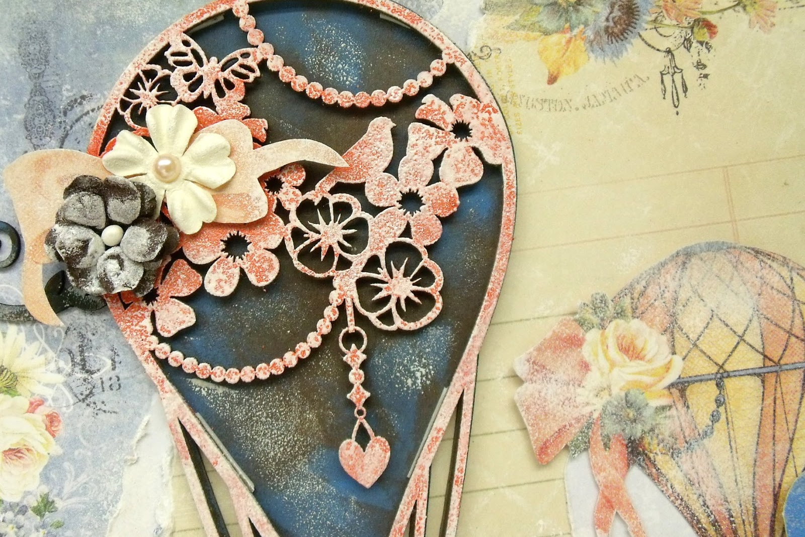
We love this creation by Rika Hayama! What an unique way to use the Gazebo image from Autumn Anthology! It looks gorgeous against the woodgrain and with the mix of color and black and white photos. Rika blogs HERE


Because we have been focusing on Seaside Cottage over the past few weeks, I wanted to include this fussy cut layout from Mikamika of Japan. Her floral cluster, and fussy cutting create such a beautiful scene alongside her photos. Her Instagram is @blanche0101.


Look at this adorable little mailbox creation from Naomi Chang using our older Love Story collection. I almost held this over until next month but it is so unique, I was anxious to share. Naomi blogs HERE
Off the Page creations using Blue Fern Studios are always eye-catching!


We have another new feature this month by Shinko who blogs at shinkoblog.blogspot.com. Her paper folding and great design create a truly gorgeous piece using our Attic Charm collection and chipboard. 


I'm sneaking in one last creation by Canadian Laura Gilhuly using our chipboard and the awesome new Seaside Cottage collection. She has lots of great photos of her boys at the beach and does a beautiful job of using flowers on her masculine pages! Great work, Laura! 

That's it for today! 
I hope you've found something to inspire you! 
Also, fingers crossed that all photo credits are correct. 
Please let us know if they are not. 

See you next month! 

Sunday, July 3, 2016

July Inspiration with Jelissa

Hello friends,

how have you been? Half the year has been gone and summer is now upon us! It has been such a great and fulfilling year so far and I'm really thankful for all the people that have come into my life.

For my blog post today on Blue Fern Studios, I have two projects to share with you using some of my favourite past collections.

First is a shadow box display which I intend as a gift to a dear friend. I've done something different this time in that, I went without my usual mixed media background but instead, focused on the Blue Fern papers and chipboards. I've been meaning to do this but couldn't find the right project to start off. The shadow box I found in my LSS was just perfect!

Here is the piece, created using Autumn Anthology papers:


I'm particularly drawn to this collection because of the beautiful shade of cobalt blue mixed with coral Michele used in the papers. If you know me by now, blue is one of my favourite colors and I can't use enough of it. It's a good thing I have two boys that I can use the color for! There are also plenty of images that I can fussy cut out from this collection and you can see that I wasted no time in doing just that.

Some details in the close-ups:


Love this hot air balloon! A little tea cup basket does remind me of the spinning tea cup ride at amusement parks in my childhood. I've dabbed some Sticklers on for a nice glittery effect.


Chained Bits and Berry Stems chipboard which I had altered with Imagine Ink embossing powders.
For Berry Stems, I first painted with some shimmery watercolors before using Grassy Knoll EP randomly. For Chained Bits, I first used Auburn EP, followed by Mushroom and Buttercup EP before topping it off with Copper Glitter.


Using the Marseille Frame here, which fit the display perfectly. I first covered it with copper metallic paint before brushing on clear crackle paint for extra texture.


A Flutter Page Dangle which I had snipped up. I first colored it with Gelato, then stamped and embossed with Cotton Candy and Watermelon EPs.


A flower which I altered with glitter in Sunshine and Dusty Pink.


Blue Fern Studios products used:

paper: Autumn Anthology - Le Ballon, Balcony, Calling Cards
chipboard: Marseille Frame, Berry Stems, Chained Bits, Flutter Page Dangle
Imagine Ink: embossing powders - Grassy Knoll, Auburn, Mushroom, Buttercup, Cotton Candy, Watermelon
glitter - Copper, Sunshine, Dusty Pink

My second project is a layout using the Frolic collection. It matches the theme of my eldest playing in the grass field. The bits of yellow and blue really brings out the mood of feeling the sun on my face on a cloudless day. 


Details in the close-ups:


A subtitle from Calling Cards. 


Whimsy Flourish which I had altered.


My title piece, altered with embossing powders and glitter.


Fussy cutting here


Looped Frames which I had altered with embossing powders and glitter.

And here is the start to finish video:


Blue Fern Studios products used:

paper: Frolic - Veranda, Calling Cards, Dans le Jardin
chipboard: Looped Frames, Whimsy Flourish, Glee
flowers: Tranquility Blooms
Imagine Ink: embossing powder - Seven Seas, In the Navy, Cerulean, Bonny Blue, Buttercup, Snow
glitter - Sunshine, Gulf Coast

Saturday, June 25, 2016

Weekend Inspiration from YOU!

Summer is an especially busy time for everyone, but that doesn't mean that that our creative minds stop working.  If you're like many, you see things every day that inspire you with their design or colors.  Today we would like to share projects from a few Blue Fern fans.  We were impressed by their creative use of Blue Fern products.

First up is this romantic album by Cheryl Kearns.  The entire album was created using paper from our Attic Charm Collection.  Each and every page is a piece of art.  The person who ends up with this album is going to be extremely happy!


We found this lovely vintage-inspired layout in an online gallery.  It was created by Bonprof using the Autumn Anthology Collection.  We see many of you use Blue Fern paper with your vintage photos to add a sense of days gone by.  This is a beautiful example.


What could possibly be sweeter than an infant?  This adorable photo was used by Cathy Cafun as the centerpiece for this layout.  We are so glad she chose to use Blue Fern's Tranquility Collection for this one.  The colors and design are so complimentary, and allow the photo to be the star!


Ever need to put together a quick card, and have absolutely no mojo?  That happens to all of us.  A quick solution is to pull out your Blue Fern Studios paper (Serendipity was used in the example below).  Our paper is filled with detailed images that are perfect for cards, and it's just what you need to get started.  We spied this charming card, created by Marylou (Meggies Nana) in an online gallery.


Sometimes the most gorgeous layouts are those that have a lot of white space.  This layout, created by Tatiana Yemelyanenko, is an ideal example.  She chose to cluster everything around this precious photo, and left everything else simple.  Doing this gives the eye a place to rest,  and lets the beautiful design of this paper do the rest (from the Timeless Collection).


We hope you enjoyed this unique collection of Blue Fern projects.  
We are so very flattered when you use our paper in ways that never cease to amaze us.
Enjoy your weekend, everyone! 


Saturday, June 18, 2016

Around the World with Blue Fern Studios- by Keren Tamir


Hi Everyone,
Its Keren here with a different type of blog post today!!!

Ever wonder where Blue Fern Studios' products are used? except for the US, where it is manufactured, Blue Fern Studios products travel to many places around the world.

Recently I had the pleasure of teaching this layout class below in Quito, Ecuador.
I have some photos below depicting my experience!!
I've also taught the same layout last year in San Jose, Costa Rica and so I'm sharing both events with you today as Blue Fern Studios travels to Central and South America!!

Enjoy!!


For the classes in Ecuador I used the Courtship Lane papers as the original ones were sold out. The Blue Fern Studios papers match so well with each other that it wasn't a problem switching these around.
The Blue Fern Studios chipboard pieces used for this layout were: Majestic Frame, Flutter Dangles and two special words "Momentos Especiales" designed just for us in Spanish.
I also used the Blue Fern Studios embossing powders to emboss the chipboard.

Here I am below explaining some components of the class.


Everyone is busy concentrating on their work. I love seeing my students working hard as it makes the final result so much more rewarding!!


Selfie with Isela the owner as everyone is working behind us!!


Look at the beautiful creations. Each one more beautiful than the next!!


<<<<<<>>>>>>

Below are the pictures of my event from last October in Costa Rica.
It was an amazing event as well and everyone loved the Blue Fern Studios products.
Below is the same layout class as above but with a different paper collection for the background.
The other components remained the same.


Everyone working hard!!!!


Here are the beautiful creations!! look at all the Blue Fern Studios loveliness.


Thank you so much for visiting the Blue Fern Studios blog!!
Hope you enjoyed this blog post!!
Have a wonderful day!!

Keren

Saturday, June 11, 2016

Attic Charm Inspiration & More by Nicole


Every time Blue Fern Studios releases a new collection, I get a new favorite!
They are all designed so beautifully, with so much attention to detail, and Attic Charm certainly is no exception!  Soft and pretty with a touch of vintage - I absolutely adore it!

Here is my first layout created with this wonderful new line.


My page was inspired by the June BFS sketch challenge:


My favorite part of Attic Charm are these gorgeous paper daisies.


A very popular chipboard piece from BFS is the Music Box which is strikingly gorgeous.
I covered it with Cotton Candy Imagine Ink embossing powder and sprinkled a little Watermelon glitter to add a little sparkle and texture.  I then dabbed the piece with a little Pearl powder and white paint.


I combined the Attic Charm daisies with some fussy cut flowers from the papers and pale green Courtship Blooms and sneaked a Leafy Page Accents behind the flower cluster.


I added strips of the Tattered Diamond Bits to the layered paper strips below my picture, and used the word Heart, covered in Melon embossing powder, as part of my title.


Very shabby chic, indeed!

Blue Fern Studios supplies used:
Patterned papers: Attic Charm (Generation, Foyer, Haberdashery, Calling Cards)
Chipboard: Happy, Music Box, Leafy Page Accents, Tattered Diamond Bits
Flowers: Attic Charm Daisies, Courtship Blooms
Stamps: Weathered Doilies, Essential Textures
Imagine Ink: Embossing Powder (Cotton Candy, Pearl, Fuscia) / Glitter (Watermelon)

***

I created another layout for my reveal using the Attic Charm collection,
this time with the Generation patterned paper as my base.


For my title, I decided to combine the words Blissful and Love from two different sets.
I colored Blissful in Melon embossing powder and Love in Mushroom.


I really loved this quote from the Calling Cards paper!  You can also framing my photo an older BFS chipboard piece, the Blue Fern Frame, that was in my stash even before I joined the DT.  I was waiting for the perfect opportunity to use it, and I thought it looked quite nice with this setup.  I cut it into pieces to add a piece on either side of my photo and covered it with my favorite Imagine Ink tone by far, Peacock.


A very romantic page for a very happy couple in love!


Blue Fern Studios supplies used:
Patterned paper: Attic Charm (Generation, Calling Cards) ***
Chipboard: Blissful, Love, Blue Fern Frame
Flowers: Attic Charm Daisies, Attic Charm Glittered Roses, Courtship Blooms
Imagine Ink: Embossing Powder (Peacock, Melon, Mushroom)

***

For my final layout today, I went back in time a little and used the older collection, Autumn Anthology to go along with this fantastic photo taken by my friend Christine on her and her boyfriend's once in a lifetime trip to Turkey, last September.


Of course, due to the whole hot air balloon theme, I had to use this gorgeous piece called Olga's Layered Balloon.  I treated the bottom layer with black and espresso distress stains as well as dabs of blue paint, and covered the fancy top layer with Imagine Ink Melon embossing powder.


I stamped different travel-theme designs from the Journey and Postal Textures stamp sets on my background and fussy cut this pretty balloon from the papers.  The word Stillness seemed a perfect title for the photo and page!


I added the Organic Vine Corner that I separated and stuck each side of my flower cluster.
It was treated with distress stains, the same as the title and bottom layer of the balloon chipboard.


All main flowers are from Blue Fern Studios, including the blue flower which is from the Tranquil Roses set.  I altered it a little, removing its center and replacing it with a brown pearly brad.


How truly magical is this scene!?
My friend is very lucky to have been able to experience it and I wanted to create this layout for her as a keepsake.  I am sure that she will appreciate all the BFS goodies used on it!

Blue Fern Studios supplies used:
Patterned Papers: Autumn Anthology (Le Ballon, Robin)
Chipboard: Stillness, Organic Vine Corner, Olga's Layered Balloon
Stamps: Postal Textures, Journey, Love Story Set One
Flowers: Tranquil Roses, Courtship Blooms, Attic Charm Daisies
Imagine Ink: Embossing Powder (Melon)

I hope you have enjoyed my creations and you will visit my blog to see more!

Happy JUNE to all of you!

Wednesday, May 11, 2016

Tranquility Inspiration & More - by Nicole Doiron


You have seen lots of beautiful creations featuring Blue Fern Studios' latest collection Tranquility, and I am sure that you are in love with it!  I have to say that I absolutely adore all BFS collections, but this one is my new favorite!  It has everything to please my crafty heart from beautiful wood grain to soft earthy tones!!

Let's start my post today with more details on 2 layouts using Tranquility that you may have already seen on the blog, the first one being my take on the May sketch challenge


This is the gorgeous Blue Fern Studios sketch for May.


To coincide with the Tranquility collection, Blue Fern Studios has released a few sets of chipboard words that match the name of each paper in the collection.  I chose the word Jubilation for my layout in order to represent the blooming of nature that makes most everyone happy during this time of year... 
Springtime in the northern hemisphere!


I used a brand new Imagine Ink Embossing Powder color on my title and the Scalloped Border which is simply called Ruby, and I can tell that it will be used a lot on in future creating because the colour is so rich and beautiful!


On the Spring Trinkets, I used Tangerine.  And on my background, I embossed a stamp pattern using the Wallflower stamp and Chili Powder embossing powder.


As you may well know, Blue Fern Studios are making flowers now, and when I saw these orange pretties from the Tranquil Blooms set, I knew I had to use them right away.  They were the main inspiration,
along with the sketch, for my entire page.


Blue Fern Studios Supplies
Paper: Tranquility (Hushed, Peaceful, Serenity, Calling Cards)
Chipboard: Jubilation, Spring Trinkets, Scalloped Border
Flowers: Tranquil Blooms
Stamp: Wallflower
Imagine Ink Embossing Powders: Ruby, Tangerine, Chili Powder

  Next is this very serene layout created on some of that gorgeous woodgrain pattern I mentioned earlier.


The name of this collection is perfect... all papers give a soothing sense of calm...


And the title Serenity seemed to fit perfectly!  I embossed the bottom part of it first with Seamist, and then did the part with Snow, and I blended it together with a little pearly paint and some light touches of gold.


One of my favorite chipboard pieces is this delectable feather called La Plume.
I covered it with Snow embossing powder and dipped one side of it in metallic gold paint.


I absolutely adore this quote and found that it went perfectly with the my page.


Blue Fern Studios Supplies
Papers: Tranquility (Calm, Contentment)
Chipboard: Serenity, Checker Bits, La Plume
Stamp: Texture Set One
Flowers: Tranquility Blooms, Courtship Blooms
Imagine Ink Embossing Powder: Snow, Sea Mist, Mushroom

  And my last share for you today is this brand new layout created with older BFS papers, a combination of Sanctuary and Autumn Anthology collections as well as the pretty blue packaging cardstock 
that comes with all your Blue Fern Studios products.


Below you can see the Capture the Moment title covered with Breeze Imagine Ink embossing powder.  
I find it looks so nice against the rich burgundy background paper.


Another favorite chipboard piece of mine is this one called Deja Vu Atelier.  I love the combination of floral
and steampunk with fancy paneling.  I covered it with Garnet embossing powder.


On the upper right corner of my layout is a little cluster of embellishments,
including an Ironwork Accent and Leafy Page Accent.


You can see a glimpse here of my stamping work on the bottom layer of paper
using the Serendipity stamp and Blue Sky embossing powder.


I am so grateful to Blue Fern Studios for all these amazing products!

Blue Fern Studios Supplies:
Papers: Sanctuary (Botanical Garden, Calling Cards)
Autumn Anthology (Parfumerie)
Chipboard: DejaVu Atelier, Capture the Moment, Ironwork Accents, Leafy Page Accents
 Stamp: Serendipity Medley
Imagine Ink Embossing Powder: Garnet, Breeze, Blue Sky