Tuesday, April 26, 2016

3 different collections with Yuko


Hello!Blue Fern Studios funs!
It's Yuko here!


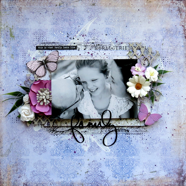
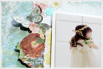
【WHAT  A  wonderful DAY】
My family went to the memorial trip last month married 10 anniversary.
We took the photo at the same location as 10 years ago!

It was a wonderful experience!

Precious memories!

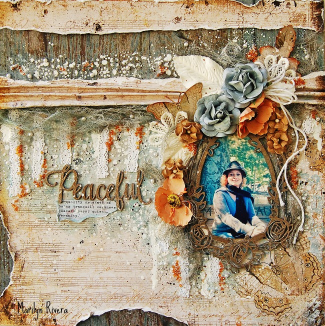
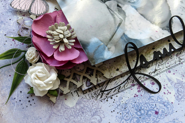
Because I wanted to express the clean and gorgeous feeling of Chapel

I chose this TIMELESS collection!


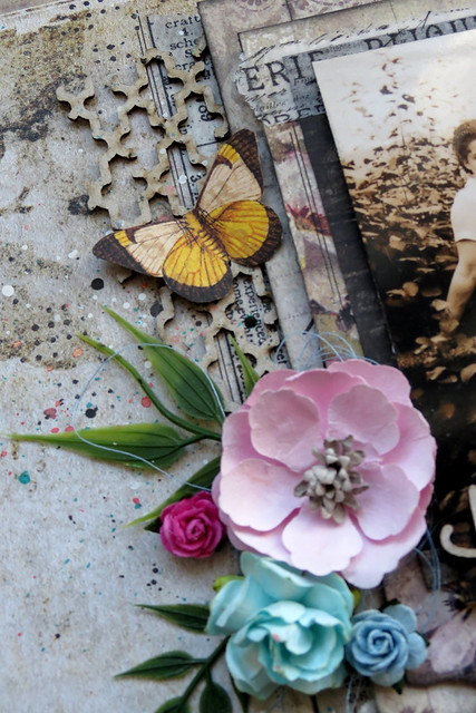
 Used tulle and white bird with the image of a wedding.

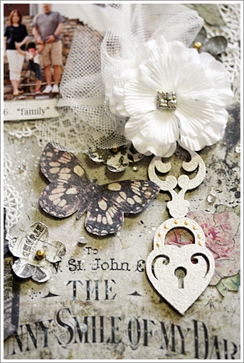
Clipboard (dangle) was embossed in parl.
It is clean out a little luster.

Such as the pattern of the letters and these bottles of paper
I feel good looks very little vintage.

Also processing the embossed of parl to the heart of the chip board,
 put a gold liquid Pearl from the top that.


<Blue Fern Studios>
Paper :  TIMELESS Artistique/ Calling Cards/Couture
Chipboard  : Romantic Page Dangles/Lace Heart Border
Embossing Powder/Pearl
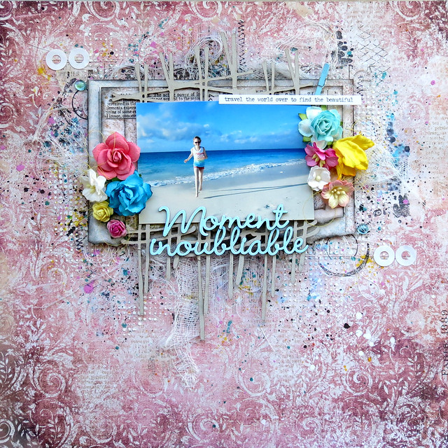
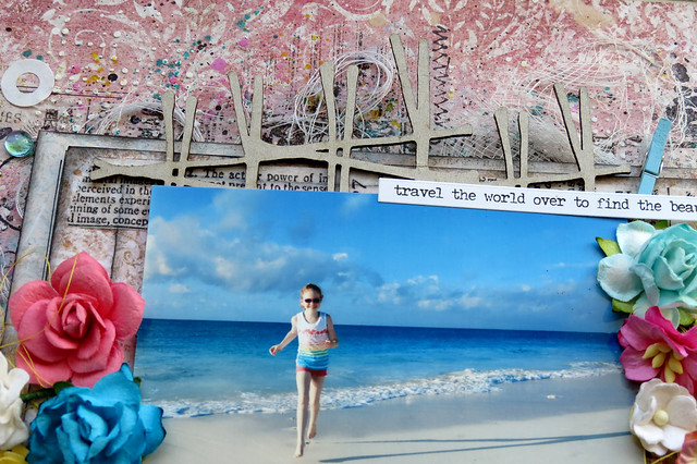
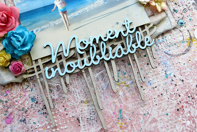


【Journey】
These photos were taken by a Taketomi Island visited on the trip.

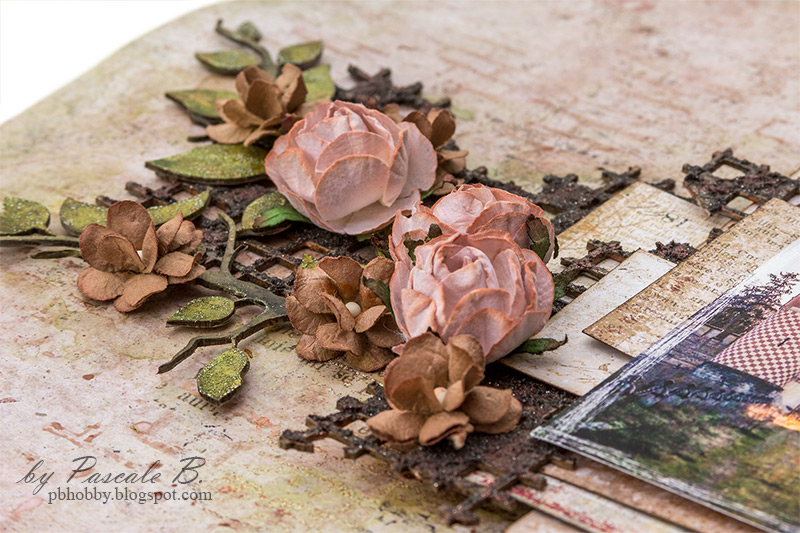
Because it was the color to red point
I chose the photo that is reflected in the bright red hibiscus and bougainvillea.


After the chipboard colored with ink
I was tracing with a pen of lame.


Chip board of the film was embossed with oatmeal.
Really this color is an excellent color can also be used to elegant to casual!


<Blue Fern Studios>
Paisley & Vine : Bohemian/Pathway/Playing Cards/Splendor/Whimsy
Chipboard : Journey, Explore, Discover/Film Strips/Directions
Enbossing Powder/Oatmeal


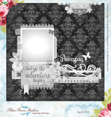
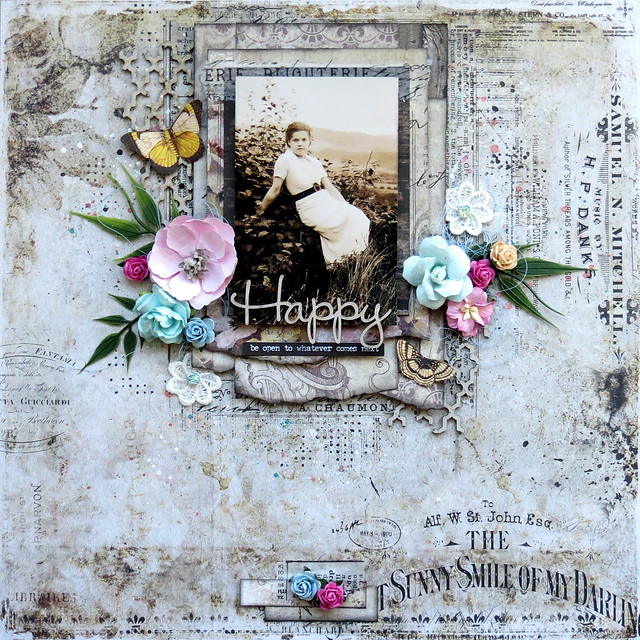
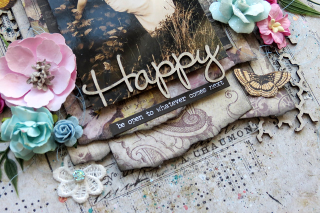
The other work is using the April sketch.


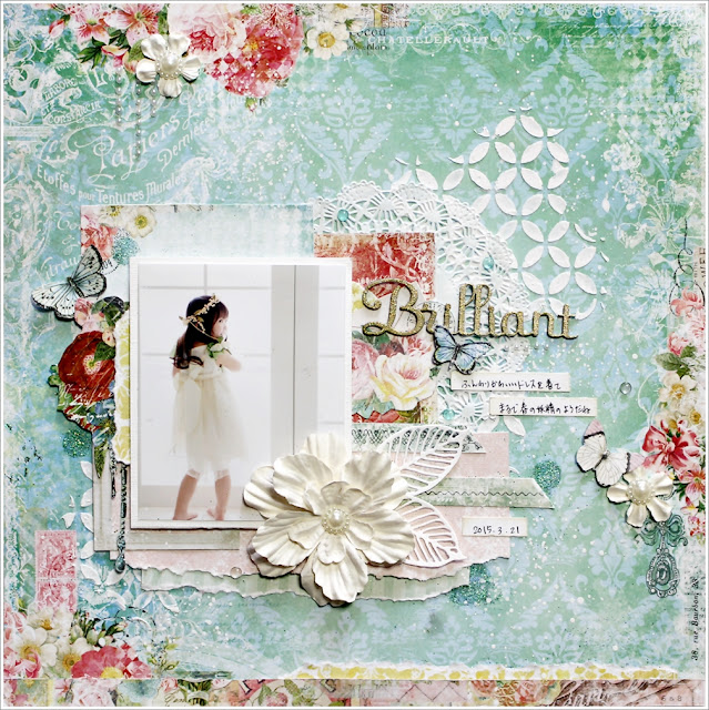
Paper used was a little nostalgic Frolic Collection.

The title was used for embossing powder 14karat.
This color also uses well with your favorite !


And Circle punch the card stock in the background, using the created template
I put a glitter paint a bond there.

This color and is beautiful!
The name is CARIBBEAN.


Finely skip the white paint
To have toned down as multiplied by the veil softly.


Blue Fern Studios
Frolic Collection -  Adorn/Friendship/Petits Moments
Chipboard-Brilliant, Amazing, Dazzling
Embossing Powder -14Karat
Gilitter-CARIBBEAN


Thank you!


Monday, April 25, 2016

Tranquility Layouts from our Creative Team

Have you seen Tranquility, our new collection?  If not, you can see all the details HERE.  Some of our Creative Team members have been busy working with this new line, and we can't wait to show you the wonderful layouts they have created

First up is Marie-Josee Hamel.  Marie-Josee used two papers from the Tranquility collection, Patience and Calm, as well as flowers from the Tranquil Blooms and Tranquil Roses and Lilies flower sets. She also altered the Dangle Border chipboard with two of the new Blue Fern Studios embossing powders, Mushroom and Chili Powder. She used the Serendipity Medley stamp with orange and black ink.


Our next layout was created by Keren Tamir using the Peaceful paper from the Tranquility collection and creating some texture on the background with stamping from the Bourbon Street stamp set.    Around the photo she has used the Tranquil Blooms flowers.  Three pieces of Blue Fern chipboard have been used (Romantic page dangle, Shrine frame, and Optimist word set).  The chipboard pieces were colored using Blue Fern embossing powders in Auburn, Mushroom, and Chili Powder. 


For her layout, Debbie Burns used the Peaceful paper for the background, along with Calling Cards and Jubilation.  The flowers are from the Tranquil Blooms set, and stamps used include Bourbon Street and Romantic Accents.  The chipboard (Tranquil Foliage, Peaceful title, and Royal Monarch), as well as the background of the layout have been embellished with Blue Fern glitter and embossing powder. 


Next we have Nicole Doiron's layout using the distressed wood grain Calm paper for the background.  The texture in the background was created using the Texture1 stamp set. Flowers from both of the Tranquility flower sets have been used.  The Serenity title, Checker Bits, and La Plume chipboard pieces have been colored using our Snow and Sea Mist embossing powders.


Sandi Clarkson's layout uses the Hushed paper from the collection as her primary background.  She also used both sets of flowers that were created to coordinate with the Tranquility paper collection.  Chipboard pieces include the Scalloped Border, Organic Coins, the title Blissful from the Blissful, Jubilation, Patience set of titles.

We are so excited about this collection, and we hope you love it, too.
A big thank you to these members of our Creative Team for creating these layouts for us to share with you!


Sunday, April 24, 2016

Frolic, Timeless and Autumn Anthology with Karine

Hi there,

It's my turn today on the blog. I have three layouts to share with you today. I was hoping to share some projects with the newest collection, but I haven't received my box yet, so I'll have to wait until next month.

It doesn't matter, I still love older collections.

Giggle

My first layout features the beautiful Frolic collection. I used the Friendship paper. I just can't believe how cute those little birds are. I think I have 6 or 7 copies of this paper! I love it!


I used modeling paste and a stencil to add texture on my background. Then, I glued thorn doilies with gel medium. Over that, I adhered dry wall tape. When everything was dry, I added my colors.


I layered parts of the Damask Panel underneath my picture and my flowers. I covered it with Snow embossing powder. While the powder was still hot, I sprinkled a little bit of Bonny Blue embossing powder and melted it again.


My title piece, part of the «Funny, Giggle, Smile» set, received the same treatment. I adhered it on top of my picture.

Famille

My second layout is more subtle. I used the Song paper from the Timeless collection. I love its colors.


My composition is based on the Aloha Flowers chipboard, which I painted with white gesso and covered with mist.


I also added the Chelsea Vines, that were coloured the same way.


You can see, in the background, that I used the Vintage Edges stamp with brown ink to add texture to my layout.


My title piece, part of the French Words set, was also altered with mists over gesso.

Special

My last layout features on of my favorite pictures of my daughter. Isn't she cute?


My background paper is called Newsworthy and it is from the Autumn Anthology collection. I chose it for its neutral colors. I added a little bit of color to the bird above, to help him match my layout. A light touch of white gesso helped to see all the details.


My layout is based on the Chelsea Medallion chipboard piece. I LOVE this piece! I embossed it with three colors of embossing powder: Fern, Cerulean and Azure.


To add a bit of interest below my picture, I layered two pieces of the Leafy Page Accents over my medallion. They were embossed with the same three powders as well as white gesso.


Lastly, my title piece, part of the «Perfect, Adorable, Special», was left raw, as it helped to bring the background color back into the layout.

I hope my layouts inspired you. Have a nice crafty day,

Karine


Saturday, April 23, 2016

April inspiration by Pascale

Hello Sweeties

I followed the April sketch for these first layout. I chose to work with papers of the Serendipity collection. Their vintage feel is a perfect match with the photo of Notre-Dame-la-Grande of Poitiers (France).


I started to add a layer of clear gesso to the background and the chipboards. Then I added adding a design with a stencil and 3D gloss gel. 


While the design was drying, I colored the Whimsy Flourishes with a brown Distress inkand added a touch of gold wax. 


I colored the die-cut sprigs with the same ink, sprayed them with water to activate the ink and sprinkled sage embossing ink while wet. I colored the leaves with the same Distress ink and some Twinkling H2O and added ginger and garnet embossing powder. 


I colored the flowers with the H2Os too and I used them to added some color to the background too. 


To finish I added some splatter of merlot glitter: I mixed soft matte gel with water and the glitter so I was able to splatter the mixing. 

Blue Fern Studios products:

Serendipity collection - Calling Cards, Fascination
Chipboards - Whimsy Flourishes
Imagine Ink - Embossing Powders - Ginger, Garnet, Sage
Imagine Ink - Glitter - Merlot

-------------------------------------

The second layout showcase a photo of the entrance of the castle of the Temple (L'Ile-Bouchard - France).


I started to add a layer of clear gesso to protect the background and the chipboards. I added some texture the wall stamp and the oatmeal embossing powder.


I covered the Grid Pieces chipboards with a graphite paste. When dry, I splattered some color.


I  painted the Spring Branches with some Twinkling H2O  and sprinkled some embossing powders to add some texture.    


I colored the flowers with some Twinkling H2O too. 


When all the embellishments were glued, I added more wall prints: I used a twinkling H2O with a similar color as the background.


Blue Fern Studios products:

Timeless collection - Song
Serendipity collection - Calling Cards, Chronicle, Fascination
Chipboards - Spring Branche, Grid Pieces
Flowers - Courtship Blooms
Imagine Ink - Embossing powders - Verdant, Sage, Nutmeg
Stamp - Essentiel Textures

-------------------------------------

The third layout showcase another postcard from Rennes (France) where we can see the City Hall Belfry.


I started to add a layer of clear gesso to protect the background and all the chipboards. Then I added a design with a stencil and modeling paste. While the paste was still wet I sprinkled different colors of embossing powder and heat set them. 


I covered the Roman Clock with black gesso, then I added some texture with the Texture Circles stamp and the Ginger embossing powder. 


I covered the Leafy Page Accents with a white crackle paste. When dry I colored them with a light brown Twinkling H2O. 


I colored the roses and the leaves with different Twinkling H2O and I added some ebossing powders on the leaves to add some textures.


I added some colors to the background and some random stamping with the Arcadia Textures stamp. To finish I splattered some glitters mixed with matte gel and water.


Blue Fern Studios products:

Serendipity collection - Contemplation, Reminisce
Chipboards - Roman Clock Set - Small, Leafy Page Accents
Imagine Ink - Embossing powders - Breeze, Icicle, Pearl, Ginger, Verdant
Imagine Ink - Glitter - Blue Ice
Stamp: Texture Circles, Arcadia Textures

Friday, April 22, 2016

Two layouts and a Video Tutorial featuring the new Tranquility Collection

Hello everyone!
My projects today are featuring the new Tranquility collection, Tranquil Blooms, Roses and Lilies and the new products by Blue Fern. Let's take a look...
I love the soft colors of the Contentment and Serenity papers in this new collection. The sweet photo of my nieces goes perfect with it.   I made a video tutorial of this page that you can see at the end of the post.

My title is the Darling chipboard and the flowers are the new Tranquil Roses and Lilies.

I embossed and painted the Scalloped Border and cut out some flowers from the Contentment paper.

I framed my photo with the Oval Daisy Frame.

Blue Fern Products:
Tranquility collection: Contentment, Serenity papers
Embossing powders: Mushroom, Sky View, Cotton Candy
Chipboard: Oval Daisy Frame, Darling word, Scalloped Border
Flowers: Tranquil Blooms, Tranquil Roses and Lilies
Stamp: Bourbon Street


Here's the video tutorial, I hope you enjoy it!


"PEACEFUL"
For my second project, I chose the warm colors from the Tranquility collection. My papers  are  the Calm and Jubilation.
The Tranquil Blooms and roses go perfect with these color tones . 

The Rose Shield frame and the Peaceful chipboards were embossed with Mushroom and Seven Seas embossing powders.

I cut out the phrase and the butterfly from the Calling Cards paper.

The flowers colors are perfect with the papers.

Blue Fern Studios products:
Tranquility collection: Jubilation, Calm papers
Flowers: Courtship Blooms, Tranquil Blooms, Tranquil Roses and Lilies
Chipboard: Rose Shield, Peaceful word
Embossing powder: Mushroom, Seven Seas


Thanks for stopping by..Until next time!
Marilyn Rivera

Thursday, April 21, 2016

Three layouts by Marie-Josée

Hello, Blue Fern Studios fans!

Today, I am featuring three layouts created with the latest three Blue Fern Studios paper collections: Courtship Lane, Serendipity, and Timeless.

Happy (Timeless collection)

For this layout, I used the Timeless collection. I have to admit that this one is my all-time favorite BFS collection! I used a picture of my grandmother, taken in 1936.

As you can see, I created many layers under the picture with various Timeless papers. I used the Artistic paper for the background.


You must have notice that I love the look of bare chipboards on my layouts. Here, I also used bare chipboards from two different sets: two pieces of the Turkish Bits set, and the word Happy, from The Optimist Word Set.


Moment inoubliable (Serendipity collection)

For this layout, I used the Serendipity collection. For the background, I used the Glee paper.


Under the picture, I used the Crossing the Lines chipboard, which I did not alter.
 

For the title, I used two words from the French Words set, Moment and inoubliable. I altered them with Blue Fern Studios embossing powder. I used the color Breeze.


Family (Courtship Lane)

Unlike many people, I LOVE purple! Thus, I was really happy when Blue Fern Studios introduced the Courtship Lane collection, because it has lots of purple.

I used the West Plaza paper for the background.
 

Under the picture, I used pieces of chipboard from the Frolic Mesh set.


That's all for today! I hope you enjoyed my projects! :)