Thursday, August 20, 2015

New at Blue Fern Studios - Autumn Anthology!

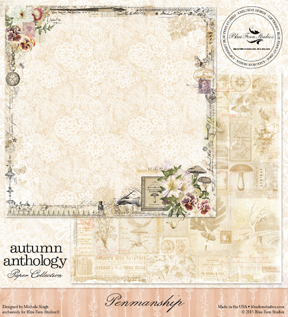
We are excited to introduce our new collection - Autumn Anthology, designed by the very talented Michele Singh.  This is going to be a long post, with a lot of images, because there is so much to see!


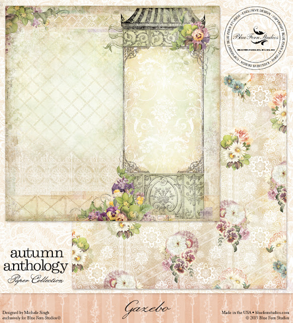
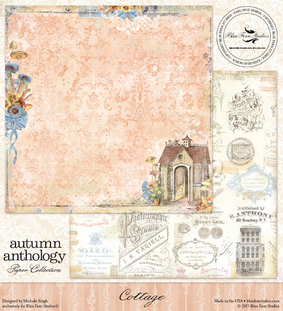
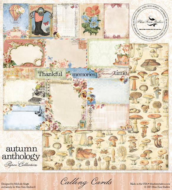
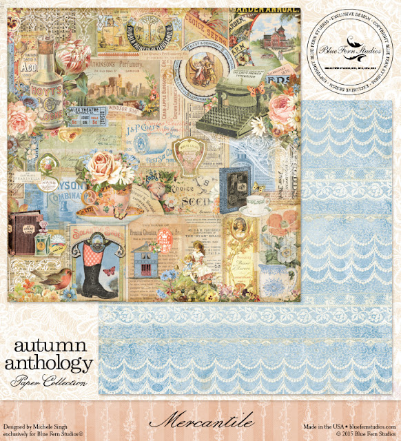
We begin with the paper collection.  In addition to the beautiful colors, you will find an array of dainty lace patterns, a charming cottage and gazebo, classic ironwork, and vintage newsprint adorning this collection of 10 patterned papers.  There are also plenty of items just perfect for fussy cutting, and numerous cards for you to cut apart and tuck into your projects.


But that's not all!  This collection is packed with enough products to get your creativity going, and keep it flowing for quite some time.  Each item in this release builds on the others!

For the first time, we are excited to add a collection of  mists that were selected to further bring alive the colors in this collection:

Imagine Ink Mica Color Mist - Leaf

(a leafy green with silver mica)


Imagine Ink Mica Color Mist - Persimmon 

(a beautiful coral red with bronze mica)


Imagine Ink Mica Color Mist - Sky 

(a beautiful sky blue with silver mica)


What would a release be without some new chipboard pieces to go along with it?  

French Ironwork


Iron Signage

Ironwork Edges


We round out this amazing collection with a couple of elegant stamp sets.

Flight & Flair


Parisian Ironwork


Wow!  This is an amazing collection and we are so excited to bring it to you.  It is available in our Store now, and will be shipping to your favorite retailer soon!

Wednesday, August 19, 2015

August Projects with Angelica

Hello friends! Today I'm going to show you three layouts I created with three different lines.

My first page is using the newest line Frolic and based on the sketch. I loved the soft pinks so I went for a baby theme page.
 
Heaven Sent


I used the Mercantile paper as my background. I like to use the Calling Cards as a spot to put my title. I used the Dans le Jardin as my photo mat. A little darker pink to pop the photo.
 
For the title I used "Heaven Sent" from the Spiritually Speaking Set.

I used gesso on the Frolic bits and sprayed with light color mist.


Next, I used the Deja Vu collection. I love the purples in this collection and added in some gray. I plan to put this piece in my living room! :)

Cherish

I did lots of layering and distressing using three papers. For the very bottom with the punching I used the Lustre paper. Then I used the La Plume and Petite Cartes.

 
I also like to layer my chipboard. I used the Damask Panel and the Roman Clock Small.

For the title I used the large Cherish.


Lastly, I used the Ombre Collection. This is actually my last bit for this line! I love these colors!

The Sweetest

I used Charlotte's Dream as my background paper. And Joyce's Dream as layer.
 
For the Royal Monarch I painted them with gesso. Then, misted and painted. I did the same with the Quatrefoil Panel.
 
 And the Medium Symphony Corners.

Thanks for taking a peek!


Tuesday, August 18, 2015

Wonders of Nature- with Paisley & Vine- By Keren Tamir


Hi Everyone its Keren here with two brand new layouts for Blue Fern Studios using the new Paisley and Vine Collection.
Both layouts have a nature theme to them and this collection was perfect for these photos.

"Wonder"


I used the "Passion" Paper for the background and added lots of natural texture behind the photo.


I framed the photo in the "Chipper Frame" which was covered with texture paste and then inked.
I also used the "Wonder" chipboard word as a title. It was painted in copper acrylic paint.


<<<<<<<<<<<<<>>>>>>>>>>>>>

"Dare to Dream"


I used the Paisley and Vine "Whimsy" paper for the background and the "playing cards" paper to frame the photo and for the title.


I used the rock wall bits under the photo. I embossed them, inked them and then highlighted with white gesso.
I also used some vines from the "All natural set" and the "leafy bough". They were both inked in green chalk edgers.


Thank you for visiting the Blue Fern Studios blog today
have a wonderful day!!

Keren


Sunday, August 16, 2015

Three Layouts Featuring The Frolic Collection

Hi eveyone!  Debbie here with you today sharing 3 layouts I created with the new Frolic paper collection.  I love the colors in this collection, perfect for your summer photos.  

My first layout highlights the Amoroso, Dans le Jardin, Friendship and Calling Cards paper.  I thought they were perfect for a somewhat masculine layout.
Lots of layering behind my photo and some fussy cutting.

I used the Collage Border and Bits of Honey chipboard, both of which I primed with some gesso and then colored with water colors.

My flower cluster on the right hand side along with some of the Bits Of Honey chipboard.

As you can see I again used some of the Bits Of Honey chipboard and the word Noted from the Arrow Words which I colored with some water color paints.

My next layout is a feminine one.  Love the pretty color combinations in the background paper, Mercantile. I also used the Friendship and Calling Cards papers. 
 Lots of subtle stamping with the Forever and Vintage stamps.

From the Arrow Words I used Love This, which I covered with gesso and applied some gelatos.   I also used the Gatsby Collage which I also covered with gesso and then added some gelatos and micro beads

Tucked beneath my cluster of flowers in the new Floral Lattice Bits chipboard.

Here I used more of the Floral Lattice Bits and added some micro beads.

My last layout I created using the August sketch and the Friendship, Allegro, Dans le Jardin and Calling Cards papers.  I added some stenciling and mists on my background to blend with my flowers. My photo is backed with a chipboard piece from the Paisley and Vine Medley and some Mini Flourish chipboard pieces are nestled among the flowers.


My title Smile is from the Smile, Funny, Giggle set which I colored with some gelatos.


Here you can see more of the Paisley & Vine Medley chipboard which I painted with gesso and misted.  I cut a few butterflies from the Dans le Jardin paper and added them to my clusters.

I hope you have enjoyed my layouts.  Don't forget that you still have time to enter our August Sketch Challenge.  You can find all of the details here.

Thanks for stopping by!
. . . Debbie

Friday, August 14, 2015

Three layouts, three different collections.

           So happy to show you my layouts today using three different beautiful paper collections.

             For my first layout I took one of the beautiful papers out of the Deja Vu collection.
                The soft and dreamy background was what I needed for these pictures.

                For the background I made a circle pattern by hand and with a mask.
                                  Too match the chipboard I wanted to use.
                               

I cut  one of my favorit chipboard, the beaded strings up in one big and a smaller .
To use them behind my picture clusters.
First I gessod the chipboard very random, inked them with two colors distress matching my background.
Next I stamped them with a scriptstamp .
For a nature feeling I tucked in cork pieces here and there. 
Just cut up a winecork in slices.


My next project is one for the boys!
I found the perfect background in the Paisley and Vine collection.
The borders of the paper gives me the surrounding I like to go with the picture.
I left them as they are. 
The background is made with paint , gesso and stencils.

The chipboard is the triangle Eclipse which I cut in a few pieces to use it over the length. 
I than was able to keep the triangle I love so much and made the shape I liked for this layout.
You must never be afraid to cut your chipboard up.
Because it gives you so many new possibilities. 
I colored them with watercolor. and stamped them with a Blue fern Studios clear stamp.
Most of the time I write my journaling on the backside, but now and than I like a few words on the front aswell. I dont care anymore about my handwriting. My children always make fun about it, so I like it on my pages as a keepsake they have to deal with :) 


And than we come to the last page where I used the Frolic collection.
The trail of the goats, high up in the mountains .
The yellow Secretary paper was perfect for the sunset picture .  
Random black paste to mimic the trail that the goats make when they go up looking for gras.

I really wanted to keep this layout calm in the feeling of the picture.
With as many black as I could to have this sunset feeling.
Many times I spray my chipboard with spraypaint when I want a even coat..
It gives a supercoverage and shiny or matt look. And is dry in a few minutes.
Here I took a mat look.
After I sprayed it I added some black stickles on the flowers.
I ended with adding some real, dryed Edelweiss.

Thank you for visiting the blog 
Wilma