Wednesday, August 20, 2014

Two Layouts and a Card with Rae

Hello, everyone! It's Rae with you today to share some projects I've made this month.

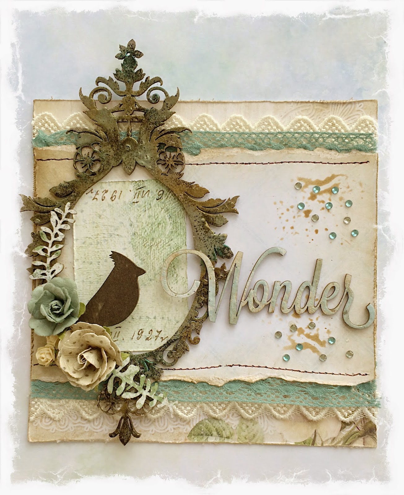
"Wonder" Card


For this card, I used a couple of sheets of paper of the Blue Fern Garden line, Parlour and Timeless. I used a light brown distress ink to give it the aged look.

In this closeup, you can see the four pieces of chipboard I used, each treated in a different way.
 The bird is from the "Little Birds" set is simply colored with brown archival ink. The title, "Wonder" from "Winter Titles" set was primed with white paint, then I randomly placed light blue embossing powder so some of the white would show through, then I lightly covered the whole piece with a light brown distress ink. The foliage peeking out under the flowers are remnants I had form some "Layering Stems" that painted white and lightly misted with an olive green mist.

For the "Majestic Frame," I covered the whole piece with an embossing medium and sprinkled brown, gold, and blue embossing powders. I repeated the process three times to get nice coverage.

"Cherish" Layout


For this layout, I used papers from the Ombre Dreams collection, along with some green cardstock.

I used the "Blue Fern Frame" for the focus of my design. I treated this piece by spraying it with a brown mist, letting it dry, then tracing the details with dimensional paint to create a look somewhat reminiscent of a gilded metal look. I finished the look by spraying the whole piece again with the brown spray to get into the little crevices of the dimensional paint.


I used green dimensional paint and poured purple and coral embossing powders over the entire "Cherish" piece while the paint was still wet. Then, I used a heat tool, and overdid it so the paint would bubble up for this dimensional distressed look.


"Key to my Heart" Layout

I used papers from both the Blue Fern Garden and Ombre Dreams collections, picking out light blue and light brown tones, along with some cardstock.


In this closeup, you can see the paper that I stamped with a script stamp to alter the look of it.


I treated all of the pieces with gesso.  On the "Ket to my Heart" title and key, I used two shades of brown distress ink.

On the "Large Roman Clock Set" I used various distress and chalk inks.

For the "Wild Flourish Bundle" I sprayed it with an ivy mist to create drops, then used more light brown distress ink.

I hope you enjoyed seeing my projects today. Thanks for stopping by!


Rae

Tuesday, August 19, 2014

Video Education: With Kelly!

Hi there! Kelly here today...with my very first video as a member of the Video Education Team.
I am excited to share my layout process with you and hope you will enjoy watching it.
Be sure to subscribe to our YouTube Channel so you don't miss out what our team has to share!

Here is my layout...
"Dreams Come True"
I used the Ombre Dreams paper collection, along with the Roman Clock Set - Small.

A few close ups..


And here you can watch, start to finish how I created it!


Thanks for watching!! Have a great day!!

Kelly

Monday, August 18, 2014

Mixed Media Layout Inspiration by Keren Tamir


Keren here and its my turn again on the Blue Fern Studios blog. I have 3 Mixed Media Layouts for you today.

Hope they inspire you!!


"You Are My Happiness"

This is the first layout I created using the Ombré Dreams Ginger's Dream Paper as a background.


I used the Wild Flourish Frame to frame my photo. I altered it by adding texture over it using textured paste and a patterned Stencil. Then I sprayed it with two different Color Bloom Sprays: Sorbet, Vintage Coal and Lime Wedge


I added the same texture and colours to the background and then stamped some branches and birds using black archival ink.


Finally I added some matching flowers, a title using the word Happiness from the Good Vibes set  and Voila!! 


<<<<<<<<<<<>>>>>>>>>>>


"You are perfect just as you are"

This is my second creation this month for Blue Fern Studios

I created a mixed media layout using the Ombre Dreams Chalotte's Dream paper as the background.


I wanted to hide the purple side of the paper as much as I could because I wanted to create a masculine layout. First I primed the purple side of the paper with clear gesso. Then, I created lots of texture in the background using a Stone Wall  stencil and some Textured paste. Finally, I sprayed it with two  Color Bloom Sprays: Cobalt and Precious Stone. I let the spray drip down the page to cover as much of the purple as possible.


I cut the Ups and Down panel Blue Fern Studio Chipboard. I cut it unevenly to create movement on the page. Then I embossed it with white and black embossing powder. Finally I inked the edges with black coal fluid chalk ink.


I built some layers over the chipboard panel and added some matching flowers and embellishments around the photo.


Finally I added a title in the corner using the Perfect chipboard word from the Chunky Word Set. I also embossed it with black embossing powder.
I also added some journaling along the side of the page using both sticker words and my own writing.


<<<<<<<<<<<<>>>>>>>>>

"I Love You"

This was my layout created for the new sketch challenge this month. The August's sketch was amazing as always.
We hope you get to play with us!!!


I love it when my kids pose together for me and on that rare occasion I snap the camera to get this cute picture of them. I used it as the centre of my layout.


I used the Blue Fern Studios Ombre Dreams Collection, Flutterbird chipboard dangles, a small camera from the picture perfect chipboard set and the word Love from the good vibes chipboard set.


Well that's all for today!!
Hope you enjoyed my creations

Have a wonderful day!!

Keren


Sunday, August 17, 2014

August projects with Blue Fern Garden

Hi Maja here today. I have two projects to show you, one layout and one card made with the Blue Fern Garden papers and BFS chipboard pieces. First up is the layout.


For this layout I used light modelling paste togehter with a stencil. I like this light paste because you can still see the pattern in the paper. Looks like embossing. My chipboard pieces I´ve painted with gesso and then used a stamp on them with some chalk.

Blue Fern products used:
papers: Blue Fern Garden - Boudoir and Picnic
chipboard: Lace Rounds and Bohemian Flowers


For my card I have used the new chipboerd piece " Birds ona wire".  I love birds and the color blue =) 

I have used 2 differerent colors of chalk on my chipboard and some pearls.

Blue Fern products used:
papers: Blue Fern Garden -Parlour
Chipborad: Birds on a wire 


Thanks for stopping by =)

Maja

Saturday, August 16, 2014

Multi dimensional canvas

Hello All Blue Fern studios Fans. It's Olga here.

Today I have for you multidimensional canvas based on BFS products. I use floral clock as main element, Layering Stems and Mini Flourishes as decorations in my composition and Dream Big as title of my work .

If you wonder how i did this work you can watch my video from Creative process. And don't forget to suscribe our You Tube channel

and here is my work

And some deatails :

Friday, August 15, 2014

Watching YOU Put Our Designs to Work! (+ YouTube Giveaway Winners!!)

Today we get to share some of YOUR fabulous projects we've found around the web which showcase our products! We also have some winners to announce from our YouTube Giveaway!

Let's take a look first at the projects we've chosen to feature this month:

Angelica Franssen

Kathi

Niesia

scrappininAK

Ulrika Blomfelt

Such gorgeous work, girls!!! Thank-you!!!

And of course we have some WINNERS from our YouTube subscriber giveaway!!

The lucky ones are: Judith and Robin!


Congrats to you! Please email me {erin@bluefernstudios.com} within 7 days to claim your prize!!