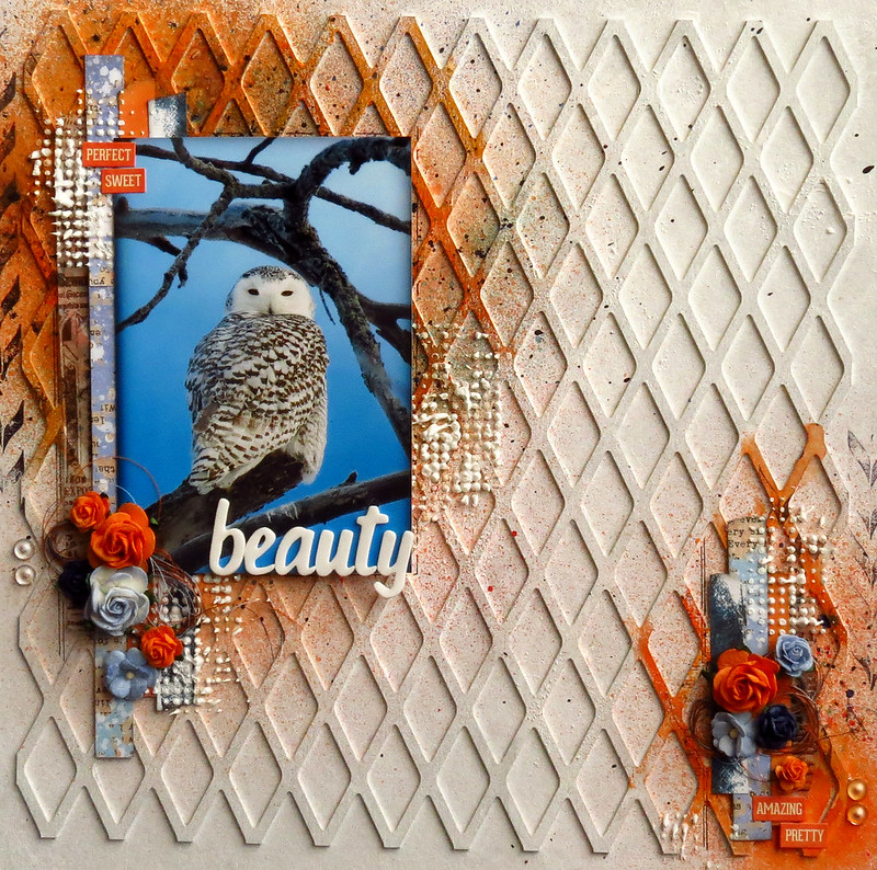
Hello, Jackie here today to share my February design team projects, including one with the new Blue Fern Garden papers. I was so excited to receive these papers; they are so beautiful I almost couldn't bear to cut into them. Almost. I did get over it, and had a lot of fun in the process.
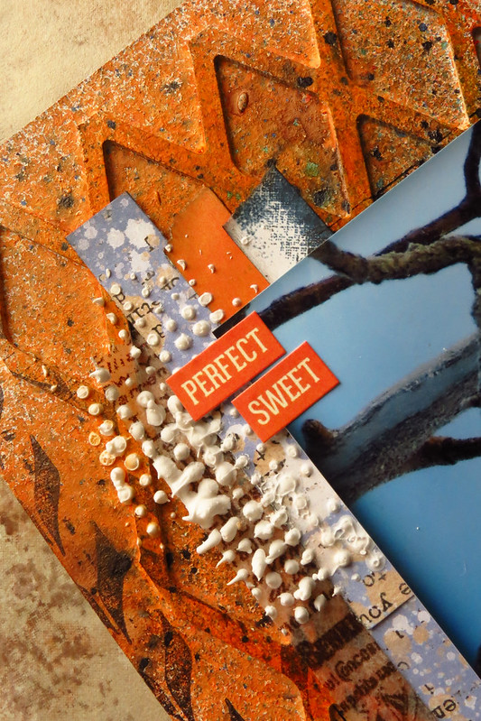
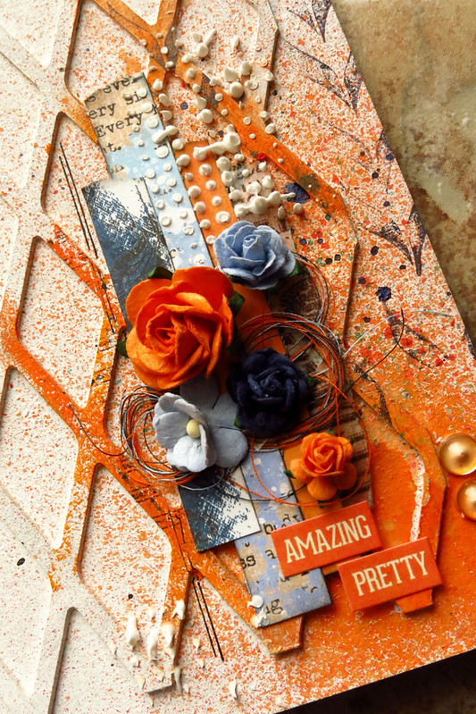
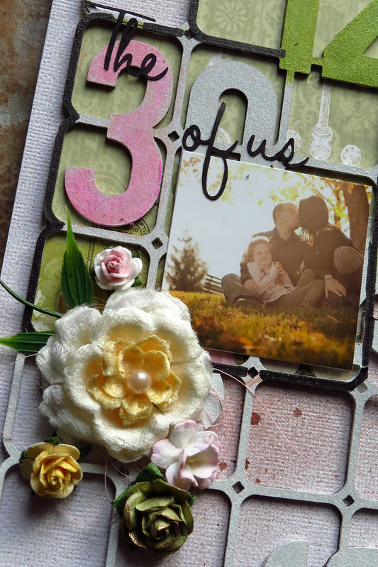
I love the lattice pattern of the Love Letters paper, and started by cutting it out with an X-acto knife, then used the pattern on the background Signature paper dictate how I trimmed the lattice. I wanted to leave the lovely birdcage and doily in the bottom right and the flowers and flourishes in the top left corners visible.
I glued the lattice down, then applied all my media overtop to make it an organic part of my background.
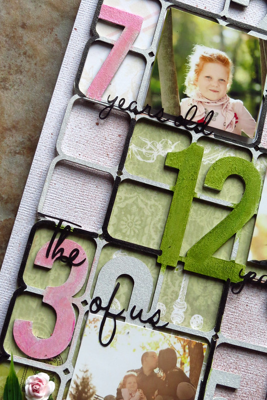
Lots of Blue Fern Studios chipboard scattered throughout. Frames are a great way to highlight a focal point on your photo; here I printed a second copy of the photo and fussy cut my son and the swing out of it and adhered it over the frame to bring movement to the picture. Of the three of us in the picture, there is no doubt who is the focal person (even more helpful when the photo is not particularly flattering of my eldest son and I). I started by rubbing a candle on the chipboard to create a bit of a resist, then painted and splattered on various coordinating colours of watercolour paints for a fun, artsy feel.

In addition to the lattice, there are lots of layers of paper and media on my background. I didn't want to cover these completely with additional layers of paper, but did want to add some additional bulk behind the photo; the Shabby Brick Bits were ideal for this purpose, and grounded the photo and cluster while allowing the background to peek through. I simply painted the chipboard with two coats of gesso, then added stamping and splattering.
Your chipboard doesn't always have to be the focal point of your layout. I needed a little something to bulk up my cluster, and this butterfly, painted randomly with watercolours, fit the bill perfectly.
With such a busy background, I wanted to make my title bold and simple to help it really stand out. A simple coat of black watercolour paint did the trick. I mounted the title on top of the flowers in my cluster with some wet adhesive.
Products Used
- Blue Fern Garden Signature paper
- Blue Fern Garden Love Letters paper
- Blue Fern Garden Calling Cards paper
- Shabby Brick Bits chipboard
- Picture Perfect chipboard
- The Optimist Word Set chipboard
- Icons Set One chipboard
I had so much fun playing around with this next layout. I love this picture of my middle son, and the look of disdain on his face, and wanted to use chipboard to draw the eye in to the photo.
The Graduated Circles were perfect for the task. I started by colouring the piece with a white Gelato, then built up additional colours with Gelatos and finished the whole thing off with random spots of coordinating embossing powder. I would later use the Graduated Circle as a frame for my clusters, which keeps the eyes moving around the centre of the page.
The Tattered Diamond Bits ground the photo within the circle, preventing it from looking as though it is just floating there. I started by heat embossing them with a weathered embossing powder, then added in Gelatos in orange and brown to marry it to my colour scheme.
For the title, I painted it with gesso and my finger, leaving texture behind, then misted it randomly to achieve an ombre effect.
And last but not least, a pop of purple to coordinate with the purple in the photo.
Products Used
- Never A Dull Moment chipboard
- Graduated Circles chipboard
- Tattered Diamond Bits chipboard
- Seaside Seashells chipboard
Thank you for stopping by today!

