"Brown Eyed Girl"
Hello there, everyone! Sandi here with you today!
I am going back a bit and creating a couple of projects with our Serendipity collection.
I am going back a bit and creating a couple of projects with our Serendipity collection.
It's wonderful mix of rich earth tones and grunge widen it's appeal to more paper crafters.
The background paper on the first project is Chronicle and then I've added torn Glee, Contemplation and Calling Cards.

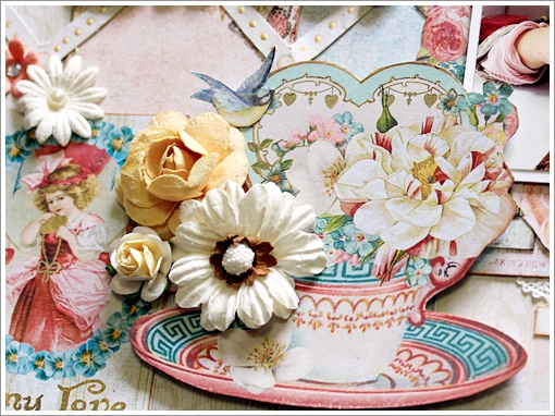
Hiding on the left is a Butterfly Grid remnant from a previous month. But the main focus here is the Berry Stem embossed with Verdant And Grassy Knoll. You can see a bit of the Brocade Texture stamp which I adore!

Brown-Eyed Girl was simply inked with brown and then given a dose of random glitter.

I had fun with the Techno-scape chippy using Ginger Embossing Powder and then sprinkling on Mermaid Glitter! I cut it in half so that it could peek out under my layers.

Great close-up of the Brocade stamping.
Blue Fern Studios Products used:
Paper:
Serendipity Glee, Chronicle, Contemplation, Calling Cards
Chipboard:
Butterfly grid remnant, Brown Eyed Girl, Techno-scape, Berry Stem
Stamp:
Brocade Texture
Embossing Powder:
Ginger, Verdant, Grassy Knoll
Glitter:
Mermaid
***
 "And so … "
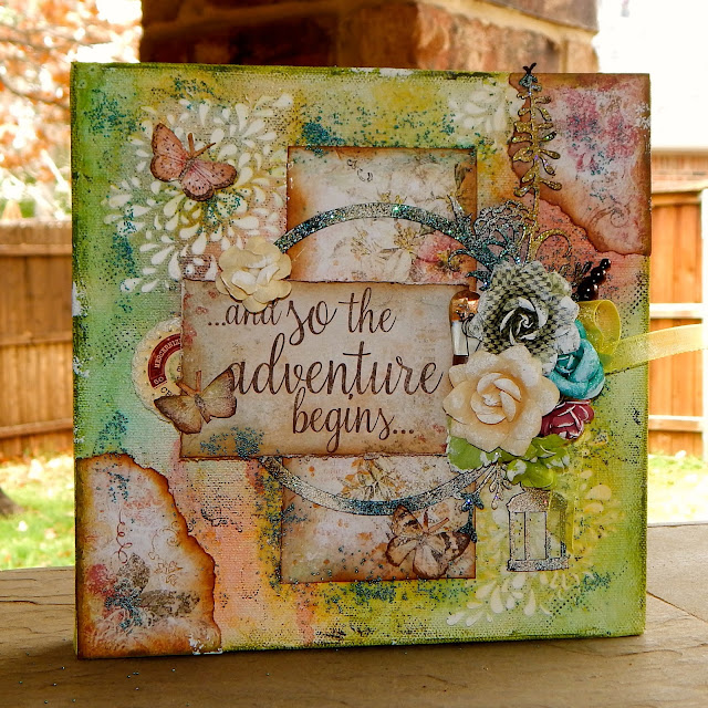
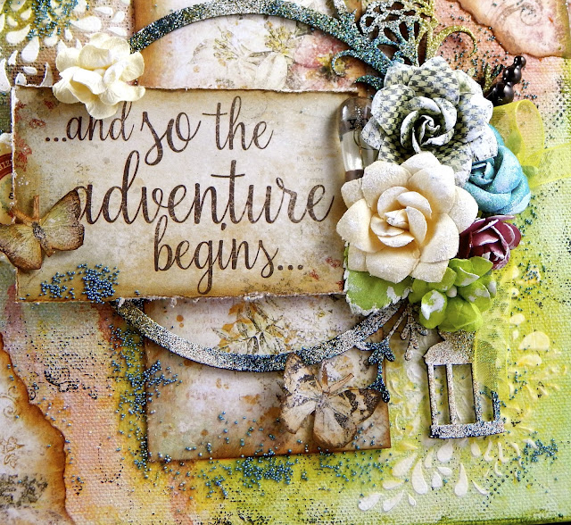
There is nothing I enjoy more than creating a canvas project! It feels so liberating to know that if I mess it up, I can just cover it with gesso and try again. And sometimes, you just get stuck in a rut when you do layouts consistently. So, the other day, I let loose and allowed the inner artist to have some expression.
I started with an 8x8 canvas and decided that I wanted to use this inspirational quote from the Serendipity Calling Cards sheet as my focal point. I also tore some scraps from the Merriment sheet to place in the center and in the corners.
Before adding my papers, I prepared the background with gesso and then had fun with my Imagine Ink mists, Fern, Cotton Candy and Winter Mint .. drying between colors. More dimension was created with some stamping utilizing the Brocade Texture, Textures 1 and Photography stamps. Of course, I did some stenciling and created texture with super heavy gesso.


***
***

There is nothing I enjoy more than creating a canvas project! It feels so liberating to know that if I mess it up, I can just cover it with gesso and try again. And sometimes, you just get stuck in a rut when you do layouts consistently. So, the other day, I let loose and allowed the inner artist to have some expression.
I started with an 8x8 canvas and decided that I wanted to use this inspirational quote from the Serendipity Calling Cards sheet as my focal point. I also tore some scraps from the Merriment sheet to place in the center and in the corners.
Before adding my papers, I prepared the background with gesso and then had fun with my Imagine Ink mists, Fern, Cotton Candy and Winter Mint .. drying between colors. More dimension was created with some stamping utilizing the Brocade Texture, Textures 1 and Photography stamps. Of course, I did some stenciling and created texture with super heavy gesso.

The Twilight Garden Frame frames my primary focal point. I first painted it black and then used Oatmeal, Peacock and 14K Embossing Powders to give it character! Great combination, by the way. I love how rustic it looks!

Then I added some embellishments that were laying on my desk, some flowers, a junkyard light bulb, ribbon and a couple of stick pins. I fussy cut some of the Merriment butterflies and worked them in as well.

Of course, I had to use one of my new Courtship Blooms because I adore their size and shape.
My finishing touch was to apply some mircro-beads with clear gel medium.
Blue Fern Studios Products used:
Paper: Serendipity Merriment and Calling Cards
Chipboard: Twilight Garden Frame
Stamps: Brocade Texture, Textures 1, Photography
Imagine Ink Mists: Cotton Candy, Fern, Winter Mint
Embossing Powder: Oatmeal, Peacock, 14K
Flowers: Courtship Lane Blooms
***
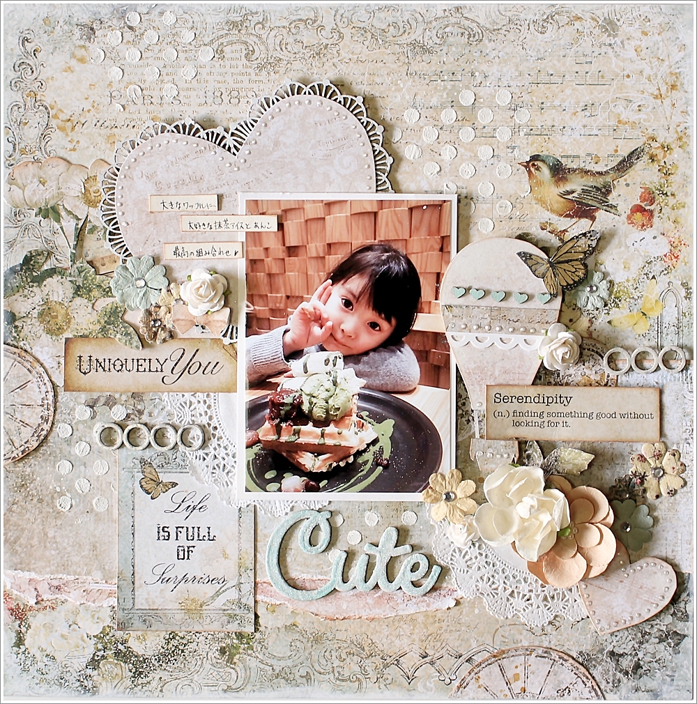
Since I felt that I hadn't really got to dig into my Timeless papers, that's where I went next.
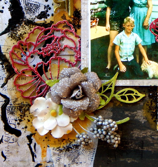
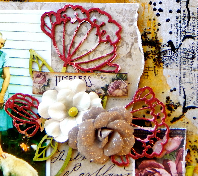
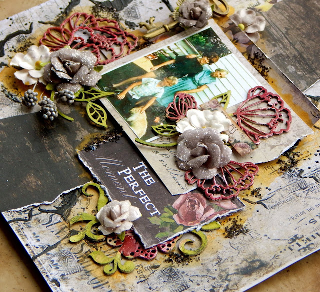
 "The Perfect Moment"
I prepared my background with gel medium and black gesso pushed through a stencil. Then I used some gold mist to bring out the yellow tones in the paper. I finished with the Postal Texures stamp to remind myself of my Grandma's faithful correspondence.
The photo of my brother and me with our Grandma Key was taken on her small farm in Indiana. She was such a special lady, always had a kind word, worked hard, raised 10 kids and loved her flower garden. She was so faithful to write me and there was always a mention of how her flowers were doing ... or that she couldn't wait for Winter to be over so that she could get outside. So, I had to pull out my fave BFS chipboard, Ginger's Poppies and put them on her layout!
Just a close-up.

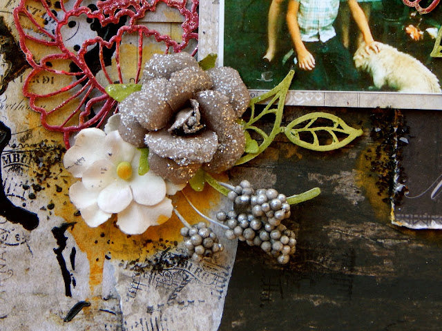
Lastly I added some dimensional flowers and berries and a random key laying on my desk. Nothing is complete these days without some added glitter or microbeads, so I've added some black chunky glitter.
Just a couple of dimensional shots!

Thanks for coming by today!
Remember to tag Blue Fern on your social media uploads.
I'll be back on the 17th with some social media Features!

I prepared my background with gel medium and black gesso pushed through a stencil. Then I used some gold mist to bring out the yellow tones in the paper. I finished with the Postal Texures stamp to remind myself of my Grandma's faithful correspondence.
The photo of my brother and me with our Grandma Key was taken on her small farm in Indiana. She was such a special lady, always had a kind word, worked hard, raised 10 kids and loved her flower garden. She was so faithful to write me and there was always a mention of how her flowers were doing ... or that she couldn't wait for Winter to be over so that she could get outside. So, I had to pull out my fave BFS chipboard, Ginger's Poppies and put them on her layout!

I prepared the Poppies, as well as the Paisley and Vine Flowers with white gesso, the used gelato for color and went back with my embossing powder in Garnet. Before I went to heat the powder, I sprinkled in some Pyrite Glitter, just to give the flowers a hint of shine like dewdrops.

Just a close-up.

Additionally on the Paisley and Vine leaves, I did some stamping with Postal Texture stamps, always a nice touch!

Lastly I added some dimensional flowers and berries and a random key laying on my desk. Nothing is complete these days without some added glitter or microbeads, so I've added some black chunky glitter.

Just a couple of dimensional shots!

Blue Fern Studios Products used:
Paper: Timeless Artistique. Abode and Calling Cards
Chipboard: Ginger's Poppies, Paisley ands Vine Flowers
Stamps: Postal Textures
Embossing Powder: Garnet
Glitter: Pyrite
Remember to tag Blue Fern on your social media uploads.
I'll be back on the 17th with some social media Features!
It could be yours!