Showing posts with label Timeless collection. Show all posts

Monday, July 11, 2016

A Mixture of Everything by Nicole Doiron


Hello!  This is Nicole and it's my turn to share with you some creations featuring plenty of Blue Fern Studios goodies!  This month, in wait of the brand new collection, Seaside Cottage (click HERE to see it!) that is on its way to me via post and which I will prominently feature in my August reveal, I decided to dig into my BFS stash and pick some of my all-time favorites... oldies but certainly still goodies!

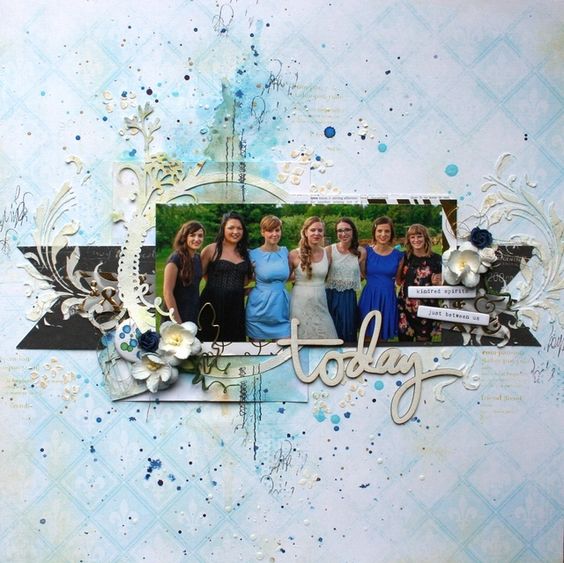
Let's start with this very sunny layout featuring the beautiful Frolic collection!


 I thought that these papers were perfect for this very Summery page!  I wanted my layout to be happy and fun so I started with the title 'Frolic in the Sun' colored in an ombre effect over some stenciled yellow sunrays, all using different Imagine Ink embossing powders and glitter.


Below you see some of the pretty Attic Charm Daisies.  The yellow flower was an Attic Charm Glitter Rose from which I removed the center and replaced with a royal blue brad to go with my palette.


To go along with my sunrays, I used the smaller Looped Frame in the upper right corner of my design while using the larger one behind my photo. They were both covered with a combination of Buttercup and Honey embossing powders.


I fussy cut some of the butterflies from the patterned paper and popped them up throughout.


This sweet photo of little Jade 'frolicking in the sun', very proudly showing off her parasol, was the perfect photo for my page!


Blue Fern Studios products
Patterned Papers: Frolic (Veranda, Dans le jardin, Friendship)
Chipboard: Frolic in the Sun, Looped Frames, Leafy Page Accents
Flowers: Attic Charm Glitter Roses, Attic Charm Daisies
Imagine Ink: Embossing Powders (In the Navy, Cerulean, Bonny Blue, Buttercup, Honey), Glitter (Sunshine)


While my first layout is very bright and sunny, this one is a little darker, using the Timeless collection.


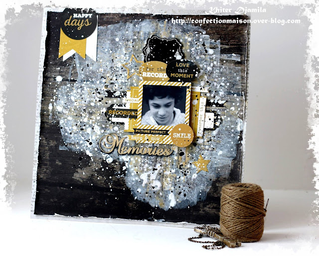
I absolutely adore this dark brown woodgrain paper and had to use it as my background.  I added some stenciling with black molding paste and some stamping designs with white ink.  I mixed 3 shades of embossing powders (ebony, auburn & mushroom) to colour the title and the Floral Lattice Bits.


 I created some elegant flower clusters using some beautiful Blue Fern Studios blooms along with more from my stash, adorned with fancy brads and badges.


The focal point of my layout is the fantastic Sweetheart Dressform - this piece is just so elegant!  I covered it with magenta embossing powder, then dabbed with a little white.


Blue Fern Studios products
Patterned paper: Timeless (Abode, Artistique, Calling Cards)
Chipboard: Sweetheart Dressform, Floral Lattice Bits, Leafy Page Accents, Contentment
Flowers: Attic Charm Daisies, Courtship Blooms
Stamp: Making Plans
Imagine Ink: Embossing Powders (Magenta, Ebony, Auburn, Mushroom)


For my last project, I created a mixed media canvas using lots of BFS chipboard, flowers and Imagine Ink mediums.


My base was created using layers upon layers of mediums.  I have to be honest, I started over this project about 3 times, not being satisfied with the result.  They say... third time's a charm.  Well, this proved to be true for me with this canvas.  After much gesso, molding paste, crackle paint, mists and inks, I added the final touches to it with some Imagine Ink embossing powder and glitter mixed in with glitter glass to create the pinkish shimmery texture.  I love the way it turned out!


I chose the title Dreams Come True as the theme for my canvas because we are all dreamers at heart, and I'm hoping that this canvas could bring a little hope and inspiration to someone somewhere someday.  I first covered this piece with Peacock embossing powder.  Such a beautiful colour!!!  And then, I dabbed some clear gesso and heated it to add some bubbly texture to it.


All the flowers used on my canvas are from Blue Fern Studios.


I fussy cut some butterflies and added die-cut scalloped squares, all from the Frolic line.  The "Dare to Dream" sentiment comes from the Paisley & Vine collection.


And last, but certainly not least, take a look at the gorgeous Victorian Fan!  I used Lime embossing powder on it as well as on the Checker Bits.


I hope I was able to inspire you with my creations today!

Blue Fern Studios products
Patterned Papers: Frolic (Adorn, Dans le jardin)
Chipboard: Victorian Fan, Dreams Come True, Leafy Page Accents, Checker Bits
Flowers: Tranquil Roses & Lilies, Attic Charm Glitter Roses, Courtship Roses
Imagine Ink: Embossing Powders (Peacock, Lime, Sea Mist, Cotton Candy), Glitter (The Pink Ladies)


Saturday, June 25, 2016

Weekend Inspiration from YOU!

Summer is an especially busy time for everyone, but that doesn't mean that that our creative minds stop working.  If you're like many, you see things every day that inspire you with their design or colors.  Today we would like to share projects from a few Blue Fern fans.  We were impressed by their creative use of Blue Fern products.

First up is this romantic album by Cheryl Kearns.  The entire album was created using paper from our Attic Charm Collection.  Each and every page is a piece of art.  The person who ends up with this album is going to be extremely happy!


We found this lovely vintage-inspired layout in an online gallery.  It was created by Bonprof using the Autumn Anthology Collection.  We see many of you use Blue Fern paper with your vintage photos to add a sense of days gone by.  This is a beautiful example.


What could possibly be sweeter than an infant?  This adorable photo was used by Cathy Cafun as the centerpiece for this layout.  We are so glad she chose to use Blue Fern's Tranquility Collection for this one.  The colors and design are so complimentary, and allow the photo to be the star!


Ever need to put together a quick card, and have absolutely no mojo?  That happens to all of us.  A quick solution is to pull out your Blue Fern Studios paper (Serendipity was used in the example below).  Our paper is filled with detailed images that are perfect for cards, and it's just what you need to get started.  We spied this charming card, created by Marylou (Meggies Nana) in an online gallery.


Sometimes the most gorgeous layouts are those that have a lot of white space.  This layout, created by Tatiana Yemelyanenko, is an ideal example.  She chose to cluster everything around this precious photo, and left everything else simple.  Doing this gives the eye a place to rest,  and lets the beautiful design of this paper do the rest (from the Timeless Collection).


We hope you enjoyed this unique collection of Blue Fern projects.  
We are so very flattered when you use our paper in ways that never cease to amaze us.
Enjoy your weekend, everyone! 


Friday, June 3, 2016

Today it's all about YOU!

Watching you use our products gives us such great joy.   We think you will enjoy seeing what we have found on blogs, social media, and online galleries. 

These beautiful cards created by Vera Shelemekh were made as thank you cards for teachers at the end of the year.  There is a compartment inside to tuck in a chocolate.  


We came across this beautiful layout by Robin Shakoor in an online gallery.  
Robin added the perfect embellishments to accent this paper from our Montage Collection. 


Anna Rogalska had posted this layout on her blog, and we fell in love with it!  Isn't it amazing how she has duplicated the flowers in the photo she has used?  Paper is from the Blush Collection, and the chipboard title, The Best Day Ever, has been cut apart to better fit the design of the layout.


Mei entered this sweet layout in one of our sketch challenges, using paper from the Serendipity Collection.  
The sweet photo jumps off the page with the layering of paper strips behind it.  
The chipboard title is also from Blue Fern.


We were very excited to see this layout created by Joanne.
Can you guess which paper collection she used as the background for this layout?  
If you really know Blue Fern products, you might recognize this as the backing for our larger pieces of chipboard.  What a creative example of re-purposing your packaging.  We love the design of this layout and how well the background brings out the beautiful blues in the photo. 


Last, but not least, is this artsy mixed media piece by  Djamila Khiter , which she shared on our Facebook page.  She used paper from the Timeless Collection for the background.  Did you know that Blue Fern paper is nice and heavy, and can withstand layers of media? 


Thanks to these amazing women for the beautiful ways in which you have used Blue Fern products!

We hope you will share your projects with us on Social Media!

Facebook     Instagram     Twitter     Pinterest     YouTube

Friday, May 20, 2016

The Light & Dark of it

Hi Blue Fern fans!  Today we thought we would share with you some layouts from various members of our Creative Team.  Some of the layouts will be light and some will be dark.  Like most of you, we like to mix it up, and Blue Fern paper will allow you to do that with our diverse paper collections.

First up, let's take a look at some layouts that are soft and mellow.

Marie Eve Bernard used this paper from the Serendipity collection with muted colors that seem to have been made just for this adorable baby photo.  She created just the amount of color she wanted with texture and embellishments.


Sandi Clarkson has chosen to use the somewhat brighter Blush collection for this soft, romantic wedding layout, with stunning pops of color.


This light pink paper from the Serendipity collection is what Cathi O'Neill chose for her layout with this unique photo.  The color palette of the background allows this bold photo to be the star of the show!


But sometimes we are all in the mood for something a little darker - a little more dramatic.  See how the next three members of our Creative Team used darker paper for their layouts.

Speaking of drama, Marie Josee Hamel's layout using paper from the Timeless collection is quite dramatic with the stark white against the beautiful background. 


The photo on Pascale Bernard's layout stands out beautifully, thanks to the various shades of gold she has added to this stunning layout.  This paper is from the Sanctuary collection


Nicole Doiron began with this dark background paper from the Serendipity collection and brought it to life by adding soft colors with  the flowers, chipboard, and other embellishments.  It really adds to the sweetness of this darling photo.


We thought we would finish it up with this art journal page created by Wilma Voermans who chose to use both dark and light, resulting in gorgeous contrast.  The chipboard piece from the "2 Hearts Set", which she has painted black, is the focal point of her page.


That's it for today.  We hope you enjoyed seeing the many ways Blue Fern products can be used, whether you're in a light and airy mood, or a more dark and dramatic mood.

Enjoy your weekend!

Wednesday, April 6, 2016

Sandi's April Inspiration!

 "Brown Eyed Girl"

Hello there, everyone! Sandi here with you today!
I am going back a bit and creating a couple of projects with our Serendipity collection.
It's wonderful mix of rich earth tones and grunge widen it's appeal to more paper crafters.

The background paper on the first project is Chronicle and then I've added torn Glee, Contemplation and Calling Cards.


Hiding on the left is a Butterfly Grid remnant from a previous month. But the main focus here is the Berry Stem embossed with Verdant And Grassy Knoll. You can see a bit of the Brocade Texture stamp which I adore! 


Brown-Eyed Girl was simply inked with brown and then given a dose of random glitter. 


I had fun with the Techno-scape chippy using Ginger Embossing Powder and then sprinkling on Mermaid Glitter! I cut it in half so that it could peek out under my layers. 


Great close-up of the Brocade stamping. 

Blue Fern Studios Products used:
Paper:
Serendipity Glee, Chronicle, Contemplation, Calling Cards
Chipboard:
Butterfly grid remnant, Brown Eyed Girl, Techno-scape, Berry Stem
Stamp:
Brocade Texture
Embossing Powder:
Ginger, Verdant, Grassy Knoll
Glitter:
Mermaid

***

"And so … "

There is nothing I enjoy more than creating a canvas project! It feels so liberating to know that if I mess it up, I can just cover it with gesso and try again. And sometimes, you just get stuck in a rut when you do layouts consistently. So, the other day, I let loose and allowed the inner artist to have some expression.

I started with an 8x8 canvas and decided that I wanted to use this inspirational quote from the Serendipity Calling Cards sheet as my focal point.  I also tore some scraps from the Merriment sheet to place in the center and in the corners.

Before adding my papers, I prepared the background with gesso and then had fun with my Imagine Ink mists, Fern, Cotton Candy and Winter Mint .. drying between colors.  More dimension was created with some stamping utilizing the Brocade Texture, Textures 1 and Photography stamps.  Of course, I did some stenciling and created texture with super heavy gesso. 


The Twilight Garden Frame frames my primary focal point. I first painted it black and then used  Oatmeal, Peacock and 14K Embossing Powders to give it character! Great combination, by the way. I love how rustic it looks! 


Then I added some embellishments that were laying on my desk, some flowers, a junkyard light bulb, ribbon and a couple of stick pins. I fussy cut some of the Merriment butterflies and worked them in as well. 


Of course, I had to use one of my new Courtship Blooms because I adore their size and shape. 
My finishing touch was to apply some mircro-beads with clear gel medium. 

Blue Fern Studios Products used:
Paper: Serendipity Merriment and Calling Cards
Chipboard: Twilight Garden Frame
Stamps: Brocade Texture, Textures 1, Photography
Imagine Ink Mists: Cotton Candy, Fern, Winter Mint
Embossing Powder: Oatmeal, Peacock, 14K       
Flowers: Courtship Lane Blooms

***

Since I felt that I hadn't really got to dig into my Timeless papers, that's where I went next.

"The Perfect Moment"

I prepared my background with gel medium and black gesso pushed through a stencil. Then I  used some gold mist to bring out the yellow tones in the paper. I finished with the Postal Texures stamp to remind myself of my Grandma's faithful correspondence.

The photo of my brother and me with our Grandma Key was taken on her small farm in Indiana. She was such a special lady, always had a kind word, worked hard, raised 10 kids and loved her flower garden. She was so faithful to write me and there was always a mention of how her flowers were doing ... or that she couldn't wait for Winter to be over so that she could get outside. So, I had to pull out my fave BFS chipboard, Ginger's Poppies and put them on her layout!


I prepared the Poppies, as well as the Paisley and Vine Flowers with white gesso, the used gelato for color and went back with my embossing powder in Garnet.  Before I went to heat the powder, I sprinkled in some Pyrite Glitter, just to give the flowers a hint of shine like dewdrops. 


Just a close-up.


Additionally on the Paisley and Vine leaves, I did some stamping with Postal Texture stamps, always a nice touch!


Lastly I added some dimensional flowers and berries and a random key laying on my desk. Nothing is complete these days without some added glitter or microbeads, so I've added some black chunky glitter.


Just a couple of dimensional shots!


Blue Fern Studios Products used:
Paper: Timeless Artistique. Abode and Calling Cards
Chipboard: Ginger's Poppies, Paisley ands Vine Flowers
Stamps: Postal Textures
Embossing Powder: Garnet
Glitter: Pyrite

Thanks for coming by today!

Remember to tag Blue Fern on your social media uploads. 
I'll be back on the 17th with some social media Features! 
It could be yours!