Hello Blue Fern friends!
I'm up on the blog today to share with you my creations for May. I had other projects planned for this post but this collection was too beautiful for me to put down. As usual, I like to play with light and dark background papers and this post is no different.
For my first project, I based it on the May sketch challenge although it didn't make it in time for the sketch reveal a few days ago. Below is the sketch again:


I just had to make a big deal of the blues here because of the boys' t-shirts. It also matches the color scheme of the paper perfectly. Lots of subtle details in the background as I wanted it to merge with the paper itself.
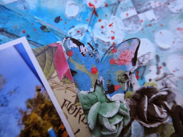
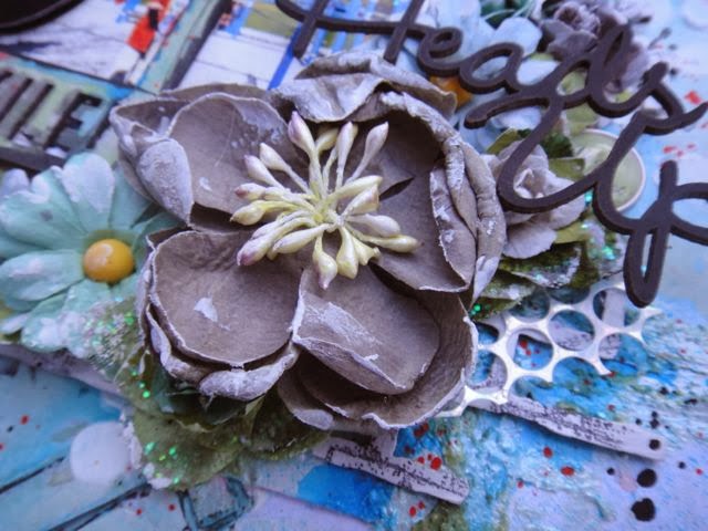
Some details in the close-ups:

Tranquillity flowers. I'm so glad BFS has released coordinating flower packs! No more hunting high and low for blooms that match.

Altering one of the roses a bit with some watercolor paint to create an ombre effect.

A chippie which I altered by first painting with green watercolor, followed by layering the embossing powders Lilac, Amethyst and with a sprinkle of glitter in Sunshine.

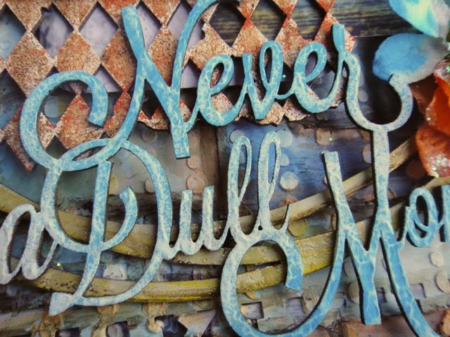
For my title piece "Blissful", I layered the embossing powders In The Navy, Seven Seas, Cerulean and Breeze.
Blue Fern Studios products used:
paper: Tranquility collection - Calm, Calling Cards, Jubilation, Peaceful
chipboard: "Blissful, Jubilation, Patience", "Tranquil Foliage"
embossing powder: In The Navy, Seven Seas, Cerulean, Breeze, Lilac, Amethyst
Glitter: SunshineFlowers: Tranquil Blooms, Tranquil Roses and Lilies
My second share is a video tutorial, of a layout of the boys at Rockingham Beach. Granted it was close to winter and chilly, we were hoping to make a day trip to Penguin Island just across the shore and check out the wildlife. Unfortunately the ferry trips were all canceled but we had a lot of fun picking up shells and watching the sea birds play in the distance.

I love how the whole project turned out, although there were a few bits which I thought I could have added more details - some of you may know what I'm talking about when I say I wanted to do something this minute and the next minute I've clean forgotten it! Nevertheless, I'm a sucker for woodgrain patterns and this sheet of Calm (I've used the reverse side for the first layout, that's how much I like it) really got my groove going.
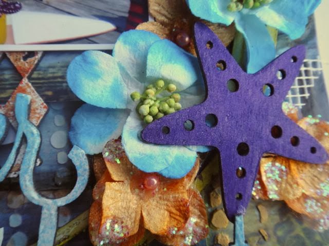
Some details in the close-ups:

A cute little anchor amidst the waves. Matched with Tranquility flowers.

More altered blooms, shells and seaweed chippies.

Love how the glitter sparkles in the sunlight, much like seaspray on a summer day.

Lapping waves and foam

The title piece - Fascination. Love the duo-toned effect in the sun!
And here is the start to finish video tutorial. I have noted the feedback from the previous video and slowed things down here so that you don't miss out on the action. Sit back and have fun!
Blue Fern Studios products used:
paper: Tranquility collection - Calm, Jubilation, Peaceful
chipboard: By the Sea, Nautical Set, Seaside Seashells, Seaweed, Serendipity - Fascination
embossing powder: In The Navy, Seven Seas, Cerulean, Bonny Blue, Ebony, Mushroom, Clover, Fern, Verdant
Glitter: Blue Diamond, Carribean, Autumn
Flowers: Tranquil Blooms, Tranquil Roses and Lilies
embossing powder: In The Navy, Seven Seas, Cerulean, Bonny Blue, Ebony, Mushroom, Clover, Fern, Verdant
Glitter: Blue Diamond, Carribean, Autumn
Flowers: Tranquil Blooms, Tranquil Roses and Lilies