Showing posts with label Roman Clock Set- Large. Show all posts

Tuesday, October 7, 2014

a card, a mini album and a trifold pocket album created by Lisa Gregory

For my first project I created a card that is shaped like a tag. It was easy to create the folded shape. I folded a rectangular piece of white 100lb card stock  and ran it through my Sizzix alterations die placing the fold of the card on the  inside of the die as not to cut 1 side, leaving the fold intact. Then I die cut 2 pieces of patterned paper Ombre Dreams Paper Leslies Dream, and adhered it to the front and back of the card. I left the inside plain white for some handwriting.


I used the fabulous  Fall acorns and  Bits Of Honey on my card. I painted the corns with acrylic paint then spread some crackle paint over it to enhance the colors. I just sprayed the bits of honey with Lindys Stamp gang spray after priming them with gesso.


Here is view of the back of the card when it is open. I strung some seam binding through the front hole in the card,. I spayed the seam binging with Lindys Starburst spray in My Mojito Green to match the die cut leaves on the front of the card.


For my next project I created another mini album in a different style. I used  the Montage Paper Collection using the Wisdom and Fairyland papers..


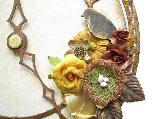
On the cover I used the smaller piece from the Roman Clock Set Large. The butterfly is from the Royal Monarchs collection. I inked both pieces with Ranger distress ink in Vintage Photo.

 I used the Roman Clock Set small on the right hand page, On the left hand page, I used a left over piece from one of the original Blue Fern Studios designs. I save everything! It makes a great frame. 


I created a tag with the flower on top and a small key from the Vintage Keys set.


This is just a closeup of the cover. The jeweled piece is a Recollection flower piece and I used burlap and some flower buds tucked underneath.


This is the album closed with twine that I adorned with some beads.


This is the view of the inside of the back cover. I love the pattern on the paper and did not want to cover it up.


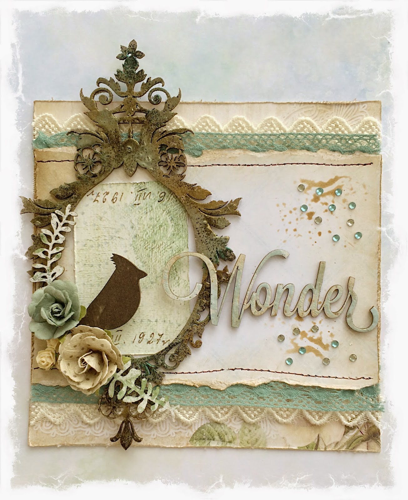
My next project is a trifold pocket album. I followed a pattern from a Kathy Orton book on mini albums. I used the  Montage Paper Collection, using the Wisdom and Fairyland papers.Sometimes mixing and matching  chipboard pieces from different collections can match perfectly. That is what I did here. I used  Manor Hinges  and  Damask Flourish to create the design on my cover. I painted them with black gesso.


I added a jeweled brad  to complete the look.


When you open the album, you can see there is plenty of room for pictures and journaling. The waterfall feature can hold many photo's.


This is a view of the back of the trifold. I used black cardstock for the base. I love the black and pink color combination together.


This is the  Damask Flourish  shown on its own.


Here are the little folders and tag cards shown, pulled out of their pockets. Each one opens up to add more photos or journaling.

Thank You for joining me this week. I look forward to creating with more of the gorgeous Blue Fern Studios papers and chip board. Until next time...
xoxo
Lisa

Montage layouts with Camilla

Hi everybody!

Here are two new layouts with lovely Blue Fern Studios products. I have used the NEW fabulous collection Montage. 

On my first layout I have used the paper Invitation from the Montage collection and also some new chipboards: Chunky Words and Ornate Frame.


And for my next layout I have used the paper Society from the Montage collection together with these chipboards - Chunky Words, Tattered Butterflies and Roman Clock Set.


Thanks for stopping by!

Thursday, September 18, 2014

Montage Inspiration by Keren Tamir


Keren here and I'm happy to be on the Blue Fern Studios blog once again.

I've created two different types of projects today so I hope you enjoy them!!

<<<>>>

Altered Clock Canvas


Below is a step by step video on how I created this OTP clock:


I covered a circular canvas with the "Society" paper from the new Montage Collection.
Then I used the large Roman clock chipboard to create this clock.


I used different coloured flowers and two small chipboard birds to decorate around it.


The chipboard was distressed with crackle paste and paint.


<<<<<<<<<<<<<>>>>>>>>>>>>

My Happy Life


I used the "Invitation" paper from the new Montage collection to design this layout. I loved the central theme of the background and therefore, I tried to create vertical movement on the page.


After designing the colourful background I framed my photo in the ornate chipboard frame that was embossed in white. You can see the texture of the frame below.


I added flowers and leaves under the frame to embellish the page. I tried to maintain the central/vertical theme in the layout.


Finally I used a word from the valentine word set and couple of words from the chunky word set (the word life, was cut from the word lifetime in the set). All the words were embossed to match the frame.


Thank you so much for visiting the Blue Fern Studios blog today.

Have a wonderful day!!

Keren

Sunday, September 7, 2014

September projects with Camilla

Hi all!

September is here and I have some new Blue Fern Studios projects to share. First a layout where I have used some of the newer chipboard pieces together with a paper from the Blue Fern Garden collection. The chipboards are the Ornate Frame, the Chunky Words and the Roman Clock Set.


The chipboards are painted in white gesso and then sprayed on with Color Bloom.


The tag looks like this. I have used papers from the Blue Fern Garden collection. The chipboards are the Roman Clock Set and the Leafy Bough.


I cut the clock into two pieces and left them raw.


The leafy bough is painted in white and then sprayed on with Color Bloom.


Thank you for stopping by! Make sure to check in later to see more inspiration from the Blue Fern Studios team!

Thursday, August 28, 2014

August projects from Leila

Hello everybody

Leila's here again to show my projects for this month...

My layouts today are about my daughter, in the first one she had 1 year old and in the second, she had a 13! She is my sunshine!


"You shine!"

I used gesso and gelatos in this chipboard and put some strass in the frame!

Here I painted the chippie with black pen and then put some colorless relief.


BFS supplies:
- Leslie's dream paper
- Brick rings
- The optmist word set


"Pretty as a picture"

Here I used a lot of chipboards and diferent supplies to customize them...

In the title and checker bits I used liquid pearl, in the big clock, acrilic paint and distress ink!


This wonderful chippie I used acrilic paint and spray ink (applied with brush)

BFS supplies:
- Julianna's dream paper by Ombré Collection
- Checker bits
- Roman clock set - large
- Spring branch
- Pretty as a picture

So, this it's! I hope you like it! See you next month...

Tks for stopping by.

Leila

Wednesday, August 20, 2014

Two Layouts and a Card with Rae

Hello, everyone! It's Rae with you today to share some projects I've made this month.

"Wonder" Card


For this card, I used a couple of sheets of paper of the Blue Fern Garden line, Parlour and Timeless. I used a light brown distress ink to give it the aged look.

In this closeup, you can see the four pieces of chipboard I used, each treated in a different way.
 The bird is from the "Little Birds" set is simply colored with brown archival ink. The title, "Wonder" from "Winter Titles" set was primed with white paint, then I randomly placed light blue embossing powder so some of the white would show through, then I lightly covered the whole piece with a light brown distress ink. The foliage peeking out under the flowers are remnants I had form some "Layering Stems" that painted white and lightly misted with an olive green mist.

For the "Majestic Frame," I covered the whole piece with an embossing medium and sprinkled brown, gold, and blue embossing powders. I repeated the process three times to get nice coverage.

"Cherish" Layout


For this layout, I used papers from the Ombre Dreams collection, along with some green cardstock.

I used the "Blue Fern Frame" for the focus of my design. I treated this piece by spraying it with a brown mist, letting it dry, then tracing the details with dimensional paint to create a look somewhat reminiscent of a gilded metal look. I finished the look by spraying the whole piece again with the brown spray to get into the little crevices of the dimensional paint.


I used green dimensional paint and poured purple and coral embossing powders over the entire "Cherish" piece while the paint was still wet. Then, I used a heat tool, and overdid it so the paint would bubble up for this dimensional distressed look.


"Key to my Heart" Layout

I used papers from both the Blue Fern Garden and Ombre Dreams collections, picking out light blue and light brown tones, along with some cardstock.


In this closeup, you can see the paper that I stamped with a script stamp to alter the look of it.


I treated all of the pieces with gesso.  On the "Ket to my Heart" title and key, I used two shades of brown distress ink.

On the "Large Roman Clock Set" I used various distress and chalk inks.

For the "Wild Flourish Bundle" I sprayed it with an ivy mist to create drops, then used more light brown distress ink.

I hope you enjoyed seeing my projects today. Thanks for stopping by!


Rae