Showing posts with label Optimist Word Set. Show all posts

Wednesday, June 18, 2014

Journaling Yourself- By Keren Tamir


Keren here and its my turn again on the Blue Fern Studios blog.
This month my reveal is all about me, how I feel, my thoughts and memories of this time of my life as I'm approaching 40. I had to jot down some of my thoughts and feelings so I can one day look back and remember them. I guess this is what scrapbooking is all about. I always thought I should scrapbook for my kids so they can have these memories in the future. However I actually think that I am scrapbooking for myself, so when I'm old and gray (LOL) I can look back and remember how I felt or how I looked. That is if I can find these layouts amidst the hundreds of boxes I will have by then.

"Happy"


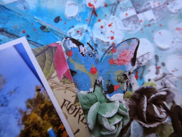
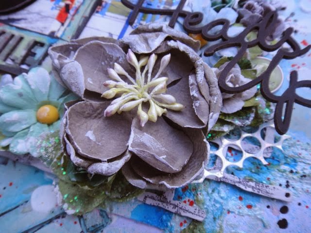
 I've used the new and amazing Ombré Dreams collection for both layouts today. It is such a gorgeous collection and so versatile. I just love it so much and its perfect for my style.


I framed my photo in the new Wildflower chipboard frame. I painted in purple and turquoise to match the colours of the papers. 


I used a few of the layering stems and the tweet friends branch to layer in between the flowers. I also painted them in purple and turquoise. 


Finally I used pieces of the graduated circles and the happy title from the optimist word set to finish the page.


<<<<<<<<<<<<<<>>>>>>>>>>>>>>>

"Believe"


Here is my second layout this month and it also about me but with my new haircut.
I recently cut my hair short so I can donate it. I figured I should also record this episode in my life as I very seldomly journal about myself. I think it happens about once a year so at least now I have two layouts showing my Before and After pictures of my hair.


I have a how to video on how I create this layout here below so I won't go into a lot of specific details and just watch the video.


Thank you so much for visiting the Blue Fern blog today!!
Have a wonderful day!!

Keren

Saturday, May 24, 2014

Hello all BFS Fans. Today I'm coming with 3 mixed -media projects.

First one is Little canvas in summer colors with my son on it. I use Dot Grid Panel as background to my project. Those panels from BFS are awesome You can use them to whole 12''x12'' work or cut to pieces so many ways of use a single product ! . one of Memory Frames become frame to my photo and Dream Big sign is title and filling to my composition


This work is girly and messy. I made  background using leftovers from circlce pannels I had. I glued them layered , and covered all with gesso . I recomend thick product to do that . Then i made composition using Graduated Circles and Blue Fern Bits and one of theValentine's Word Set is title.

This work was inspired by amazing photo of little girl.  I use Beaded Strings The Optimist Word Set, Heart Set and Jeweled Page Dangles to enhance delicacy of this picture.

Friday, March 21, 2014

"Girly-Girl Layouts" with Kelly Foster

Good morning! And...happy Friday!!! 
I hope you have some fun weekend plans - maybe some creating? If so, I hope to inspire you a little bit...
I have two super girly-girl pages to share today!

"Adorable"

I love this picture of my little girl...she looks to me just like a porcelain doll...ivory, smooth skin, sweet pink lips, and a frozen expression to go with it - lol!
Anyway, I wanted to go for a super feminine and soft look here. I started with the Rose Wreath, giving it a good coating of gesso, then let that dry.


Atop the gesso, I randomly dabbed Distress Ink and Distress Paint, then sprayed with water, dried, and repeat. The colors weren't quite where I wanted them, so I went in with my favorite chalk inks and added the green, and a bit more color here and there on the flowers. I think this is such a beautiful "statement piece" for any layout, and i based the entire design of my page around it!


For my title, I simply painted the word "adorable" from the Good Vibes Set white with a few coats of gesso so it would really stand out.

Blue Fern products:
Rose Wreath
Good Vibes Set

"Love"

Another ultra- feminine page..this one a bit more bright and wild! The colors I chose were based off of my photo 100%. I started with "Love Letters" from the Blue Fern Garden papers, and then cut and layered pieces from "Calling Cards", "In Bloom", and "Picnic". Much of this did end up being covered up, however, by my photo, chipboard, and media.


Next I took the Quatrefoil Panel and have used it in three ways. I cut a large rectangular piece of the panel and it is entwined in my paper layers beneath my photo. Next, I cut a few strips from the panel and added those here and there. I also popped out a few of the "inner pieces" of the panel and scattered them and added them to clusters as well. The panel pieces were all given a coating of white embossing powder, then painted with watercolor paints and Gelatos.


To ground my title, I added a section of one of the Heart Borders, and used the word "Love" from the Valentine Word Set for a simple title...once again painted white.

Blue Fern Studios products:
Blue Fern Garden - Calling Cards
Blue Fern Garden - Love Letters
Blue Fern Garden - Picnic
Blue Fern Garden - In Bloom
Quatrefoil Panel
Heart Borders
Valentine Word Set

Thank you so much for stopping in today. Until next time!

*Kelly*

Saturday, February 22, 2014

3 New Projects by Lisa Griffith

Hello everyone! It's my turn to share my February projects today. I'm sure you've all
seen by now the gorgeous new line of papers by Blue Fern Studios. I love the soft 
colors and the sweet girly feel, I was inspired to create this...

"Flowers for Lily"


This is a photo of my niece Lily. My sister told me that last Valentine's Day her Daddy
brought her her very first bouquet of flowers, Lily just loved them and thought they were so special.
So, so sweet. I used the paper "In Bloom" as the background, and then cut up some pieces
of the "Calling Card"paper as layers underneath my photo. I have taken a piece from the
Manor Hinges and a piece of the Ironwork accents and painted them with cream colored paint
and then stamped them with Ranger Distress ink in Vintage Photo. For the
word 'Delightful' from the Optimist Word Set, I painted with the cream colored paint,
added a touch of pink mist and then a coat of Glossy Accents. 
Here is a close up:


Blue Fern Studio products used:
Blue Fern Studios "In Bloom"
Blue Fern Studios "Calling Card"
Ironwork Accents
Manor Hinges
Optimist Word Set

Next is a tag I created using Blue Fern Studios paper and several chipboard pieces, which I embossed 
in white and then splashed with a bit of blue and orange mist to match the flowers. I cut out 
some of the diagonal pieces of the Love Letters paper so that it would highlight the pattern.


And a close up:


Blue Fern Studios products used:

Blue Fern Studios "Love Letters"
Tattered Diamond Bits
Hearts from the Chunky Heart panel
Ever After Frame Set

And lastly I have a card to share. I really enjoyed making this. I am madly in love with
Blue Fern Studios panels! I love to give them a really distressed look by cutting them up
in jagged pieces and then adding different mediums, they add such a great textural element to any
project.  I painted both the Turkish panel pieces and the butterfly  with Ranger Antique Linen Distress 
paint, did just a touch of embossing with Ranger Antique Linen embossing powder and then 
once that was all dry, painted them with some Silks paint in Emperor's Gold.


I have to admit I haven't made many cards, but after seeing how adding a few
pieces of altered chipboard to a card makes it so pretty, I will definitely
be making more! It's so nice to send someone special something hand made 
and from the heart.

Here is that beautiful butterfly:


Blue Fern Studios products used:

Butterfly Grid Panel 
Turkish Panel

Thanks so much for stopping by today!

Hugs, Lisa xo

Monday, February 10, 2014

2 Bright and Bold Layouts

Hello, Jackie here today to share my February design team projects, including one with the new Blue Fern Garden papers. I was so excited to receive these papers; they are so beautiful I almost couldn't bear to cut into them. Almost. I did get over it, and had a lot of fun in the process.


I love the lattice pattern of the Love Letters paper, and started by cutting it out with an X-acto knife, then used the pattern on the background Signature paper dictate how I trimmed the lattice. I wanted to leave the lovely birdcage and doily in the bottom right and the flowers and flourishes in the top left corners visible.


I glued the lattice down, then applied all my media overtop to make it an organic part of my background.

Lots of Blue Fern Studios chipboard scattered throughout. Frames are a great way to highlight a focal point on your photo; here I printed a second copy of the photo and fussy cut my son and the swing out of it and adhered it over the frame to bring movement to the picture. Of the three of us in the picture, there is no doubt who is the focal person (even more helpful when the photo is not particularly flattering of my eldest son and I). I started by rubbing a candle on the chipboard to create a bit of a resist, then painted and splattered on various coordinating colours of watercolour paints for a fun, artsy feel.


In addition to the lattice, there are lots of layers of paper and media on my background. I didn't want to cover these completely with additional layers of paper, but did want to add some additional bulk behind the photo; the Shabby Brick Bits were ideal for this purpose, and grounded the photo and cluster while allowing the background to peek through. I simply painted the chipboard with two coats of gesso, then added stamping and splattering.


Your chipboard doesn't always have to be the focal point of your layout. I needed a little something to bulk up my cluster, and this butterfly, painted randomly with watercolours, fit the bill perfectly.


With such a busy background, I wanted to make my title bold and simple to help it really stand out. A simple coat of black watercolour paint did the trick. I mounted the title on top of the flowers in my cluster with some wet adhesive.


Products Used

- Blue Fern Garden Signature paper
- Blue Fern Garden Love Letters paper
- Blue Fern Garden Calling Cards paper
- Shabby Brick Bits chipboard
- Picture Perfect chipboard
- The Optimist Word Set chipboard
- Icons Set One chipboard

I had so much fun playing around with this next layout. I love this picture of my middle son, and the look of disdain on his face, and wanted to use chipboard to draw the eye in to the photo.


The Graduated Circles were perfect for the task. I started by colouring the piece with a white Gelato, then built up additional colours with Gelatos and finished the whole thing off with random spots of coordinating embossing powder. I would later use the Graduated Circle as a frame for my clusters, which keeps the eyes moving around the centre of the page.


The Tattered Diamond Bits ground the photo within the circle, preventing it from looking as though it is just floating there. I started by heat embossing them with a weathered embossing powder, then added in Gelatos in orange and brown to marry it to my colour scheme.


For the title, I painted it with gesso and my finger, leaving texture behind, then misted it randomly to achieve an ombre effect.


And last but not least, a pop of purple to coordinate with the purple in the photo.


Products Used

- Never A Dull Moment chipboard
- Graduated Circles chipboard
- Tattered Diamond Bits chipboard
- Seaside Seashells chipboard

Thank you for stopping by today! 

Sunday, December 29, 2013

December projects with Kerryn Lawson

As another year draws to a close I would like to take this opportunity to share my final Blue Fern Studios projects with you.  It has been a fabulous 6 months.  Thankyou for allowing me to share my work with you.

Today I have a couple of cards and a layout to share.  First up is a general purpose card featuring the Tweet Friends chipboard.


After being primed with gesso a combination of green paints was applied to the branches and leaves.  By applying the gesso first the paint goes on beautifully and rich.  The birds were painted with a combination of blue paints with a touch of gold glitter applied to the wings as a finishing touch.


For my second card I focussed on creating a bold centrepiece using a Quatrefoil Garden Panel. 


Again the chipboard was primed with gesso and once dry gold paint was applied with a paintbrush.  Afterwards bronze paint was applied with my finger to give a rustic, random finish.  The sentiment, from the Optimist word set, was painted with black paint to provide a lovely contrast against the bolder colours of the Quatrefoil Garden Panel and the other embellishments.


For my final project I have a layout of my daughter with a background featuring the cut-out pieces from the Quatrefoil Panel.


I have a bag full of these fabulous little cut-out pieces and I refuse to part with them.  They are a great way to add texture and interest to a background as well as creating a great opportunity to play with inks, mists and paints.


The cut-out pieces were primed with gesso and adhered in position on the page.  They were first painted with a textured paint before being painted with Shimmerz paints to better match the colour palette I was looking for.  The Bits of Honey piece was painted with a combination of mists that complemented the papers I had chosen to use.


The same products were used repeatedly on the page.  The same combination of mists and paints were used on the chipboard and on the background to create an element of consistency to the page.  The same is true for the Garden Daisies - Small, with mists already used elsewhere on the page being used to paint it.


It has been an absolute pleasure to design for Blue Fern Studios. 

Thankyou,
Kerryn