Showing posts with label Manor Hinges. Show all posts

Thursday, January 15, 2015

Inspiration from our Creative Team

Our Creative Team is crazy about Blue Fern products and we love to show off their work.  Here are some recent projects from members of our team:

Galina Sazonova used a piece from the Checkered Bits chipboard set 
when she created this Christmas card.  
I love the way she has items extending off the edge of the card. 
Definitely a card you would want to hand-deliver. 


Bente Fagerberg used an ink pad to color the title (from the Arrow Words set) and the Manor Hinges.
  Isn't this a lovely layout?


You will notice that the next three designers have all used circle frames in one way or another.  Jelissa Mei glammed up the frames she used behind her photos.


Melinda Thompson uses two Blue Fern Graduated Circles chipboard pieces to draw the eye toward the photo on this stunning layout.


And last, but not least, returning creative team member Marie-Josee Hamel also chose to use one of the Graduated Circles as a frame for the focal point of her layout.

We hope you enjoyed this inspiration from our Creative Team and found some new ways to use Blue Fern chipboard on your layouts and cards.

Saturday, December 20, 2014

Sanctuary Projects with Rae

Hello all. It's Rae, sharing my last projects for BFS! It's been an exciting year for me, and I feel so honored to to have been a part of this team! I made all of these projects with the Sanctuary paper collection.


"Remember" Layout


This is my layout that I made for the December Sketch Challenge. You still have time to play along!

I am absolutely obsessed with cemetery statues. I took these pics a few months ago at a huge cemetery here in Denver, and I knew they would be perfect for the Sanctuary papers!

Here's a closeup of two pieces of chipboard that I layered (the ornate frame and a piece of the small Roman clock set). On the ornate frame, I used embossing powders and chalk ink to get that effect. I pressed my black archival ink pad on the clock piece, and used some gold paint.

Untitled Layout

I love all the rich colors in Sanctuary collection and how they are paired with such soft complimentary colors, so I wanted to play with all of them for this layout.


Here's a close up of the small spring iris piece. I treated it with a heavy layer of gesso, then randomly sprinkled clear embossing powder over it, and dried it with a heat gun. Once dry, I used some acrylic glaze paints and water to get this effect.

You can also see the Boston lattice- nothing fancy there- just a coat of gesso!

I used some of the Bohemian flowers from that set under the flower cluster, along with a key from the vintage key set. I used a platinum embossing powder and once it was hot, I pour small amounts of black embossing powder over it, so it only slightly melded on to the platinum.

I used the same technique on the manor hinges.


"Smile" Card

For this card, I used the Bordeaux Layered Frame. I traced the bottom piece on to the Conservatory paper, then adhered it to the chipboard, and filed the edges for a clean look.


 In this close up, you can see the top layer of the frame- I used several colors of embossing powders, layering them to achieve this effect.

I did the same thing with the "Smile" title. 


I hope you enjoyed taking a peek at my projects today, and this past year!

Congrats to the new Blue Fern Studios design team- it's going to be an amazing year!


Rae

Tuesday, October 7, 2014

a card, a mini album and a trifold pocket album created by Lisa Gregory

For my first project I created a card that is shaped like a tag. It was easy to create the folded shape. I folded a rectangular piece of white 100lb card stock  and ran it through my Sizzix alterations die placing the fold of the card on the  inside of the die as not to cut 1 side, leaving the fold intact. Then I die cut 2 pieces of patterned paper Ombre Dreams Paper Leslies Dream, and adhered it to the front and back of the card. I left the inside plain white for some handwriting.


I used the fabulous  Fall acorns and  Bits Of Honey on my card. I painted the corns with acrylic paint then spread some crackle paint over it to enhance the colors. I just sprayed the bits of honey with Lindys Stamp gang spray after priming them with gesso.


Here is view of the back of the card when it is open. I strung some seam binding through the front hole in the card,. I spayed the seam binging with Lindys Starburst spray in My Mojito Green to match the die cut leaves on the front of the card.


For my next project I created another mini album in a different style. I used  the Montage Paper Collection using the Wisdom and Fairyland papers..


On the cover I used the smaller piece from the Roman Clock Set Large. The butterfly is from the Royal Monarchs collection. I inked both pieces with Ranger distress ink in Vintage Photo.

 I used the Roman Clock Set small on the right hand page, On the left hand page, I used a left over piece from one of the original Blue Fern Studios designs. I save everything! It makes a great frame. 


I created a tag with the flower on top and a small key from the Vintage Keys set.


This is just a closeup of the cover. The jeweled piece is a Recollection flower piece and I used burlap and some flower buds tucked underneath.


This is the album closed with twine that I adorned with some beads.


This is the view of the inside of the back cover. I love the pattern on the paper and did not want to cover it up.


My next project is a trifold pocket album. I followed a pattern from a Kathy Orton book on mini albums. I used the  Montage Paper Collection, using the Wisdom and Fairyland papers.Sometimes mixing and matching  chipboard pieces from different collections can match perfectly. That is what I did here. I used  Manor Hinges  and  Damask Flourish to create the design on my cover. I painted them with black gesso.


I added a jeweled brad  to complete the look.


When you open the album, you can see there is plenty of room for pictures and journaling. The waterfall feature can hold many photo's.


This is a view of the back of the trifold. I used black cardstock for the base. I love the black and pink color combination together.


This is the  Damask Flourish  shown on its own.


Here are the little folders and tag cards shown, pulled out of their pockets. Each one opens up to add more photos or journaling.

Thank You for joining me this week. I look forward to creating with more of the gorgeous Blue Fern Studios papers and chip board. Until next time...
xoxo
Lisa

Friday, April 25, 2014

April inspirations with Jelissa

Hi there Blue Fern fans, so happy to be back here to share some creations with you. 

"She Wanted to Fly"


I wanted to make something with the chippies from "Spread Your Wings" so that was how this layout came about. 


I used a piece from Manor Hinges and sprinkled embossing powder in both bronze and turquoise randomly. The turquoise gave a very nice burnished metal effect. 


For the wings, I applied some texture paste using a peacock feather mask which I had used throughout in my background. This was followed by some shimmery paint and I used turquoise glitter on the edges of the feathers for an oomph. For the Page Chains, I did some simple heat embossing. 

Blue Fern products used:

Spread Your Wings
Manor Hinges
Page Chains


My second page is a bright one where I experimented with watercolor paper and distress stains.

"Best of Times"


I altered the chipboard to match the overall colours and mood of the layout.


A frame from the Memory Frame set, which I inked with distress ink and doubled up as a title.


The Shabby Brick bits, which is perfect for background and layering. I patted three different coloured Texturez from Shimmerz on it randomly.


The Berry Stems which I left bare, only to accent the berries with some Texturez.

Blue Fern products used:
Shabby Brick Bits
Berry Stems
Memory Frame Set


My last share is the sketch created for Blue Fern Studios' April challenge, using the Blue Fern Garden collection.


I have a video tutorial as well showing how I put together this page and how I altered the chipboards.


Blue Fern products used:
Blue Fern Garden "In Bloom"
Charmed Page Dangle
Bits of Honey

That's all I have for now. Hope you've enjoyed my work and the video. See you all next month!

love,
Jelissa


Friday, March 7, 2014

March inspiration from Camilla

Hi all! This month I have a layout and a card to show you. For both projects I have used the new Blue Fern Garden papers and some fabulous BFS chipboards.

First my layout... The paper from the Blue Fern Garden collection is a beautiful piece of art. I have just added some mist and some texture paste here and there. The Jeweled Page Dangles and the Manor Hinges chipboards are painted in white and the misted on using a mask.


For my card I used another paper from the Blue Fern Garden collection. I added some texture paste on a mask and decorated with some flowers. The BFS Romantic Page Dangles chipboard is raw.


I hope you enjoyed my projects! Keep coming back to see more inspiration from the design team.

Saturday, February 22, 2014

3 New Projects by Lisa Griffith

Hello everyone! It's my turn to share my February projects today. I'm sure you've all
seen by now the gorgeous new line of papers by Blue Fern Studios. I love the soft 
colors and the sweet girly feel, I was inspired to create this...

"Flowers for Lily"


This is a photo of my niece Lily. My sister told me that last Valentine's Day her Daddy
brought her her very first bouquet of flowers, Lily just loved them and thought they were so special.
So, so sweet. I used the paper "In Bloom" as the background, and then cut up some pieces
of the "Calling Card"paper as layers underneath my photo. I have taken a piece from the
Manor Hinges and a piece of the Ironwork accents and painted them with cream colored paint
and then stamped them with Ranger Distress ink in Vintage Photo. For the
word 'Delightful' from the Optimist Word Set, I painted with the cream colored paint,
added a touch of pink mist and then a coat of Glossy Accents. 
Here is a close up:


Blue Fern Studio products used:
Blue Fern Studios "In Bloom"
Blue Fern Studios "Calling Card"
Ironwork Accents
Manor Hinges
Optimist Word Set

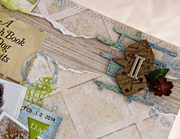
Next is a tag I created using Blue Fern Studios paper and several chipboard pieces, which I embossed 
in white and then splashed with a bit of blue and orange mist to match the flowers. I cut out 
some of the diagonal pieces of the Love Letters paper so that it would highlight the pattern.


And a close up:


Blue Fern Studios products used:

Blue Fern Studios "Love Letters"
Tattered Diamond Bits
Hearts from the Chunky Heart panel
Ever After Frame Set

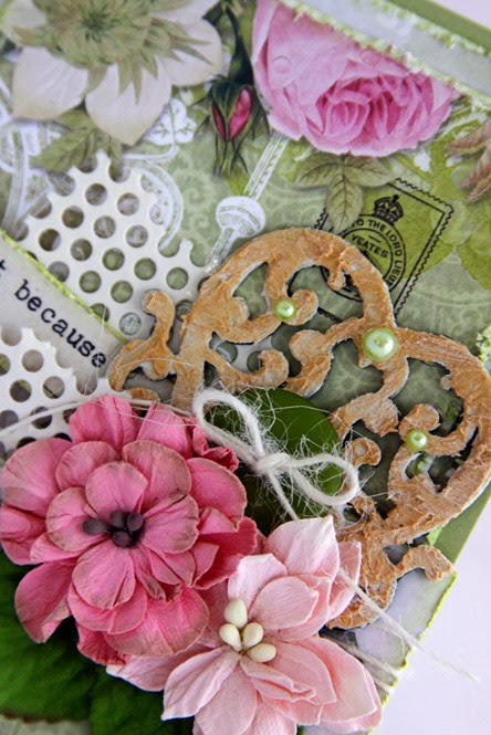
And lastly I have a card to share. I really enjoyed making this. I am madly in love with
Blue Fern Studios panels! I love to give them a really distressed look by cutting them up
in jagged pieces and then adding different mediums, they add such a great textural element to any
project.  I painted both the Turkish panel pieces and the butterfly  with Ranger Antique Linen Distress 
paint, did just a touch of embossing with Ranger Antique Linen embossing powder and then 
once that was all dry, painted them with some Silks paint in Emperor's Gold.


I have to admit I haven't made many cards, but after seeing how adding a few
pieces of altered chipboard to a card makes it so pretty, I will definitely
be making more! It's so nice to send someone special something hand made 
and from the heart.

Here is that beautiful butterfly:


Blue Fern Studios products used:

Butterfly Grid Panel 
Turkish Panel

Thanks so much for stopping by today!

Hugs, Lisa xo

Wednesday, February 19, 2014

Projects with {Patter}

Hello everyone. Today I have two cards and an 8 1/2 x 11 layout for you using the new Blue Fern Garden papers, the February sketch, and of course Blue Fern chippies.

Just Because
My best friend is having a hard time right now so I decided to make her a card out of the new Blue Fern Garden papers.
Pin It
I layered and distressed the papers. I also used one heart from the Lace Heart Border chipboard. I mixed a bit of modeling paste and crackle paint to color the chipboard.
Blue Fern Products Used: Blue Fern Garden papers, Lace Heart Border

One of a Kind
This is our 2 year old Keeshond that was diagnosed with epilepsy in August 2013. He is on many medications, and everyday is a challenge. These papers and chipboard were just perfect for this layout. I also use the Blue Fern Studios February sketch for this 8 1/2 x 11 layout.
Pin It
For the title (One of a Kind), I covered it in gesso and while it was still wet, I misted it with some color. Once it was dry, it gave a very nice effect.

For the corner embellishments, I treated the Shabby Brick Bits the same way as I did the title (with gesso and mist). The Manor Hinge was first inked with distress ink, then I stamped on it, and painted on a bit of Glossy Accents to finish.
Blue Fern Products Used: One of a Kind, Manor Hinges, Shabby Brick Bits, Blue Fern Garden papers

Faith
I have an envelope full of the new Blue Fern Garden paper scraps. I truly save every little bit. So, I decided to put some of those scraps to use on this card. There are scraps used on both creations above too. Can you find them? :) For this card, you can see how I distressed the edges of all the little scrap strips.
Pin It
For the chipboard, I used the Blue Fern Studios Doodle corner. I treated it the same way I did with the layout title above but after it was dry, I added a little more paint using watercolors.
Blue Fern Products Used: Blue Fern Garden papers, Doodle Corner

Thanks for stopping by, and remember, there is still time to participate in the Blue Fern Studios February Sketch Challenge. All of the details are here. I hope you will join in! Blessings,