Showing posts with label Ironwork Accents. Show all posts

Friday, March 11, 2016

March Creations by Nicole Doiron


How happy I am to be here with you again to share some more 
creations using Blue Fern Studios products.

Two of my layouts feature the beautiful new Courtship Lane collection,
starting with this romantic page inspired by the March sketch challenge.


This is the beautiful March sketch.  I'm hoping to see your take on it!


Like all Blue Fern Studios papers, Courtship Lane has elegant floral designs
and is centered on a Home Sweet Home theme.  And when I think of home, I think of love!
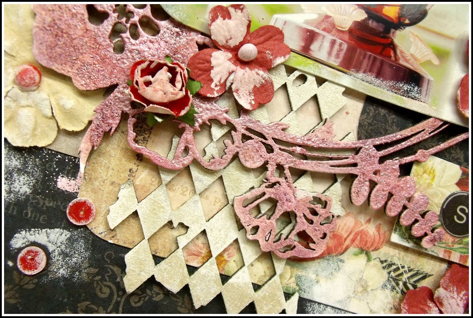
I used the Everlasting Love title which I covered in Imagine Ink Copper 
embossing powder and then dabbed in white paint.


Below you see the fancy Floral Vine which I embossed in Imagine Ink Copper, Sage
and Iris embossing powders.  I love the way the mix of colors turned out.


I did some stenciling on my background and mixed in different purple shades of stains.
I added a small piece of the Ironwork Accents set adorned with a purple gem.


All and all, a very soft color palette with a touch of copper to match the beautiful, 
albeit dead, rusted tree in front of which Yves and I posed in this picture.


Blue Fern Studios Supplies
Paper: Courtship Lane (Royal Street, Parkway, Calling Cards)
Chipboard: Everlasting Love, Floral Vine, Ironwork Accents
Imagine Ink Embossing Powder: Copper, Iris, Sage


My 2nd Courtship Lane inspired layout brings the 'home' theme home, so to speak.
I decided to scrap this old but precious family photo.  I have very few pictures of me alone as a baby
 or with my family, and the ones I do have are of very bad 1970's quality. This one, however, is certainly
a favorite of mine and I found that it was perfect for Courtship Lane.


Slipped behind my photo is the Princess Window which I've treated with 2 shades of Imagine Ink  powders,
Ginger and Nutmeg. I then lightly dabbed on some copper and white acrylic paint.


I did the same to this piece from the Leafy Page Accents set...


and this fancy hinge from the Ironwork Accents.


Other chipboard pieces used are the Reminisce word from Serendipity Words 2 and the Shabby Brick Bits
which I simply covered with Snow embossing powder.


Blue Fern Studios Supplies
Paper: Courtship Lane (West Plaza, Parkway)
Chipboard: Princess Window, Ironwork Accents, Leafy Page Accents, 
Serendipity Words 2, Shabby Brick Bits
Imagine Ink Embossing Powder: Ginger, Nutmeg, Snow


As you may know, I'm from Canada and, in my part of the country especially, we have the longest Winters!  
They always seem to drag on and on and on... So to warm myself up a little, 
I thought of using this adorable picture of my friends' daughters on a beautiful 
Summer day matched with the bright happy papers from the Frolic collection.


The beautiful blue background paper, Petits Moments, covered in different shades of blue mist reminds
me of a bright blue sky.  I decided to combine it cut out circles of the pretty butterflies
from Dans le jardin paper.  I love the combination of blue and yellow.


 I chose Sunshine Kisses as my title, using the Sunshine piece from the Optimist Word Set
that I colored in  Buttercup yellow Imagine Ink embossing powder.


Surrounding the picture is the Floral Medley Frame on which I used a mixture of Seven Seas,
Breeze and Azure embossing powders with added white paint.  You can also see below
the Mixed Media Poppies that I cut into 3 pieces to display across diagonally on my page behind the butterflies.


Lastly, I chose to add this sweet little heart and arrow from the Directions set... perfect to accentuate 
the adorable sisterly love between these two little girls!


Blue Fern Studios Supplies
Paper: Frolic (Dans le jardin, Petits moments, Calling Cards)
Chipboard: Floral Medley Frame, Mixed Media Poppies, Directions, Optimist Word Set
Imagine Ink Embossing Powder: Sevens Seas, Breeze, Azure, Buttercup


Whether or not it's Winter where you are, I hope I've added a little sunshine in your day with my projects!  
I can't wait already until next month's post!
- Nicole

Thursday, February 11, 2016

February Projects by Nicole Doiron


Already a month has passed by since my first DT reveal for Blue Fern Studios!
I was waiting with much anticipation to share with you some more creations
using these gorgeous papers and intricate chipboard pieces!

My first layout features the whimsical and oh so pretty Serendipity Collection!


I used a lot of chipboard on my page mixing some brand new pieces with a few classic ones.  In the close-up below you see some Leafy Page Accent that I cut into 2 pieces, using one half to frame the Serendipity calling card and the other is peaking out from under the photo.


Blue Fern Studios has a lot of chipboard sets that offer not just one, but numerous pieces in a set so you get much more for your money.  The Leafy Page Accents and the Ironwork Accents both seen above are just two of the many examples. You get up to 8-9 pieces in each set!


I never tire of using butterflies on my layouts (I am shabby chic after all!) and this one is called the Brigitte Butterfly.  I covered it with  Imagine Ink Petal embossing powder.  I did the same on the Floral Lattice Bits used around my flower clusters.


Here you see 2 newer pieces that have been designed to complement the Serendipity papers, the large and majestic Swan Gate that I treated with Fuchsia embossing powder and the word 'contemplation'.  The word as well as the Leafy Page Accent were simply painted white with a faint touch of pink.


Blue Fern Studios Supplies
Paper: Serendipity (Merriment, Calling Cards)
Chipboard: Swan Gate, Serendipity Words 1, Brigitte Butterfly Set, 
Ironwork Accents, Leafy Page Accents, Floral Lattice Bits
Imagine Ink Embossing Powder: Fuchsia, Petal


On my next project, I dug into some of my Blue Fern Studios papers and rediscovered this beautiful dark design from the Sanctuary collection which turned out perfect for this sweet picture mixed in with a little bit of Love Story to complete the title.


I layered some of the Tattered Diamond Bits, covered with Oatmeal embossing powder, and the gorgeous must-have Circle Flourish which I heat embossed with Garnet, then sprinkled with a little Phoenix glitter and dabbed with a little pearly shimmer paint.


A close-up from the other side...


You see below a little snippet of my background stamped with the brick design from the Essential Textures Stamps set and some Cotton Candy embossing powder.


This incredible photo was given to me by a friend a couple years back!
I have a whole collection and I absolutely love it!


Blue Fern Studios Supplies
Paper: Sanctuary (Bountiful, Calling Cards); Love Story (Calling Cards)
Chipboard: Circle Flourish - Small, Tattered Diamond Bits
Imagine Ink Embossing Powder: Garnet, Oatmeal
Imagine Ink Glitter: Phoenix
Stamp: Essential Textures set


And last, but certainly not least, let's take a look at my take on the February BFS sketch!


Here is the sketch, very romantic and perfect for the Blush Collection!


I did some stamping on my background with the Essential Textures set and used this sweet title.


On all my chipboard pieces, I put white gesso, then added some distress stain and added some Imagine Ink glitter, Caribbean.  I then dabbed on some more white gesso to soften them up.


There are so many gorgeous images on the Blush collection papers so I fussy cut a few of them, including those cute little butterflies from the title strips, and popped them up with foam squares to add dimension to my page.  I absolutely adore the Bits of Honey!


I have scrapbooked this picture of my sweetheart and I several times before, but I had another copy and I thought it matched perfectly with these romantic papers!


Blue Fern Studios Supplies
Paper: Blush (Enamored, Charmed, Key to my Heart, Calling Cards)
Chipboard: Sweet On You title, Bits of Honey
Imagine Ink Glitter: Caribbean
Stamp: Essential Textures set


I hope that looking at my creations this month has inspired you to create!

Thursday, March 19, 2015

Love Story Layouts with Angelica

Hello Friends! Today I'd like to share with you three layouts I created with the Love Story Collection.  I've made seven layouts thus far with this collection. I can't get enough...I just love it!

For my first project I made a masculine page.  When going for those boy pages I prefer not to use flowers. So embellishing is a little light than my usual. I layered the Film Strips and used the chippy Handsome for the title. I did a small bit of a mixed media background using mist and molding paste. I did some light distressing on the Amazing Heart, Twenty One and True Harmony papers.  I used the Love Story: Stamp 2 .


After doing the masculine page I wanted to go back to girly...lol! Here I used the Floral Clock and Dreams Come True Chippys. My little one was Cinderella a couple of years back and I thought the Grand Ball paper was a perfect fit. I did some stamping with the Forever Stamp.


For my last page I picked the title Angel Eyes from the Spiritually Speaking set.  I also used the Ironworks Accents. I did paper layering use four different sheets: Concerto, Calling Cards, True Harmony and  Amazing Heart.


Thank you for taking a peek at my March projects! I hope that I've inspired you!

Wednesday, January 28, 2015

Bente's first post for Blue Fern Studios.

Hi there!...*waving from Sweden*.
My name is Bente and some of you may have seen my creations around the internet for a few years now. I started scrapping about six years ago and never stopped to look back. I've tried many other creative outlets like knitting, sewing and embroidering, but scrapbooking is by far my favourite.
I am a native of Norway although I have lived more than half my life away from there. I have had my permanent address in the south of Sweden for many years, but have spent a few years in exciting places like Chile, Mexico and the UK. Loved that!
My three beautiful daughters are my main inspiration and we also have a cute but spoilt kitty.
I am so happy to be on the 2015 creative team here at Blue Fern Studios!
To see more of my work please visit me here:

Now for my first creations here on the blog:


Here I used the Roman Clock set and the Arrow Words set. 
To add colour to the pieces and create a coherent look I coloured the pieces with an ink chalker.


I love the feminine look created by lifting and layering a piece of the pretty Montage paper.


My next page features the youngest members of the family. 
-My DD and Lady, the royal princess of our house :-)


Again I used the beautifully decorated papers from the Montage collection.
The large frame is called Shabby Layered Frame.
In the corners you can see some Tattered Diamond bits.


I love these pictures that I took a while back. 
I love the look of the enamel dots on the black painted frame.


 Finally to round off this post I created a couple of cards using the lovely Sanctuary collection.


I used the pretty Roman Clock set and the Arrow words  here as well.

On this card is also a small piece from the Ironwork Accents set.
The Tattered Diamond bits were painted inked and stamped with a musical note pattern.


Products used: Papers from the Montage collection and the Sanctuary collection, Roman Clock set, Arrow Words set, Shabby Layered frame, Tattered Diamond bits, Ironwork Accents.

I hope you liked my first creations as a DT member for Blue Fern Studios.
Thanks for looking!