Showing posts with label Ever After Frame Set. Show all posts

Saturday, May 17, 2014

The Colors of Blues and Browns by Joyce

Greetings everyone, this month I found inspiration in the colors of the blues and browns found in the Blue Fern Garden papers.

The Love Letters Paper was used on this layout:

Most of the flowers in the layout were made with a die cut and the Parlour paper,  the bike surrounded by the flowers near the photo is the Penny Farthing cycle chipboard.
 
Here's a little mixed media tag using the Signature paper as the base, with lost of stamping and gesso on top of the reverse side of the paper which was then torn into strips. The little fussy cutting ribbon came from the Calling Cards paper. The Apothecary jar was treated with some white paint, fiber paper, and blue mist applied with a fine paint brush, then it was placed on top of one of the many Ever After Frames.


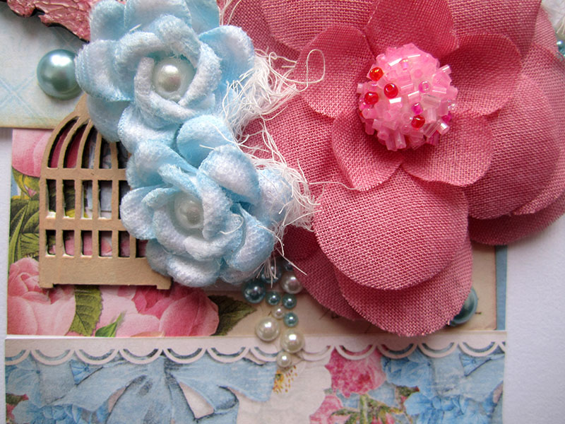
And, finally here's a greeting card using one of the Calling Cards, applied on top of the back side of the Parlour paper.  The little humming bird was treated with white paint, script stamp, and some blue mist.

 
Thank you for stopping by and allowing me to share my design team creations with you.  I'll be seeing you again on June 17th with some creations from the new Blue Fern Studios Ombre Dreams paper collection. 

Friday, April 18, 2014

So Much Gratitude and Thanks- by Keren Tamir


Hello Blue Fern Studio Friends
This post is very meaningful to me as its all about Gratitude and Thanks.
There are so many things I'm thankful for that If I list them here I won't have enough space to display my creations this month.

All three of my projects this month were created as a gift for three different people whom I love very much and are very special to me.
I'm Thankful and Grateful that I have them in my life!!!

The first project is a layout created for the parents of this precious baby who has been such a miracle of life.

"Sweet Dreams"


When I asked the parents to give me the color scheme of this baby's nursery they described these colours above which are exactly the colours of some of the papers from the Blue Fern Garden collection. I was then so happy to fussy cut, frames, bows and other images from those papers.


I framed the photo in one of the Ever After frames. I simply primed it with Gesso and then painted it using Shimmerz sky blue paint.


I  treated the Frilly Heart behind the photo with the same gesso and paint to match the Blue Fern Garden Papers.


Finally the title was inked in blue fluid chalk ink.


<<<<<<<<<<<<<<<>>>>>>>>>>>>>>

The next two projects are very near and dear to my heart. I created them for two very special people in my life. Both these people asked me to create Gratitude Journals for them and I thought it would be great to include some Blue Fern Studio Chipboard on the front cover.


"The Book of Gratitude"


I bought 2 hard cover journals at the dollar store. Then, using some of the Blue Fern Garden papers I covered both front and back. To blend the paper seam to the cover's background I used light moulding paste and a brick stencil.


I used the tree from the Descanso Garden Set, a little bird and one of the Veranda cages. I have a tutorial below describing how I created the tree. The bird was painted in silks glaze paint and the bird cage in brown fluid chalk ink.


Here is the tutorial on how I created the texture on this tree:


<<<<<<<<<<<<<<>>>>>>>>>>>>

"The Book of Gratitude"


This is the second book of gratitude I created. Its a little different than the other one but still unique on its own. 


I used a different set of Blue Fern Garden papers to cover this journal. Then, I also covered the seams with some stencilled moulding paste. This time I used a different stencil to mimic the pattern on the Blue Fern Garden paper.


I used two different shades of Silks glaze paint to cover all the different flowers on the cover as well as the mini butterfly.
The Lattice fence was roughly covered with gesso leaving parts unpainted.


I try to find things to be thankful and grateful each and every day.
I hope you sit back today and find something to be thankful for.

Thanks so much for visiting the Blue Fern Studios Blog

Have a wonderful day!!!

Keren

Thursday, April 17, 2014

Inspiration from Colors in the Blue Fern Garden Paper Collection by Joyce


The colors of pinks, roses and greens from the Blue Fern Garden (“BFG”) paper collection inspired me to create this collection of a layout, a 6 x 6 card, and an artist trading card collection.  A lot of fussy cutting took place to capture all those glorious colors, prints and patterns and assemble them onto the collection.

Layout:

 
I used the pretty rose pattern from the BFG Signature paper to create the basis of the composition of the layout.  No, your monitor is not blurry, that photo of the kids is blurry, a defect from the camera or the photographer in those days.  Sadly, the shoes are more in focus, and unfortunately, a lot of these old pics I inherited are blurry.   But on to the best part… those chipboard dangles! This one is the Flutter Page Dangle.  I cut off the butterfly portion of the dangle and placed it on the other side of the layout on top of the rose pattern paper.  It looks more like a “flutter fly” than a “butterfly” because I applied mists of water to separate the cardboard to make the wings look like they are in motion. I love the dangle chipboard pieces because they are so versatile and you can cut them up too.

Treatment of the Dangle: The dangle was created by first applying white dauber, light green mist, and a darker mist.  To add depth, you sporadically cover the chipboard with the two mists (allow to dry between applications) and carefully allow some overlapping but not too much or you’ll only create one color. After the applications of mists dry, add some detail with a black marker, or water color pencil around various areas.  Try to create larger sweeps of the application of the marker, or watercolor pencil, in some areas and go over them with a white gel pen to add little dots to create further detail.  A simple treatment with lovely results.


Artist Trading Card Collection:

It was time for another artist trading card collection,  and I quickly set about creating this collection with my left over scraps of the “Signature” page to BFG paper collection.  I thought the rose pattern on the paper would add a lovely base layer on the cards.  More,  BFG papers were used to create the torn textured layers on top of the base paper.  I strategically placed the torn textured papers so they would not cover up the rose pattern on the base layer.  The BFG papers are really sturdy and can stand mixed media applications very well.  The little flowers are the result of using a flower punch over the rose pattern areas on the BFG Signature paper, and the centers were filled with beads, and a specially formulated glitter mixture from my forensic scrapping buddy which consists of red glitter and various sized micro beads. The glitter mixture looks like candy and is so pretty on chipboard too.


On the cards, you’ll find the window frames from the “petite window” chipboard collection. 
Treatment of the Petite Windows:  Each petite window was treated with a coat of white dauber, one light sporadic application of a light green colored chalk ink, one light sporadic application of a medium green colored chalk ink, and a light spray of a darker green glimmer mist in which I let the liquid of the mist run in various places making sure not to let it cover the entire frame. Applying the inks and mist sporadically over the frames creates interest and depth.     Some gold pen, black and white markers were used to highlight certain areas on the frame too.
 
6x6 Card:


This is the second of my “Women of Substance” card series. I used the BFS April sketch for the basis of the card. The card series is dedicated to the women before me from my maternal line of the family. I’m introducing these women to my 20 year old niece and future generations. Each of the 6 x 6 cards will have a picture of the woman, and inside the card, I will write a biography for the women I knew. And, for those few photos I  have of women from the 1800’s, I’ll incorporate some historical facts to enlighten my niece of what life must have been like living during that period so that she will know what it was like living before the Smartphone and her Twitter account. J  Each card will be mailed to my niece in intervals, and I hope she thinks of them as gifts when she receives them in her mailbox. Hmm…I foresee in he near future, a decorate box using BFS chipboard to store these cards.
Here’s Ginger from the 1950’s, I’m certain her hairstyle gave that a way.  All the papers on this card are from the Blue Fern Garden paper collection, including the fussy cutting papers.  Some of the papers were stamped, gesso’d, torn, and stamped some more to add texture and interest
to the front of the card.  I have used the “Ever After” frame, and Turkish bits chipboard pieces from “BFS”. The size of the chipboard frame is just perfect for the 6 x 6 card.  The frame was treated very similarly to the Petite Windows except a stencil and molding pasted was used to create the raised circles.  The card was pasted on another piece of Blue Fern Studio’s paper.  I don’t normally leave a piece of chipboard undressed, but the Turkish bits added some balance in the composition lighted painted with a white dauber, and a pretty bead.
Thank you for stopping by, and I hope I have inspired you to do something similar for those women who came before you and to share some of your family history with your future family.  And, of course, add some beauty by using some BFS chipboard to your creations.  


Tuesday, March 25, 2014

Spring wedding with Jelissa

Hello everyone! We're almost at the end of March, can you believe it?!

Today I have two projects I created for Blue Fern Studios based on two of the most wonderful things ever - Spring and weddings! The first is a layout using their beautiful paper collection "Blue Fern Garden". I cannot get enough of this paper line - the colors are soft and shabby and just perfect for my mixed media projects. 

"The Big Day"


The photo I used was from my own wedding 6 years ago, how time have passed! Love how the pinks and greens come together in this paper collection which gives a feel of Spring.  I primed the papers with clear gesso so that I can still achieve the water color effects without masking the beautiful designs on the papers.

Some close-ups:


I've used the Rose Bouquet chippie, what a beautiful piece!  I used one half of the chipboard for this corner cluster. I covered it with gesso and painted it over with some watercolors and randomly sprinkled clear embossing powder and heat set them. The result is a very uneven texture with small drops of embossed surface looking like dew. Lastly I patted some coloured texture paste over the leaves and flowers. In this cluster, I have also tucked the key piece from Romantic Page Dangles under my photo and I only did simple heat embossing.


For the title, I used "The Big Day" from the "Wedding Words" set and layered green water colors in three different shades for a marbled effect. 

Blue Fern products used:
Blue Fern Garden - "Boudoir"
Blue Fern Garden - "Picnic"
Rose Bouquet
Wedding Words set
Romantic Page Dangles


My second project is a canvas which I made for a very special couple on their wedding day.

"Wedding Canvas"


One of my favourite background elements are the panel chipboards as they add dimension and design. Here, I've used cut outs from the Marrakesh Panel and painted them with green watercolors.


I've rotated a piece of the Ever After frame set and painted it with at least four different shades of green for a marbled look and finished off with some script stamping. 


In this cluster, I used two pieces from the Jeweled Trinkets set. I snipped of the chains on either end of one of the pieces and used it as a centre for one of the flowers. On the ends of each motif, I added a dab of dimensional paint and topped the centre with a gem. I've also used the in-between hexagon bits from Bits of Honey to accent the background.

Blue Fern products used:
Marrakesh Panel
Ever After Frame set
Jeweled Trinkets
Bits of Honey

Thanks for joining me today and have fun creating!

Jelissa

Saturday, February 22, 2014

3 New Projects by Lisa Griffith

Hello everyone! It's my turn to share my February projects today. I'm sure you've all
seen by now the gorgeous new line of papers by Blue Fern Studios. I love the soft 
colors and the sweet girly feel, I was inspired to create this...

"Flowers for Lily"


This is a photo of my niece Lily. My sister told me that last Valentine's Day her Daddy
brought her her very first bouquet of flowers, Lily just loved them and thought they were so special.
So, so sweet. I used the paper "In Bloom" as the background, and then cut up some pieces
of the "Calling Card"paper as layers underneath my photo. I have taken a piece from the
Manor Hinges and a piece of the Ironwork accents and painted them with cream colored paint
and then stamped them with Ranger Distress ink in Vintage Photo. For the
word 'Delightful' from the Optimist Word Set, I painted with the cream colored paint,
added a touch of pink mist and then a coat of Glossy Accents. 
Here is a close up:


Blue Fern Studio products used:
Blue Fern Studios "In Bloom"
Blue Fern Studios "Calling Card"
Ironwork Accents
Manor Hinges
Optimist Word Set

Next is a tag I created using Blue Fern Studios paper and several chipboard pieces, which I embossed 
in white and then splashed with a bit of blue and orange mist to match the flowers. I cut out 
some of the diagonal pieces of the Love Letters paper so that it would highlight the pattern.


And a close up:


Blue Fern Studios products used:

Blue Fern Studios "Love Letters"
Tattered Diamond Bits
Hearts from the Chunky Heart panel
Ever After Frame Set

And lastly I have a card to share. I really enjoyed making this. I am madly in love with
Blue Fern Studios panels! I love to give them a really distressed look by cutting them up
in jagged pieces and then adding different mediums, they add such a great textural element to any
project.  I painted both the Turkish panel pieces and the butterfly  with Ranger Antique Linen Distress 
paint, did just a touch of embossing with Ranger Antique Linen embossing powder and then 
once that was all dry, painted them with some Silks paint in Emperor's Gold.


I have to admit I haven't made many cards, but after seeing how adding a few
pieces of altered chipboard to a card makes it so pretty, I will definitely
be making more! It's so nice to send someone special something hand made 
and from the heart.

Here is that beautiful butterfly:


Blue Fern Studios products used:

Butterfly Grid Panel 
Turkish Panel

Thanks so much for stopping by today!

Hugs, Lisa xo

Tuesday, February 18, 2014

Special Moments- By Keren Tamir


 Keren here and its my turn again to showcase my work on the Blue Fern Studios blog.
 I'm thrilled to feature the new Blue Fern Garden Collection today for you.


Capture the Moment


I really loved combining these two colours: green and pink. Its from the Picnic paper of the new Blue Fern Garden collection. 


I painted the beaded circles in matching colours using Shimmerz paints. Of course I first primed the chipboard with Gesso.


Products
Blue Fern Studios:
Blue Fern Garden- Picnic
Blue Fern Garden- Calling Cards
Capture the Moment title
Beaded Strings

<<<<<<<<>>>>>>>>

Natural Beauty Tag


I created a tag with some of the leftover bits from the Calling Cards paper from the Blue Fern Garden collection. I even added a piece of Blue Fern Studios chipboard packaging.


I altered one of the Ever After Frames by covering it in crackle paste. Once dried (which dried clear) I painted it with Pink Shimmerz paint. The bird and the cage were primed with gesso and then inked with a chalk edger.


Blue Fern Studios Products:
Pacakging
Blue Fern Garden Calling Cards
Veranda cage set
Little Birds
Ever After Frame set

<<<<<<>>>>>>>

Finally I want to show you, in some more detail, my Layout for the monthly sketch challenge on the Blue Fern Blog.
I didn't use the Blue Fern Garden collection for it because my package came well after the sketch was revealed. 
I used very earthy colours for this layout and combined it with many different Blue Fern Studios chipboard pieces.


All Natural

The February sketch is very versatile.
I've rotated it 90 degrees to fit my design.


This is a picture of my daughter watching the ducks by the pond. I really wanted to give this layout an earthy natural feel. I used flowers, feathers and nature themed chipboard to create this look.


The Blue Fern Chipboards I used are: All Natural set, Little Birds set, Bordeaux layered frame, Shabby brick bits and Twiggy branch.


I altered the frame by painting it with butterscotch coloured acrylic paint and then stamping it with brown archival ink. The bricks, bird and branch I simply inked in brown fluid chalk and the title I left raw.


Blue Fern Studios Products
Bordeaux layerez frame
All Natural set
Little Birds
Captured Words
Shabby Brick bits
Twiggy Branch

Thank you so much for visiting the Blue Fern Studios blog today!!
I hope you get a chance to come and play with us with the the February sketch.
Have a wonderful day!!

Keren

Tuesday, January 21, 2014

2 Layouts, and a Canvas, with Kelly Foster

Hi everyone! Kelly here..I am thrilled to be going on my second year here at Blue Fern. I hope you are enjoying all of the inspiration from our new (and returning!) DT members this month, I know I am!
I have three projects to share today so I'll get right to it!

"Love"

This first layout, I have used a bunch of little bits of Blue Fern Chipboard. I started with one of the frames from the Ever After Frame Set. I did a little stamping, embossing with black and bronze, and then added a bit of gold shimmering acrylic ink. I also tucked a piece of the Bits Of Honey, which I cut in half and left bare, into either side of the layering beneath my photo.


On the right side of the photo, I have placed one of the Garden Daisies (Small), which was painted with the same shimmery ink, a bit of green pearl paint, and topped with just a bit of a gold texture paste. To the cluster on the left side, I added one of the cute little dandelions from the All Natural set, which was given the same treatment as the Daisies.


Lastly, the title, "Love" comes from the "Good Vibes" set, and this piece was painted with a green pearly paint and a gold shimmering acrylic ink. I added just a touch of stamping as well.


Chipboard used:
Good Vibes Set
Garden Daisies- Small
All Natural Set
Bits Of Honey
Ever After Frame Set

 "Count Your Blessings" (8x10 Canvas)

This canvas, which I started some time ago, was finally finished when I chose the perfect bits of chipboard to finish it off! I made my flowers out of a vintage dress sewing pattern, and I added little strips cut from the Checker Bits as the stems.


The word "Blessings" comes from the Spiritually Speaking word set. This was simply given two coats of gesso so it would stand out.

Chipboard used:
Spiritually Speaking
Checker Bits

 "Sweet As Honey"

Last up, a sweet, girly layout. The Graduated Circles, this one cut apart a bit, make for such a fun page design. I painted this with Distress Paint, watercolors, gelatos, and then brushed on some gold texture medium.


The title was colored with Gelatos as well, in pink and butterscotch.

Chipboard used:
The Latest Buzz
Graduated Circles

Thank you so much for taking a look today, I hope you enjoyed my projects. Have a great day!!

*Kelly*