Showing posts with label Directions. Show all posts

Saturday, January 16, 2016

January Inspiration by Maja Nowak

Hello there, Blue Fern Studios Fans :) I'm so excited to be sharing my first post as a DT member!


My name is Maja Nowak (Oliwiaen in the Internet), I live in Poland with my university-sweetheart husband and our two sons. I started scrapbooking in 2008 and, although I have always been crafting (drawing, painting, cross-stiching and decoupage), scrapbooking seems to have taken my whole heart (and time!). 
My style is mostly romantic and shabby chic. But being a mom of two growing up boys who are almost always present in my layouts, I sometimes create something more modern too :-) You can see my work on my blog (where you will find links to my Scrapbook.com and Pinterest galleries too).
I love Blue Fern Studios products: thick papers with beautiful designs, varied chipboard pieces and most gorgeous vintage stamp images! I'm really happy to be working with such quality products. So let me show you what I used them for in my first projects :)


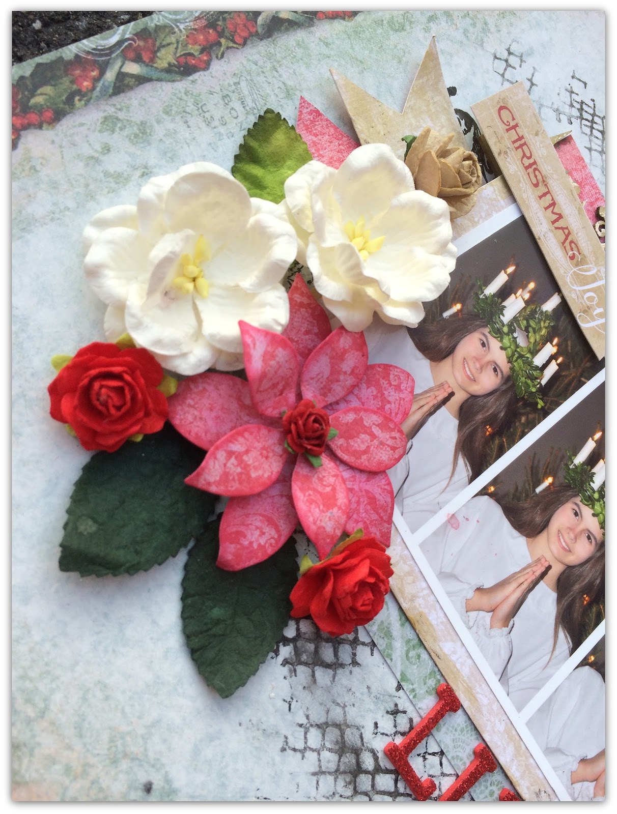
I have created three layouts for January. You might have noticed the first one, as it was presented among fantastic samples by my DT friends with our January sketch challenge reveal :) I went for my favourite teal tones combined with golden and white accents to scrapbook a photo of my darling elder son:


I like to follow a sketch as closely as possible, and so I did for our challenge too. For the background I layered papers from the Paisley&Vine collection and added some elements I cut out from the Frolic collection:


Among other embellishments I used this cute chipboard arrow that I covered with 14 Karat embossing powder - I'm simply in love with this one, the best golden metallic/glittery golden ep I've ever used! Forgive me if I use it in every project of mine ;)


In my title piece I first covered the chipboard with Oatmeal ep and then sprinkled some 14 Karat here and there to get this effect:


I hope you'd join in the fun and share your interpretations of the sketch too :)

Dream Big:
Papers: Paisley & Vine: Nature, Deja Vu: Atelier, Frolic: Dans Le Jardin, Calling Cards
Chipboard: The Optimist Word Set, Directions
Embossing powder: Karat, Oatmeal


My second project is a layout that was inspired by... the piece of chipboard I used for my title: We're All Mad Here ;) I reminded me of the Alice in Wonderland style and I immediately thought the Blush collection and of those crazy photos of my sons and their cousins :) Together they resulted in a funny whimsical page that I had a true fun making!


For the background I used the Charmed paper, then I cut out the flowery frame from the Fondness sheet and layered it on top.


 I also cut the key image from the Key To My Heart paper and added it below my photos:


And then I used scraps of those papers to mat my photos and to stamp some images onto :) I stamped two balloon images, decorated them with liquid pearls, glitter and flowers and mounted on 3D dots:


As for the title piece, I decorated it with embossing powders and did that in stages: I first covered each word separately with embossing ink reinker (of course, you can use an embossing pen that I don't have ;)) and heat-embossed it with a different colour ep before going on to the next word:


We're All Mad Here:
Papers: Blush: Fondness, Charmed, Key to My Heart, Reminisce
Chipboard: We're All Made Here, Directions
Embossing powder: Buttercup, Karat, Petal, Fern
Stamps: Flight & Flair, Journey, Photography, Deja Vu


And finally the third layout I made using the beautiful Timeless collection: you should have seen me choosing the papers! I couldn't decide for ages, they're all so beautiful :) In the end I decided on gray tones and here's the result, with my shiny boys in the photo ;)


I distressed the edges of the Artistique and Papillons papers and layered them together. Then I added some stamping in the background:


I cut out some tags from the Keepsakes sheet and matted my photo.


I covered the title chipboard piece with the 14 Karat ep (told you, I love it!)...


...while for the "industrial" pieces from the Cogs&Gears and Working Parts sets I used a custom mixture of the Poinsettia, Cerulean, Icicle and Ebony powders. I took a pinch of each (a really tiny amount, together they gave me enough to emboss all the parts and still more than a half was left for future use. If you wish to mix several powders, I'd recommend taking small amounts and as you add more colours, emboss on some spare scrap of paper to check the result.) I mixed the powders well on a scrap of paper and after embossing my pieces I got this really natural rusty-patined but still metallic shiny look of old metal pieces.


I also added a real vintage watchface and a key charm to my page. Then I tucked in a couple of mini roses here and there - I think they go well with all those "masculine" elements ;)


You Shine:
Papers: Timeless: Artistique, Papillons, Keepsakes
Chipboard: Working Parts, The Optimist Word Set, Cogs & Gears
Embossing powder: 14 Karat, Poinsettia, Cerulean, Icicle, Ebony.
Stamps: Deja Vu, Essential Textures.

Thank you so much for visiting the Blue Fern Studios blog today - see you later!

Maja

Saturday, November 21, 2015

Lots of Blue Fern Studios goodness with Bente.

Hi there friends of Blue Fern Studios.
 I am so happy you came to see what I have prepared for you this time :-) Winter is now definitely upon us and what more perfect collection to use for those crisp winter photos than the beautiful Vintage Christmas.

My first page showcases a couple of older photos of my youngest daughter as I wanted to scrap pictures with snow .This year it hasn't snowed yet :-) Sorry the pictures are not great. It's pretty dark up here in the Nordic countries at the moment :-) 


I used the Holiday Vine chipboard and the title Sparkle is from the Winter Titles set.

Here are a couple of close ups:


I used the Petal embossing powder as well as the Pyrite glitter to embellish my page.

My next project is an alterd frame. It was so much fun to make.


 I painted one of the  words from the Delight set and also one of the Vintage Labels. 
The perforated arrow is from the Directions set. The paper collection is Autumn Anthology.


To top off this creation I used the beautiful Ornate Shelf as something similar to a roof.


This next layout you may recognize as it was part of this months sketch reveal  HERE.


Even here I used Vintage Christmas. The French Ironwork-chipboard behind my photos is such a stunning piece! This time I painted it gold and used one of the Blue Fern Studios Texture stamps
 to emboss it.


 I used a mixture of hnd made and bought flowers.
Of course I used the Vintage Christmas papers even for the flowers! :-)


And then my last  page for today,also with the latest collection and some more fabulous chipboard!


I used the Chain link panel ,just lightly covered in gesso and the Framed Winter Words with some added glitter. Here is a closer look at some details :


Again I used a mixture of store bought and handmade flowers using the beautiful red Deck the Halls sheet


I love the look of the chipboard panel peeking out from behind the beautiful paper :-)


That was all for today, well done if you made it all the way to the end!!

I wish you all a wonderful wek end. I knowI am really looking forward to some free time!
Thanks for looking!!


Wednesday, October 21, 2015

Bentes October projects.


Hi there.
Today it's my turn to blog some Blue Fern goodness and to start with I have a page that I made
with the lovely Autumn Anthology. 


I used the Robin paper as a base and the Cottage paper on top.  I used a brayer to add a thin layer of gesso to prime my paper for the Imagine Ink Sky mist and the Love Story 2 stamp set.


I cut a piece from the Shabby Brick Panel chipboard and haphazardly  painted it white. I then just gave it a slight splash of the same mist I used earlier.


I picked a choipboard title to suit my page and after priming with gesso I paintd it with blue acrylic paint. To finish the look I added some Distress stickles on top. I useda third choipboard piece here as well, but it may be hard to detect,....-It's the arrow from the Directions set. 
But instead of painting it, this time I covered it in a cute washi tape. 


 So here's a last look at the pretty colours in this page, and as you see I also cut some strips of other pretty papers in this collection just so I could do a little layering.

My second project is a little different for me. I don't usually do scrap on canvas, 
but this round one looked fun, so I decided to give it a try!

Here's how it turned out;


As further inspiration for this canvas I used the October sketch. I turned it upside down and took  a free approach as you should with a sketch, but I think you can still see the resemblance.

Here's the sketch:


Read all about the challenge HERE.


I used calling cards from the Frolic collection as a title for my canvas/page.
The Butterfly Friends chipboard rceived a coat of white paint, some glitter and a light application of the green mist Imagine Ink Leaf. Also the large Frolic Mesh Bits chipboard was treated similarly.

I added a few leftover pieces of chipboard here and there, you can see them in the photo above. 
I dont ever throw those little tresures away :-)


Finally a close up of the gorgeous Butterfly Friends again!


Thank you so much for looking in today :-)


Tuesday, July 21, 2015

Bente's July inspiration.

Hi, I hope all of you in the northern hemisphere are enjoying a lovely Summer, 
and that the Winter is not too bad on the rest of you :-) 

Today I have some layouts to share with you that are absolutely 'fresh from the press' so to speak.
I was in the UK last week celebrating my eldest daughters graduation from university and 
when I got back I had to finish my projects rapidly!! 
-But with such awesome products to play with it's not a problem:-)


My first page is based upon a pink paper from the Montage collection. 
On top is a paper from the Deja Vu collection. As yo can see the collections mix very well.
-Especially when you add a litttle mixed media here and there. :-)
I 'framed' the whole page with the largest sized Graduated Squares, painted white then inked around.


 The gorgeous piece of chipboardbelow the picture is one of the recent shapes and called
  Rock Wall Bits. I painted it beige , stapmed on it and addedsome pink glitter. The part of the Grunge Frames chipboard piece above the photo was given the same treatment. I just love to add glitter to my pages at the moment :-)


The cute small dots scattered all over my page are the insides of then alpha stickers that I used.


I used the Montage collection for my second project. I love all the lovely yellow papers in that collection:-)


And here are some close ups of the details.

I used one of the Memory Frames as my title and hid it partially behind my photo.


The arrows are from the Directions set and simply painted black.


Making banner-pieces or mats behind the photos are such great ways to use up those left over pieces from your favourite patterned papers.


And finally here is my page for the current sketch challenge that you can find HERE.


The chipboards I used are:
Laughter, Happy, Smile and Floral Clock.

And a closer peek at some of the details:


That's all from me for today!! 
Have a good week!