Friday, October 10, 2014

A layout, a canvas and a card with Jackie

Hello! It's Jackie with you today, sharing three projects for October.

First up is a Halloween layout using the new Montage collection. I love how versatile these papers are - a little strategic layering to cover the more non-Halloweeny elements (in this case the fairy on the Fairyland paper), some thematic paint colours and you're off to the races. Paired with Blue Fern Studios' Halloween chipboard, and you have the makings of a spooktacular layout.


The Halloween Collage chippy is so cool - it just had to be the centrepiece of my layout. I treated it with a combination of painting (the moon, pumpkin and the green base of the grass) and heat embossing (for the ghost, bat, checkers and atop the painted grass) using one of my favourite techniques for the heat embossing - painting on the embossing ink with a fine paintbrush to allow me to use several colours on the same embellishment.


Once I'd painted the grass green I wanted to give it a little texture, so I use the same silverizing embossing powder I'd used on the bats, but sparingly this time, to give the illusion of dew on the ground.


Carrying over the diamond pattern of the Halloween Collage chippy to the background using a checker stencil rotated to create diamonds rather than squares and glossy black paint helped to marry the chippy to the Montage papers and give the whole layout a more Halloween-y feel. I added some sparkly orange watercolour paint and black and orange flowers to complete the transformation.


One of the Cobwebs chippies, painted white and heat embossed with a shimmery powder, was great for filling in a gap in the cluster while letting the details in the fussy cut piece from the Society paper peek through.


The Creepy House chippy was heat embossed black, and then sparingly with silverizing embossing powder for a worn, pitted appearance.

Blue Fern Studios Products:

Montage papers:
- Fairyland
- Society
- Now and Then

Chipboard:
- Halloween Collage
- Creepy House Set
- Cobwebs

Next up I have a card created from a piece of leftover pattern paper from the layout above. I am loathe to cut into a fresh piece of 12x12 paper to make cards, but I'm always eyeing my scraps to see what leftovers I can use for cards. When I was tearing the strip of Now and Then paper, I was sure to save the lovely fussy-cuttable image from the flip side of the paper. I wanted to keep the background fairly simple to highlight the incredible details from the paper, so I used a piece of watercolour paper which I painted with complementary colours, then added some stencilling and flicks of black ink. I left the Turkish Bits chipboard naked for a bit of extra contrast.


Blue Fern Studios Products:

Montage papers:
- Now and Then

Chipboard:
- Turkish Bits

My third project is a whimsical 6" x 12" canvas featuring the bottom half of the Olga's Balloon set. The two pieces are designed to be layered together, but I chose to go "off label" in my usage as I wanted to add crazy dimension to my canvas. Never fear, the top piece will find a loving home on another project!


To get the 3D balloon, I traced the shape of the balloon part (the second image in the graphic below) 8 times onto Charlotte's Dream paper (it took 2 sheets) and cut these out, then folded them in half, alternating sides so that 4 pieces have the blue side and 4 pieces have the flowered side showing. I then adhered the negative sides together.


Before I adhered my paper balloon to the chippy I set about altering the lines and the basket. For the lines I painted them with a couple of shades of brown, and touched them up with white gesso once dry.

For the basket, I trimmed a scrap piece of Ombre Dreams paper to the exact size of the basket, and then sprayed it with a gold/brown. I then set about weaving my basket out of wire thread. It was finicky work, and I'll admit I burnt myself several times on my glue gun. I adhered the thread to the left and the bottom and then wove each individual strand, fastening it to the opposite side at the end. It is imperfect, and I love it! A little touch of gesso for aging, and I was ready to adhere my balloon to the chippy.


To add detail to the top of the balloon, I created a net out of gauze coloured with mist, and adhered wire and flowers, as well as a banner from the Dream Cards paper.


To build my background, I started with a piece of Susan's Dream paper trimmed to the size of the canvas then set about creating my landscape by tearing hills from Ginger's Dream.


What would a scene of a hot air balloon be without drifting clouds? To create texture on the Cloudy Skies chippies, I used some snow texture paste.


Blue Fern Studios Products:

Ombre Dreams Papers:
- Susan's Dream
- Ginger's Dream
- Charlotte's Dream x2
- Dream Cards

Chipboard:

- Olga's Balloon
- Cloudy Skies
- The Optimist Word Set


Tuesday, October 7, 2014

a card, a mini album and a trifold pocket album created by Lisa Gregory

For my first project I created a card that is shaped like a tag. It was easy to create the folded shape. I folded a rectangular piece of white 100lb card stock  and ran it through my Sizzix alterations die placing the fold of the card on the  inside of the die as not to cut 1 side, leaving the fold intact. Then I die cut 2 pieces of patterned paper Ombre Dreams Paper Leslies Dream, and adhered it to the front and back of the card. I left the inside plain white for some handwriting.


I used the fabulous  Fall acorns and  Bits Of Honey on my card. I painted the corns with acrylic paint then spread some crackle paint over it to enhance the colors. I just sprayed the bits of honey with Lindys Stamp gang spray after priming them with gesso.


Here is view of the back of the card when it is open. I strung some seam binding through the front hole in the card,. I spayed the seam binging with Lindys Starburst spray in My Mojito Green to match the die cut leaves on the front of the card.


For my next project I created another mini album in a different style. I used  the Montage Paper Collection using the Wisdom and Fairyland papers..


On the cover I used the smaller piece from the Roman Clock Set Large. The butterfly is from the Royal Monarchs collection. I inked both pieces with Ranger distress ink in Vintage Photo.

 I used the Roman Clock Set small on the right hand page, On the left hand page, I used a left over piece from one of the original Blue Fern Studios designs. I save everything! It makes a great frame. 


I created a tag with the flower on top and a small key from the Vintage Keys set.


This is just a closeup of the cover. The jeweled piece is a Recollection flower piece and I used burlap and some flower buds tucked underneath.


This is the album closed with twine that I adorned with some beads.


This is the view of the inside of the back cover. I love the pattern on the paper and did not want to cover it up.


My next project is a trifold pocket album. I followed a pattern from a Kathy Orton book on mini albums. I used the  Montage Paper Collection, using the Wisdom and Fairyland papers.Sometimes mixing and matching  chipboard pieces from different collections can match perfectly. That is what I did here. I used  Manor Hinges  and  Damask Flourish to create the design on my cover. I painted them with black gesso.


I added a jeweled brad  to complete the look.


When you open the album, you can see there is plenty of room for pictures and journaling. The waterfall feature can hold many photo's.


This is a view of the back of the trifold. I used black cardstock for the base. I love the black and pink color combination together.


This is the  Damask Flourish  shown on its own.


Here are the little folders and tag cards shown, pulled out of their pockets. Each one opens up to add more photos or journaling.

Thank You for joining me this week. I look forward to creating with more of the gorgeous Blue Fern Studios papers and chip board. Until next time...
xoxo
Lisa

Montage layouts with Camilla

Hi everybody!

Here are two new layouts with lovely Blue Fern Studios products. I have used the NEW fabulous collection Montage. 

On my first layout I have used the paper Invitation from the Montage collection and also some new chipboards: Chunky Words and Ornate Frame.


And for my next layout I have used the paper Society from the Montage collection together with these chipboards - Chunky Words, Tattered Butterflies and Roman Clock Set.


Thanks for stopping by!

Monday, October 6, 2014

Sketch Challenge Winner & Featured Layouts!

Happy Monday everyone!  Today we would like to announce the winner of our September Sketch Challenge.  Thanks to all of you who participated in our challenge by following the sketch and using Blue Fern Studios products for your layouts.

Based on a random draw, the winner is..................

Congratulations to Candy Chelepi of Australia!

You have won an awesome prize package from Blue Fern Studios!  Please e-mail  me at {valerie(at)bluefernstudios(dot)com} to claim your prize.


Now we would like to share this month's 3 featured layouts.  

Marina Gridasova of Russia who used paper from the Blue Fern Garden Collection


Sandra Nicholls of Australia who used both Blue Fern Studios chipboard and paper from our new Montage Collection!


And last, but not least, this layout by Svetlana Austin of South Africa who used Blue Fern Studios chipboard.


Congratulations ladies!  

Be sure to check out our October Sketch challenge.  A link to the details can be found in the sidebar above.

Friday, October 3, 2014

Two monochromatic layouts by Marie-Josee

Hello, Blue Fern Studios fans!

Today, I have two monochromatic mixed media layouts to show you.

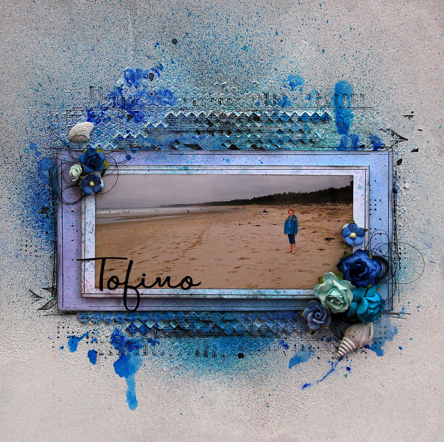
"Tofino" layout

This summer, we went to Tofino, British Columbia, a beautiful beach. I decided to focus on the blue because it is the color of the sea and it makes a nice contrast with the color of the sand in my picture.


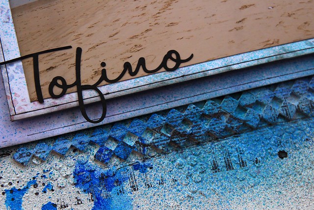
I glued two pieces from the Checker Bits set to my background and applied gesso all over. I then added color with Gelatos and various mists. I also stamped patterns with black ink on my chipboard.

I also used two pieces of the Ombre Dreams paper behind my photo.


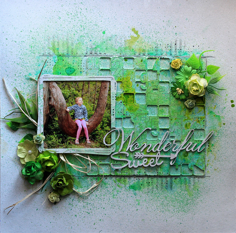
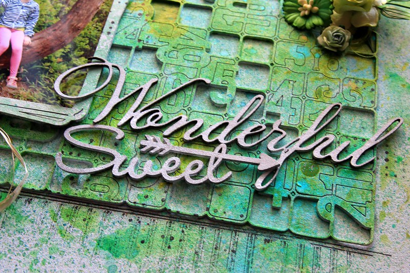
"Wonderful Sweet" layout

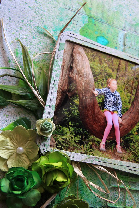
To create this layout, I glued the Number Grid - Small to my background, and once again, I applied gesso all over. I also applied gesso to my square frame, which is part of the Graduated Squares set, and to the words, Wonderful, as well as Sweet, from the Arrow Words set. I set those aside.


Then, I added color to my background with Twinkling H2O watercolors, Gelatos and various mists. I also used stamps and black ink.


I added two different colors of mist to my frame.


The words were not altered, because I wanted them to stand out.


Thursday, October 2, 2014

Priceless Moments with the Montage collection

Hello friends, can you imagine it's already October and the last quarter of the year?! Oh my gosh, time has really past hasn't it?

Today I'm up on the Blue Fern Studios blog with an education video and I'm squealing with excitement because it features the gorgeous Montage collection that Michele Singh has designed. I basically just swooned over it - too pretty!

Here's the mixed media layout I created:


I've used "Now and Then" as my background paper, together with layering pieces from "Society" and "Calling Cards". Tucked between the papers are the new Poppies and Jasmine collages. These are my favourite at the moment and they are actually a combination of flowers with existing chipboard designs already available (Poppies is mixed with Bits of Honey, and Jasmine is mixed with Checkered Bits).

Some close-ups:


My page title from "Bouquet".


The Poppies collage. Love the effect you get when layering shades of colors.


This is the Jasmine collage and you can see the gradients in the colors giving an ombre effect. 


So here's the video I've made, do enjoy the process!


That's all I have for today. If you have not subscribed to us on Youtube, now's the time to do so! And do drop by the blog again to see what the rest of the fabulous team has in store for you. 

Blue Fern products used:
"Society"
"Calling Cards"
"Now and Then"
"Bouquet"
Poppies Collage
Jasmine Collage

love,

Wednesday, October 1, 2014

October Sketch Challenge

Welcome to October everyone!  

Let's start the month with a brand new sketch designed just for us by Michele Singh. 


We think you will agree that there are so many possibilities!

Take a look at how our Design Team interpreted the sketch:

Keren Tamir


Camilla Ekman


Marie Josée Hamel


Yuko Tanaka


Patter Cross


Jackie Clark


Leila Cardoso


Lisa Griffith


One lucky winner, selected by a random draw, will receive a prize package of Blue Fern Studios chipboard!
In addition, we will also select 3 layouts to feature.

We have just a few simple rules to follow if you would like to participate in our sketch challenge:

1.) Feel free to interpret the sketch as you please by means of taking it as-is or 
flipping/turning/mirroring it to suit your needs! 

2). Please note that you can do whatever type of project you please- a layout, card, 
tag, canvas, altered item- whatever suits your mood and style! 
We would love to see the different ways our sketch can be used.

3.) You must use at least one piece of Blue Fern Studios chipboard OR use Blue Fern Studios paper on your project. Please note that you do not need to use the pieces featured in the sketch
- use whatever suits your fancy! You can find the store nearest you HERE.
 {Do not use any other brand of chipboard on your project please!}

4.) Upload your project using the Inlinkz tool below by midnight EST on October 31st, 2014.

We look forward to your entries!