Showing posts with label The Optimist Word Set. Show all posts

Tuesday, November 28, 2017

November Inspiration by Wendy Scholten

Hi All,
Hope you are enjoying November as much as i do although i must say i'm looking forwards to december. I just love that month with our little girls birthday and Christmas.
The sparkling lights, cozy inside with hot cocoa and off course the Christmas tree.
I have 3 layouts this month to share with you, from which one of them of course features the vintage Christmas collection.

So let's start with the first one:
Memories
It features an older collection, Timeless, but those papers are still gorgeous!
I started with some gesso to secure my paper and used a stencil with moddeling paste and 3 different colors of sprays to give my layout some more texture.
I placed a little piece of cardboard and paper behind my photo to give it some depth and embossed my chipboard pieces. The title Memories with Stormy skies embossing powder, the scalloped border with oatmeal embossing powder and Heidi's Emblem with Taupe Embossing powder.
I decided to give the Garden Florals a brown color with a spay to match my layout a bit more.
And made flower clusters with the Garden Florals, Wanderlust Lilies and Apricot Blooms.
Next i used some metal embellishments and pebbles to finsh my layout.
Blue fern Studios products used:

Paper:
-Timeless
Chipboard:
-Scalloped Border
-Heidi's Emblem
-Memories from the Chunky Word set
Flowers:
-Garden Florals
-Wanderlust Lilies
-Apricot Blooms
Embossing Powder:
-Stormy Skies
-Oatmeal

And now my next one:
Warm and Cozy
This one features the Vintage Christmas 2 collection. Are those Christmas papers gorgeous or what!
I used the backside of the Let it Snow paper and used some Gesso, moddeling paste and a snowflake stencil for my background, i also used 3 different shades of color spary and the Jingle Bells Stamp.
I love Lace number 8, it's so pretty so i had to use it on this layout.
The title Warm and Cozy was cut out of a framed winter word and i embossed it with Fern and antique gold embossing powder as well as the Snow medley chipboard.
I used some Garden Blooms and Homespun Blossoms for my flowers and finished my layout with glass and sweet pea seedlings.
Blue Fern studios products used:
Paper:
-Vintage Christmas: Let it snow
Chipboard:
-Framed Winter Words
-Sow Medley
Flowers:
-Garden Blooms
-Homespun Blossoms
Embossing powder:
-Fern
-Antique Gold
Stamp:
-Jingle Bells
Lace;
8
Seedlings:
-Glass
-Sweet Pea

And my last one this month features the Homespun Collection
Delightful

I used the Hospitality paper, and a placed a piece of the Crafty paper on top. To create some texture i used a doily and a stencil with moddeling paste.
I framed my photo with a piece of coordinated chipboard from the Homespun Collection.
For my chipboard pieces i used the title Delightful from the optimist word set which i embossed with Taupe embossing powder, The Classic Corners with Pink dust and the Mesh Bits with Snow embossing powder.
I finished my layout with Mauve and Wintergreen Seedlings and some flowers from my own stash.
Blue Fern Studios Products used:
Paper:
-Homespun: Hospitality and Crafty
Chipboard:
-Delightful from the optimist word set
-Classic Corners
-Mesh bits
Embossing powder:
-Snow
-Taupe
--Pink dust
Coordinated Chipboard
Seedlings:
-Mauve
-Wintergreen

Hope you enjoyed this inspiration and have a great week!
Hugs wendy


Friday, June 24, 2016

Three Tranquility Layouts with Karine

Hi there, Blue Fern Studios fans,

I hope this post finds you well and that summer is arrived in your part of the world. I'm sharing with you today three layouts I did in the past week or so. I used one of the last collection: Tranquility. I think it's my favorite collection ever!

All You Need Is Love


For this layout, I stepped out of my comfort zone. Orange is a scary color for me, but this Keepsakes paper from the Timeless collection is so beautiful, I couldn't resist.


My main chipboard piece is the Circle Vine. I coloured it with brown ink, and then partially embossed it with Imagine Ink Honey and Chili Powder embossing powders. I just love how it turned out.


As for my background work, I used the Serendipity stamp with brown ink and the Garden Frolic stamp with orange ink. I also used some withe and gold texture paste, to add interest to the background. Brown ink drops complete the work.


My title piece is simply coloured with brown ink.


I must say, my layout is also inspired by the beautiful orange flowers, part of the Tranquil Blooms set. I just can't get enough of those gorgeous flowers. I also used some of the Courtship Blooms.

Blue Fern Studios products used:
Keepsakes paper (Timeless collection)
Serendipity and Garden Frolic stamps
Chipboards: All You Need is Love and Circle Vine 
Imagine Ink Honey and Chili Powder embossing powder
Tranquil Blooms and Courtship Blooms flowers


Serenity


My second layout features the Contentment paper from the Tranquility collection. When I got the collection, I wanted to create something special with this paper. It is just gorgeous. I decided on a layout about me, since I rarely use a picture of me.


For the background, I wanted to match what was already in the paper and that reminded me of sand or some rough texture. I used some stone effect medium with a stencil or simply applying it with a palet knife, and while it was still wet, I sprinkled some Imagine Ink Seven Seas and Honey embossing powders and heated it. I LOVE the result.

I did the same thing with my chipboards (the Crackle Bits). Look at this texture!


My title piece comes from the Serenity, Cam, Hushed set.

To mat my photo, I used the Jubilation and the Calling Cards papers, also from the Tranquility collection.


To embellish, I used two large flowers and some pale yellow lilies from the Tranquil Roses and Lilies set.


To add a bit of interest to my background, I partially stamped using the Serendipity Medley and the Making Plans stamps with blue ink, and the Postal Textures stamps with grey ink.


Blue Fern Studios products used:
Contentment, Jubilation and Calling Cards Papers (Tranquility collection)
Serendipity Medley, Postal Textures and Making Plans stamps
Crackle Bits and Serenity, Calm, Hushed chipboards
Tranquil Roses and Lilies
Imagine Ink Seven Seas and Honey embossing Powders 


Perky


My last layout features the Stillness paper from the Tranquility collection. I mated my picture with the Serenity paper, also from the Tranquility collection.


I wanted a masculine feel to this one, so I used the Grid Pieces on which I used clear crackle medium and some brown paint to make the cracks stand out more. I love the result. It matches the grid pattern in the paper. I also used a grid stencil with modeling paste and a grid stamp, along with the Texture 1 and Making Plans stamps sets.


Look at the texture on the chipboards pieces.


My title is part of The Optimist Word set. I left it raw.


To embellish everything, I used the Tranquil Blooms (green) and some Courtship Blooms (kraft and dark brown). Aren't those flowers simply amazing?

Blue Fern Studios products used:
Stillness and Serenity papers (Tranquility collection)
Texture 1 and Making Plans stamps
Grid Pieces and The Optimist Word set chipboards
Tranquil Blooms and Courtship Blooms flowers

I hope you have a great day.
Karine

Thursday, April 21, 2016

Three layouts by Marie-Josée

Hello, Blue Fern Studios fans!

Today, I am featuring three layouts created with the latest three Blue Fern Studios paper collections: Courtship Lane, Serendipity, and Timeless.

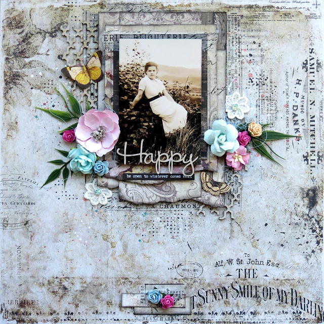
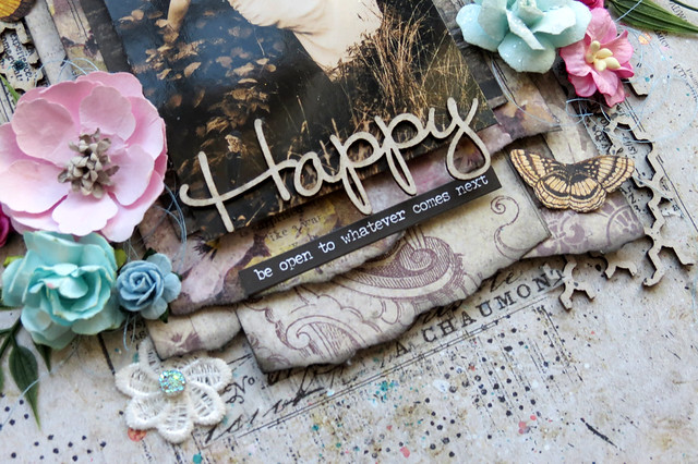
Happy (Timeless collection)

For this layout, I used the Timeless collection. I have to admit that this one is my all-time favorite BFS collection! I used a picture of my grandmother, taken in 1936.

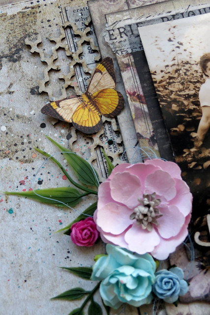
As you can see, I created many layers under the picture with various Timeless papers. I used the Artistic paper for the background.


You must have notice that I love the look of bare chipboards on my layouts. Here, I also used bare chipboards from two different sets: two pieces of the Turkish Bits set, and the word Happy, from The Optimist Word Set.


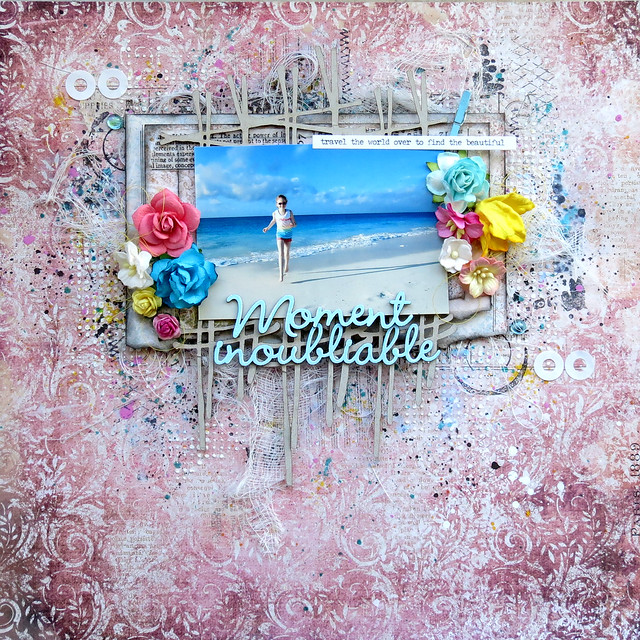
Moment inoubliable (Serendipity collection)

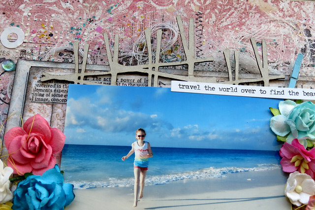
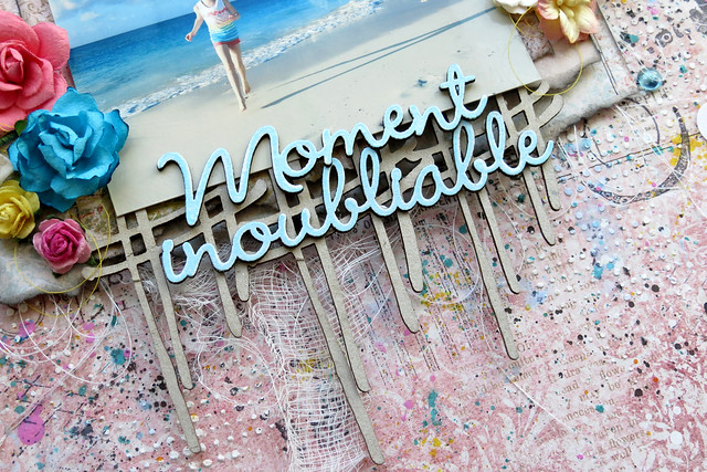
For this layout, I used the Serendipity collection. For the background, I used the Glee paper.


Under the picture, I used the Crossing the Lines chipboard, which I did not alter.
 

For the title, I used two words from the French Words set, Moment and inoubliable. I altered them with Blue Fern Studios embossing powder. I used the color Breeze.


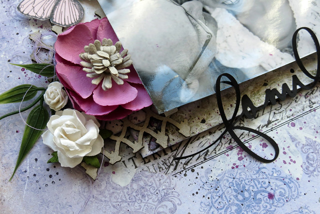
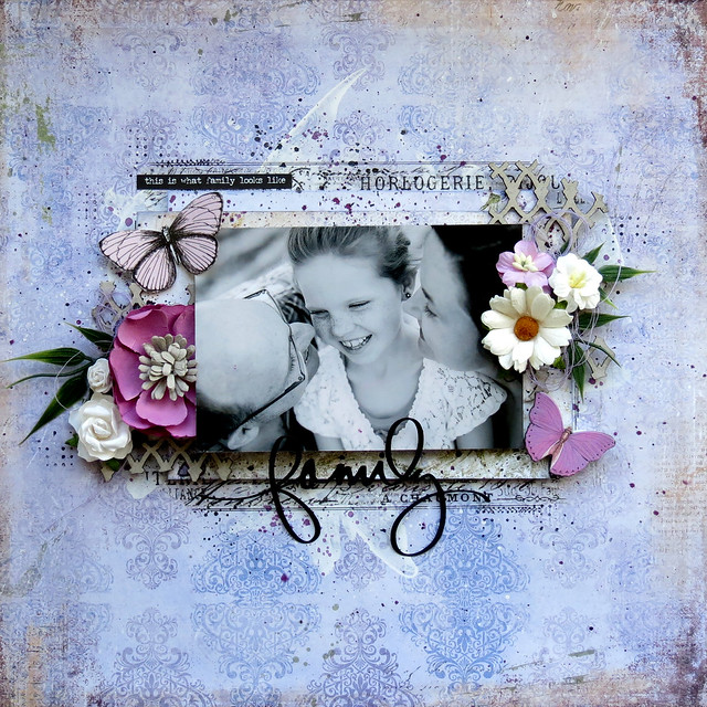
Family (Courtship Lane)

Unlike many people, I LOVE purple! Thus, I was really happy when Blue Fern Studios introduced the Courtship Lane collection, because it has lots of purple.

I used the West Plaza paper for the background.
 

Under the picture, I used pieces of chipboard from the Frolic Mesh set.


That's all for today! I hope you enjoyed my projects! :)

Thursday, March 24, 2016

In love with the Courtship Lane collection (Karine)

Hi there, Blue Fern Studios fans,

I can't believe spring is here! And what better way to celebrate it than with our new Courtship Lane collection? It's gorgeous colors and pretty patterns are perfect for the season!

Love


For this layout, I used two paper as my background: Town Gossip and Concert Hall. I altered them with modeling paste and a stencil, and I added color with watercolor. I also used a card from the Calling Cards paper in my paper cluster.


My main chipboard piece is the Bordeaux Layered frame which come in two parts. The bottom one, I painted with white gesso and sprayed mists over it, to match the color in the background paper. For the swirly top part, I covered it with white gesso. I chose to leave it white because I thought it was contrasting over the pink chipboard.


While I was looking in my box of smaller chipboards, I found a little piece (you can see it in the picture above, just below my frame) that came from a flourish from the Leafy Page Accents. I painted it with white gesso also, to match the frame. I thought it filled the gap between my flower and my frame perfectly. I never throw away even the tiniest pieces: you never know when they can come handy.


My title piece, from the Adore, Love, Cherish set is also painted plain white.

Perfect


My second layout is way much colourful.than my first one. I chose the Parkway paper as my background. I was inspired by the colors of the feather on the left of the page. 


My composition on mainly based on the Whimzy Flourishes that frame my picture. I embossed them with Imagine Ink Garnet embossing powder. 


I created my flowers clusters around the two flourishes. I also fussy cut some flower from the Calling Cards paper to put in my clusters, to give dimension. You can see, in a few places, that I used the Forever stamp set to add a bit of texture to my background. 


My title, part of the Perfect, Adorable, Special set, is embossed with Imagine Ink Iris embossing powder.

Happy


My last layout uses the beautiful West Plaza paper. I chose the colors of my layout based on the damask pattern of the paper.


I used the Garden Frolic stamp set to stamp randomly on my background.


To frame my picture, I used the Celebration Hearts, which I embossed with Imagine Ink Snow embossing powder. I built my flower clusters around them.


My title piece, from The Optimist Word Set, was embossed with Imagine Ink Lilac embossing powder and glued over my embellishments.

I hope my creations inspired you.
Have a nice crafty day.

Karine