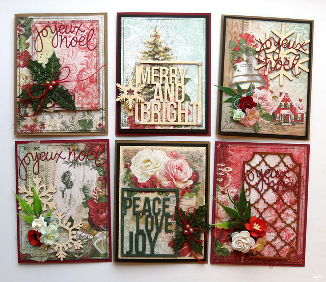
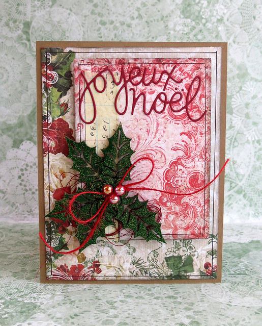
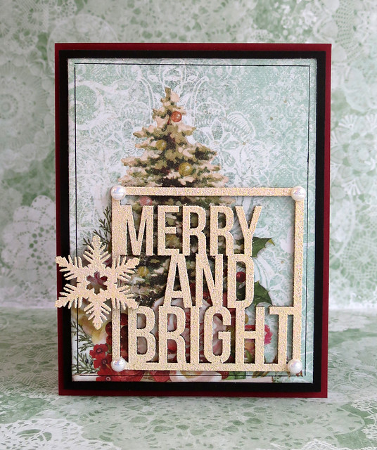
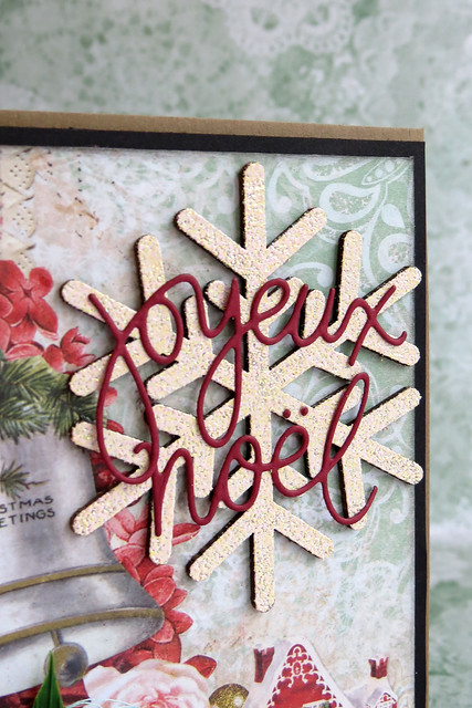
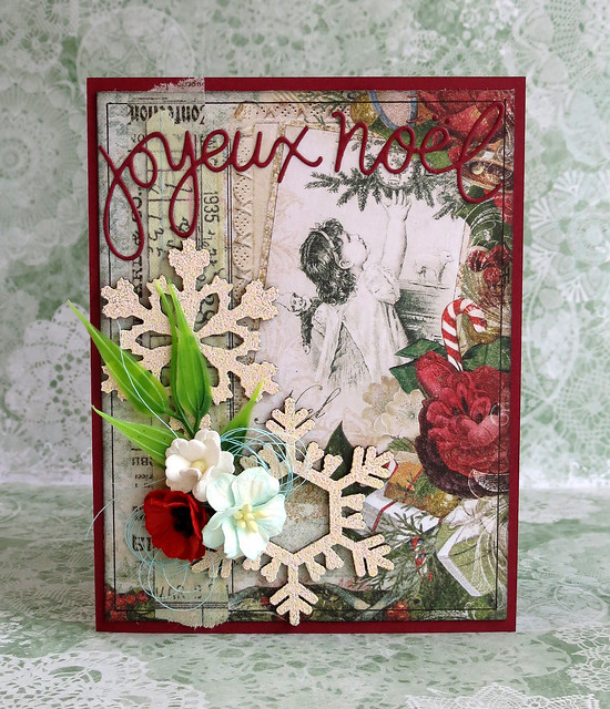
... and the Imagine Ink embossing powders!
Hello, Blue Fern fans!
Today, I will show you six cards that I created with the beautiful Vintage Christmas collection and the new embossing powders.
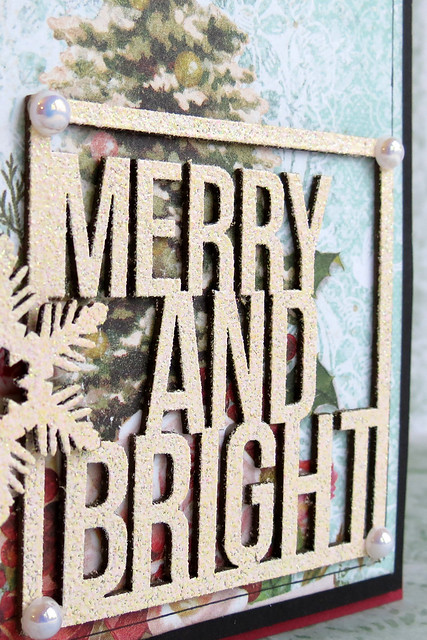
I used the embossing powders with Versamark ink on the raw chipboards, without painting them or altering them in any way before.
Here are the colors I used :
Petal (rosy white)
Fern (teal)
Poinsettia (red gold)
Lucky (green)
I also used chipboards from four different sets: Framed Winter Words (Peace and Joy and Merry and Bright), Holly Sprigs,Winter Flakes, and Quatrefoil Garden Panels.
Here are my cards!
Showing posts with label Quatrefoil Garden Panel. Show all posts
Showing posts with label Quatrefoil Garden Panel. Show all posts
Friday, November 13, 2015
Monday, February 9, 2015
Love is Beautiful!
Ahhhh yes, love is beautiful, and so is our Love Story Collection. It's the perfect choice for your love and Valentine projects. Take a look at the beautiful card Marie-Joseé created using paper from Love Story and the Quatrefoil Garden Panel chipboard piece. We love that she made it so personal by including a photo of herself!
Now take a look at the romantic layout Marie-Joseé created, layering several sheets of paper from the Love Story collection with some Bits of Honey chipboard pieces. To top it off, she added some words of love from our French Words chipboard set. What better way to show your special someone how much they mean to you?
Now take a look at the romantic layout Marie-Joseé created, layering several sheets of paper from the Love Story collection with some Bits of Honey chipboard pieces. To top it off, she added some words of love from our French Words chipboard set. What better way to show your special someone how much they mean to you?
If you've got a love story to tell, we have the perfect paper collection for you!
Tuesday, June 10, 2014
Jackie's June Creations - A Layout and A Mixed Media Gift Bag and Card
Hello Blue Fern Studios Fans! Jackie with you today to share my June Blue Fern Studios projects. I've had a blast playing with the new Ombre Dreams papers, and I have two Ombre Dreams projects to share with you today, but I'd like to start off with a very dimensional layout using Blue Fern Gardens.
I've mentioned before how much I love the thickness of these papers (and if you haven't had a chance to pick up some Ombre Dreams paper, they are printed on the same paper) because of how well they take media, and I've piled it on again here, with gesso, mists, inks and watercolour paints.

I treated one of the Leafy Page Accents in a similar manner, though I used a copper mist instead of the orange acrylic as my base colour (I applied clear gesso to the piece first, so that the mist would sit on top instead of seeping into the porous chipboard).
I matted my photo collage using two layers of Blue Fern chipboard, starting with one of the Beaded Strings circles. I painted it with a thick gesso (because I find super heavy gesso spreads so much easier with better coverage), then added some touches of watercolour paints, and then added a bit more gesso once those were dry to tone everything down a little. I also added some grey ink to the outside for definition.
The second layer of my photo mat is one of the Quatrefoil Garden Panels. I cut it in half lengthwise so that I could have a border both on top of and below my photos, and painted it with a shimmery acrylic paint.
To create a horizon line across my page, I used a piece of one of the Jeweled Page Dangles left over from another project. The links are coloured with chalk ink, and I used some of the shimmery watercolour paint I used on the page to colour the flower, and topped it with some bling.
Blue Fern Studios Products Used:
- Blue Fern Garden: Picnic
- Blue Fern Chipboard: Beaded Strings, Jeweled Page Dangles, Quatrefoil Garden Panels
With Father's Day just around the corner, I set out to make a masculine gift bag, though in the end it turned out a little too colourful to be truly masculine, but I love it!
I combined Blue Fern Garden and Ombre Dream papers for this one; they work so well together! After I built my base layers, I added strips and squares I cut from scrap pieces and the cut-away strips at the bottom of the papers, and added random colour to the sides of all of these.

I then added stencilling, stamping and splattering to the background along with some sewing thread.
I coloured the Grand Balloon Chippy with several different colours of acrylic and watercolour paints, layering them on until I was happy with the effect then adding some gesso to help to tie the piece in with the background.
See the wonderful texture from the acrylic paint? Some metal pieces provided nice finishing touches to the balloon.
Blue Fern Studios Products Used:
- Blue Fern Garden: Signature, Timeless, Parlour
- Ombre Dreams: Susan's Dream
- Blue Fern Chipboard: Grand Balloon
I so enjoyed making the gift bag that I decided to make a card along the same lines, this time using one of the Eastern Lanterns, and one of my favourite colours, orange.
On the Grand Balloon chippy I achieved the texture by dabbing with my finger in the wet paint; with this one I held my heat gun close to the acrylic paint to cause it to bubble and create this gorgeous effect. I then added some modelling paste and gesso to enhance the aged effect.
I treated one of the Leafy Page Accents in a similar manner, though I used a copper mist instead of the orange acrylic as my base colour (I applied clear gesso to the piece first, so that the mist would sit on top instead of seeping into the porous chipboard).
Blue Fern Studios Products Used:
- Blue Fern Garden: Parlour
- Ombre Dreams: Susan's Dream, Shannon's Dream
- Blue Fern Chipboard: Eastern Lanterns and Leafy Page Accents
Thank you for stopping in today!
Sunday, December 29, 2013
December projects with Kerryn Lawson
As another year draws to a close I would like to take this opportunity to share my final Blue Fern Studios projects with you. It has been a fabulous 6 months. Thankyou for allowing me to share my work with you.
Today I have a couple of cards and a layout to share. First up is a general purpose card featuring the Tweet Friends chipboard.
After being primed with gesso a combination of green paints was applied to the branches and leaves. By applying the gesso first the paint goes on beautifully and rich. The birds were painted with a combination of blue paints with a touch of gold glitter applied to the wings as a finishing touch.
For my second card I focussed on creating a bold centrepiece using a Quatrefoil Garden Panel.
Again the chipboard was primed with gesso and once dry gold paint was applied with a paintbrush. Afterwards bronze paint was applied with my finger to give a rustic, random finish. The sentiment, from the Optimist word set, was painted with black paint to provide a lovely contrast against the bolder colours of the Quatrefoil Garden Panel and the other embellishments.
For my final project I have a layout of my daughter with a background featuring the cut-out pieces from the Quatrefoil Panel.
I have a bag full of these fabulous little cut-out pieces and I refuse to part with them. They are a great way to add texture and interest to a background as well as creating a great opportunity to play with inks, mists and paints.
The cut-out pieces were primed with gesso and adhered in position on the page. They were first painted with a textured paint before being painted with Shimmerz paints to better match the colour palette I was looking for. The Bits of Honey piece was painted with a combination of mists that complemented the papers I had chosen to use.
The same products were used repeatedly on the page. The same combination of mists and paints were used on the chipboard and on the background to create an element of consistency to the page. The same is true for the Garden Daisies - Small, with mists already used elsewhere on the page being used to paint it.
It has been an absolute pleasure to design for Blue Fern Studios.
Thankyou,
Kerryn
Saturday, July 27, 2013
Keep it Whole or Take it Apart w/Erin Blegen
Hi everyone! Erin Blegen here with you today with some projects showing how you can keep your chipboards "as is" or piece them apart in order to best compliment your work. We all like to make the most of our products and it can sure be fun to see how far you can stretch something. While at other times, we want to use something in its entirety to really make a statement!
Let's see how I did both :)
"Pause to Live"
This piece is an 8"x10" canvas. Normally, when I create something, I don't necessarily start with the chipboard. But that wasn't the case here. I knew I wanted to use the gorgeous Ornate Heart piece- and I definitely knew I didn't want to take this one apart. It's such a gorgeous design and I really wanted to make something special with it.
Here are the steps I took in coloring this piece:
1. Prime chipboard with gesso; dry.
2. Stamp chipboard with a favorite stamp and clear embossing ink.
3. Sprinkle on some white embossing powder and set with heat gun.
4. Randomly apply some watercolors. The embossed stamping will resist.
5. Apply clear embossing powder to some areas of the wet watercolors. Set with heat gun.
Products Used:
Ornate Heart
"Pretty Creative Girl This Afternoon"
This project is a bit of an interesting one as my background is made of sandpaper. I actually have a full step-by-step tutorial on how I went about creating this HERE on my blog if interested.
For this project, I chose to piece apart my chipboard. I've done so with two different pieces, the Quatrefoil Garden Panel and one of the Ironwork Accents. I've kept them raw for the most part, save for a few beads on the panel bits.
I've added a couple of the punched out bits that come with these panels.
Products Used:
Quatrefoil Garden Panel
Ironwork Accents
"Key to My Heart" Tag
My final project today is a tag. I've created a collage-style piece using the bird/flourish cut from the Village Sign Post, and a heart from the Heart Set pack.
I actually ended up using the backside of the heart piece. I'd done some stamping and coloring and just didn't like it- but when I turned it over and discovered the random gesso look that it had, I decided I wanted to keep it that way :). I backed it with a transparency before cutting off a piece from the Village Sign Post, applying some sandy colored chalk ink, and then topping off the heart with it.
Products Used:
Heart Set
Village Sign Post
Thank-you for hanging in there with me today! I hope you enjoyed my projects :)
See you soon- and don't forget about the July Sketch Challenge!
Subscribe to:
Comments (Atom)

